- Home
- InDesign
- Discussions
- Re: Create tables with spaces between cells (ie ce...
- Re: Create tables with spaces between cells (ie ce...
Copy link to clipboard
Copied
Hi.
One image is better than 100 words, so here is one. 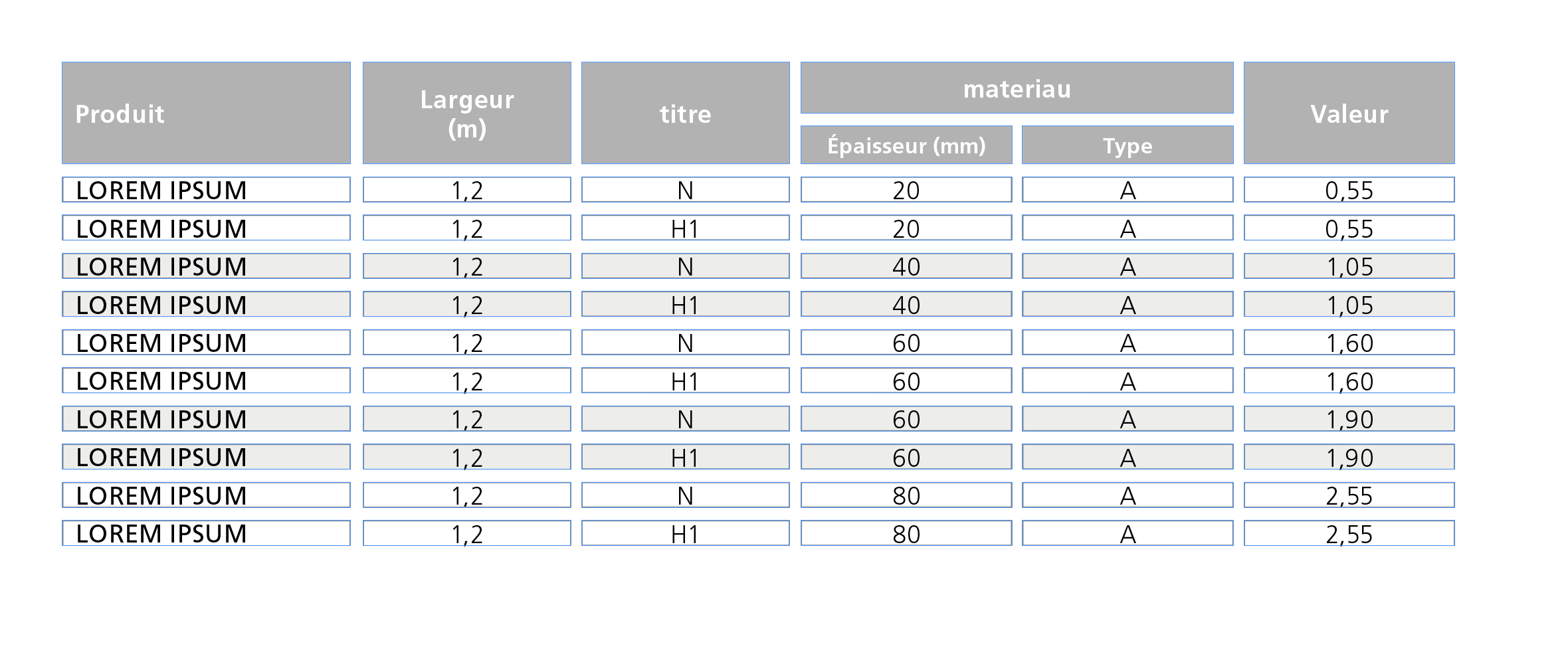
Untill now, this kind of table is done by grouping Text-blocks.
Do you know if ther is a way to get the same result using tables only using regular options or any plugin ?
Thanks in advance.
 1 Correct answer
Hi Aman,
at first glance the task seems to be an easy one. But it isn't.
What you are showing is not exactly what the OP—bernard—likes to accomplish.
In his sample there is no stroke around the table.
The gray header cells are showing no black strokes.
Just the fills.
It could be done using empty columns and empty rows.
But I assume this trick is not allowed.
Maybe something can be done by text formatting using a combination of paragraph shading, graphic lines above and below?
But that wouldn't be very f
Copy link to clipboard
Copied
The Lounge Forum is not for technical help, please provide the name of the program you are using so your message may be moved to the correct program forum... A program would be Photoshop or Dreamweaver or Muse or Premiere Pro or ???
Copy link to clipboard
Copied
@John T Smith: Sorry, I thought I posted in the right place
@
Copy link to clipboard
Copied
In HTML tables, we use CSS padding on the table cell selector.
td {
padding: 20px; /**adjust values to suit**/
}
Copy link to clipboard
Copied
The original poster tagged the question "InDesign", folks. I'm moving the post to the InDesign Forum.
Copy link to clipboard
Copied
Hi,
Every cell in an Indesign table has cell insets, which automatically default to 4pt (1.411mm) so you shouldn't need to worry about it.
Make sure that you use table and cell styles to keep consistency as it looks as if your tables are fairly complex.
Regards,
Malcolm
Copy link to clipboard
Copied
Hi,
An easy workaround to achieve something similar in InDesign would be to apply cell Stroke to the table cells with appropriate weight.
First create a table of desired number of cells and columns

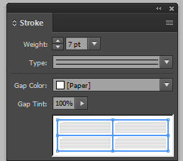
Select all the cells and open the strokes panel from window menu.

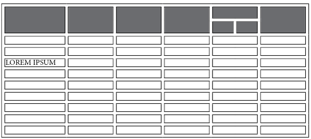
Apply the stroke as shown in the below screenshot. To increase the spacing between cells, you can increase the stroke weight. however, this will also increase the weight of the black section.
Preview, if the cell spacing is as per need. You can then fill cells with the needed colors and type your data. Also note that this leaves an extra border around your table.
Regards,
Aman
Copy link to clipboard
Copied
Hi Aman,
at first glance the task seems to be an easy one. But it isn't.
What you are showing is not exactly what the OP—bernard—likes to accomplish.
In his sample there is no stroke around the table.
The gray header cells are showing no black strokes.
Just the fills.
It could be done using empty columns and empty rows.
But I assume this trick is not allowed.
Maybe something can be done by text formatting using a combination of paragraph shading, graphic lines above and below?
But that wouldn't be very flexible. And if the cells showing white as fill should be transparent behind a background it would be perhaps impossible to do…
Regards,
Uwe
Copy link to clipboard
Copied
Hi Uwe,
i totally agree with you.
I only intended to give a workaround to achieve a close result.
The stroke can be used to achieve just the cell spacing and later the color can be changed to paper, by selecting the entire table and then choosing stroke color from the control strip.
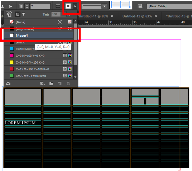
Agreed, that this method too would need lot of tweaking and adjustments to make it look identical to the desired design.
-Aman
Copy link to clipboard
Copied
Hi Uwe!
Have you forgotten …
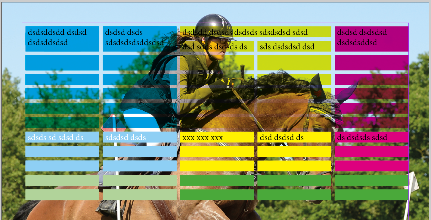
the use of a 10-points stroke without color for the cells? ![]()
(^/)
Copy link to clipboard
Copied
Can you show me what that structure would look like in the menu's Obi?
Can it be less than 10 points or does it only work at this amount?
Best,
EW
Copy link to clipboard
Copied
There are many ways to achieve cell spacing.
You certainly don't need to go to such complicated lengths as:
bernardc8812564 wrote
this kind of table is done by grouping Text-blocks.
The quickest way would be amaarora suggestion.
It sounds like you should learn more about table and cell styles as well as this can make things more "automatic".
Copy link to clipboard
Copied
https://forums.adobe.com/people/Eternal+Warrior wrote
There are many ways to achieve cell spacing.
You certainly don't need to go to such complicated lengths as:
bernardc8812564 wrote
this kind of table is done by grouping Text-blocks.
Hi Eternal Warrior,
I'm sure there were good reasons.
Do you have a suggestion how to do it with table cells?
I'm curious…
Regards,
Uwe
Copy link to clipboard
Copied
Good morning Laubender,
I hope you are well?
I applaud the fact that you are looking at the exact way that this has been constructed and are focused only on providing "the" solution that exactly replicates what the OP has made.
I personally am not as clear why you assume that it has to be an exact reconstruction in the manner shown - unless you either personally know or assume that the OP has extensive knowledge of InDesign and wants an "exact" reconstruction. Which was not specified.
Also the fact that someone wants "traditional web-based" cell spacing should tell you that you will need to use one form of work around or another.
Both could be more automated with table and cell styles...
For a more amazing result you could write a (couple of) script(s) - for solution #2.
SOLUTION #1 WITHOUT MAKING LOADS OF TEXT BOXES....
As suggested by amaarora you would create an illusionary text cell spacing using either black or paper strokes... this could be put into a table style quite easily using the following example:
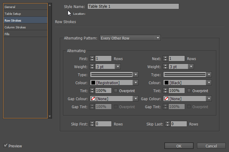
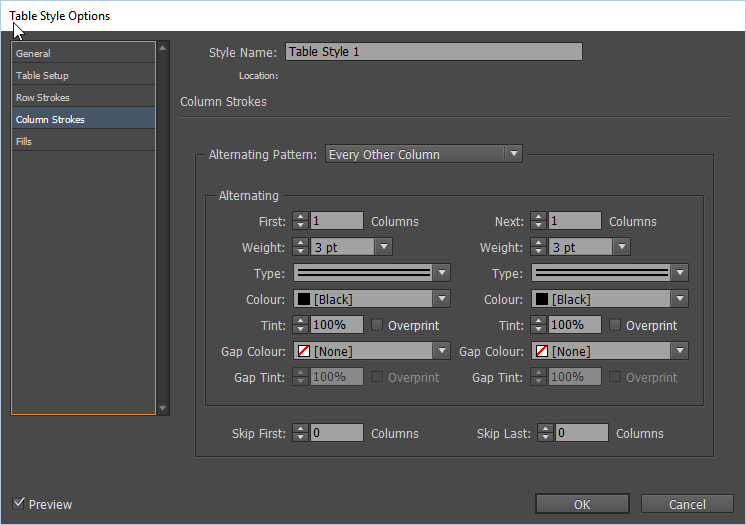
Giving you a very quick example like this:

Obviously this creates either black or white stroked lines but if it is for print and going to be flattened on to a solid fill background then this is no problem... You could always have the stroke the same colour as the fill.
However - the trouble comes when you need a completely alpha transparent background except for the cell fill.
SOLUTION #2 - ...NOT AUTOMATIC (WITHOUT ADOBE'S HELP OR A SCRIPT) BUT STILL PRETTY QUICK IN COMPARISON:
Again there is a slightly quicker way of doing this than the original - but it involves doubling the amount of rows and or columns that the table has and then applying an alternating cell style to every other row and column to make them effectively the correct width
In this case 6 columns displayed here becomes 12 and 11 rows become 22.
Then we need to make every other row and column the desired width and height of the "stroke"...
Personally - Adobe should have made us able to do this as part of style controls - but you would need a script to do this currently as even manually we cannot currently Ctrl or cmd click on multiple rows or columns you can only shift click...
With this done you can create the same effect with a lot less time and effort and have transparency in the "strokes".
IF the OP wants to recreate exactly the way they have currently produced the table then this will need a script or perhaps a feature request so that typically coded cell spacing is actually supported.
Anyway... that's how I would do it.
If the OP wants to submit a feature request I suggest they do that here: Feature Request/Bug Report Form
Best wishes and kind regards,
EW
![]()
Copy link to clipboard
Copied
… Then we need to make every other row and column the desired width and height of the "stroke"...
Hi EW,
much can be done by scripting.
Unfortunately there are harsh restrictions when it comes to minimum cell width and height.
With CS6 and above the minimum width and height of a cell is 3 pt or 1.058 mm. Also by scripting.
With versions below CS6 that was different.
Not in the UI but by scripting.
Regards,
Uwe
Copy link to clipboard
Copied
Worth knowing!
Thanks Uwe 🙂
Copy link to clipboard
Copied
https://forums.adobe.com/people/Eternal+Warrior wrote
…However - the trouble comes when you need a completely alpha transparent background except for the cell fill.
SOLUTION #2 - ...NOT AUTOMATIC (WITHOUT ADOBE'S HELP OR A SCRIPT) BUT STILL PRETTY QUICK IN COMPARISON:
Again there is a slightly quicker way of doing this than the original - but it involves doubling the amount of rows and or columns that the table has and then applying an alternating cell style to every other row and column to make them effectively the correct width
In this case 6 columns displayed here becomes 12 and 11 rows become 22.
Then we need to make every other row and column the desired width and height of the "stroke"...
Personally - Adobe should have made us able to do this as part of style controls - but you would need a script to do this currently as even manually we cannot currently Ctrl or cmd click on multiple rows or columns you can only shift click...
With this done you can create the same effect with a lot less time and effort and have transparency in the "strokes".
…
Hi EW,
if we propose a new feature for InDesign's tables, it could be the following:
Allow a cell to be locked.
In effect that would mean, if you:
1. Copy/paste text to a table
2. Update contents by using Excel files
3. Copy/paste cells to a table
two optional rules will apply:
A. Locked cells would not be filled with incoming data.
The data will simply not appear. All other cells will be filled.
In two optional directions: Columnwise or row wise insertion.
This could be branched out to a second optional rule that could be set in the preferences:
B. The next available not locked cell will be filled with any data that is applied to the table.
In two optional directions: Columnwise or row wise insertion.
Option B would make a perfect solution for the OP here.
( I hope, Aman is still following this thread 🙂 )
Regards,
Uwe
Copy link to clipboard
Copied
Hi Uwe,
This makes good sense to me!
I would still add the caveat that we should be able to Ctrl (or cmd) click on multiple rows or columns rather than only shift click...especially as this feature is available in many other programs.
Best,
EW
Copy link to clipboard
Copied
Laubender wrote
https://forums.adobe.com/people/Eternal+Warrior wrote
…However - the trouble comes when you need a completely alpha transparent background except for the cell fill.
SOLUTION #2 - ...NOT AUTOMATIC (WITHOUT ADOBE'S HELP OR A SCRIPT) BUT STILL PRETTY QUICK IN COMPARISON:
Again there is a slightly quicker way of doing this than the original - but it involves doubling the amount of rows and or columns that the table has and then applying an alternating cell style to every other row and column to make them effectively the correct width
In this case 6 columns displayed here becomes 12 and 11 rows become 22.
Then we need to make every other row and column the desired width and height of the "stroke"...
Personally - Adobe should have made us able to do this as part of style controls - but you would need a script to do this currently as even manually we cannot currently Ctrl or cmd click on multiple rows or columns you can only shift click...
With this done you can create the same effect with a lot less time and effort and have transparency in the "strokes".
…Hi EW,
if we propose a new feature for InDesign's tables, it could be the following:
Allow a cell to be locked.In effect that would mean, if you:
1. Copy/paste text to a table
2. Update contents by using Excel files
3. Copy/paste cells to a table
two optional rules will apply:A. Locked cells would not be filled with incoming data.
The data will simply not appear. All other cells will be filled.
In two optional directions: Columnwise or row wise insertion.
This could be branched out to a second optional rule that could be set in the preferences:
B. The next available not locked cell will be filled with any data that is applied to the table.In two optional directions: Columnwise or row wise insertion.
Option B would make a perfect solution for the OP here.
( I hope, Aman is still following this thread 🙂 )
Regards,
Uwe
Hi Uwe,
Yes indeed am following this thread.
The above mentioned reply seems like an interesting user scenario and would be a good feature request.
PS: I feel the second approach is really a good one to try out and explore
-Aman
Copy link to clipboard
Copied
I'm not sure about your answer. Is this ironic?
I know and use styles for several years.
Copy link to clipboard
Copied
bernardc8812564 wrote
I'm not sure about your answer. Is this ironic?
I know and use styles for several years.
Which answer?
If by looking at the second part you are referring to the first comment about using styles.. then please remember I don't know what every OP's knowledge of InDesign is and I don't mean offence.
Best,
EW
Copy link to clipboard
Copied
Many sorry for that. I was answering to your image about "styles are your friends".
You're right, this was useless.
Copy link to clipboard
Copied
Ok so unless I'm corrected in the meantime I have two thoughts...
1) What is the actual end goal? What is it going to look like and where is it going to be printed/displayed? I'll happily take Uwe's opinion that there was a good reason for making tables the way you have been...especially as I'm now confident of your knowledge in InDesign.
2) With a slight bit more work. Solution #1 might work with alpha if you use the gap between feature set to none... the only issue would be that you would need to set the line stroke the same as the cell fills > Or use a reduced tint or less visible colour..
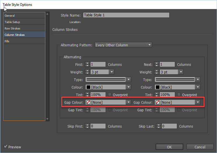
But again without knowing the desired end result where a picture really is worth a thousand words... I'm shooting in the dark ![]()
Copy link to clipboard
Copied
"What is the actual end goal? "
This is one of the 100 tables (approx.) that will appear in a industrial products catalog.
It will be printed, more or less with a width of 18cm.
With Uwe solution I finally get this. 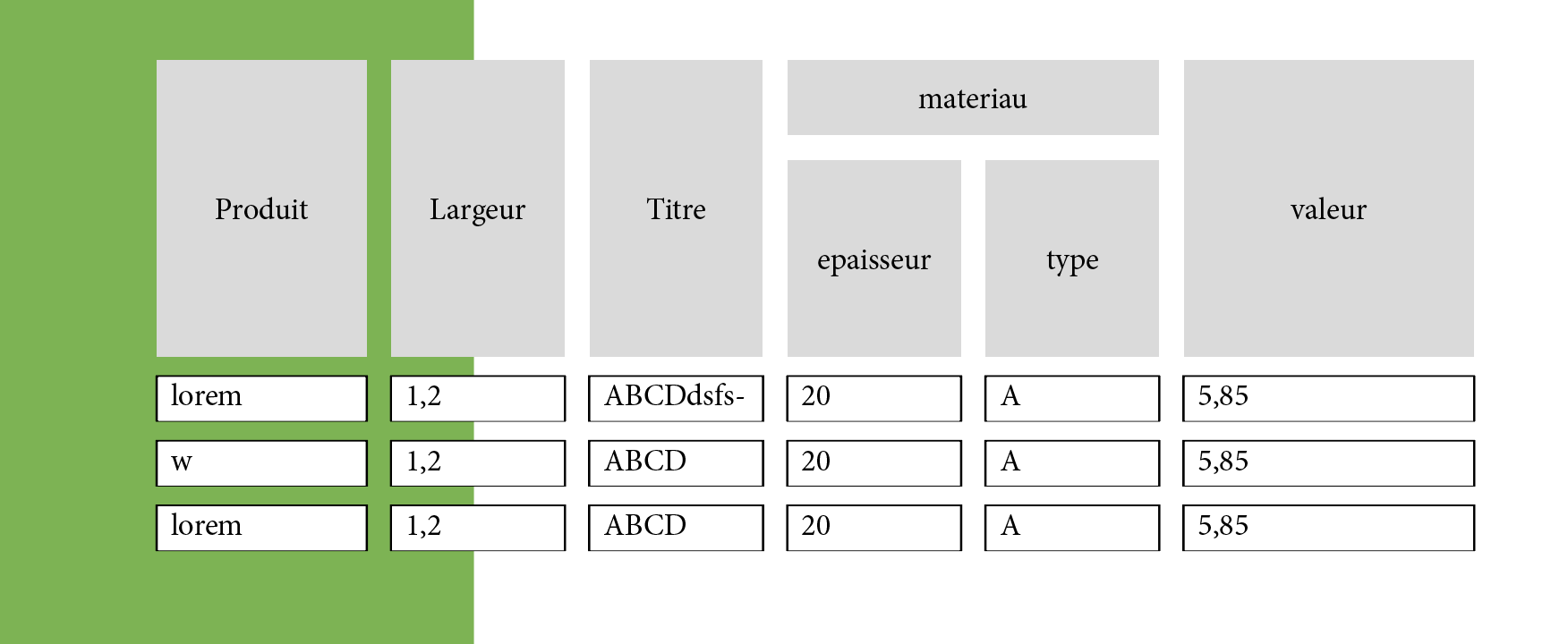
The only problem is that, with the amount of text in each cell (and their height), every setting has to be different from a table to another (correct english? )
I'll try the Solution #1
Copy link to clipboard
Copied
Will that green background be present in the final catalogue?
-
- 1
- 2
