Creating versatile PDFs
Copy link to clipboard
Copied
Hello,
I'm trying to prepare a PDF for both print and on-screen viewing. Because I don't know and can't control how the PDF is going to be viewed, I want a best-of-both or best compromise approach here. I do not want to send two separate documents, just one document that can stand up to either screen or print. My general experience is that photographs and renderings that look great on the screen tend to look much darker/gloomier when printed out - I'd like to prevent this as much as possible.
Any tips on the best approach here for image handling, color profiles etc? I am exporting a PDF from InDesign, my materials are a mixture of color, B&W, line drawings and renderings / photographs (both raster and vector).
Thank you
Copy link to clipboard
Copied
You printing digital or on a 4 color press?. if the first. just do an interactive .pdf for both.
If the second, export a print .pdf so the colors are set up for press ( if the artwork bleeds you need to set up bleeds). the 4 color press requires for the .pdf to be set up in the correct color profile. if you don't want people to see the crop marks that you will have to have two different .pdf files anyways...
Copy link to clipboard
Copied
Hi Jonathan, thanks for the response. The point is, I'm not printing it at all. I don't know who will print the document and on what printer. Or how they will view on what screen.
Having said that, it's unlikely the document will be printed on serious/specialist equipment, probably just basic laser or inkjet printers.
Copy link to clipboard
Copied
interactive .pdf will do just fine.
Copy link to clipboard
Copied
Having said that, it's unlikely the document will be printed on serious/specialist equipment, probably just basic laser or inkjet printers.
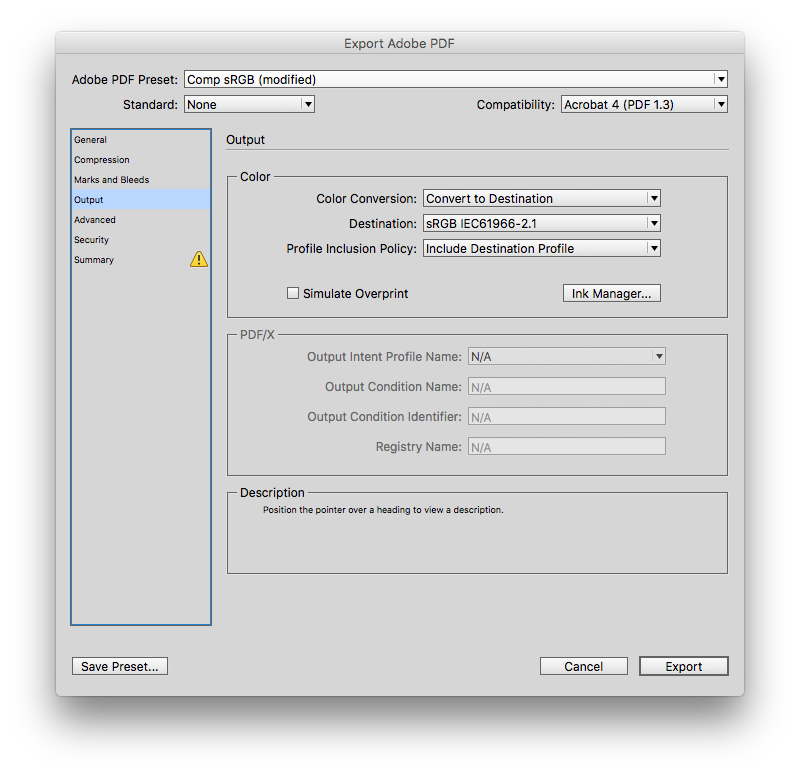
Most composite desktop printers expect RGB color and CMYK values get converted. Also, web browser's can have problems handling CMYK color and live transparency. So this output setting would flatten all color and convert it to sRGB on export. You should avoid spot colors and complex transparency:

Copy link to clipboard
Copied
I agree with Rob here… exporting as sRGB (and ensuring all the colors are in RGB) is best when you're not sure if or when something will be printed.
However, I wouldn't flatten it (which gets rid of all transparency; that's what you get when you save in the old Acrobat 4 format)… I would leave the Compatibility setting to Acrobat 6.
Copy link to clipboard
Copied
However, I wouldn't flatten it
You do run the risk of stitching artifacts showing at low resolutions (screens), but I've seen complex transparency effects kept live completely fall apart in a web browser. If flattening causes objectionable stitching you'll see it right away in Reader. With live transparency you would have to check the PDF in every reader and browser.
Find more inspiration, events, and resources on the new Adobe Community
Explore Now
