- Home
- InDesign
- Discussions
- Exporting a PDF changed the colour of a logo - why...
- Exporting a PDF changed the colour of a logo - why...
Copy link to clipboard
Copied
Hi all. Long-time user but first post, I think.
I produce a magazine and have done for years. We have an angry client whose advert got weirdly altered in the export - that is to say their logo changed colour from blue to pink. That's the only change in the whole doc, and I can't figure out why. It's never happened to me before. I'm using a custom PDF export setting that forces everything to CMYK. I don't know how to examine the original PDF beyond what I've looked at already. I've tried taking it apart in Acrobat and it all seems OK in there.
Anyone able to help me with this? Was it:
1. A problem with the PDF the client supplied, something like an RGB quirk that went funny when I CMYKed it?
2. A bug in InDesign?
Additionally, in the InDesign doc it appears correctly, and in the Publish Online version it does too – until I click to download it, and then it switches to pink again. Bizarre!
Please help - need to explain this to angry client.
 2 Correct answers
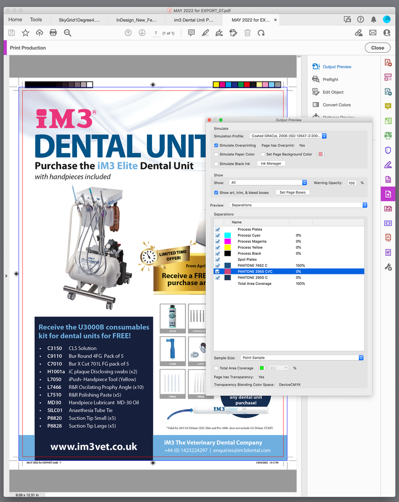
Spot colors are custom inks that would print on separate plates on an offset press—they shouldn’t be used when the printing will be process CMYK color. The provided PDF has 3 spot colors, but it doesn’t look like there is any reason for the added expense to print custom inks.
I don’t think CVC is a Pantone suffix (e.g., C for coated, U for uncoated), so it looks like a made up name and not an actual Pantone library name. It may have been intended for a spot varnish.
If the InDesign document
...Must be more than 20 years, I still have the Pantone Libraries that shipped with CS1 and the coated suffix is C.
Copy link to clipboard
Copied
- What file type has the logo? EPS does not support color management, rgb will change anyway. Best is AI or PDF/X-4.
- What color has the logo? Spot color, RGB with color profile? When spot color, what policy did you apply?
- If the logo was in CMYK, did it have the same color profile as your print, or a differen? If it was a different profile, which policy did you choose for output? Keep values, ignore, or convert to destination?
Copy link to clipboard
Copied
I totally agree with Will Adelberger, all these suggestions are great troubleshooting answers.
Copy link to clipboard
Copied
I would happily agree too if I knew what any of that meant. I'm a self-taught graduate from PageMaker back in the day and have never messed with any of this stuff – I've never had any problems (until today!) that would have led me to. I just got sent a PDF and placed it on the page, then exported as I always do. Colour profiles and policies are all new to me!
Copy link to clipboard
Copied
Can you share the PDF? A shift from blue to pink wouldn’t like be caused by Color management or profile assigments.
Copy link to clipboard
Copied
Copy link to clipboard
Copied
How was the PDF created? Can you provide the PDF?
Copy link to clipboard
Copied
I attached them above – the before and after. The one titled 'iM3...' is the original as supplied to me.
Copy link to clipboard
Copied
I cannot access these PDFs.
Copy link to clipboard
Copied
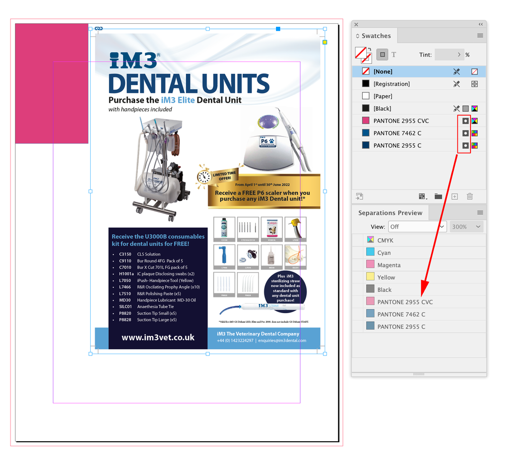
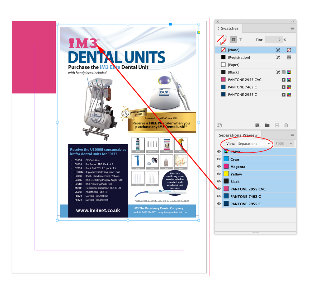
Hi @sickmoth , the logo is set as a spot color—there are 3 spot colors in the ad. Without seeing the InDesign file that the PDF was placed in, it looks like the spot color was aliased to different color via Ink Manager or it was placed in a document that already had PANTONE 2955 CVC defined as different color values. If you view the InDesign file with the placed PDF with Overprint Preview turned on, is the logo pink?
Copy link to clipboard
Copied
Thanks @rob day – yes, and I'm ashamed to say I've never used Overprint Preview before but will be doing so from now on. It's pink on the page now. So what is it exactly that has caused that? Something in Ink Manager? And, more importantly, is it a fault at my end?
Copy link to clipboard
Copied
Sorry, hadn't seen your screenshots before. I'll take a look at that.
Copy link to clipboard
Copied
Spot colors are custom inks that would print on separate plates on an offset press—they shouldn’t be used when the printing will be process CMYK color. The provided PDF has 3 spot colors, but it doesn’t look like there is any reason for the added expense to print custom inks.
I don’t think CVC is a Pantone suffix (e.g., C for coated, U for uncoated), so it looks like a made up name and not an actual Pantone library name. It may have been intended for a spot varnish.
If the InDesign document has a spot color swatch named PANTONE 2555 CVC before you place an object with the same named spot color, the source InDesign spot color definition is going to be used:
Overprint/Separation Preview shows the expected spot color print output
Copy link to clipboard
Copied
CVC is a long since deprecated suffix. It stood for Computer Video Coated. They dropped the CV about 20 years ago.
Copy link to clipboard
Copied
Must be more than 20 years, I still have the Pantone Libraries that shipped with CS1 and the coated suffix is C.
Copy link to clipboard
Copied
And before the CVC and CVU sets were the CV set!
The first ever Pantone swatches released for computer use had the suffix CV that was based on the Pantone Process Color Imaging Guide (I still have a swatch book!).
The Process Color Imaging Guide was based on a special set of proprietary letter-coded halftones screens used for traditional negative stripping (pre-computer days). For example Pantone 299 had the letter code WEOO which meant you needed the W screen for Cyan, which was 87.0%, the E screen for Magenta which was 18.5% and the O letter stood for 0% for each of Y and K. Pantone just took those existing percentages and created the first set of digital CV swatches in Illustrator and PageMaker. There was just the one set.. no Coated or Uncoated variant.
Once digital imaging got more sophisticated and imagesetters could reproduce any value between 0 and 100%, they then came out with the CVC and CVU sets with much better match percentages. (There was also a CVM set (Matte Coated) at that time, but it didn't get much traction).
Copy link to clipboard
Copied
Copy link to clipboard
Copied
Thanks Bob. I will read with interest!
Copy link to clipboard
Copied
Thanks for this. I finally understand!
Copy link to clipboard
Copied
So I've had a look at that in Acrobat but I don't really understand what I'm looking at - that is, why it's changed to pink in InDesign. Baffled.
Is there a setting in InDesign I need to check please?
Copy link to clipboard
Copied
It appears for whatever reason, the 2955 CVC spot colour was redefined or remapped in your InDesign document.
This normally wouldn't be possible if a logo was already placed; ID locks out editing of placed colours. But it IS possible if that graphic was deleted - You can then edit the blue in ID to something else, in your case the Pink (approx 89M 14Y). So, even if you re-place the logo, it will look Blue, but it will print in the Pink as now defined in ID.
Why would someone do this? I can think of some reasons, but I'm going to assume this was accidental.
In any case, once you've fixed this: If you are providing a PDF of an ad for print that is meant to print only in Process colours, you should "change" all your colours in your ID document to Process in your Ink Manager, BEFORE you make your PDF. This avoids the possibility of sending spot colours down the line, and also a good way to proof the final thing on screen (but yes, if you had looked at Separation preview in either ID or Acrobat, you would have seen the problem)
(fyi: CVC indicated the old school Pantone Libraries that were used years ago and were based on Process Ink Mixes, as opposed to the LAB based mixes used nowadays. It was defined as 100C 43M 0Y 34K.)
Copy link to clipboard
Copied
btw: "I'm using a custom PDF export setting that forces everything to CMYK."
You shouldn't have had spot colours in the PDFs at all, then. Both of your samples do, so we should see exactky how you have your settings.
You should also look at updating and considating your Pantone colour usage in the document.
You had 3 spot colours, two of them 2955 with different definitions, but I assume all are supposed to be the same "corporate" blue. The question is, which one should to go with? You SHOULD go with the latest method going forward, so that would be the Solid Coated "C" that is LAB based, and this will convert to CMYK dynamically according to your Color Management settings. There is also the Color Bridge Coated set "CP" for a newer fixed defined CMYK mix that Pantone has put its stamp on, but I find them weirdly off on some colours, so I usually avoid it.
It should be noted the CMYK mixes in the old CVC set are quite a bit lighter than what you will get from converting the Solid Coated set, because they were measured based on old-world printing processes where there was a great deal more dot gain throughout the process than what we get today in modern direct-to-plate imaging. e.g.:
Copy link to clipboard
Copied
Are you working with the original InDesign working document? What does the Pantone 2955 CVC look like in your Colours palette there? If it's Pink, then you need to reimport the proper definition from the logo file.
Normally I would say, open the Illustrator file for the logo and recolour the file with the current Solid Coated 2955 C, but since your client is already peeved, they may not like THAT shift in colour, so let's work with the CVC version:
Based on what's in your PDF, the only thing using that colour is the logo, so temporarily Cut (Command-X) the logo. This will free up the Colour Pantone 2955 CVC in the list. Delete that colour. Paste your logo back into position. This will reimport the colour from the file. It shoud be Blue now.
Find more inspiration, events, and resources on the new Adobe Community
Explore Now


