

Hanging punctuation InDesign

Copy link to clipboard
Copied
Hanging puctuation in InDesighn does not work very well. Sorry to say, Quark XPress is far superior. Maybe I do something wrong – I do it by the book/manual – and it does not look good. Any tips from professionals?
Egil Haraldsen


 53
Replies
53
53
Replies
53

Copy link to clipboard
Copied
File it. I'll vote for it.
Copy link to clipboard
Copied
The OP filed it as a feature request:
Add hanging punctuation for chevrons – Adobe InDesign Feedback

Copy link to clipboard
Copied
May be you should try a different approach?
Copy link to clipboard
Copied
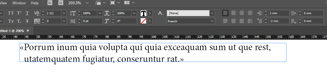
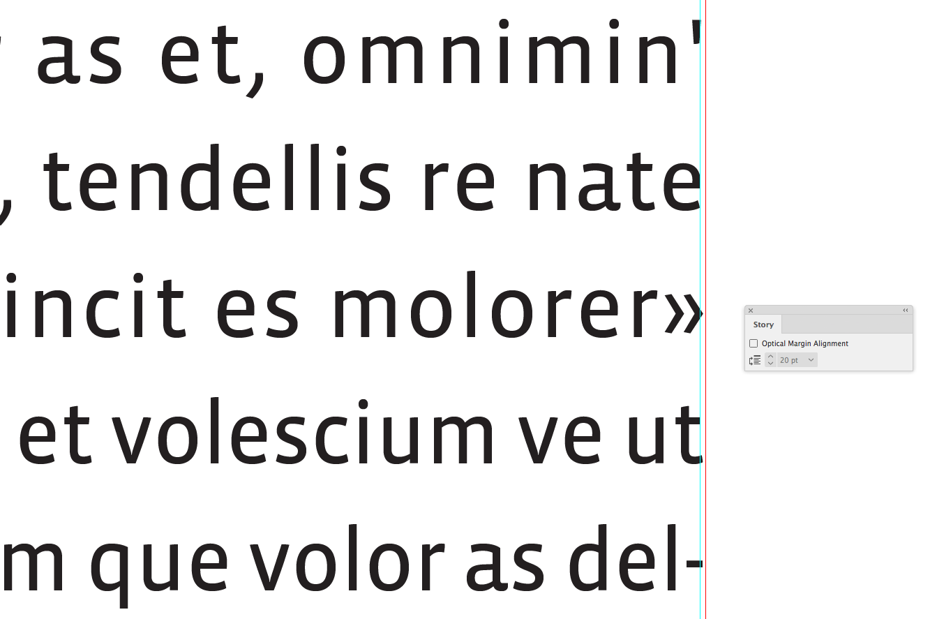
We have tried this and it works for short texts, like on a bookjacket. But for typesetting a whole book it is no good because we sometimes have to change the font size throughout the book. I think the easiest solution would be that InDesign/Adobe would add hanging punctuation for these guys too: « ».

Copy link to clipboard
Copied
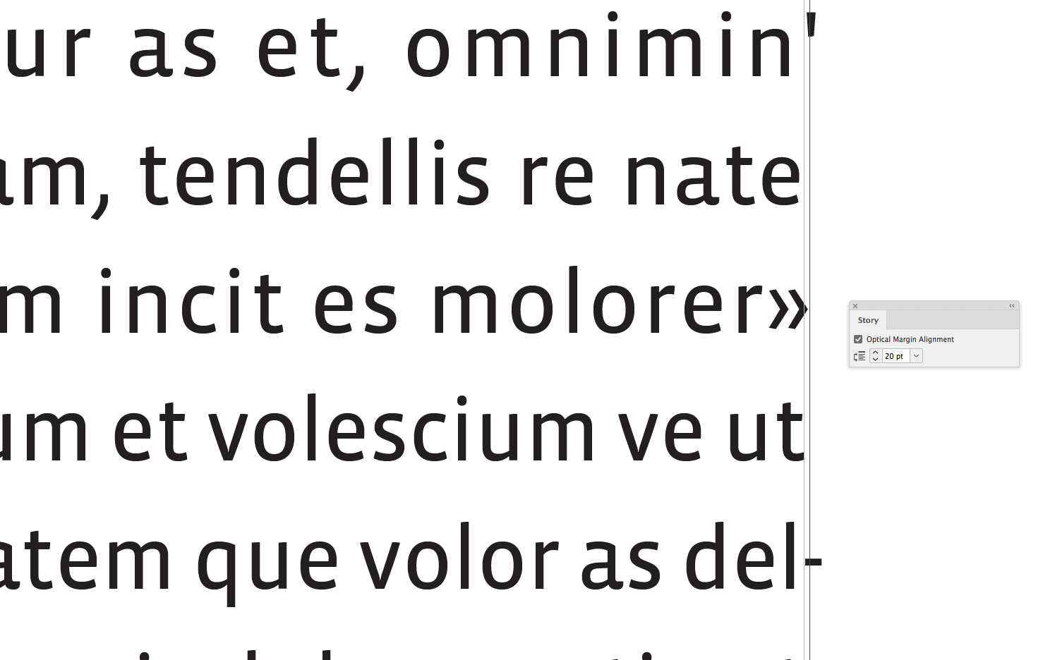
Have you tried to set the Optical Alignment?

Copy link to clipboard
Copied
I don’t think the InDesign Optical Margin Alignment feature is the same as hanging punctuation. I take to mean there is an attempt to adjust the text block to have better optical alignment, so larger glyphs that take up more space—like a question mark or your double angle quote—move less than a period or hyphen.
Copy link to clipboard
Copied
It is absolutely for hanging punctuation.
Copy link to clipboard
Copied
I'm with rob day!
Copy link to clipboard
Copied
Then I suggest googling InDesign hanging punctuation and see what you come up with. What I would do is report that it doesn't work well with non-English quotes.
Copy link to clipboard
Copied
It is absolutely for hanging punctuation.
Then why not call it that? If it is literally hanging punctuation, why does a period hang and a question mark doesn't?

Copy link to clipboard
Copied
I didn't say it worked great in all conditions. I just said that it was designed for hanging punctuation.
If it's not working well, I would adjust the justification settings and see if that helps.
Copy link to clipboard
Copied
I didn't say it worked great in all conditions. I just said that it was designed for hanging punctuation.
The amount of movement is dependent on the amount of optical space the glyph takes up, that's why a hyphen hangs more than a double angle quote mark. If I zoom in all of the glyphs are being adjusted, not just punctuation marks.
Copy link to clipboard
Copied
If that is so, how do we get hanging punctuation then?
Copy link to clipboard
Copied
BTW, this really works much better with justified text.
Copy link to clipboard
Copied
It does not work the same with quotes English style, German style and chevrons... Whatever drives the adjustment, there is a difference.
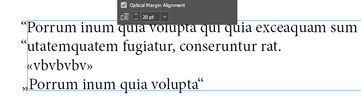
It works fine for doing what it tells it's doing: optical margin alignment. The "hanging punctuation" is more a misuse of this feature and I do not think that it is very practical as it is a frame feature and not a paragraph feature.
Copy link to clipboard
Copied
Right...which is why I suggested reporting it.
Copy link to clipboard
Copied
We have reported it.
Copy link to clipboard
Copied
That’s the problem. InDesign has not defined hanging punctuation for chevrons. And that’s kind of strange given that chevrons are used in Germany, Italy, France, Spain – and Norway.
Copy link to clipboard
Copied
Germans are using more „“ than chevrons.
Copy link to clipboard
Copied
They use both. According to Wikipedia.
Copy link to clipboard
Copied
(Off topic) You may use chevrons but that is not that common, mostly when used in headings or "elegant" texts. In addition they are reversed, so that the opening points to the outside and the closing to the inside of the quoted text. (OT)
Copy link to clipboard
Copied
Read this for more info: https://creativepro.com/typetalk-hang-or-not-hang/
The Quark style is IMHO the more logical approach here. Use Bob's link to enter a feature request.
Copy link to clipboard
Copied
The Quark style is IMHO the more logical approach here. Use Bob's link to enter a feature request.
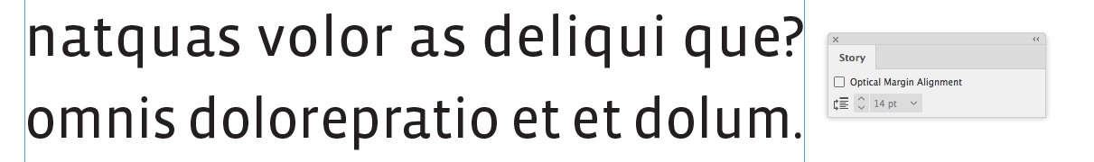
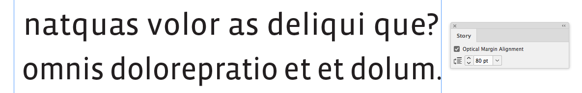
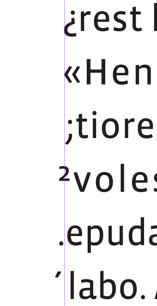
If the reason for "hanging punctuation" is to prevent the extra white space around a hyphen or period that might create a ragged appearance on the justified text block’s margin, the same would happen if you hung a glyph with little surrounding white space. Why would you want to hang a question mark, but not the number 2? They both take up similar optical space.
InDesign's feature is different, but more sophisticated. If for some reason you want to hang all punctuation glyphs no matter how much optical space they occupy, then that‘s not an option.
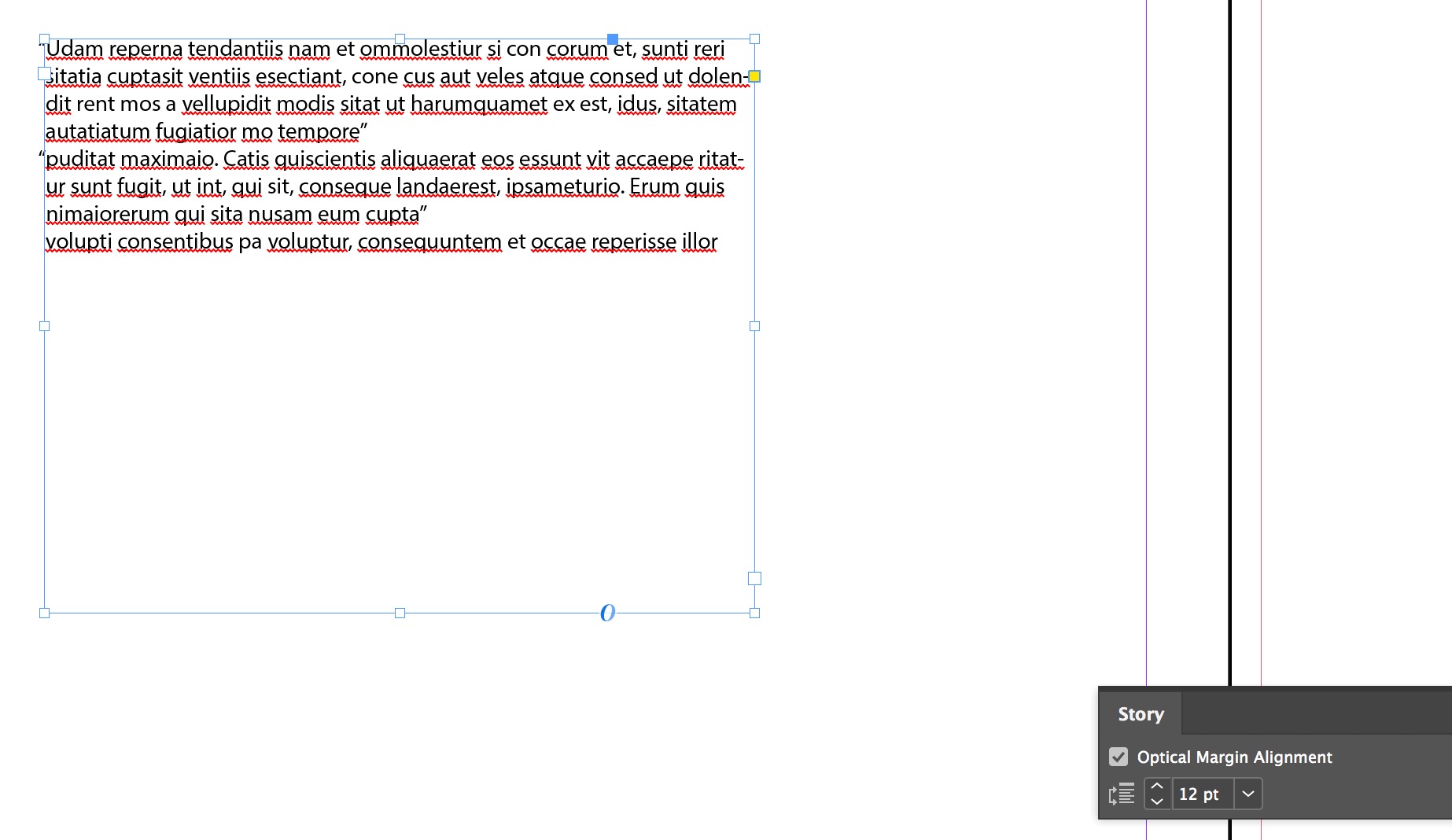
Here you can see the "hang amount" is relative to the glyph’s white space:
Copy link to clipboard
Copied
The reason for hanging punctuation is to hang the chevrons outside the body text on the left side (not other glyphs and not on the right hand side). Maybe a very specific need for book designers, but still important. So until InDesign improve HP, I will continue using Quark XPress. This discussion no longer needs my presence, so I log off. Thank you very much for your time and response.
Copy link to clipboard
Copied
I use the Optical Margin Alignment feature and I love it. It works well but it is somewhere "hidden away". I never felt comfortable having that feature attached to the frame, but if it is attached to the frame, it could also be an attribute of the frame.
I do not use it for "hanging quotations" which is what the OP does. It would be useful to have that feature too. When I need that feature, I need it only for special reasons. I adjust therefore manually. But if you're typesetting a book, that's pretty unpractical.
For now, I would do hanging quotations with a paragraph style.

Find more inspiration, events, and resources on the new Adobe Community
Explore Now
 AdChoices