


Copy link to clipboard
Copied


 1 Correct answer

Anya said: "Wow that is really cool. Thanks."
Well, it's just a proof of concept.
Note: I did not test anything else, especially not, if InDesign's optical kerning does its job right in this situation. A minimized solution using this idea would be to create a font that has all glyphs from A-Z and a-z where only the first character in a paragraph is substituted with a GREP Style through the applied paragraph style. This would work for situations where every paragraph is only one line of text. A
... 10
Replies
10
10
Replies
10

Copy link to clipboard
Copied
Choose Type --> Story --> Optical Margin Alignment. You have to try a few valuest to get the best result.
Copy link to clipboard
Copied
That does not solve it unfortunately 😞
Copy link to clipboard
Copied
Hi Anya,
without "cheating"?
No. You could "cheat" faster or more efficient using a script, but no, this is not possible without "cheating".
Regards,
Uwe Laubender
( ACP )
Copy link to clipboard
Copied
I know this isn't the answer you're looking for, but you're probably not going to get that text totally aligned with InDesign without "cheating" it.
Type characters fit within a "slug" which incorporates the character and the surrounding space it "floats" in. That varies by font, and by character. And the slug — both the type character and the surrounding space — sizes proportionately with changes in font size. Curved letterforms like your "C"s can be the worst offenders. So unless you want to set your type to start at exactly the same size with exactly the same character, you're built to lose here. You're going to have to fiddle with it to fit your complete alignment needs.
This isn't a recent development. In ancient days of hand-set type, typographic characters like bullets and fixed spaces were used to get blocks of lead type to "line up" perfectly. Or at least as perfectly as lead engravings being repeatedly smashed into a platen could maintain.
Sorry I don't have a better answer for you, but this is the truthful one.
Randy

Copy link to clipboard
Copied
That's more or less correct, though letterpress type is not an engraving but .918 tall and the term "slug" is only used for lines of type produced by Linotype and similar machines such as from a Ludlow, the term is not used for Monotype and similar characters.
Copy link to clipboard
Copied
I guess that depends on whether you make the characters by pouring hot lead into a mold or you chip the extraneous material away to create the raised letterform. Raised type can be an engraving ...
Copy link to clipboard
Copied
Hi Anya,
the following is working:
If your font license allows, create your own font without side-bearings by using a script like IndyFont created by Jongware and Marc Autret. When done use optical kerning and a vast amount of tracking to typeset your text.
Successfully tested that with a font that has a SIL OPEN FONT LICENSE Version 1.1.
In my case I used the Heuristica Regular that is similar to Adobe Utopia Regular.
Some screenshots below, from the construction process with the InDesign document the IndyFont script provides, where I used the original glyphs converted to outlines in layer Outline, but moved them to the left and also changed the position of the green guide that indicates the position of the right side bearing. The original position of the glyphs can be seen in gray in the non-printing Sample layer:


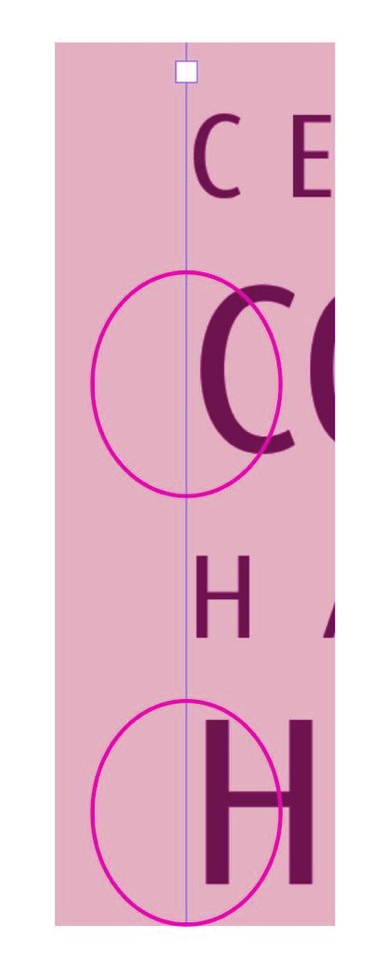
Usage of that very special font; kerning is set to "Optical" and tracking value is set to 50:

Note: I did only do the glyphs ABCDEFG to test this.
Also note: The above sample is just a proof of concept and requires a lot of effort for serious implementation.
Read about IndyFont and the process of creating fonts solely with InDesign here:
https://www.indiscripts.com/category/projects/IndyFont
Regards,
Uwe Laubender
( ACP )
Copy link to clipboard
Copied
Wow that is really cool. Thanks.

Copy link to clipboard
Copied
Text alignment aligns the font's bounding box, not the actual edges of the letter shapes. In some fonts the difference is very noticeable.
Copy link to clipboard
Copied
Anya said: "Wow that is really cool. Thanks."
Well, it's just a proof of concept.
Note: I did not test anything else, especially not, if InDesign's optical kerning does its job right in this situation. A minimized solution using this idea would be to create a font that has all glyphs from A-Z and a-z where only the first character in a paragraph is substituted with a GREP Style through the applied paragraph style. This would work for situations where every paragraph is only one line of text. A headline perhaps, followed by a subhead. All other text will be set with the original font.
Below the comparison of my special Heuristica Regular without side bearings and the original one.
I used metric kerning and no tracking with the original Heuristica:

Hm. The original Heuristica used in the right text frame needs more love with built in kerning values. InDesign's optical kerning will do a better job, but still needs some tweaking as you can see with the "DE" combination in the left text frame where I used my special font created with IndyFont…
Regards,
Uwe Laubender
( ACP )

Find more inspiration, events, and resources on the new Adobe Community
Explore Now
 AdChoices