

- Home
- InDesign
- Discussions
- Re: How to make the new Stroke panel smaller?
- Re: How to make the new Stroke panel smaller?
How to make the new Stroke panel smaller?

Copy link to clipboard
Copied
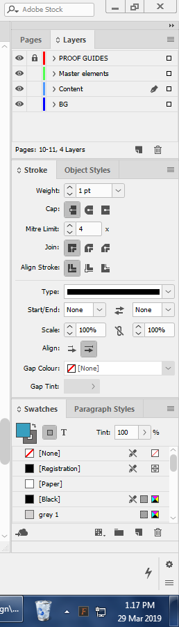
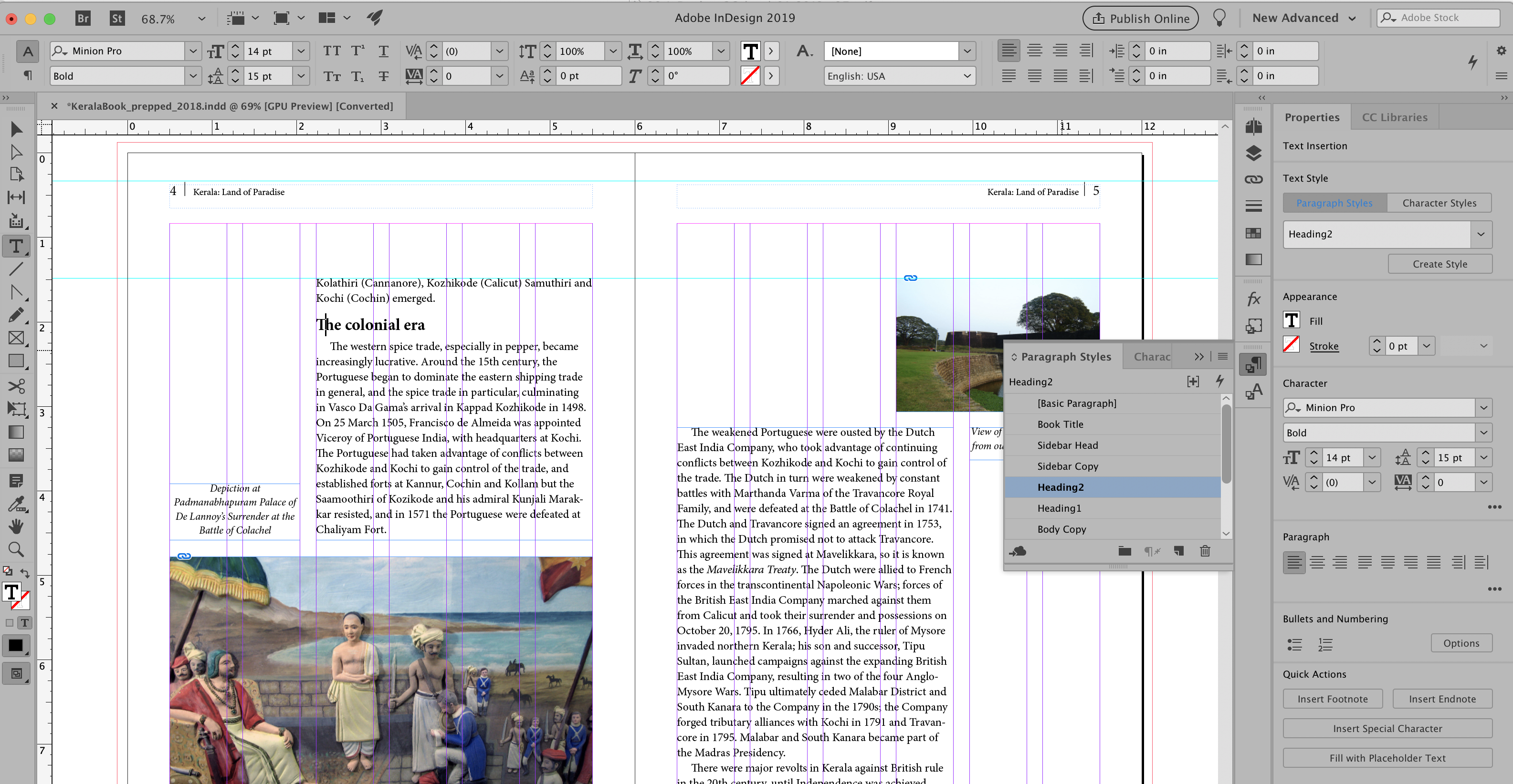
The new Stroke panel (introduced last year I think) is absolutely huge and takes up most of the screen height on my computer.
It's seriously hindering my productivity as it forces the other panels to be tiny, so I am constantly scrolling up and down through my colors.)
Is there some way to make the Stroke panel smaller, like it used to be? (And I don't just mean to "Hide Options". I need the other options, especially "Align stroke" which I use all the time.)


 12
Replies
12
12
Replies
12

Copy link to clipboard
Copied
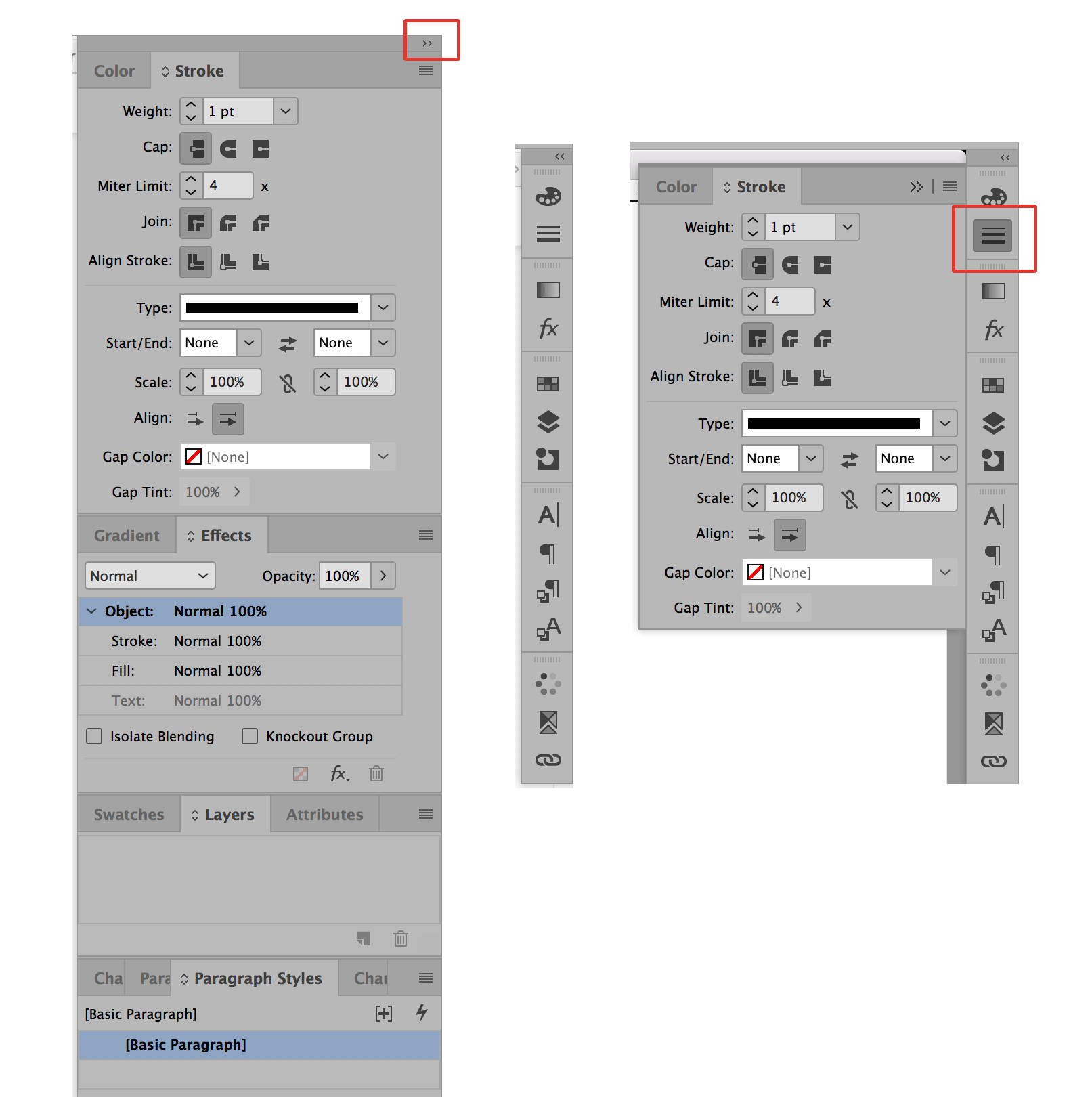
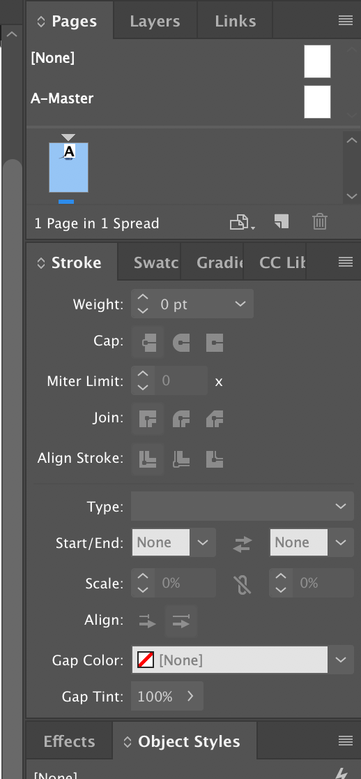
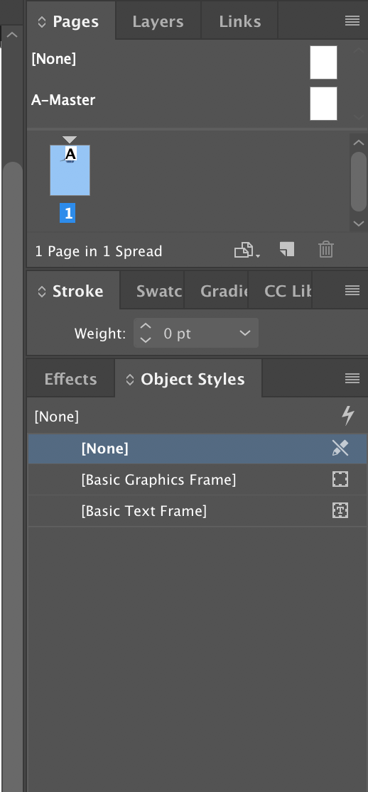
I just compared the Stroke Panel from CC 2018 and CC 2019 InDesign and the size is exactly the same. Based on that and my own memory, it does not appear that its size has changed at least as long as I can remember (I've been using InDesign for 17 years). However, if you want to be able to work on all of your panels at full size then I suggest that you collapse all of your docked panels into buttons. You can do that by clicking on the double arrow at the top right of the uppermost docked panel. Then when you click on one of the buttons (as in the example using the Stroke Panel below) only that panel at full size will pop out. If you click on a different panel then the first panel will close and the new one will pop out. You can also close all panels back to the button by clicking on its icon a second time.

Copy link to clipboard
Copied
https://forums.adobe.com/people/Bill+Silbert wrote
I just compared the Stroke Panel from CC 2018 and CC 2019 InDesign and the size is exactly the same. Based on that and my own memory, it does not appear that its size has changed at least as long as I can remember (I've been using InDesign for 17 years).
The Scale and Align options are relatively new additions. But also, in previous CSes these widgets could be stacked sideways, and in the most modern versions they are all exclusively stacked vertically:
thus leading to OP's observed "unused space" at the right.

Copy link to clipboard
Copied
Maybe I'm missing something but I don't see the problem.
You can adjust the workspace and panels to be anywhere you want. Just drag the stroke panel somewhere else until you find a comfortable arrangement and save it.
Copy link to clipboard
Copied
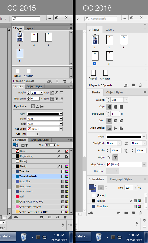
To clarify, I've made a comparison between CC 2015 and CC 2018.
You can see that the Stroke panel is now twice as big, leaving my Swatches panel with just 3 visible colors, instead of 13 previously.
Sure, people have suggested that I dock or minimize my panels, but I have been using InDesign for 15 years and never needed to dock or minimize my panels (nor in Quark Xpress for the 7 years prior to that). I consider that a frustrating and cumbersome way of working, adding unnecessary mouse clicks to get things done, and hiding away important information.
The suggestion was also made to use multiple panels, which I consider a more viable option. But the fact is that I've never needed to do this before. Things worked perfectly well in CC 2015.
Right now, I feel that my best option is probably to go back to using an older version, because this new Stroke panel is really making InDesign no fun to use any more.
Copy link to clipboard
Copied
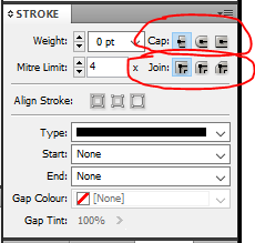
Do you really need the Stoke panel open all the time? Just asking. Most of the time, I'm just choosing a new stroke weight, or stroke style, and I can do that from the Control panel.
Collapsing it and uncollapsing a panel is simply a double-click.
I can't imagine going back to an earlier version just for that. But that's me, not you.
Another thing you could try is using the Properties panel introduced in CC 2019. You click click the Stroke link (one click) to open it:

Copy link to clipboard
Copied
Thanks for the replies, folks.
<quote="Steve Werner">Do you really need the Stoke panel open all the time? Just asking. Most of the time, I'm just choosing a new stroke weight, or stroke style, and I can do that from the Control panel.</quote>
That's actually a really good point. I've got so used to using the Stroke panel over the years (since the days before Adobe added the Control Panel) that it hadn't occurred to me that I could just use the Control Panel. If the Control Panel just included the "align stroke" controls then I would say consider this the solution to my problem. In any case, I will probably start collapsing the Stroke panel from now on and relying on the Control Panel controls more.
<quote="Steve Werner">Another thing you could try is using the Properties panel introduced in CC 2019.</quote>
That's interesting and I wasn't aware of this new feature. I don't tend to upgrade very often because I don't like change (which is why I jumped from CC 2015 to CC 2018). From what I can ascertain, this new Properties panel seems to be a contextual panel which changes based on the tool you're using. In other words, it does exactly what the Control Panel is there to do. So… has the Properties panel now replaced the Control Panel?
<quote="BobLevine">UI Scaling is a big issue and there has to be some room for the icons to scale up.</quote>
The idea of "leaving room" for the icons to get bigger - frankly that is just terrible interface design as it forces users to have large areas of unused space on their screen! Any application which allows variable icon sizes should have controls that re-flow to occupy the space, while allowing the panels to be re-sized (basically like a text box, or a card-based website design).
Then we have the issue of the default icons size. As you can see from my screenshot, my icons are now notably larger than they were in CC 2015, so I am clearly not using the smallest size. It would be fantastic if I could just drag a slider down to make everything small again, but I can't find any way to do that in my prefs. No matter what I change, the icons stay the same size.
(By the way, sorry I can't quote properly, I can never work out how to use this forum's quoting controls. In fact, of all the forums I've ever used, I find this one absolutely abysmal in terms of user interface and controls, which is quite ironic. Half the time when I post a message, it appears with the line breaks missing and I have to go back and edit it, as I'm doing now. I also abhor any comment box that doesn't use plain text. It's just totally confusing. If only this site used phpBB. It's so easy to use!)
Copy link to clipboard
Copied
You can combine the Control panel and your other panels with the Properties panel.
Just choose Window > Control and dock it at the top of your screen (there are other options).
Alternatively, you can start with a workspace like Advanced which has the Control panel and the panels I tend use the most (including those for styles). Then open the Properties panel and dock them side-by-side. It depends on how much space you have and what you use the most. Even on my 15 in MacBook Pro, I can use them together like this:
Bottom line: There are as many ways of customizing things as there are users. The Control panel and Properties panel are contextual so what they display depends on the tool you're using and what's selected.

Copy link to clipboard
Copied
Suicide wrote
To clarify, I've made a comparison between CC 2015 and CC 2018.
You can see that the Stroke panel is now twice as big, leaving my Swatches panel with just 3 visible colors, instead of 13 previously.
Thanks for the comparison shot. We noticed it on our Windows workstations, too, especially when we flick between the current and older versions of InDesign as we work on legacy projects.
I think what you're experiencing is the result of the tweaks Adobe is doing to our GUI to address a couple of major issues: consolidating the panels and interface for better productivity, and allowing the GUI to adjust to various monitor resolutions. Adobe is moving toward the taller, vertical panel layout in the current versions which dovetails with the new Properties panel.
We find that some of the GUI difference depends upon how our Windows workstations are set up (monitor resolution, etc.). And the affects of the changes are more pronounced on our Windows workstations than on our Macs. As you described, sometimes taking up the entire vertical screen real estate.
One benefit to these tweaks: the icons and fields in these new panels are larger than in previous versions. And that's good! On one of our 4k monitor workstations, the icons in previous versions were so tiny that they were indistinguishable from each other. Plus, I think this new vertical layout will adjust better when we have even higher resolution monitors on our desktops.
As Steve and others have suggested, there are some adjustments to your panel setup that you can make. I'm getting better with the new Properties panel and find that I'm now more comfortable with drilling down into its expanded menus. Because of this, I'm using the traditional panels less so the new, taller elongated Strokes panel is less of an issue.
Change is tough, especially for all of us who've been working with these programs for a couple of decades. But I think this one is for the better; certainly lets me see the freaking icons on my 4k monitor!
FYI, I didn't think I needed this, but when preparing for a basic InDesign class a while back, I reviewed Adobe's help section about the new Properties panel and workspace. I learned some nice little things! A few minutes here explained some of the details that I had missed: Properties panel and Workspace basics in InDesign
| PubCom | Classes & Books for Accessible InDesign, PDFs & MS Office |
Copy link to clipboard
Copied
I think you hit on it, Bevi. UI Scaling is a big issue and there has to be some room for the icons to scale up.
That said, UI scaling in Windows sucks, big time.
Copy link to clipboard
Copied
"UI scaling in Windows sucks, big time."
Bob, your words are too kind to Windows!
| PubCom | Classes & Books for Accessible InDesign, PDFs & MS Office |
Copy link to clipboard
Copied
It’s not Windows I was commenting on. Other applications (including Photoshop and Illy) are fine. It’s InDesign that sucks.
Copy link to clipboard
Copied
If you have the Stroke panel open in the dock with the other panels as you show, double-clicking the tab ("Stroke") will minimize it to take up less space. That's also true when it's floating. BEFORE:
AFTER:

Find more inspiration, events, and resources on the new Adobe Community
Explore Now
 AdChoices