

- Home
- InDesign
- Discussions
- Re: Inconsistent appearance of Black and White ima...
- Re: Inconsistent appearance of Black and White ima...
Inconsistent appearance of Black and White images

Copy link to clipboard
Copied
I'm currently working on a book full of Black and White images. I'm correcting the images in Photoshop and laying the book out in InDesign. The issue I'm having is the images are not displaying accurately in Indesign - they don't export to a PDF accurately either. I've checked that all the images color profiles are the same. Their bit depth is the same. They're all greyscale. I've made sure the "appearance of black" dialogue box is what I need it to be. I've been saving everything down to a Tiff rather than including my working PSD files (which defeats the handy feature of live updates to the document when correcting the images). I'm at a loss for why images adjusted to be similar in tonal range and appearance look so wildly different from spread to spread. My best guess is that Indesign can't handle PSD files well in this latest update?
I'm on a MacBookPro running 10.13.6 with Photoshop & InDesign CC21019


 16
Replies
16
16
Replies
16

Copy link to clipboard
Copied
Hi Steve,
Sorry to hear about this issue. The first thing which I would suggest you is color sync all Adobe applications using bridge: Keeping colors consistent, Adobe Acrobat
If that does not help, I would request if you can share some screenshots and a sample file. I will try to check it at my end.
Regards,
Srishti
Copy link to clipboard
Copied
Thanks for that tip. It didn't correct the issue. My color management was working perfectly.
I can tell you exactly how to recreate the issue if you want to try it out?
- Take any image - make it greyscale. (I'm working with the Dot Gain 25% profile - but I don't think it matters)
- Convert for smart filters.
- Apply Camera raw as smart filter - adjust image to desired outcome.
- Now save as a PSD with layers and a TIF with no layers.
- If you lay the PSD next to the TIF on the same spread or page in InDesign they both display inaccurately.
- If you move the TIF to the next spread it displays correctly.
- Even when exporting a PDF the issue remains


My only solution was to save all my images down to TIFs without layers in order to export an accurate PDF for my clients approval.
It would have been preferable to have the PSDs in the document so that when i make corrections they are automatically updated in the document - ready to export.

Copy link to clipboard
Copied
I'm at a loss for why images adjusted to be similar in tonal range and appearance look so wildly different from spread to spread.
Try this neat little trick: Just place in the canvas (outside the pages) of each spread a tiny element with some transparency. A black square in multiply mode will do. If the visual appearance of your screen has changed in some of the spreads just by doing that, the answer is that some of your srpeads had applied an element with transparency and some didn't.
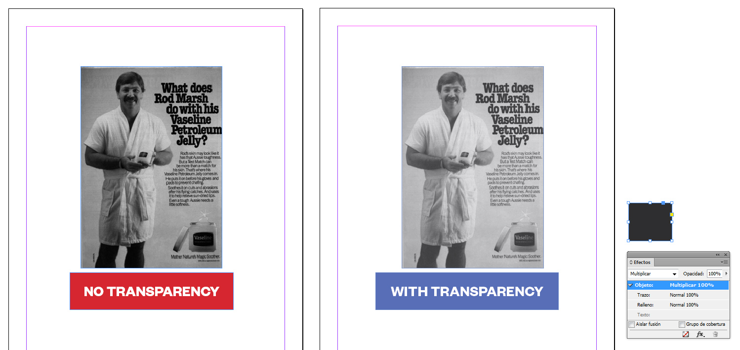
InDesign shows greysale images accurately if you set the general preferences to show "accurate" black AND you have "overprint preview" checked on OR you have an element with some transparency in the spread (hence the trick). Besides, you might have "softproof colors" on. But that does not affect the first issue: Blacks are shown more black than they really are.
Hope it helps.
Copy link to clipboard
Copied
There are no transparencies in the document.

Copy link to clipboard
Copied
SteveRinzen wrote
There are no transparencies in the document.
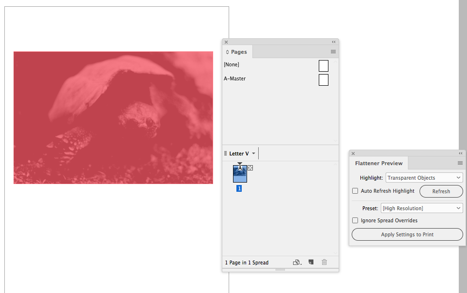
Are you sure all of the images a flattened? It’s easy to inadvertantly save a Photoshop file with no Background layer, which would add transparency to its InDesign spread. Use the Flattener or Preflight panel to check.
Here I haven't applied any ID Effects, but the Pages panel is showing a transparency icon

As does the Flattener Preview panel
Copy link to clipboard
Copied
I think we're not solving the same problem. If you read the initial post the whole point is to have an editable PSD file sitting in the Indesign document. The goal being an efficient workflow where I can make changes to the Camera Raw smart filter in each PSD as the project proceeds and those changes are appearing accurately in the Indesign document - from which I can deliver accurate PDFs for approval. Currently I'm wasting time and storage saving each iteration of the PSD down to a TIF.
Copy link to clipboard
Copied
How have you decided that 25% Dot Gain is the correct press profile?
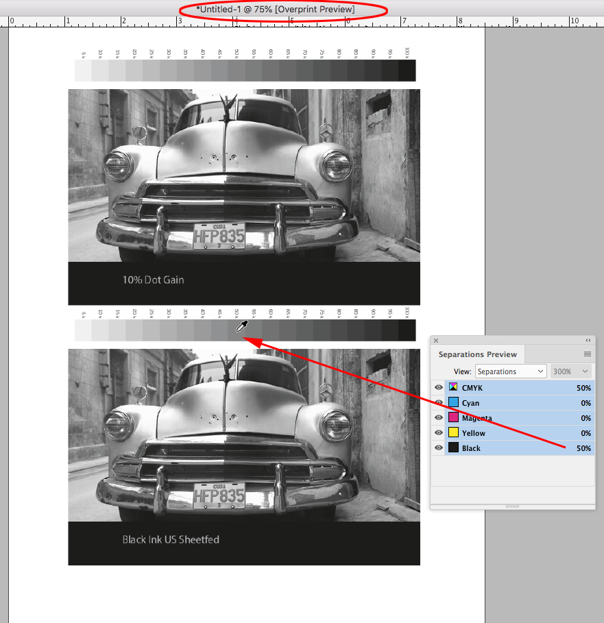
I think you are assuming the Photoshop grayscale's assigned profile is affecting the output values, which is not the case—the profile assignment only affects the preview. You can see that by assigning (not converting to) different gray profiles in Photoshop and checking the output values. Here's 10% Dot Gain vs. Black Ink US Sheetfed


If I place the two files in InDesign, the Photoshop gray profiles are ignored and the document’s assigned CMYK (Black Ink) profile is used for the Overprint preview—there can only be one destination profile. The gray output numbers are not changed by the reassignment, and don’t change on export unless you force a conversion in the Output tab.
Turning off Overprint changes the preview to sGray (the typical Web sRGB preview), but that does not affect the offset press separation output numbers.

Copy link to clipboard
Copied
The goal being an efficient workflow where I can make changes to the Camera Raw smart filter in each PSD as the project proceeds and those changes are appearing accurately in the Indesign document - from which I can deliver accurate PDFs for approval. Currently I'm wasting time and storage saving each iteration of the PSD down to a TIF.
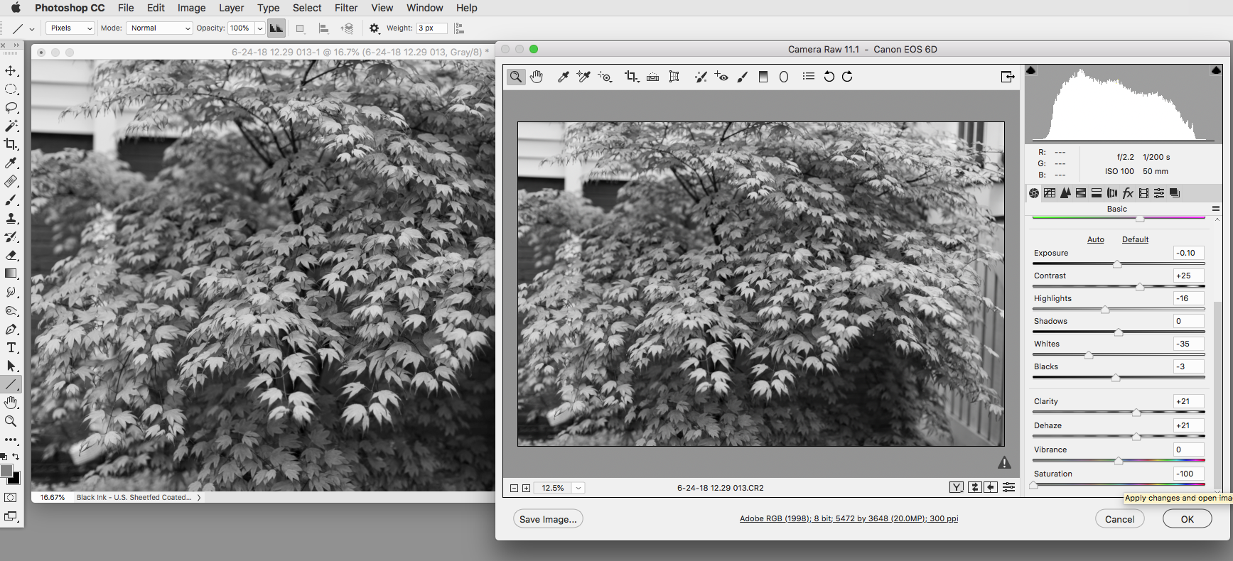
I think you can do that if you avoid profile conflicts and use a black ink profile over in Photoshop. Here‘s a US Sheetfed Coated example.
Convert the Camera Raw document to the US Sheetfed Black Ink profile:

Make your Camera Raw edits
Make sure your InDesign document’s CMYK assigned profile (Edit>Assign Profiles...) is the matching US Sheetfed Coated with Overprint turned on, and Export as PDF/X-4. When you use a PDF/X preset the Acrobat Simulation Profile preview defaults to the Output Intent, which in this case is also US Sheetfed Coated. The preview in all three apps is now color managed with the same profile

Copy link to clipboard
Copied
If you try the steps I posted in response to Shristri you'll see what I mean.
- Take any image - make it greyscale. (I'm working with the Dot Gain 25% profile - but I don't think it matters)
- Convert for smart filters.
- Apply Camera raw as smart filter - adjust image to desired outcome.
- Now save as a PSD with layers and a TIF with no layers.
- If you lay the PSD next to the TIF on the same spread or page in InDesign they both display inaccurately.
- If you move the TIF to the next spread it displays correctly.
- Even when exporting a PDF the issue remains
Copy link to clipboard
Copied
I'm working with the Dot Gain 25% profile - but I don't think it matter
The profile matters for the Photoshop preview. Try Edit>Assign profile, choose a different profile and your grayscale document preview will change.
Again, why are you using the Dot Gain 25% profile? How do you know it is the correct press profile?
Now save as a PSD with layers and a TIF with no layers.
Your PSD is probably not flattened, so InDesign sees it as a transparent object. Adding it to the page invokes the Transparency Blend Space. If you include a Background layer the placed PSD will not be considered a transparent object and will preview the same as your flattened TIFF:

If you move the TIF to the next spread it displays correctly.
You have to turn on Overprint or Separation Preview to get a color managed print preview. The InDesign Overprint Preview is different than your Photoshop Dot Gain 25% preview because InDesign ignores gray profiles and is using a different black ink profile.
Turning off Overprint gives you an sRGB preview, which coincidentally is similar to the PS Dot Gain 25%
Even when exporting a PDF the issue remains
Acrobat is also previewing the grayscale as if it is on the CMYK black plate. Again it is not changing the separation output numbers
Copy link to clipboard
Copied
Again, why are you using the Dot Gain 25% profile? How do you know it is the correct press profile?
I have a printers proof sitting in front of me - the Dot Gain 25% profile accurately represents the Image I had proofed on screen.
I've been a designer for 25 years - I understand color profiles
Of course the PSD isn't flattened - thats the whole point! I want to preserve the Camera Raw smart filter!!
I think its time to delete this discussion! Its more frustrating than helpful!
Copy link to clipboard
Copied
I think its time to delete this discussion! Its more frustrating than helpful!
Sorry, didn't mean to frustrate. Nothing new is happening with InDesign, it has always used the CMYK profile for grayscale previews. If you understand profiles then check and compare the K output values in all three apps, they will be the same.
Copy link to clipboard
Copied
InDesign has no grayscale color space and color manages gray objects as if they are on the black CMYK plate via the document’s CMYK profile. To consistently get the print view you have to have Overprint preview on. If there is a transparent object anywhere on the spread, the doc‘s Transparency Blend space is used—with a CMYK blend space, a transparent page would preview as if Overprint was turned on.
To get a preview match with PS you have to use the Black Ink version of your InDesign document‘s CMYK profile as your grayscale file’s assigned profile in Photoshop. To create a Black Ink profile in Photoshop open Color Settings, choose a CMYK profile from the Gray Working Space drop down, and then choose Save Gray... to save the black ink profile to your profiles folder. From there you can either Convert To or Assign the profile to your grayscale documents. Here's Black Ink for US Sheetfed Coated

It's important to note that grayscale values export unchanged when you export with the destination set to Document CMYK, so you can ignore the InDesign preview. Over in AcrobatPro open Output Preview and set the Simulation Profile to your Photoshop 25% Dot Gain profile. If you check the Black values they should match your PS values.
Copy link to clipboard
Copied
I'm currently working on a book full of Black and White images.
Also, if your document is all black and white, it is possible to go the other way and use Photoshop’s legacy Custom CMYK dialog to create a 25% Dot Gain CMYK profile that can be used over in InDesign for preview matching.
The Photoshop 5 Default CMYK profile, which can be assigned to your ID doc via Edit>Assign profiles, previews the black plate as 20% Dot Gain. You could edit that profile to be 25% dot gain over in Photoshop and save it as an .icc profile for use in InDesign. But, generally you don‘t want to use legacy profiles for color managing or converting color images.
Here, I‘ve assigned my ID doc a legacy 25% dot gain CMYK profile, and everything matches


Copy link to clipboard
Copied
Viewing the InDesign file with Overprint Preview on and only the Black channel viewable does show the colors accurately. Unfortunately the interiors of the book will be printed in one color (black) while the cover and endpapers will be multiple colors.. So i need to provide regular PDFs with all elements presented accurately for approval. And while this set up works to preview the images in InDesign it doesn't output like this to a PDF. So for every correction right now I'm tweaking the PSD and saving a new TIF... fortunately there are only 118 images in this book.
Copy link to clipboard
Copied
So for every correction right now I'm tweaking the PSD and saving a new TIF... fortunately there are only 118 images in this book.
Just keep in mind when you edit in PS you are changing the output numbers. The different preview in InDesign and Acrobat is a soft proof difference because of the different Gray profile, and does not affect the output numbers,
Also, as you are seeing, ID has a duel grayscale display, which has no affect on the actual output numbers. When there is no transparency on the spread, and OP is off you get an sRGB preview. This is for documents that will not be printed and are for screen only. When you are designing for RGB devices you can leave OP off and set the Transparency Blend Space to RGB and get a consistent sRGB display for gray objects.

Find more inspiration, events, and resources on the new Adobe Community
Explore Now
 AdChoices