Indesign colors suddenly dull
Copy link to clipboard
Copied
Hi everyone. I've been working on an inDesign Document for a few days now and suddenly it's dulled out the colors and won't give me the vibrancy I want for the color pops anymore. I am not in a "web document" format however I haven't ever used web doc. (All of my stuff is made for web, I just use the typical doc settings usually).
I've never had this issue and cant seem to find a fix.
Any advice?
Copy link to clipboard
Copied
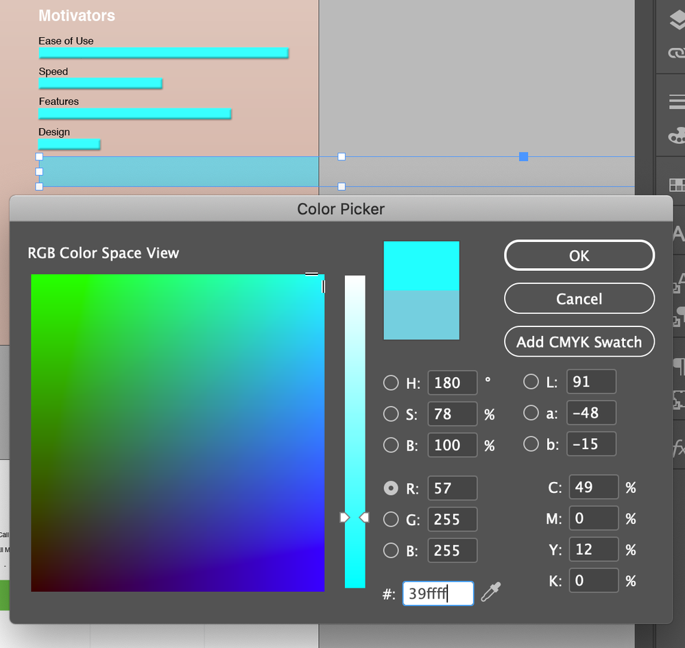
This is an example of the issue. The already placed items retain and can be that color. But new items cant Adapt it.
Copy link to clipboard
Copied
The first thing I noticed was that the button says "Add CMYK Swatch" instead of RGB.
Copy link to clipboard
Copied
If you produce your file for print, only CMYK colors and spot colors are available. CMYK conterparts for RGB and many spot colors have not the same gamuth, so they are less vibrant. This is a technical limitation you have to live with. This is not a limitation from InDesign, this is a limitiation general.
Copy link to clipboard
Copied
In the color picker, click in one of the RGB values (doesn't matter which one) and you will see it change to "Add RGB Swatch" instead of "Add CMYK Swatch".
Whatever you enter into the Hex Code box will be adjusted to the currently selected color space, so if it says "Add CMYK Swatch" you will get gamut-adjusted colors. Switched to RGB as above and you will be fine.
Also: make sure your document's Transparency Blend Space is set to RGB so you won't get any unwanted color shifts if you do some weird effects.
Copy link to clipboard
Copied
Copy link to clipboard
Copied
If you have this happen "suddenly" then I assume you added a transparnt effect like a drop shadow or placed a PNG file. If there is transparency on the page InDesign must show treat the page with the transparency flattener and you will se the result, as mentioned by others in the limitations of your output intent. Onve you are aware that there is the "ideal" or "desired" colour that is not printable you can design with these limitations in mind. If you from the begining activate "proof colours" you will work within the limitations from the start.
If you are intending to design for the web set the Transparency Blend space to RGB. You will keep your bright colours. And colours will blend with RGB logic when there is transparency. (Note that many blend modes are very different in RGB vs CMYK, that is not a bug but just the rules of mathematics)
To see how and why you want to set Transparency Blend Space there are plenty tutorials eg; https://www.printingforless.com/Choosing-a-Transparency-Blend-Space.html


