Exit
  • Global community
    • Language:
      • Deutsch
      • English
      • Español
      • Français
      • Português
  • 日本語コミュニティ
  • 한국 커뮤니티
0

Mongolian Baiti displaying the wrong glyphs

New Here ,
Jan 11, 2019 Jan 11, 2019

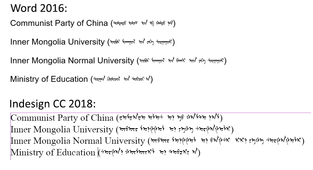
I’m trying to display mongolian script in Indesign correctly. The writing is displayed differently in Word and Indesign (see image below), while the same font is being used: “Mongolian Baiti”. Using a different font, such as “Mongolian BaiZheng Pua” results in the same differences between Word and Indesign. The same happens on other computers at my workplace, and my publisher’s computer.

The author has stated the the writing in Word is correct, while the one in Indesign is not.

word vs indesign.jpg

Can anyone tell me how to display the Mongolian script correctly in Indesign?

2.9K
Translate
Report
Community guidelines
Be kind and respectful, give credit to the original source of content, and search for duplicates before posting. Learn more
community guidelines
Community Expert ,
Jan 11, 2019 Jan 11, 2019

Maybe you need the World-Ready Composer.

Translate
Report
Community guidelines
Be kind and respectful, give credit to the original source of content, and search for duplicates before posting. Learn more
community guidelines
Community Expert ,
Jan 11, 2019 Jan 11, 2019

Peter's suggestion is a good one. You'll find it in the Paragraph or Control panel flyout menu:

WorldComposer.png

Translate
Report
Community guidelines
Be kind and respectful, give credit to the original source of content, and search for duplicates before posting. Learn more
community guidelines
New Here ,
Jan 14, 2019 Jan 14, 2019

Hi,

thank you for your help and answers. I’ve turned on the world ready composer for the paragraph that contains the Mongolian Baiti, but there is unfortunately no effect.

I’m pretty sure I’ve done it correctly since, for instance, the writing of the font “Nirmala UI” does improve upon turning the world ready composer on.

Perhaps Indesign doesn’t know how to shape Mongolian characters?

I appreciate your help!

Translate
Report
Community guidelines
Be kind and respectful, give credit to the original source of content, and search for duplicates before posting. Learn more
community guidelines
LEGEND ,
Jan 11, 2019 Jan 11, 2019

It looks as though the characters are correct but the shaping is missing. Shaping happens in some languages (not English) where the look of a character depends on the other characters nearby, and the app needs to know how to do this.

Translate
Report
Community guidelines
Be kind and respectful, give credit to the original source of content, and search for duplicates before posting. Learn more
community guidelines
Community Expert ,
Jan 11, 2019 Jan 11, 2019

> the look of a character depends on the other characters nearby, and the app needs to know how to do this.

That's what the world-ready composer does.

Translate
Report
Community guidelines
Be kind and respectful, give credit to the original source of content, and search for duplicates before posting. Learn more
community guidelines
LEGEND ,
Jan 11, 2019 Jan 11, 2019

I thought it might. Now, here's a question. Is there any reason ever to turn this off? Is it historical that it's an option, or are there sound reasons to fly without it for western, or even for shaped, languages?

Translate
Report
Community guidelines
Be kind and respectful, give credit to the original source of content, and search for duplicates before posting. Learn more
community guidelines
Community Expert ,
Jan 12, 2019 Jan 12, 2019

InDesign had the paragraph composer from the outset, the world-ready composer was added later. The world-ready composer is more complex (and allegedly less stable), and if you don't need it I wouldn't use it.

P.

Translate
Report
Community guidelines
Be kind and respectful, give credit to the original source of content, and search for duplicates before posting. Learn more
community guidelines
New Here ,
Jan 14, 2019 Jan 14, 2019

I’ve also added the Mongolian dictionary, offered on the openoffice website, to Indesign. the dictionary works, because I can select it, but the shaping doesn’t improve unfortunately.

Translate
Report
Community guidelines
Be kind and respectful, give credit to the original source of content, and search for duplicates before posting. Learn more
community guidelines
New Here ,
Jan 15, 2019 Jan 15, 2019

Doesn’t anyone have an idea?

Translate
Report
Community guidelines
Be kind and respectful, give credit to the original source of content, and search for duplicates before posting. Learn more
community guidelines
New Here ,
Jul 06, 2019 Jul 06, 2019
LATEST

In the Paragraph Style Options and in the Open Type Features menu you could try to change the Positional Form to Automatic Form. As you see in my screenshot the Mongolian text using Noto Sans Mongolian connect properly.

Translate
Report
Community guidelines
Be kind and respectful, give credit to the original source of content, and search for duplicates before posting. Learn more
community guidelines