I’m not speaking authoritatively here, but just throwing out some observations and suggestions…
It sounds like for this to work, the scatter proof should be as comprehensive as possible as a representation of the full range of images and graphics that will be reproduced in the book. If it isn’t, there’s a risk that some cases are missed by the baseline (or “assumption”) that your manual calibration is creating. I’d want at least a grayscale ramp or step wedge to be a part of that proof, so that there’s something objective in there to evaluate the entire tonal range.
A potential issue is the adaptive nature of human vision…it’s just not objective. This always makes “calibration” by eye risky, and why it’s often said to be sort of OK for super casual home/hobby work, but not appropriate for a book described as “critical” done to “high standards.”
Also, if the proof is to be used as a reliable baseline, it first has to be certain that the proof is acceptable. For example, if the images were edited on displays accurately calibrated to appropriate target specs but when you get the proof back it has some issues (such as “why are the shadows a little blocked up in the proof?”, then it has to be determined where in the workflow the image quality started failing: At the editing computers, at the export settings, in the InDesign document, at the press, etc…? (Also note that if an accurate objective calibration of the editing displays was never done, you now have one more variable to figure out in the “where is it going wrong?” detective work. This is part of the value of doing proper calibration with a measuring device.)
If you did want to go forward in this way, it is known and accepted that a pure calibration approach doesn’t always achieve what’s called a “visual match” with a proof or between two displays. For this reason, some calibration software does offer features that let you tune the display to cover any gaps you see between a properly calibrated state and the print proof or other display. This is called “post-calibration” because it is not considered a replacement for standard calibration, it assumes the system is objectively calibrated first and then you apply your own “I think it should actually look like this” adjustments on top of the objective baseline calibration.
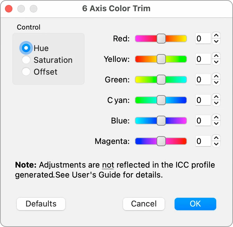
On my old NEC SpectraView, this can be done using the 6-Axis Color Trim feature in the SpectraView software. The dialog box tells you that these adjustments aren’t included in the display profile, which makes sense because you’re doing this after and outside of the standard calibration (i.e. “you’re on your own”).
As another example, the ColorNavigator software for Eizo displays offer a similar set of features; in the link below scroll down to the section “Post-Calibration Color Adjustment.” The way they talk about it sounds similar to what you’re asking:
https://www.eizo.com/products/coloredge/cn/
Sometimes due to variations in output from different printers or the special requirements of a project, it is necessary to fine-tune an otherwise perfectly calibrated monitor to match target colors. ColorNavigator lets you easily adjust hue and saturation for all six primary and secondary colors (red, green, blue, cyan, magenta, yellow), as well as white balance, brightness, black level and gamma, to achieve the closest possible visual match…
So there are ways to do what you’re asking. But first, don’t skip the critical step of doing an accurate calibration using a hardware measuring device, to set a reliable objective baseline within a color-managed system. After that, you are free to make some additional adjustments if you want, but it’s best to do it with software specifically designed for that purpose: If you’re working with less expensive displays that for example only have consumer-level pre-calibration adjustment controls (brightness, contrast, RGB), you may do more harm than good to your project. Hopefully you’re working with pro-level displays that specifically offer the appropriate type of post-calibration adjustment.
But along the same lines as what rob day is saying, if the displays are properly calibrated, and if the printing company can provide you with an accurate profile of their printing conditions, you should be able to soft-proof in InDesign with more reliability than manually adjusting displays.

