Exit
  • Global community
    • Language:
      • Deutsch
      • English
      • Español
      • Français
      • Português
  • 日本語コミュニティ
    Dedicated community for Japanese speakers
  • 한국 커뮤니티
    Dedicated community for Korean speakers
0

Need Help With Pantone Inks For InDesign

Engaged ,
Jun 08, 2023 Jun 08, 2023

Copy link to clipboard

Copied

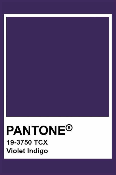
I got a request to create a Pantone swatch for Violet Indigo. A few questions popped up. What is the "19-3750 TCX" mean? I looked online for the Pantone value and found this: 533. InDesign doesn't let me enter this value for Pantone + CMYK coated or uncoated. How do I find the correct value so that I can make swatch for it?


Pantone.jpeg


It's only an island if you look at it from the water.
TOPICS
How to

Views

910
Translate

Report

Report
Community guidelines
Be kind and respectful, give credit to the original source of content, and search for duplicates before posting. Learn more
community guidelines
LEGEND ,
Jun 08, 2023 Jun 08, 2023

Copy link to clipboard

Copied

Most Pantone colours are not CMYK. They are not part of the CMYK swatches, and many of them are absolutely impossible to make with CMYK inks - too bright or special. If you want to make a swatch for the pantone spot colours you need to use spot inks - or other things. TCX colours are from the Home + Interiors Color System. I don't know if they are available as printing inks, you'd need to talk to your ink supplier (if you're a printer) or printer (if you are not). Here is info on the colour PANTONE® USA | PANTONE® 19-3750 TCX - Find a Pantone Color | Quick Online Color Tool. Scroll down for info on the swatch products - a full set of swatches will set you back $9,046.

Votes

Translate

Report

Report
Community guidelines
Be kind and respectful, give credit to the original source of content, and search for duplicates before posting. Learn more
community guidelines
Community Expert ,
Jun 08, 2023 Jun 08, 2023

Copy link to clipboard

Copied

If the swatch is for spot color printing, what you spec in ID doesn't really matter. It will output a plate to be used with that color ink. Look up the CMYK equivalent and build the swatch with that, for design purposes. Name it carefully with the whole Pantone designation, so that the printer gets it right. 


If what you need is that color for internal or digital printing, the CMYK blend is pretty much as close as you can get. 


Note that some clients don't get what TSN said, and don't understand that you can't perfectly emulate all P colors. As a guide to *about* what color they want, it's good; if they expect a perfect print match, it's not.  Only the spot ink can do that. 

Votes

Translate

Report

Report
Community guidelines
Be kind and respectful, give credit to the original source of content, and search for duplicates before posting. Learn more
community guidelines
Engaged ,
Jun 08, 2023 Jun 08, 2023

Copy link to clipboard

Copied

Thank you both for your replies. I think at this point I'm going to just create a CMYK swatch that is a close match. 


It's only an island if you look at it from the water.

Votes

Translate

Report

Report
Community guidelines
Be kind and respectful, give credit to the original source of content, and search for duplicates before posting. Learn more
community guidelines
Community Expert ,
Jun 08, 2023 Jun 08, 2023

Copy link to clipboard

Copied

That appears to be a fabric color. How do you intend to use it?

Paid (or maybe free trial) subscriptions to Pantone Connect look as if they would give you L*a*b values you could use to create a custom ink swatch.

Votes

Translate

Report

Report
Community guidelines
Be kind and respectful, give credit to the original source of content, and search for duplicates before posting. Learn more
community guidelines
Engaged ,
Jun 08, 2023 Jun 08, 2023

Copy link to clipboard

Copied

I got the request from a marketing director to implement this purple color. She sent the attached screen of the violet indigo. I wasn't familiar with the number for this. Test Screen Name shed some light on this kind of Pantone and James suggested to make a CMYK equivilent, which is what I opted for. It's part of a training manual for a Pilates instructor. Some of the h4 in the document needed to be in this color. It's final output will be print PDF.


It's only an island if you look at it from the water.

Votes

Translate

Report

Report
Community guidelines
Be kind and respectful, give credit to the original source of content, and search for duplicates before posting. Learn more
community guidelines
Community Expert ,
Jun 08, 2023 Jun 08, 2023

Copy link to clipboard

Copied

Sounds like close will be good enough, and a digital match is easier than print. It must be outside the CMYK gamut, as all I could find were RGB equivalents.


Get an okay on the color *as presented* as early as you can. You don't want to get down the road only to find she meant "exactly this color. " 🙂

Votes

Translate

Report

Report
Community guidelines
Be kind and respectful, give credit to the original source of content, and search for duplicates before posting. Learn more
community guidelines
Community Expert ,
Jun 08, 2023 Jun 08, 2023

Copy link to clipboard

Copied

As already mentioned - Pantone colors are printed using special ink - whatever color you use/see on the monitor shouldn't matter too much - the lady from the marketing should use the sample from the book as a reference.


If she needs a real deal - then the best option would be to ask the place that will be printing final material to make you the "proof" - do not skip this step or you will be the scapegoat.


Votes

Translate

Report

Report
Community guidelines
Be kind and respectful, give credit to the original source of content, and search for duplicates before posting. Learn more
community guidelines
Community Expert ,
Jun 08, 2023 Jun 08, 2023

Copy link to clipboard

Copied

Before Pantone decided to go all "pay us to even THINK about our colours" they used to have an app called Pantone X-Ref, which allowed you to cross-reference any of their colours from any guide into another. e.g. in this case, this Fabric Colour to Solid Coated inks or CMYK Color Bridge, or whatever. They long ago pulled that app (for the above reason), but I still have it on an old iPhone. 19-3750 TCX swatch has a Lab reading of 22 18 -27, which matches best to PMS 669 C (although it reads a bit darker), or P 98-15 C in the Pantone Process CMYK Coated guide (71 84 0 50).

You can do a CMYK conversion from the Lab value, but that will colormanage with some Yellow in the mix, which dulls the vibrancy of the purple a bit, hence why I mention the P 98-15 C which is purer on the purple.

In either case, you should mention to your client that the swatch they chose has no bearing on the print world, so the best you can do is find a close match. i.e.  they should never be using it for a standards manual unless they are specifically talking about a fabric dye match.

Votes

Translate

Report

Report
Community guidelines
Be kind and respectful, give credit to the original source of content, and search for duplicates before posting. Learn more
community guidelines
Community Expert ,
Jun 08, 2023 Jun 08, 2023

Copy link to clipboard

Copied

It's fairly easy to search for ink equivalents, as well. Although the Pantone site shows blurred CMYK values, none of the other 'color encyclopedia' sites do, which is why I suspect it's RGB-gamut only.


And yes, again, this is very much a case where I'd show the client the PDF results early on, and make it perfectly 100% crystal clear that only an approximation can be obtained. I get the idea this is a "use this pretty purple" kind of request, though.

Votes

Translate

Report

Report
Community guidelines
Be kind and respectful, give credit to the original source of content, and search for duplicates before posting. Learn more
community guidelines
Community Expert ,
Jun 08, 2023 Jun 08, 2023

Copy link to clipboard

Copied

"It's fairly easy to search for ink equivalents, as well"

Yes, but buyer beware. Some of these sites have wildly different ideas as to how these colours should convert. I trust none of them. I had a client once who freaked out because the colour they had spec'd using a CMYK mix they got from "suchandsuchsite.com" was nowhere close to the Spot they were trying to match on the press, and they of course were blaming us... even after seeing an Epson hard proof.

Truly, it still is quite subjective on the most part, as everyone sees colour differently, and under different lighting conditions. Even the Lab values read by Pantone might never match what I would read myself with my own spectrophotometer, even off an official Pantone chip. But it's still up to Pantone to say "this is what WE say it's supposed to be" (to draw a methaphorical line in the sand), even if they decide every few years that they need to tweak their own values.


Votes

Translate

Report

Report
Community guidelines
Be kind and respectful, give credit to the original source of content, and search for duplicates before posting. Learn more
community guidelines
Engaged ,
Jun 09, 2023 Jun 09, 2023

Copy link to clipboard

Copied

Brad, sorry to hear about your experience getting barked at by the client. There are a lot of variables that affect how people see color. 


It's only an island if you look at it from the water.

Votes

Translate

Report

Report
Community guidelines
Be kind and respectful, give credit to the original source of content, and search for duplicates before posting. Learn more
community guidelines
Community Expert ,
Jun 09, 2023 Jun 09, 2023

Copy link to clipboard

Copied

"...sorry to hear about your experience getting barked at by the client"

The joys of working prepress at a commercial printer.  Although, guaranteed you hear this at least a few times a month: "why does my bright blue in my Word file look so bad in print???". (fortunately, I went off on my own a bunch of years back... I'm the tempermental client now!)

That being said, most clients actually appreciate learning something along the way.

Votes

Translate

Report

Report
Community guidelines
Be kind and respectful, give credit to the original source of content, and search for duplicates before posting. Learn more
community guidelines
Community Expert ,
Jun 09, 2023 Jun 09, 2023

Copy link to clipboard

Copied

Amen to that. There's nothing like a client who knows more than you because they watched a YouTube video on it.


But I can go ya one better... I am off on my own AND completely free to tell clients to take their project elsewhere. 🙂


But yes, clients willing to listen and learn are worth taking good care of when you find them.

Votes

Translate

Report

Report
Community guidelines
Be kind and respectful, give credit to the original source of content, and search for duplicates before posting. Learn more
community guidelines
Community Expert ,
Jun 09, 2023 Jun 09, 2023

Copy link to clipboard

Copied

There are a lot of variables that affect how people see color.


I think it’s worth noting that the problem Brad ran into with his client wasn’t a problem with his press or a subjective interpretation of color—it was the client’s bad color conversion. Online color conversions are not color managed, and invariably produce CMYK conversions that are more than a bit off.


Adobe’s color managed conversions are very accurate, but that doesn’t stop anyone from choosing the wrong source and/or destination color profiles for a conversion—or assuming some random HTML CMYK chart will produce accurate color


All the Pantone Solid Ink libraries are defined as device captured Lab values—the only variable in the capture of the Lab value would be how the printed swatch was illuminated when it was read. So the accuracy of a CMYK conversion depends only on the destination profile and whether the source Lab color is in the CMYK destination’s gamut.


It’s easy to illustrate, here’s Pantone 669C on the left and the conversion to the default US Web Coated SWOP on the right. On the bottom is the CMYK value suggested for Pantone 669 at www.codebeautify.org — not even close.


Screen Shot 25.png


If I were to make the conversion to US Web Coated SWOP, but then put the color on a press running to the US Sheetfed Coated profile, my SWOP conversion would be wrong—change the document profile and the CMYK appearance will be adjusted accordingly. If I were to provide Brad with the codebeautify.com 27|51|0|16 CMYK value, it’s not going to match Pantone 669 no matter how he runs the press:


Screen Shot 26.png


Screen Shot 27.png


Votes

Translate

Report

Report
Community guidelines
Be kind and respectful, give credit to the original source of content, and search for duplicates before posting. Learn more
community guidelines
Community Expert ,
Jun 09, 2023 Jun 09, 2023

Copy link to clipboard

Copied

Good point. It all comes down to either signing up with Pantone, or ignoring them except at a level where a client might bring you a Home Depot paint chip.


They opted to go all high-end and exclusive. I am surprised none of the other color models have stepped in as a partner of Adobe.

Votes

Translate

Report

Report
Community guidelines
Be kind and respectful, give credit to the original source of content, and search for duplicates before posting. Learn more
community guidelines
Community Expert ,
Jun 09, 2023 Jun 09, 2023

Copy link to clipboard

Copied

Yeah, trying to print fabric colors on paper you should absolutely have a disclaimer that actual colors may vary.

I found a site that seems to offer paint in this color, too...


And as far as picking a "close match" for this project, it sounds like a decorators brochure of some sort, and they want headings in that purple. Since it's type that's going to be in color I would urge the client to spend the extra money on using a spot color rather than a CMYK mix for a crisper look.

Votes

Translate

Report

Report
Community guidelines
Be kind and respectful, give credit to the original source of content, and search for duplicates before posting. Learn more
community guidelines
Community Expert ,
Jun 09, 2023 Jun 09, 2023

Copy link to clipboard

Copied

LATEST

In fact, the actual "colour" in the client's swatch selection is the 19-3750 part. TCX refers to what it's used on... in this case actual fabric, and then it's measured for it Lab value. 19-3750 TPX is the exact same dye recipe but dyed on paper, then measured. In the end, it looks like the client simply found a reference to that colour online somewhere, liked it, and passed it on, so in reality has probably never seen an actual physical swatch, and is basing their choice only the purple they see on the screen, and who knows how THAT was colormanaged. So, maybe the route is to just take a sample of the RGB in that jpeg (assume sRGB! 😉 ) and match from there, since there's no way that is indicative of the true Lab value of a TCX swatch.

Votes

Translate

Report

Report
Community guidelines
Be kind and respectful, give credit to the original source of content, and search for duplicates before posting. Learn more
community guidelines
Community Expert ,
Jun 09, 2023 Jun 09, 2023

Copy link to clipboard

Copied

Hi @Chris Panny , Also, you can get the relatively up-to-date Pantone .acb libraries including the Pantone F+H cotton TCX library here


https://github.com/Autocrit/Pantone-color-libraries


The .acb files need to be installed here in order to show in the Swatches Color Mode drop down:


⁨Applications⁩ ▸ ⁨Adobe InDesign 202X⁩ ▸ ⁨Presets⁩ ▸ ⁨Swatch Libraries⁩


Note that only the Color Bridge libraries are defined as Process CMYK, and there is not a Bridge version for the TCX library, so your only option would be to set the Color Type of the color to Process and do a color managed conversion to CMYK in one of the Adobe color managed apps—as others have noted web based conversions are not accurate.


With the color set to process, InDesign’s Separation Preview will show the conversion numbers, which are dependant on your document’s assigned CMYK profile and the Rendering Intent— here’s US Web Coated SWOP, US Sheetfed Uncoated, and Coated GRACoL 2013 with the Pantone color set to Process:


Screen Shot 16.pngScreen Shot 17.pngScreen Shot 21.png

Votes

Translate

Report

Report
Community guidelines
Be kind and respectful, give credit to the original source of content, and search for duplicates before posting. Learn more
community guidelines