

Pantone Color Bridge-CMYK Builds Coated vs Uncoated

Copy link to clipboard
Copied
I'm currently setting up a logo and graphics standards manual for a new client. I just noticed that the Pantone Color Bridge Swatches have different CMYK values for coated versus uncoated paper. Basically, a PMS build in the coated bridge swatch generally has a higher value than the same PMS build in the uncoated swatch. That means Pantone is recommending using less ink on uncoated paper versus coated paper. I thought it would be the opposite.
Having said that, most graphics standards manuals I've seen use a coated CMYK build with no mention of specific paper stocks. Is this considered best practice?
Thanks!


 5
Replies
5
5
Replies
5

Copy link to clipboard
Copied
It has always been my own experience to use the coated values. Having said that, it is still hard to endorse this as a general rule. Different projects will always have different needs. The best advice I can suggest is to always seek out the vendor who will be producing the job and find out what their requirements are. If that is not possible I would go with the coated values simply because commercial jobs are usually more likely to be printed on coated stock. This is because coated stock gives a brighter, slicker look which is usually more visually appealing. It's not a scientific answer but, through my own experience, is quite often true.

Copy link to clipboard
Copied
Having said that, most graphics standards manuals I've seen use a coated CMYK build with no mention of specific paper stocks. Is this considered best practice?
This is the problem with any Pantone process color simulation especially when the assumed destination printing conditions are unknown, which is the case with Pantone's Bridge values.
The other way to get CMYK values is to do a color managed conversion from the Pantone+ Solid Coated swatch. You have to keep in mind that any CMYK process color would be a simulation of the solid ink swatch, so there's no guarantee that you will get an appearance match no matter how you arrive at the CMYK build–there are too many press variables.
If I were building a color guide I would use Adobe's color management to get the coated and uncoated versions.
So from Photoshop make a Lab document filled with the target color:

Open Edit>Convert to Profile and choose a standard coated profile with the Intent set to Relative Colorimetric and Black Point Compensation checked. The Info panel set to CMYK gives me the conversion for coated printing.

Note in the uncoated version there's less yellow in the separation which compensates for the loss of color saturation you would expect on an uncoated sheet.
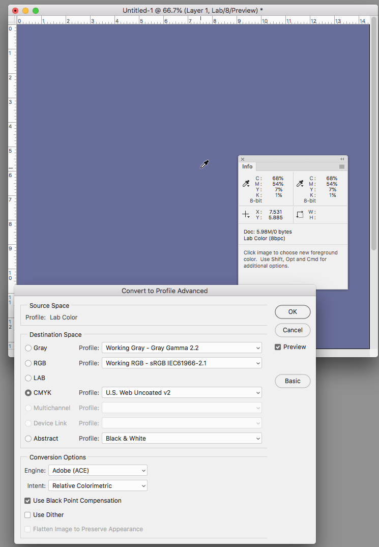
SWOP is a web press standard, so you could also use a common sheetfed standard like GRACol.
Copy link to clipboard
Copied
Here's an example of why I stay away from the Pantone Bridge values. The Solid ink Lab swatches on the left with their Bridge equivalents on the right, with GRACol Coated as the document's assigned CMYK profile (the profile affects the CMYK color appearance but not the Lab appearance). Cool Gray 4 & 6 are reasonable matches, but Cool Gray 2 is a much lighter value while Cool Gray 11 goes in the opposite direction and is considerably darker:
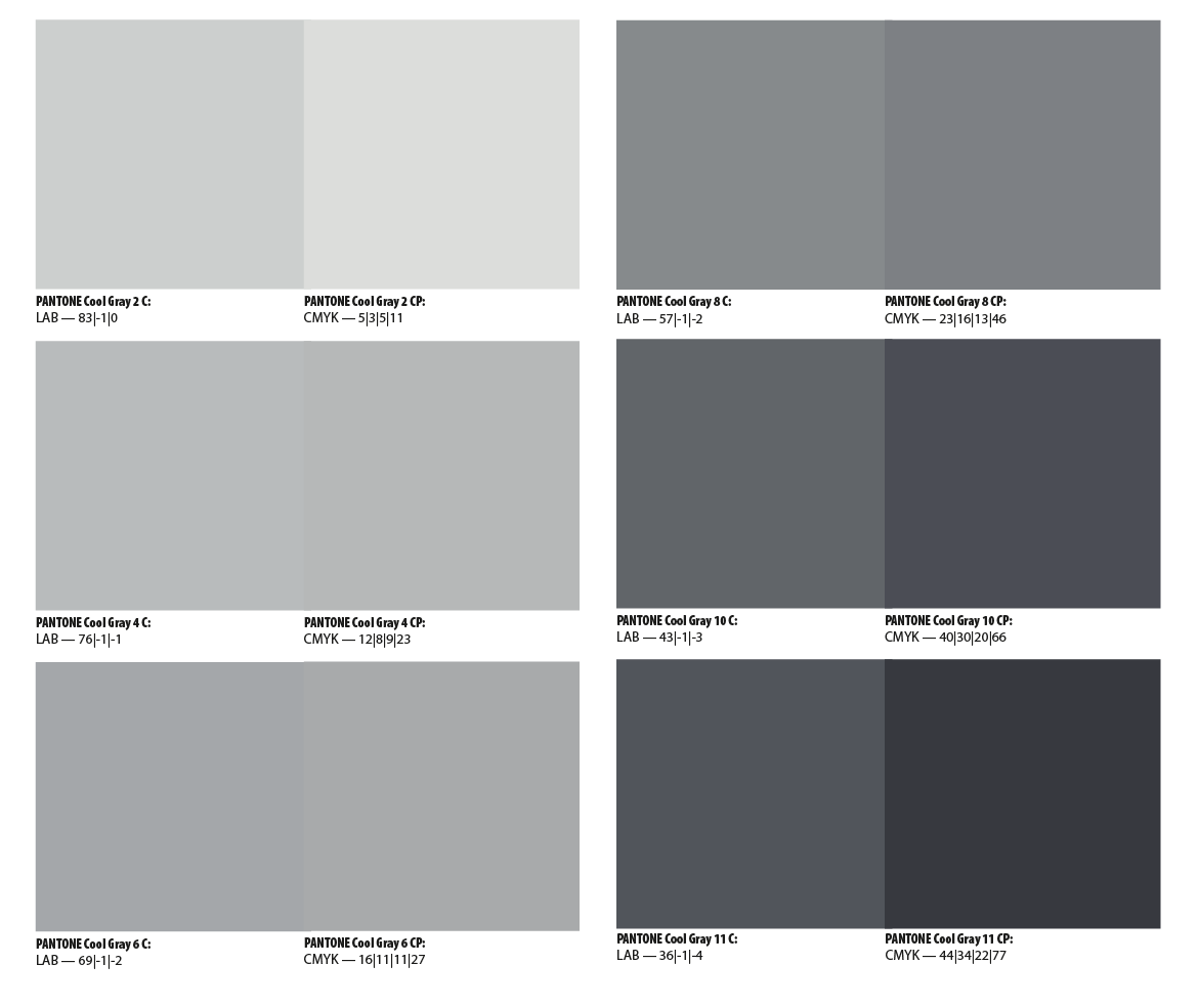
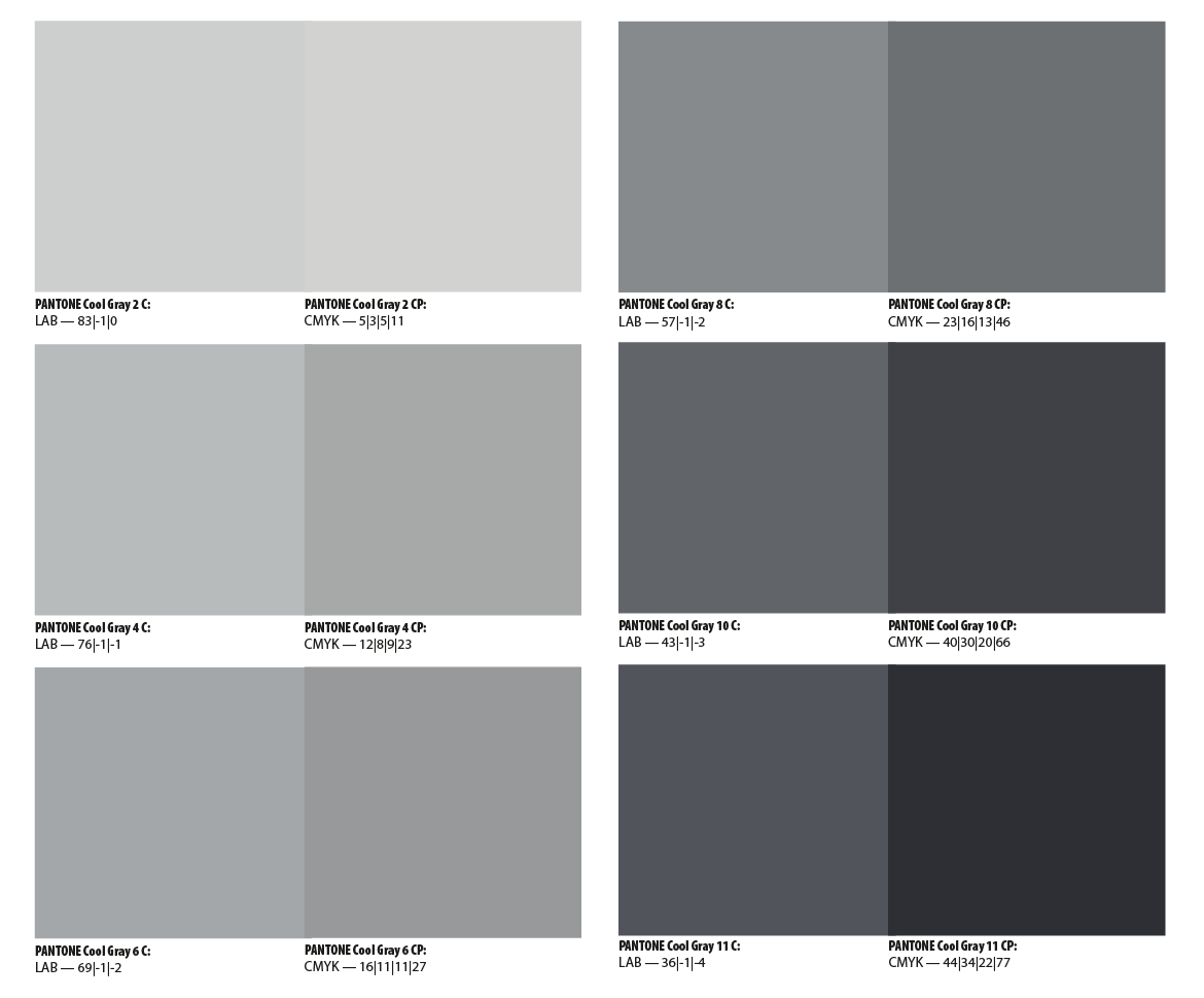
None of the common coated profiles that ship with CC gives anything close to an appearance match. Here's US Sheetfed Coated as the CMYK assignment.
Copy link to clipboard
Copied
Thanks Rob.
Yes, I see what you mean. I think the Pantone Color Bridge books do a reasonably good job of showing you the differences between a PMS and the simulated CMYK build, provided that it's accurate. As you posted, many PMS colors are simply unattainable with standard CMYK inks. I spent some time explaining this to a client yesterday.
In the end, I think the best thing to do is to have your commercial printer run a test printing, if possible.
Copy link to clipboard
Copied
I think the Pantone Color Bridge books do a reasonably good job of showing you the differences between a PMS and the simulated CMYK build, provided that it's accurate.
But if the color is in the CMYK gamut, which is the case with my cool gray example, there shouldn't be an appearance difference between the solid ink Lab and CMYK values.
The Bridge values are problematic because Pantone doesn't give any information about the expected press profile. Either the Bridge cool gray values are wrong or Adobe's color management system doesn't work.
Here's more on the problem with creating color guides based on the Pantone system

 AdChoices