


Copy link to clipboard
Copied
We are using Pantone 2105 C in a design. Client is concerned that it doesn't look purple, but it looks more blue. I've attached a screen shot of what it looks like on their screen, ours and the actual pantone. Also, the swatches client and us are the CMYK breakdown of the Pantone. I've also included the CP swatch for comparison.
I don't really think there is a problem. It's never going to be exactly the same.
Thoughts?


 1 Correct answer

I don't really think there is a problem. It's never going to be exactly the same.
It might be a problem if your client is fussy.
And it would be important to know if the color is printing as process or a spot. Starting with CS6 Pantone created separate libraries for spot color output vs CMYK process simulations of their solid ink spot colors.
The PANTONE + Color Bridge libraries are defined as CMYK Process, while the PANTONE + Solid libraries are defined as Lab Spot colors. Same colors from the dif
... 7
Replies
7
7
Replies
7

Copy link to clipboard
Copied
Are you going to print it as a spot color? If so, what it looks like on screen is pretty much irrelevant.
Copy link to clipboard
Copied
We don't know if they are printing it as pantone, but I doubt it. We will be handing this off to a different studio to finish it off.
I agree with you, but I just wanted to make sure what I was telling them was correct and I wasn't missing anything.

Copy link to clipboard
Copied
they can't make a color judgement based on screens first of all. all monitors are different. If you have the pantone loaded in indesign and you are exporting out you have the correct color loaded in the .pdf and it will print to match.
They need to print a proof with the printer.
Copy link to clipboard
Copied
Thank you. Agreed. That was my suggestion - to do a proof.

Copy link to clipboard
Copied
Unless the two monitors have fresh, quality calibrations for the same workflow, chasing the differences in color between your monitor and your client's, especially when both of them are trying to render the translation to a difference colorspace (e.g. - PANTONE, SNAP, etc.) is a fool's errand. Ambient lighting, color settings, color range bandwidth and even different senses of perception between individuals make casual soft proofing impossible. The proof comes on the press, not from the prepress monitor settings.
There's a reason why broadcast engineers maintain that TV's NTSC color standard actually stood for Never The Same Color ...
Copy link to clipboard
Copied
I don't really think there is a problem. It's never going to be exactly the same.
It might be a problem if your client is fussy.
And it would be important to know if the color is printing as process or a spot. Starting with CS6 Pantone created separate libraries for spot color output vs CMYK process simulations of their solid ink spot colors.
The PANTONE + Color Bridge libraries are defined as CMYK Process, while the PANTONE + Solid libraries are defined as Lab Spot colors. Same colors from the different libraries can preview (and print) differently. The Color Bridge swatches respond to the document's CMYK profile assignment because they are CMYK colors, while the Solid ink swatches are device independent Lab definitions and produce better color previews for solid inks, which are neither RGB or CMYK colors.
So here's 2105 CP Color Bridge on top and 2105 C Solid Ink below. The Bridge color's preview, which is a single CMYK definiton, is being affected by the default US Coated SWOP profile assignment, while the Solid ink swatch is not
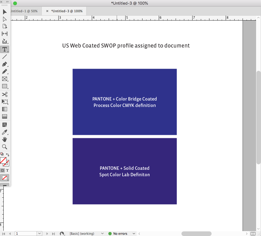
If I change the document's profile to US Sheetfed Coated, the Bridge color changes in appearance, while the Solid color does not. Whether the Bridge color prints that way on press depends on whether the press is printing close to the US Sheetfed profile. This is why the CMYK/RGB breakdowns showing in your #1 post are mostly useless because we don't know what CMYK or RGB space profile is assumed:

Copy link to clipboard
Copied
THANK YOU @rob day! That was very helpful! Thank you for taking the time to write all of that!

Get ready! An upgraded Adobe Community experience is coming in January.
Learn more
 AdChoices