- Home
- InDesign
- Discussions
- Re: Paragraph Shading Text Width Not Justifying
- Re: Paragraph Shading Text Width Not Justifying
Paragraph Shading Text Width Not Justifying

Copy link to clipboard
Copied
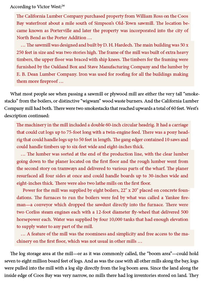
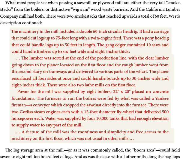
I have three ¶Styles for indented shaded paragraphs. A first ¶ with space above, a middle ¶ without space above or below, and a last ¶ with space below. The shading is equally offset from the text the same on all styles. But I am seeing the right sides not having equal offset. Moreover it isn't consisitent — on one page the first and last are wider, and mid narrower, and on another page the opposite! What's happening?
Above, the first shaded graph is First¶ style and then Last¶ style. The second set of shaded graphs is First, Middle, Middle, Last.
All the styless are using a .0625" offset. And all are using the same left and right indent on the text itself.
Has anyone run into this? Suggestions?
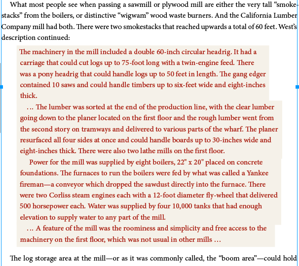
Um. Hmm. I pasted a snippet of text into a new doc to send, and the problem vanished. Pasting that text box back into my working doc and it stays nicely justified. But selecting the text (of the new test doc) and pasting that back into my original text flow—and it's uneven again! What the heck?
I've included my test doc below. But the problem doesn't appear there. I should also say that the shaded graphs are not aligned to the 16 pt grid but the regular text is, and that's same as the original doc. It doesnt't seem to affect it whether it's aligned to grid or not.

Copy link to clipboard
Copied
OK. I figured it out. I have Optical margin alignment ON. If I turn it off then these shaded graphs will properly align the right edge of the shading. This is unfortunate. I think optical margins is actually a REQUIRED feature in a well-typeset book and use that feature always.
Any chance we can get this fixed? I will probably just use boxes instead—also unfortunate as these will have to be split manually across columns or pages.
I am not able to update past the 13.1.1 build without buying a new computer. So hopefully it would be fixed retroactively.
Thanks,
Sue
Copy link to clipboard
Copied
Well done tracking down the cause!
Looks like a genuine bug – the programmers did not test this. Report it at https://indesign.uservoice.com/forums/601180-adobe-indesign-bugs and hopefully it will be fixed in an interim patch (rather than "the next major version" or "never").
Copy link to clipboard
Copied
I remember this option could cause some inconsistences, like moving characters. In your example it shortens, compress some lettering space, therefore the shading reflows to the left (more) in some paragraphs. (*)
As it is a story wide I would suggest you to use on separate individual frames when needed only.
It would be a pity if in your v13.1 build you do not have the Space between paragraphs (using same style) that would reduce using those 3 par. styles to just one.
Optical margin plays some strain or resources wasting.
Despite I like punctuation (hyphens or quotation marks) hanging out, the number of hyphens per page can be somewhat minimized in several ways without affecting copyfitting, by adjusting Justification and Hyphenation settings (in your example default values are untouched) at a paragraph level.
(*) Measure your left and right indents in the shaded paragraph, to find out they do not match the entered 27/22.5 pts width.
This interesting (and basic) option appeared at earliest release of InDesign, but it has not evolved or improved at all. It looks to me an untamed feature.

Copy link to clipboard
Copied
Thanks. I reported the bug.
Yes I could do better with the hypenation settings on those styles. If fact I might just turn off hyphenation on just those and see if it makes a difference. Worth a try. Hang on ....
Well, nope. That doesn't do it. I have adjusted the justfication settings and turned off hyphenation. Without having any punctuation on the right edge, it still is weird with Optical Margin Alignment turned on. And, strangely enough, if I switch the text to left alignment (not justified) it's even worse!
Copy link to clipboard
Copied
Thanks for reporting this issue. Yes, we can see this issue at our end.
I can see that this issue happens not only for Paragraph Shading but for Paragraph Rules also. Just try with a very thick weight Rule with an Offset on the same piece of text and you should see it.
The paragraphs with Ellipsis (or any other Special Char) at the beginning are showing this issue.
Copy link to clipboard
Copied
Hi Sue,
that's still an issue with InDesign 2020 version 15.0.0.155.
Hm. There is a workaround, but that would require to set the width of the shading to Column and do some offset values for left and right with negative numbers. A workaround that is not very flexible and will only work if you are always using the same width for text columns or text frames.
Regards,
Uwe Laubender
( ACP )
Find more inspiration, events, and resources on the new Adobe Community
Explore Now

