Exit
  • Global community
    • Language:
      • Deutsch
      • English
      • Español
      • Français
      • Português
  • 日本語コミュニティ
    Dedicated community for Japanese speakers
  • 한국 커뮤니티
    Dedicated community for Korean speakers
0

Problems with Arial "s" and "t" characters

New Here ,
Aug 04, 2023 Aug 04, 2023

Rodrigo31491169a657_0-1691144122324.pngexpand image


Hello, comrades. I have a problem related to fonts in Indesign that I've never seen anything like it and I have no idea how to search to solve it.
Specifically in the "Arial Regular" font, when the characters "s" and "t" are side by side, a curved line appears from the upper point of the "s" to the top of the letter "t". Always in lower case.
If anyone has experienced this and/or knows how to solve it I would be very grateful.


Attached is a photo and file with the problem.


Live long and prosper! 🖖

TOPICS
Bug , Feature request , Type
1.1K
Translate
Report
Community guidelines
Be kind and respectful, give credit to the original source of content, and search for duplicates before posting. Learn more
community guidelines

correct answers 1 Correct answer

Community Expert , Aug 04, 2023 Aug 04, 2023

Turn off the ligature if you don't like it.

Translate
Community Expert ,
Aug 04, 2023 Aug 04, 2023

Turn off the ligature if you don't like it.

Translate
Report
Community guidelines
Be kind and respectful, give credit to the original source of content, and search for duplicates before posting. Learn more
community guidelines
Community Expert ,
Aug 04, 2023 Aug 04, 2023

I opened up your InDesign file.


When I select the words affected I don't see the "st" issue which looks like a ligature.


Screenshot 2023-08-04 at 4.37.36 AM.pngexpand image

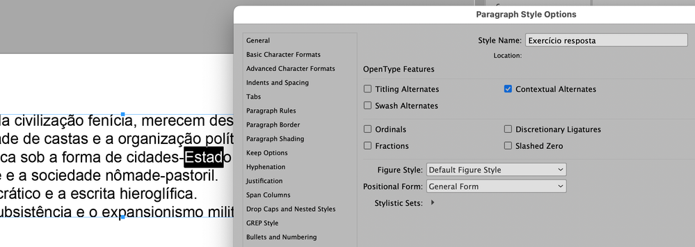
But when I look at your paragraph style, it looks like you have Contextual Alternates turned on. Try turning it off.


Screenshot 2023-08-04 at 4.41.00 AM.pngexpand image

I suspect that that's the issue.


Translate
Report
Community guidelines
Be kind and respectful, give credit to the original source of content, and search for duplicates before posting. Learn more
community guidelines
Community Expert ,
Aug 04, 2023 Aug 04, 2023

It's not, apparently, a contextual alternate. I tried turning that off before posting.

Translate
Report
Community guidelines
Be kind and respectful, give credit to the original source of content, and search for duplicates before posting. Learn more
community guidelines
New Here ,
Aug 04, 2023 Aug 04, 2023
LATEST

It worked.
I hadn't seen this before because we changed fonts recently.
Thank you very much for the objective and quick response.

Translate
Report
Community guidelines
Be kind and respectful, give credit to the original source of content, and search for duplicates before posting. Learn more
community guidelines
Community Expert ,
Aug 04, 2023 Aug 04, 2023

That's a ligature. and the s-t ligature is not particularly common, so I'm surprised it's included in Arial.

You can turn off ligatures as part of the style assigned to the text or as a local override. Turning off ligatures does not seem to affect the f-f ligature in Arial.

Translate
Report
Community guidelines
Be kind and respectful, give credit to the original source of content, and search for duplicates before posting. Learn more
community guidelines