- Home
- InDesign
- Discussions
- Spot-to-CMYK conversion: Pantone vs. ID
- Spot-to-CMYK conversion: Pantone vs. ID
Spot-to-CMYK conversion: Pantone vs. ID
Copy link to clipboard
Copied
I know this is not a new issue, and was discussed here, but more from the point of view of the visual aspect of colors on one's screen.
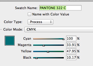
I'm baffled as to the conversion of spot colors for printing purposes (sheet-fed).... My client wants me to use PMS 322c in a CMYK job, and she's been always very picky about colors and the way they print. The difference in the conversion formulas between ID and using Pantone's website -- is striking.... See how ID has a significant amount of M, yet low K, while Panton suggests ZERO M and lots of K.... So I'm asking, WHO CAN I TRUST???....


Copy link to clipboard
Copied
I connected with the printer (again, not one of my regular printers, but my client's), and he suggested I stick with the spot colors client wants to use (beside the CMYK photos) and asked me to upload the native, ID file (create "Package"), so they will take care of the conversion. Good.
Now, to wrap up our discussion — AND I TRULY APPRECIATE ALL THE HELP HERE!!! — for the future, I'd like to know what different setting I should take the time to change in my ID to (or AI also?) before creating these kinds of new projects:
1. All spot colors
2. Pure CMYK projects
3. CMYK-printed projects involving some spot colors (like this latest one)
Again, thanks so much !
Copy link to clipboard
Copied
1. All spot colors
In CS6 there's no choice how solid Pantone spots are displayed—they are always defined as Lab.
2. Pure CMYK projects
When the document is created use the printer's suggested CMYK profile and make sure it's assigned to the document. If you convert RGB images to CMYK make sure the same CMYK profile is used
3. CMYK-printed projects involving some spot colors (like this latest one)
1 plus 2
Also, for the above to work you need a calibrated display with an accurate display profile chosen in the system.
Copy link to clipboard
Copied
In CS6 there's no choice how solid Pantone spots are displayed—they are always defined as Lab.
So you're saying I should set my ID Ink Manager to have "Use standard LAB Values for Spots" selected as my default for any job.
How/where do I set the same in AI?
When the document is created use the printer's suggested CMYK profile and make sure it's assigned to the document. If you convert RGB images to CMYK make sure the same CMYK profile is used
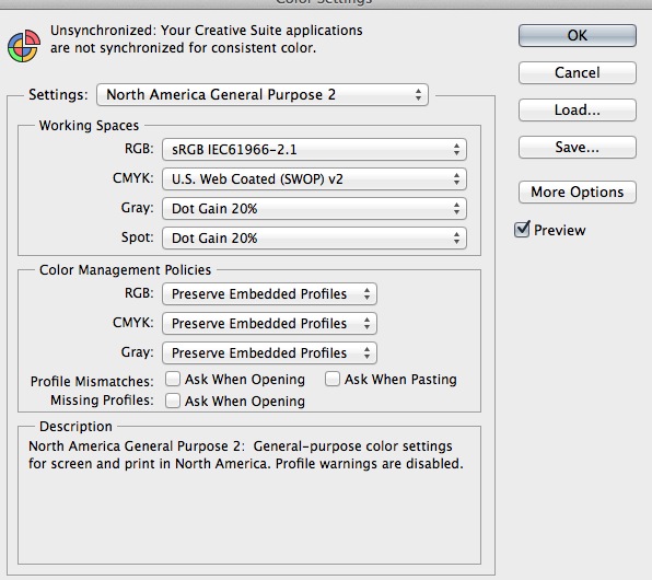
I'm sending out an email to all the printers (3 of them), asking each to tell me what CMYK Working Space I should use. As far as RGB to CMYK conversion, I always do it in Photoshop.... Below is the current settings I have. Besides the CMYK Working Space, is there anything else I should adjust?

As far as my display calibration, I use a 27" iMac which I bought new in January. I tried calibrate using the Apple System Prefs > Displays > color calibration, did a few slight tweaks. One of my more advanced printers supplied me with some test files, accompanied with those files printed, and it looks like the images on my display are quite close to those printed, both in colors, brightness and details...
THANKS FOR THE HELP !!!
Copy link to clipboard
Copied
So you're saying I should set my ID Ink Manager to have "Use standard LAB Values for Spots" selected as my default for any job.
It has no effect—the Pantone solids always display as Lab. You would have to use Pantone Bridge to get CMYK definitions
Copy link to clipboard
Copied
and it looks like the images on my display are quite close to those printed, both in colors, brightness and details...
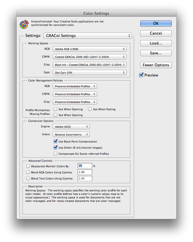
If everything is working with the defaults why mess with it. But I like this (there's no reason to use sRGB for print and the Gray profile and CMYK profile should be the same):

Here's the .CFS setting for the above:
http://www.zenodesign.com/forum/GRAColSettings.zip
If your separations consistently are printing too dark try US Sheetfed Coated, which allows for more gain than SWOP or GRACol
-
- 1
- 2
