

- Home
- InDesign
- Discussions
- Re: Tab Leader distance from characters
- Re: Tab Leader distance from characters
Tab Leader distance from characters

Copy link to clipboard
Copied
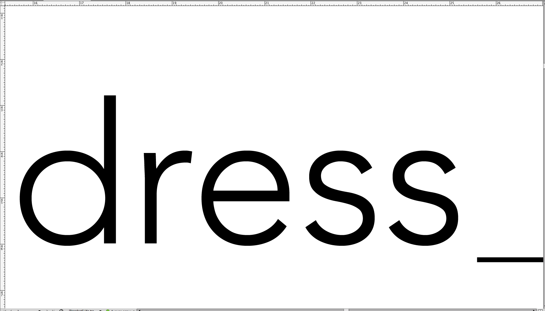
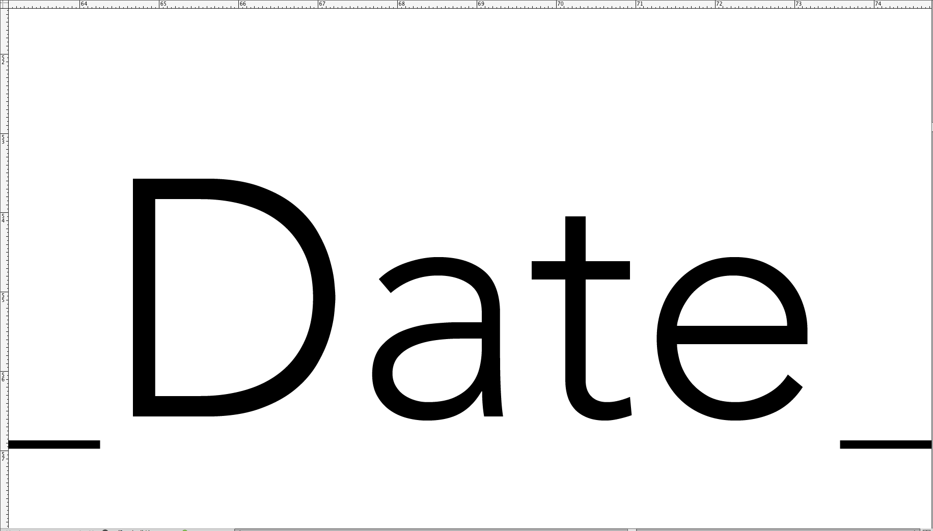
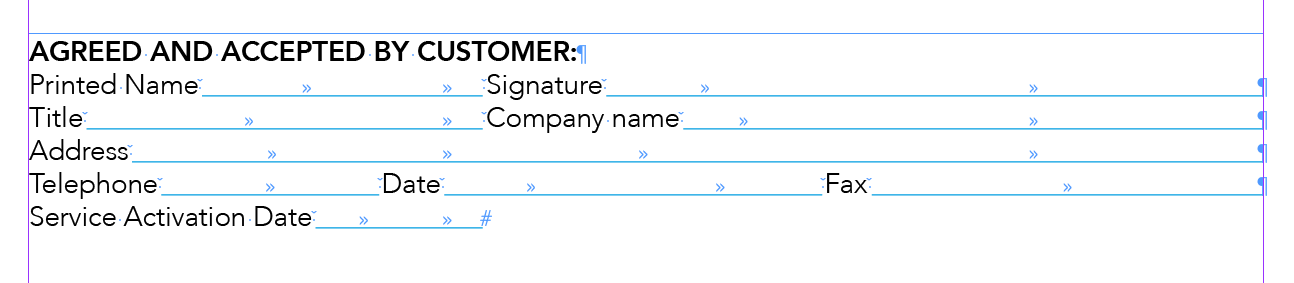
Hi. I'm working on a piece for a client, and they've requested that all tab leaders line up the same space from each character. Problem is, I'm not sure how to control that. I'm attaching a screenshot of the problem, you'll see that the distance from where the tab leader starts relative to the letter is different, even for the same letter. Especially note the two instances of Date and how where the line starts.
Any ideas?


 10
Replies
10
10
Replies
10

Copy link to clipboard
Copied
I'm sure there is more than one way to go about what you want, but whenever I need the kind of consistency you describe, I do this:
Select all. Then choose Justification from the Paragraph panel menu and set it like this:

Copy link to clipboard
Copied
Hi John, thanks. I tried that, but it didn't have any effect on spacing. 

Copy link to clipboard
Copied
Not really sure we use the same way! 

Some words! … at 4,000% zoom! 
Same space before/after!


(^/)
Copy link to clipboard
Copied
Can you tell me a little bit about how you created those?
Copy link to clipboard
Copied
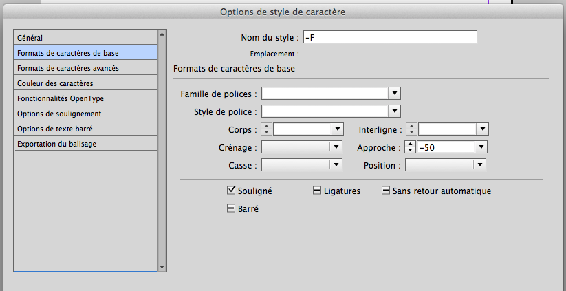
I use a para style with a para rule and the text is inserted in anchored inline text frames that allow a real control by The Force on the space before/after using the marging of the text boxes. My reference is the lettre "F"!
Always so simple when done by a Jedi!

(^/)
Copy link to clipboard
Copied
Ah! Thanks so much for sharing. It looks very nice, however, I'm interested in getting the same effects using tabs and tab leaders.

Copy link to clipboard
Copied
I would use a custom underline applied to the tab. Use Nested Styles to make all tabs underlined. The space before the tabs is a thin space (Command+Option+Shift+M), the space after the tab is an en space (Command+Shift+N).


Copy link to clipboard
Copied
The alignment difference because of the following factors..
1) Font nature (serif or sanserif)
2) Ligature
3) Of course the word spacing setting in Justification
Copy link to clipboard
Copied
Hi Scott,
Good idea but no enough effect! 
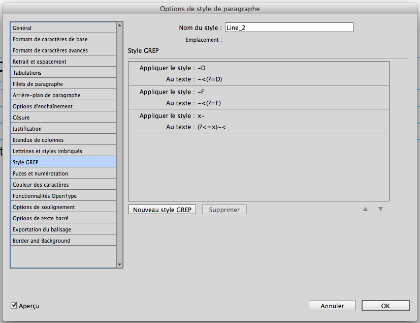
… Just need to correct the width of the thin spaces with some Grep styles, playing with different "approaches"!
E.g.:
(^/)
Copy link to clipboard
Copied
Hello master Jedi,
Thank you for all the time you've spent on this issue! I really appreciate it. I'm going to use what you've done here and massage the text until it looks right.

Find more inspiration, events, and resources on the new Adobe Community
Explore Now
 AdChoices