 Adobe Community
- Home
- InDesign
- Discussions
- Text appears jagged, unless zoomed into 100 percen...
- Text appears jagged, unless zoomed into 100 percen...
Text appears jagged, unless zoomed into 100 percent.

Copy link to clipboard
Copied
I am having the same or similar problem as Steve [Edit: branched from Indesign 5.5 displays text with ragged edge.]. I have done my best to research this but I cannot figure it out. I am using a Macbook Pro, 15 inch (late2011) with the normal display. I have Leapord 10.7.3. My InDesign is 7.5.2.
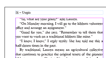
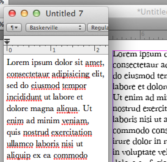
The text appears jagged, unless zoomed into 100 percent. Here is a screen shot of the problem at 300 percent:
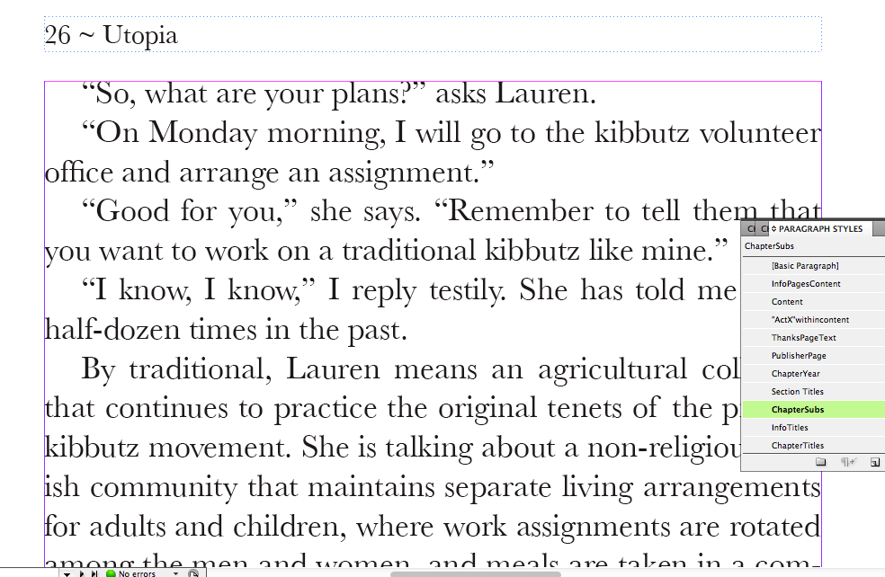
And here is the exact same file when I zoom into 100 percent:
here is the same text zoomed even more:
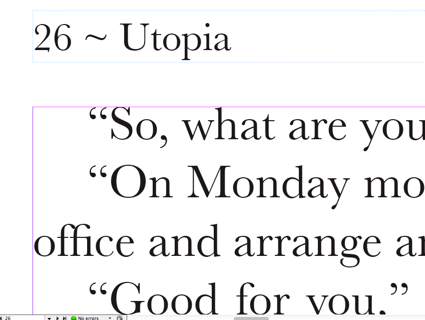
The typeface is Baskerville. It prints properly, no jagged edges.
I have tried all the display and text options
Any ideas?
Thanks. Also, do you guys think I should I post a new topic?
Message was edited by: John Hawkinson


 54
Replies
54
54
Replies
54
Copy link to clipboard
Copied
I think the issue would still be one of display if the print is good, regardless of what is producing the display (ID or Acrobat). A good test would be to put the PDF on a computer without your font and view it in Acrobat (assuming the font is embedded of course). What that could tell you is whether it is a more universal issue with the font, or your system.
I cannot remember the font, but I had one that on my computer looked like crap both on-screen in PM and in a PDF. Printed great. Looking at that PDF on another persons computer (the service bureau in this case) it looked good. We then threw it on one of the Windows computers and while it didn't look as crispy as the Mac, it was far better than on my computer.
Take care, Mike
Copy link to clipboard
Copied
pdgmtf wrote:
The font is Baskerville Regular. I dont know what other way to describe it there might be.
Take a look a tthe font properties and tell us the foundry, format, and version number. That's the only way to comapre apples to apples.

Copy link to clipboard
Copied
Take a look a tthe font properties and tell us the foundry, format, and version number. That's the only way to comapre apples to apples.
Given by yours truly in post #9! Baskerville Regular (Truetype / Baskerville; 7.0d4e2; 2011-03-16).
Copy link to clipboard
Copied
How can I find this infro?
edit: Yes, infro. 
Copy link to clipboard
Copied
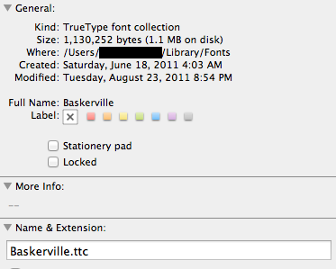
Try right-cliking on the font in Finder and Get Info. If that doesn't work, try Find Font in ID and click the More Info button.
Copy link to clipboard
Copied
All the info in finder:
All the info in ID:
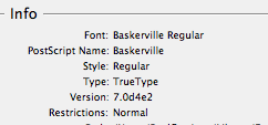
I am not sure how to determine the foundry. Let me know if there is anything else I can do to help.
Thanks again for the responses.
Copy link to clipboard
Copied
John Hawkinson wrote:
Take a look a tthe font properties and tell us the foundry, format, and version number. That's the only way to comapre apples to apples.
Given by yours truly in post #9! Baskerville Regular (Truetype / Baskerville; 7.0d4e2; 2011-03-16).
Doesn't mean that's the same font as the OP, and you left out the foundry. I hate to tell you how many fonts there are out there named Baskerville...
My TT version is 2.0 from monotype with a 1995 date, ID reports the T1 version as 1.0 with no foundry listed, and windows refuses to tell me anything-- it opens the tt version instead when I try to view it, but it has a 1990 modification date.
Copy link to clipboard
Copied
And also, it does it happens on multiple typefaces anyway, some to a lesser extent.

Copy link to clipboard
Copied
Hi all! I am having the exact same problem. I'm using InDesign 5 with Baskerville font under Mac OS 10.7.3. The only way I can solve this problem now is to create outline (Types > Create Outlines) of the problematic texts. Still, this solution is very inconvenience. I'll very appreciate a better solution for this problem.

Copy link to clipboard
Copied
There is no problem, as far as I can see.
The text looks weird when displayed at a very small size. That's not a surprise; in fact, thinking about it, it's surprising that a 7 pixel capital 'R' can still be recognized as "Baskerville"!
Fonts are designed at a large size, and every time you see it display at any size smaller than 1,000 pixels (at least!) some of the features you are seeing will be artefacts due to displaying it smaller than the designed size.
In other words, why complain that the baseline is not straight when there are lots of other "problems" with those very same characters!? (I can see large rectangular chunks, a.k.a. "pixels", which I'm sure are not in the original design. I can also clearly see all sorts of shades of gray, and I am fairly sure this text color is set to "Black". And so on ...)
When drawing a large character on a coarse screen with a *very* low number of pixels, rounding is inevitable. The less pixels you have, the more "rounding" will be making bad mistakes; and because a single pixel on this size accounts for 1/6th of the total character size, the effect is exagerrated. Compare it to the largest zoomed-in image above; in that image the pixels are also rounded to the nearest "whole" value. For that you suddenly decide that a 1-pixel difference is not important?
It's all just a screen artefact. The proof is given by the OP himself: "It prints properly, no jagged edges." Of course not -- the printer's resolution is high enough for all rounding to be practically invisible.
Copy link to clipboard
Copied
.. In the Baskerville case I'm pretty sure the problem is exagerrated because of bad hinting in the font itself. You see how all of the dropped characters have a curve at the lower bottom? That's Bad Hinting.
Copy link to clipboard
Copied
If you had said its not an InDesign problem, that would make sense. It also helps us figure the problem out.

Copy link to clipboard
Copied
bad hinting in the font itself. You see how all of the dropped characters have a curve at the lower bottom? That's Bad Hinting.
I booted up the ol' mirror-door G4 to look at this again. My suspicion is that it is entirely font-dependent. My old Baskervilles show this behavior, in both InDesign CS2 and PageMaker 6.5. That means: in both OS 9 and OS X! A bunch of other older fonts display this behavior as well.
If this bugs you, stop using those fonts. There are (as has already been observed in this thread) many other cuts of Baskerville.
Copy link to clipboard
Copied
I want to use a common font - Baskerville regular - and I want what is on screen to represent how the file is setup.
This is not too much to ask, it is not unreasonable. I would consider it minimal function, actually.
Do you have a link to a "better designer version of Baskerville" because I would LOVE it. That is why I posted this thread. All I got was people saying, "Yeah it happens to me too. Dela with it."
Making me feel like this is not a real problem does not help anyone. It clearly is.
Making me understand this is a problem with my dsiplay or font, and not Adobe or ID, is helpful.
Copy link to clipboard
Copied
Try http://store1.adobe.com/cfusion/store/html/index.cfm?store=OLS-US&event=displayFontPackage&code=1339
or http://store1.adobe.com/cfusion/store/html/index.cfm?store=OLS-US&event=displayFontPackage&code=1414 which is very similar to Baskerville.
Many of the fonts supplied with your OS (and I think Baskerville is probably one of them) seem to be stripped down "cheapie" versions that have poor hinting.
Copy link to clipboard
Copied
Jongware,
The problem is the baseline of letters changes in different zooms. Despite the fact the file is not changing at all. Also, what we see in screen is not how the final product prints. IF you dont see it as a problem, fine. But that does not mean it is not a problem. It very clearly IS a problem, which other people have as well.
The issue is when you have two letters right next to each other, there is no reason that they cannot share the horizontal pixel line. If there is a reason, it should be modified so that what I see on screen represents the file as best as possible. The other issues you mentioned are at their best presentation I would assume. Alternating baselines for letters is clearly not the best presentation.
Its not about rounding, its about optical alignment and the text representing how the file is set up, not representing some other file with alternating baselines. If it is not visible - then it is not important. PLain and simple. This is noticeable and very much so.
If the screen is not showing me the best representation of the file possible, it is not effective and I consider it an issue. You may not, that is fine. What we are looking for on this thread is suggestions and to find more out about who and why the problem is happening.
Also, its not only on the baseline, as you can see in the screen shots. It happens at the top of the letterforms as well.
Copy link to clipboard
Copied
The problem is the baseline of letters changes in different zooms. Despite the fact the file is not changing at all. ...
...
The issue is when you have two letters right next to each other, there is no reason that they cannot share the horizontal pixel line. If there is a reason, it should be modified so that what I see on screen represents the file as best as possible. ...
...
...What we are looking for on this thread is suggestions and to find more out about who and why the problem is happening.
...
The "suggestions" are what the problems are. The font has bad hinting. You do not have the issue with every font, that is clear. Fonts are little computer applications. Gone are bitmap fonts that had a better correlation on-screen for the OS they were designed for. Instead, modern fonts, even badly designed ones, are little run-time applications. Use a better designed version of Baskerville. It likely will not exhibit the issue for on-screen display--which is what hinting affects. That the font is designed well enough not to exhibit the issue in print says the version you are using is designed well enough for what you are creating. But if the on-screen bugs you enough, try a different version of the font.
Take care, Mike
Copy link to clipboard
Copied
I am fairly unimpressed here with the responses from the experts! Sorry guys, but you can do better!
Jongware writes:
There is no problem, as far as I can see.
The text looks weird when displayed at a very small size. That's not a surprise; in fact, thinking about it, it's surprising that a 7 pixel capital 'R' can still be recognized as "Baskerville"!
Of course there's a problem! It looks bad on the screen. That is a problem.
It is not a super-dooper critical stop the presses problem, but it is a problem nonetheless.
There's more to the problem, too. InDesign is doing much worse than it should be doing. Here is InDesign side-by-side with TextEdit, they don't use quite the same font specifications, so it's a bit tough to compare, but I tried a wide range of font sizes in TextEdit and none exhibit this failure. In this case, this is 14pt Baskerville in TextEdit, and 12pt Baskerville in InDesign at 125%, in CS5 (Edit: this image was scalled up 200% in Photoshop with Nearest Neighbor):
Yes, it still looks fine with the annoying spelling underlining turned off. Yes, it still looks fine at fractional point sizes in TextEdit. (14.2,14.5,14.7).
Something is wrong here, and it may be Apple's bug and it may be Adobe's bug, but I would put my money on Adobe at this point.
It also seems to be Lion-related. I don't see it on a 10.6.8 machine, though that has Baskerville 6.1d5e1.
While the problem might be related to hinting, we certainly lack sufficient information to conclude that the font has bad hinting, especially when the OS can render it just fine. Perhaps it has bad hinting only in Carbon applications? Perhaps Carbon font-hinting is catastrophically broken? But I think we can expect InDesign renders screen fonts in a fairly customized way compared to most other applications.
So let's try some other combinations:
- Reverting to Baskerville 6.1d5e1, from the OS X 10.6.8 machine, fixes the problem. Something about the font/ID combination. Curious.
- Baskerville 7.0.d4e2 under OS X 10.6.8 demonstates the problem under ID CS5. Pointing again to the font/ID combination.
- Adobe's ITC New Baskerville Std Roman (Version 2.025;PS 002.000;hotconv 1.0.51;makeotf.lib2.0.18671) works fine under 10.7.2.
- Adobe's Baskerville Cyrillic LT Std Upright (Version 2.025;PS 002.000;hotconv 1.0.51;makeotf.lib2.0.18671) works fine under 10.7.2
So, now it is fingerpointing between Apple and Adobe I suppose.
Anyhow, while I'm here:
Its not about rounding, its about optical alignment and the text representing how the file is set up, not representing some other file with alternating baselines. If it is not visible - then it is not important. PLain and simple. This is noticeable and very much so.
In this context, by rounding we mean whether a decimal of 1.6 turns into 1 pixel or 2 pixels. Not whether square edges become smooth looking. I'm not 100% sure that was clear to everyone and that we were using the same definitions.
Gone are bitmap fonts that had a better correlation on-screen for the OS they were designed for. Instead, modern fonts, even badly designed ones, are little run-time applications. Use a better designed version of Baskerville
This is fair as far it goes, but this Baskerville is indeed modern. In fact, a modern revision to it broke its use in InDesign. It may well end up that the font is at fault, but it is not at fault because it is not modern.
Doesn't mean that's the same font as the OP, and you left out the foundry. I hate to tell you how many fonts there are out there named Baskerville...
Yeah, but we're talking about identical symptoms, so it's probably OK to not worry too much about which it is. And it's a system front that Apple ships with OS X, so that is the likely choice anyhow. Yes, Peter, I didn't specify the Foundry...I'm not sure how much it matters, it's an Apple-distributed font. But since you ask, it is Monotype.
Copy link to clipboard
Copied
Thank you Peter for the link to new Font files. I wonder if anyone can confirm buying Adobe's font will fix this problem?
John, Thanks for that. It's very insightful. I had no idea that Text edit does not have this problem, that sheds a lot of light on where the issue might be and gets us closer to solving it.
Thanks again for the helpful responses guys!!!
Copy link to clipboard
Copied
Apogies for using so many exclamation points in my previous post...
My point was -- and still is -- that there is not something intrinsic "wrong" with the font. You are only *seeing* the baseline jump up and down because there is no "good" way to display any font *at that size*. There is nothing wrong with the baseline itself, as you can see for yourself when zooming in or printing that page out.
The only thing is that at certain (small!) sizes the display cannot exactly represent the font characters -- but, as I said, the same is true for the overall form, shape, and color of the characters! Sure, it's annoying that you *think* something is wrong when viewing the text at a small size, but zooming in *does* reveal the baseline is okay. (And also that these characters are *not* composed out of very small gray colored blocks, which is a totally similar misconception you might get from just looking at that screenshot.)
InDesign does not use the native OS way of drawing its texts; Adobe programmed their own. Usually it's better than the one supplied by the native OS, but I must admit that apparently in this particular case it seems to make a few bad choices... It might be worth the trouble of officially filing a Bug Report for this, so their engineers can take a look at it.
If this screen-only behavior is so annoying that you really cannot work with it, you only have the choice of using a different font.
Copy link to clipboard
Copied
Thank you Peter for the link to new Font files. I wonder if anyone can confirm buying Adobe's font will fix this problem?
Yes. As I said above:
- Adobe's ITC New Baskerville Std Roman (Version 2.025;PS 002.000;hotconv 1.0.51;makeotf.lib2.0.18671) works fine under 10.7.2.
- Adobe's Baskerville Cyrillic LT Std Upright (Version 2.025;PS 002.000;hotconv 1.0.51;makeotf.lib2.0.18671) works fine under 10.7.2
But probably your easiest solution is to copy the Baskerville from an OS X 10.6 system.
Jongware:
It might be worth the trouble of officially filing a Bug Report for this, so their engineers can take a look at it.
Didn't I say that? Huh. I guess I only hinted at it.
I'll probably get around to doing that this weekend, I've spent enough time on this, what's a smidgen more?
Copy link to clipboard
Copied
So someone has these files, and can confirm they appear correctly?
Why would I copy the font from a 10.6 system? I guess you are saying the newer system has the font with the problem? Because I have 10.7.3.
Copy link to clipboard
Copied
Please reread post #42, esp. the bulleted list.
Copy link to clipboard
Copied
I'm going to bring up the system font thing again....
Over the years I've learned to avoid using system fonts in my layouts. I have no real evidence other than experience, but in cases where the OS supplied font has some sort of problem, a "real" purchased version generally does not, and my conclusion is that the versions Apple and Microsoft are giving away are not as complete or robust in some way as the ones the foundries release to the general public. Considering how inexpensive an OS license is, and how many fonts you receive along with it, you can imagine that the font foundry is receiving only pennies for each sale in royalties so we may well be getting "lite" versions that leave out some things like the hinting that would help baskerville align at small sizes (if, indeed, hinting is the problem).
Does this mean the font is not usable in a layout? Not at all if you are printing. But the screen view is annoying, isn't it?
Copy link to clipboard
Copied
In principle I agree with Peter that it's better to buy professional versions of fonts that you use on a regular basis, but for a different reason.
There are other attributes of fonts that tend to work better in such fonts, including OpenType Features, more sub-faces, and a wider glyph complement.
But it's also not as great as one might hope. For instance, we use Utopia quite a bit, from Adobe's Font Folio 11. But its glyph coverage is not as wide as one would hope for. There are times when I end up pulling obscure glyphs from Apple's Times (typically unexpected foreign accents) which makes me feel grotty, but it's the easiest solution. Glyph coverage is going to be better with, say, Adobe's "Pro" variants, but there are only handful (ok, let us say a "double handful") of those.
Does this mean the font is not usable in a layout? Not at all if you are printing. But the screen view is annoying, isn't it?
Of course that's why we need to get the bug fixed!
If the OS's native apps get the small-size rendering correct, there is no reason that Adobe's apps cannot do so as well.
(Has anyone tested this with non-InDesign Adobe apps?)

 AdChoices