 Adobe Community
What is the slug height of the font?
Copy link to clipboard
Copied
In Adobe manual for Table, "By default, row height is determined by the slug height of the current font." I want to know what the slug heigt of the font means.
Copy link to clipboard
Copied
As far as I'm aware, fonts don't have a slug height. Cap height, x-height -- yes. But slug height?
Do you have a link to that manual?
Copy link to clipboard
Copied
https://helpx.adobe.com/indesign/using/formatting-tables.html
Resize columns and rows
Copy link to clipboard
Copied
In metal type, the slug height would, I think, be the point size of the type. How the type desinger chooses to place the glyphs on the slug would be up to them.
Adobe being what it is, though, it wouldn't surprise me if they mean the assigned leading leading value.
Copy link to clipboard
Copied
The type size of a font is the measurement from the top of the heighest ascender to the bottom of the lowest defender plus a little space to stop the assenders and descenders touching in multi line text. So, for example 12pt is this total depth and 12 on 14pt leading would actually be 2pt leading. In some typeface designs the capital letters are the same height as the lower case assenders and in some designs the lower case assenders are higher than the capitals
Copy link to clipboard
Copied
You live and learn. Here's a link to an article that says that a font's "em-height originally derives from the height of the metal slug on which each character was contained in traditional mechanical printing." http://benwhitmore.altervista.org/line-spacing-getting-right/
Interestingly, one of the options in anchored frame's Y-relative-to value is EMBOX. It's not exposed in the interface (unlike ascent, cap height, leading, and x-height). Looks as if it was once part of or intended to be part of the interface, but was abandoned was left in the scripting model.
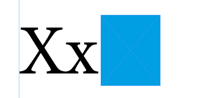
Some expriments show that an anchored object's em-box height is the same as the font's type size. Its position is such that a character's cap heigh is centred in the box:
P.
Copy link to clipboard
Copied
My description of font sizes was based on metal type. There might well be different calculations used in digital fonts but for ordinary mortals working with fonts, my description IMO be fine for those typesetting with InDesign.
Understanding this is particularly useful for calculating a base line grid. For example, a 14pt baseline grid (based on 12/14) I have a 7pt baseline grid so I can apply half a line space.
Copy link to clipboard
Copied
https://helpx.adobe.com/indesign/using/creating-tables.html
USING THE CREATE TABLE OPTION
Copy link to clipboard
Copied
@SEASONS283724216wp2 -- Aobe's text -- " (The slug is based on the leading value. In this context, a slug is the approximate height of the highlighting in selected text.)" -- doesn't make much sense since 'slug' has meaning in InDesign's interface only when you set up a page (as in slug and bleeding). InDesign doesn't have 'slug' as a font metric. You'll have to make do with ascent, cap height, x-height.
Copy link to clipboard
Copied
Yeah, stick to Font Size and Leading in points and away you won't go far wrong!
Copy link to clipboard
Copied
OK, I believe I was correct that Adobe calls the type slug the leading value. In metal type, particularly machine set type, one would refer to a type slug as being a single line of type spanning the column, and I think it is equivalent to, more or less, to waht you see as the hiughlighted area when you select a line in InDesign.
As to Ben Whitmore's article, which I only scanned, I think that's confusing. I think one needs to make the distinction between "m height," which is variable and equals the distance from the baseline to the top of a lowercase "m," and "em height." An Em is a unit of measure equal in width to the point size of metal type. I've never heard the term "em height" used before. An em space is one em wide, and with metal type we used to refer to "em quad" spaces which were square in section so couldn't be set wrong way around. An En is equal to one half em. Other fixed-with spaces are also based on the em and are therefore always proportional to the point size of the type in use.
Copy link to clipboard
Copied
As a matter of interest, in old letterpress printing days, an em space was known as a mutton and an en space a nut.
Copy link to clipboard
Copied
a slug is the approximate height of the highlighting in selected text
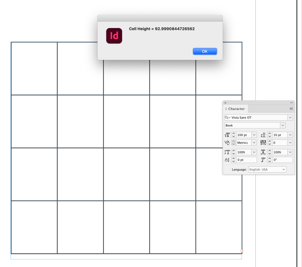
Seems like "approximate" is the operative word. If I set my default point size to 100 and the leading to anything, a new table’s cell height is 92.99 pts, which doesn’t seem to correspond to any combination of font metrics –point size, ascent+descent, capheight, etc—definately not leading:
Copy link to clipboard
Copied
Gotta love it...


