- Home
- InDesign
- Discussions
- Occasionally preventing a standard ligature while ...
- Occasionally preventing a standard ligature while ...
Copy link to clipboard
Copied
The OT font I need to use has, among others, an fl-ligature. Since in a German word like "auflesen" this ligature should not be used, I insert here a non-joiner (U+200C) between f and l to prevent ID from using the fl-ligature, plus a hair space (U+200A) to prevent the two characters from touching each other (auf<200C><200A>lesen). So far, so good.
Now the problem is that this form is not broken at the end of a line – the hair space divides this word into two parts ("auf" and "lesen"), so the only breaking point is "aufle-sen" but not "auf-lesen".
How would you trick InDesign into enabling it to break the word, at the end of a line, into "auf-lesen", with the non-ligature characters "fl" not touching each other if the word were not broken?
 1 Correct answer
https://forums.adobe.com/people/%5BJongware%5D wrote
Therefore, I wonder if there is a more elegant solution. Locally switching off ligatures is not enough, because that will indeed show an ugly overlap of the "f" and "l" (which the ligature was for to solve).
Got it! Create a character style "no-lig" that has Ligatures switched off and tracking set to +10. Apply this to your "fl" only. I still find InDesign hyphenating between the "f" and the "l", so this should totally work.
Copy link to clipboard
Copied
Ah, the joys of proper typesetting!
I find that "auf<200C>lesen" is still able to break as "auf-lesen", so indeed it must be the hair space that messes up things. Now theoretically you should have been able to insert a discretionary hyphen (ctrl+-) right after the hair space, but for some reason InDesign refuses to use it. It might be as simple as that it considers the hair space "a space" and so it does not want to insert a hyphen there.
I can get it to break properly is to insert a soft hyphen, before the Non-Joiner -- so not touching the hair space. This does mean, however, that the 'l' at the start of the next line is ever so slightly more indented than a "regular" 'l' …
Another drawback is that inserting a soft hyphen here is not a problem (you probably prefer hyphenation as "auf-lesen" over "aufle-sen"), but with longer words, you need to manually insert all possible soft hyphen, because InDesign will only use the one you supply.
Therefore, I wonder if there is a more elegant solution. Locally switching off ligatures is not enough, because that will indeed show an ugly overlap of the "f" and "l" (which the ligature was for to solve).
Copy link to clipboard
Copied
https://forums.adobe.com/people/%5BJongware%5D wrote
Therefore, I wonder if there is a more elegant solution. Locally switching off ligatures is not enough, because that will indeed show an ugly overlap of the "f" and "l" (which the ligature was for to solve).
Got it! Create a character style "no-lig" that has Ligatures switched off and tracking set to +10. Apply this to your "fl" only. I still find InDesign hyphenating between the "f" and the "l", so this should totally work.
Copy link to clipboard
Copied
Excellent – thank you Jongware, this is truly an elegant solution.
With the font in question, tracking does not work well. I've found that it is better to change the kerning method instead: so in my new character style, I have now replaced Metrics with Optical (only for this character style, and with Ligatures tuned off), and then applied the character style to all "f<200C><200A>l" strings in the file, and replaced these with "fl". The result looks fantastic!
Copy link to clipboard
Copied
Hi samar1234. I think this might do what you need.
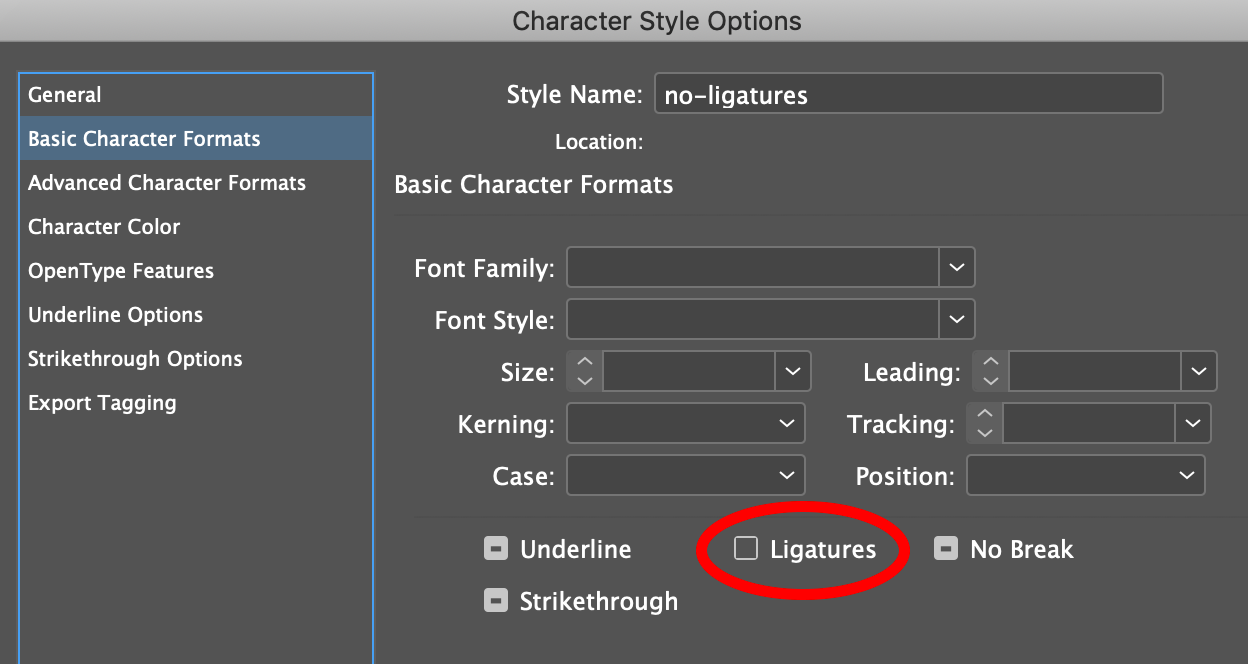
Create a character style called "no-ligatures". Turn Ligatures off. ie make sure the checkbox is empty like in the image below.

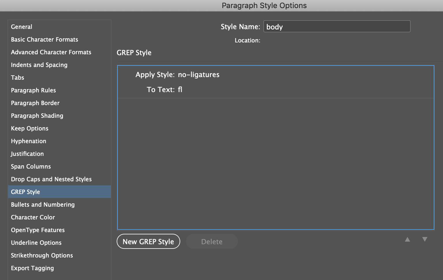
Create a paragraph style and apply it to all your text. Within the paragraph style create a GREP Style that applies the character style to the text "fl".

This should prevent any pairs of "f" and "l" from forming a ligature.
You could also add more GREP Styles to stop other pairs of characters from forming ligatures.
Copy link to clipboard
Copied
Thanks, Michael. The problem is that most of the "fl"-combinations need to be set as ligatures (those who don't are the exceptions). Also, when the fl-pairs are not set as ligatures, their tops collide (which is a problem of the font I need to use).