- Home
- InDesign
- Discussions
- Optical margin alignment (OMA) ignores guillemets ...
- Optical margin alignment (OMA) ignores guillemets ...
Optical margin alignment (OMA) ignores guillemets :-(
Copy link to clipboard
Copied
Hi there!
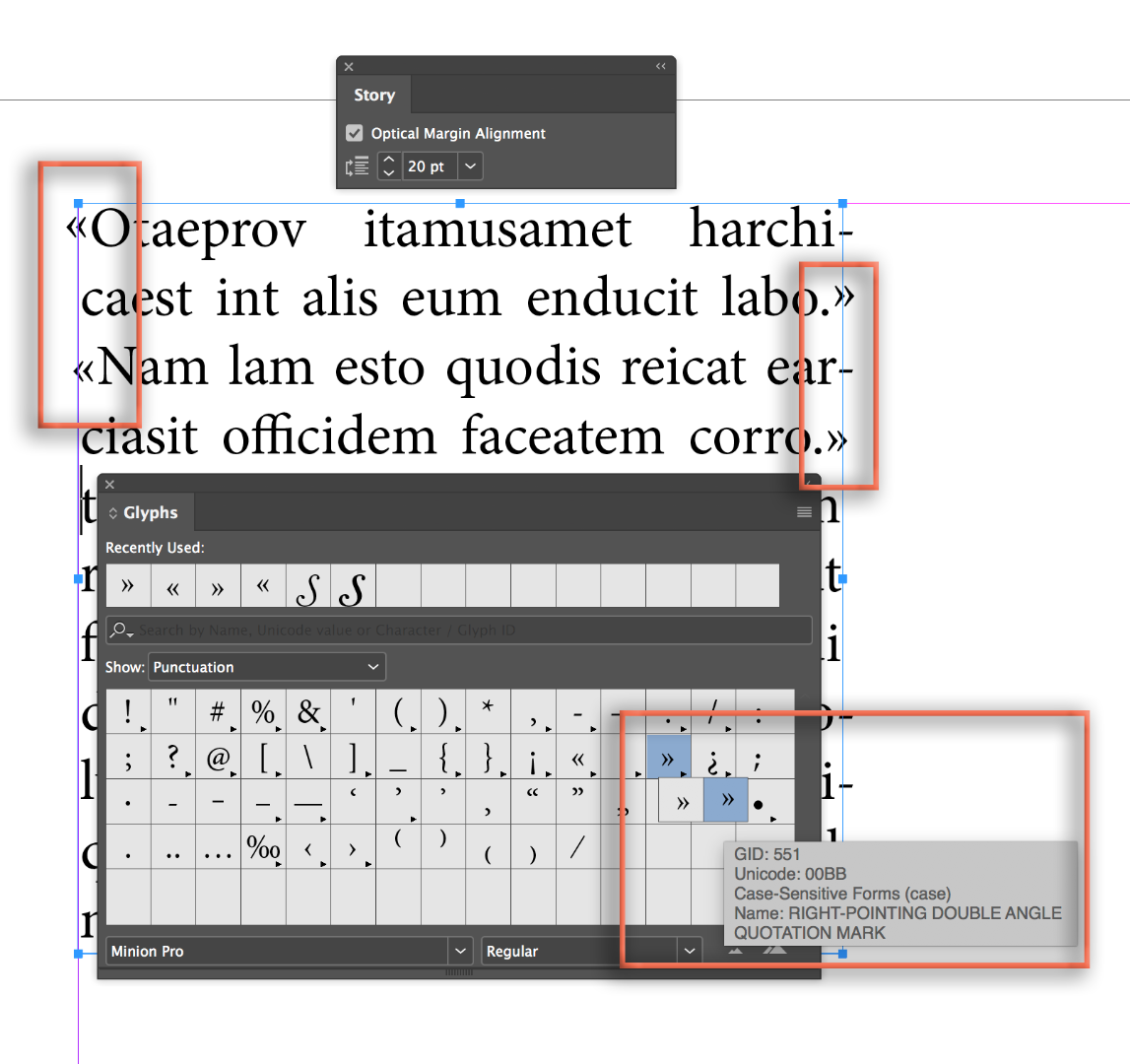
It seems to me that some glyphs are excluded from the optical margin alignment (OMA). I’ll try to attach a screen shot in order to demonstrate OMA’s good job with . and -, and sort of poor job with » and «.
How can I deal with that problem?
Thanks –
Klaus

Copy link to clipboard
Copied
Hi Klaus,
Such a good question and I wonder why it hasn't come up before. In playing around, I see that the various fonts I tried have two different guillemets: one is baseline aligned and the other is set higher. In my image below, the baseline-aligned ones are used second.
Edit: both are hanging, but the case-sensitive ones extend further. So is it font-related?

Here is the same text with Optical Margin Alignment turned off.

~Barb
Copy link to clipboard
Copied
And those that are above the baseline are not even the ones normally keyed in. They are named guillemotleft.cap and guillemotright.cap and are used in case operations.
It would be best if ID had the same capability as QXP always has had...being able to make sets of characters to apply OMA to. (One can literally add any character in a font if one is crazy enough to.)
Copy link to clipboard
Copied
Thanks, Mike. I've been reading about them since my post. I don't need to use them in my work, and none of my students have asked me about them, so I'm trying to get up to speed.
~Barb
Copy link to clipboard
Copied
Hi Barb,
I do some publications from the Continent that uses them (and inward pointing ones). And UK ones that quote Continental work.
I do not understand why ID would hang the *.cap varieties and not the standard ones. I haven't loaded text using Minion Pro to see what happens here, and then switch out various fonts and see if any work using the normal code points. Sounds like something to twiddle-away some time over the weekend.
Mike
Copy link to clipboard
Copied
Thanks for your reply.
I tried de-activating/activating OMA. Gives me the impression, that » and « are very well affected, but at a very tiny degree.
The font is Adobe Garamont Pro. Should not be the problem as such, I guess.
What surprises me most: Up to now I was believing that ID is simply checking the »shape« of any glyph touching the margins, to decide the degree of alignment for it. Seems I was wrong here ... ![]()
Copy link to clipboard
Copied
I did a test. When the guillemets are used in the Swiss/French style, pointing out, the Optical Margin seemed to move them, although only a little. When the guillemets are used in the German style, pointing in, the Optical Margin Alignment seemed not to move them AT ALL.
Fascinating.
Copy link to clipboard
Copied
Yes, can be confirmed from my side. Although I’d say that shifting the outward pointing guy a bit further than his inward pointing brother is OK, in general.
Another screen shot:

Copy link to clipboard
Copied
What I want of course looks a little bit like this:
Copy link to clipboard
Copied
Ich sehe es so, wie es ist, korrekt an. Es ist ja eine optische Ausrichtung und nicht eine Hinausrichtung von An- und Abführungen. Wir in Deutschland, Österreich, Südtirol und Dänemark nutzen diese Form der Apostrophe genau umgekehrt, wie der Rest der Welt, die auf diese Form zurückgreift. Lediglich spitze oder runde Formen müssen oder sollen bei einer optischen Ausrichtung nach außen ragen. Das wäre bei den konservativen Apostrophen, „…“, der Fall, bei den »…« natürlich nicht.
Copy link to clipboard
Copied
Well, I disagree, Willi. OMA’s effect towards a smooth optical margin appearance is currently impaired if it comes to guillemets. Lines ending (or beginning) with guillemets are treated significantly different than those ending (or beginning) with quotation marks, hyphens etc

Copy link to clipboard
Copied
This is a screen shot from QXP where I have defined hanging characters. One can define the percentage and, indeed, have various hanging characters in different percentages for either/both leading or trailing characters sets, all connected with the hanging style.

Mike
Copy link to clipboard
Copied
So, there’s obviously no solution for this other than shifting the guillemets »by hand«? Or, well, some nifty script or something.
Copy link to clipboard
Copied
One year later, with InDesign 14.0.1, this issue is still present.
Copy link to clipboard
Copied
Have you posted a feature request on the InDesign User Voice site. That's the one the engineers and product managers look at and comment on. People can vote on a request to make it more likely. Here's a link:
Find more inspiration, events, and resources on the new Adobe Community
Explore Now

