Hi,
InDesign Colour management is complex and sometimes, given the improper combination of circumstances, what should work does not work. In any case, the preserve numbers/ appearance explanation applies. So, disregarding InDesign not asking in this particular situation, if you paste from one document into another and the software shows a noticeable change of colours, that means that both documents have a different colour profile (either RGB or CMYK). That's called a profile mismatch. The change of appearance is InDesign trying to translate that difference of colour profiles and showing it in the screen.
Depending on the difference between both profiles, the difference could be rather evident or not. If both profiles are very similar OR the destination colour profile is much bigger than the source one, that difference could be not noticeable or almost.
Besides, both profiles can be very similar in size as colour spaces but their aspect could vary (one more yellowish than the other, for instance).
So, what you are seeing, is InDesign trying to show you that in screen.
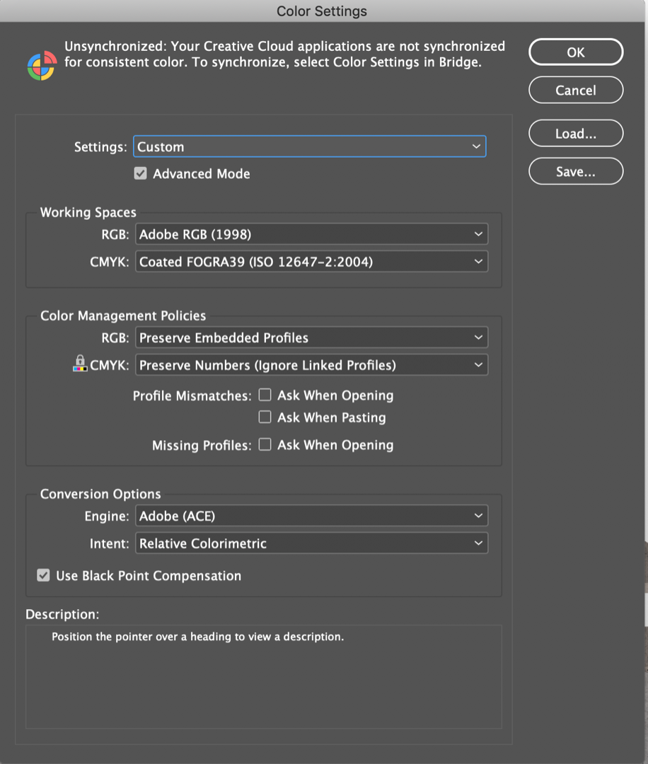
If you want to know the source profiles, open Document 1 and got to "Edit - Convert to profile" and take note of the source profiles for RGB and CMYK. Now got to Document 2 and make the same. Compare. I'd bet RGB or/and CMYK do not match between 1 and 2.
If so... That's is what it is: Colour profiles are different colour spaces. You can think of them as 3D shapes. Some are bigger and some are very limited. Colours are points in those 3D spaces. When you translate between them, sometimes there is no correspondence in those points and InDesign (or Photoshop or...) try their best to adapt that difference with different approaches (rendering intents, but that's way too long to tell now).
To cut a long story short: If the destination colour space is similar, you may adapt the difference in colour with minor tweaks. If not, life sucks and you do not have enough colours in the destination space. Life and colour will be duller. Adapt your design.
Hope it helps somehow


 3
Replies
3
Replies


 AdChoices