bpk101
Inspiring
January 25, 2018
Question

Why is type point size not same as frame point size?

  • January 25, 2018
  • 7 replies
  • 3147 views

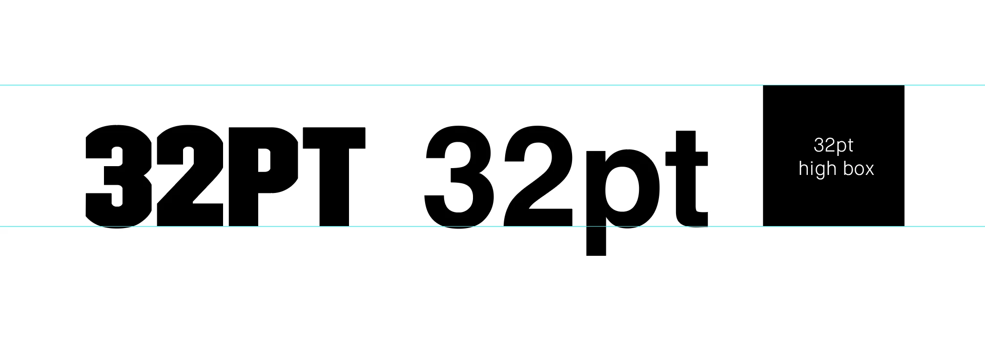
If I type something in a 32pt font, draw a box that is 32pt high and sit them next to each other, neither the cap height or X-height of the type matches the size of the box.

Why is this?

    This topic has been closed for replies.

    7 replies

    Legend
    January 25, 2018

    The way I see it is that this definition of font size made perfect sense when type was little blocks of metal. The type designer made decisions of esthetics and practicality, and made little metal letters which, when assembled into a block, "looked right". Some typefaces will want more "air around them" from an esthetic point of view, and according to their intended use. Other fonts were designed for having not a jot of wasted space, like classified ads, and so sacrificed everything for a tight fit. Cheap paperbacks would use tighter type than luxury hardcovers, and each would choose a type designed for this purpose.

    Some digital designers will have understood and preserved this design ideal. Others won't have understood it, and probably just picked the proportions of some other font, of used the default of some app, right or wrong.

    (Vaguely connected tangent: I was reading about the first printing of Shakespeare's plays, after his death. Academics with a LOT of time on their hands have analysed it to discover which bits were done with which boxes of type, and by which typesetters. Most interestingly, they have shown that printers did not own enough type to set a whole book. A section was typeset and printed. Then the pages were broken up, and the next part typeset and printed, until it was done. An order for a reprint meant repeating the whole process. Perhaps this is common knowledge but it surprised me: I always assumed that made up pages were kept).

    happie_97
    Community Expert
    Community Expert
    January 25, 2018

    Hi bpk101,

    This was a good question so I did some research and found this article https://practicaltypography.com/point-size.html

    It has a lot of useful information. I particularly like the "By The Way" area.

    Legend
    January 25, 2018

    Do you plan to use different fonts? They vary wildly in their relationship to their point size.

    bpk101
    bpk101Author
    Inspiring
    January 25, 2018

    I will have a different font for body but its only this headline font (TRIM) I was hoping to have lock up with the image boxes top and bottom.

    Body copy I'm happy for the bottom to drift off the boxes so long as it aligns across the Cap height.

    bpk101
    bpk101Author
    Inspiring
    January 25, 2018

    I see, thanks for the help.

    I'm trying to develop a modular print grid based on a baseline grid of 8pt.

    Starting with a default type size of 80pt type over 64pt leading (multiples of 8) I was hoping to have a system where further type size options could decrease in multiples of 8 and the cap height and baseline of the type would always lock perfectly in between lines on the baseline grid (as it does with the default 80/64).

    This would then enable the top and bottom of picture boxes that also used the baseline grid to lock perfectly next to the type.

    Unfortunately though the cap height overshoots the top of the boxes (see image)

    If I set the text frame baseline option to 'Cap Height' then the top of the type lines up with top of box (which is good) but not the baseline.

    Would you therefore just align the top of the type with the box and let the bottom of the type drift off baseline ... or is there a better / more correct way of doing this?

    I'd rather not force the type to fit between lines using odd point sizes as it needs to go into guidelines and the rules need to be fairly simple and robust.

    rob day
    Community Expert
    Community Expert
    January 25, 2018

    Derek Cross
    Community Expert
    Community Expert
    January 25, 2018

    These are the correct definitions, though what is the descent line is, in the UK anyway, called the Beard. What is misleading in the illustration, is the amount of space indicated above and below the ascender line and the descender line, it’s normally much less than this; see my earlier screenshot for what is usual. Any additional line spacing added would be the leading, named after the strips of lead that were added to the lines of metal type in the old letterpress days of printing.

    Legend
    January 25, 2018

    You might like to consider what would happen if your wish were true: if the top of the box and the top of the letters were the same. Text Lines, if there was no extra space between them, would overlap each other. Nobody would want that. The measurement systems weren’t designed for the benefit of artists working to fill spaces with type.

    Bill Silbert
    Community Expert
    Community Expert
    January 25, 2018

    The point size for type is something that was established many years ago before there were even computers (is that possible?). It was based on the metal "slug" that a piece of type was cast on and depending on how fragile the letters of a typeface the height of the slug was made taller or shorter to make sure that it would not break apart. Upon the adoption in the industry of computer type the established heights of typefaces was maintained. Thus you will also find a disparity between different typefaces that will not be the same height relative to one another despite being the same point size. You cannot use type height as an accurate measure of how tall the letters actually are.

    Derek Cross
    Community Expert
    Community Expert
    January 25, 2018

    "the height of the slug was made taller or shorter to make sure that it would not break apart"

    I don't recognise that description.

    Bill Silbert
    Community Expert
    Community Expert
    January 25, 2018

    I guess I’m just older than you, Derek. They were still using metal type when I was in college and we were taught all of this.

    Derek Cross
    Community Expert
    Community Expert
    January 25, 2018

    A font size is the measurement in points from the top of the Ascenders to the bottom of the Descenders (not the cap height – unless it's a lining cap only font nor is it of the x-height).

    Doug A Roberts
    Community Expert
    Community Expert
    January 25, 2018

    https://forums.adobe.com/people/Derek+Cross  wrote

    A font size is the measurement in points from the top of the Ascenders to the bottom of the Descenders (not the cap height – unless it's a lining cap only font nor is it of the x-height).

    this is only true if the font has been designed that way. a font might have a taller cap height than ascenders, or it might be arbitrarily small in the em box, or it might have aspects that extend beyond it.

    Doug A Roberts
    Community Expert
    Community Expert
    January 25, 2018

    12pt type (for example) is on a 12pt body.

    Here's a screenshot of a 14pt Font on 14pt body with a 14pt baseline grid:


    the measurement from top of the ascender to bottom of the descender won't be exactly 14 points though. and if you used a different font, it'd be different again.

    i've read others say what you said many times but never understood how it can be meaningfully called the definition of 'font size'.