Exit
  • Global community
    • Language:
      • Deutsch
      • English
      • Español
      • Français
      • Português
  • 日本語コミュニティ
  • 한국 커뮤니티
15

Adjust Colors Ready for Beta Testing

Adobe Employee ,
Mar 07, 2025 Mar 07, 2025

Adjust Colors enables you to make quick and easy hue, saturation, and lightness adjustments to the 6 most prominent colors in your image.


Pixel CTB and Adjust Colors RTT.pngexpand image


HOW TO TEST

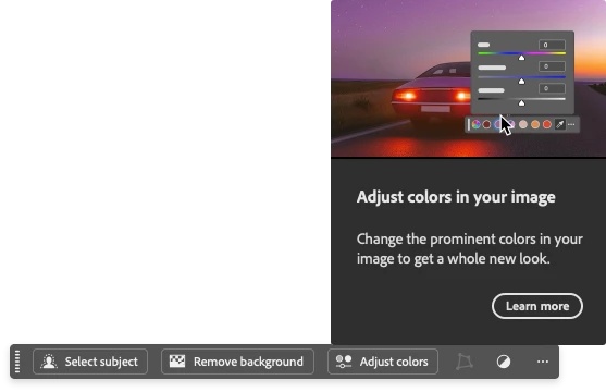
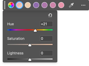
When a "pixel" layer is selected with the Contextual Task Bar enabled, you'll see an "Adjust Colors" button. Clicking it shows the six main colors in your image. You can select a color and adjust its hue, saturation, and lightness. Changes appear instantly on the canvas, and the swatch updates to show the before-and-after colors.


Adjust Colors CTB Popover.pngexpand image


Using the eyedropper tool, you can choose any different color for the swatches. A magnifier loupe appears when you click to help you preview a color. You can reset the colors anytime from the ••• menu on the Contextual Task Bar.


You can also find "Prominent Colors" in the Presets dropdown under Hue/Saturation in the Properties panel.


Other updates to the Hue/Saturation Adjustment in the Properties panel include:

  • Color swatches for RGB, Cyan, Magenta, and Yellow channels
  • Color swatches for the Prominent Colors preset
  • Color swatch for the "Colorize" option
  • Indicators (before/after swatch) for updated channels
  • Improved before/after color bars with a larger, more user-friendly UI

Hue-Saturation Adjustment Adjust Prominent Colors Preset.pngexpand image

PROVIDE FEEDBACK

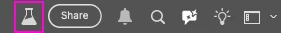
1. Click on the Beaker Icon in the upper right of the Photoshop application:

Beaker 2.pngexpand image


2. Find "Adjust Colors" in the left panel, and provide YES ready to be released or NO not ready to be released. Leave a comment if you have one...

3. Or you can leave a comment in the Beta Forum post.


Adjust Colors Beta Panel.pngexpand image


TOPICS
Desktop-macOS , Desktop-Windows
4.9K
Translate
Report
Community guidelines
Be kind and respectful, give credit to the original source of content, and search for duplicates before posting. Learn more
community guidelines
Community Beginner ,
Mar 10, 2025 Mar 10, 2025

Great work Amy! Will a file saved with the new panels open in previous versions? Thanks!

Translate
Report
Community guidelines
Be kind and respectful, give credit to the original source of content, and search for duplicates before posting. Learn more
community guidelines
Adobe Employee ,
Mar 10, 2025 Mar 10, 2025

Beta is an early feature release app and as such, we recommend that it’s used with test files only. For the most part, the Hue and Saturation adjustment layer is largely compatible with earlier releases of Photoshop.
You can open documents and modify the “Default” color channels, as well as use presets other than “Prominent Colors”.


I included screen capture of how the Prominent colors will show in earlier versions of Photoshop.


Prominent Colors is a new preset that allows color swatches to display both the original and modified colors, capturing Hue, Saturation, and Lightness.


When a Hue and Saturation adjustment layer using Prominent Color preset is modified in the latest release (as of today 26.4.1) or an older version of Photoshop, the changes will be applied and retained on the imaged when the document is opened in Beta. However, the swatch colors will show the Hue at 100% saturation.

Translate
Report
Community guidelines
Be kind and respectful, give credit to the original source of content, and search for duplicates before posting. Learn more
community guidelines
Community Beginner ,
Mar 10, 2025 Mar 10, 2025

For Hue/Saturation adjustment layer, when I add a new one, the red color swatch it is selected by default, not the first one(the one for all), it is a bug or a feature?, because now I have to give 1 click more to do same job that I did before(change saturation for all colors).

Translate
Report
Community guidelines
Be kind and respectful, give credit to the original source of content, and search for duplicates before posting. Learn more
community guidelines
Adobe Employee ,
Mar 10, 2025 Mar 10, 2025

Hi @pigulici cosmin this is currently a bug, we will fix the issue soon!

Translate
Report
Community guidelines
Be kind and respectful, give credit to the original source of content, and search for duplicates before posting. Learn more
community guidelines
Community Beginner ,
Mar 16, 2025 Mar 16, 2025

Regarding the default selection, would this affect existing Photoshop Actions that use the Saturation adjustment layer? For instance, I have actions that desaturate all colors in a selection, and other actions that desaturate certain color ranges in a selection. Will these actions using the Saturation adjustment layer continue to perform as they have?

Translate
Report
Community guidelines
Be kind and respectful, give credit to the original source of content, and search for duplicates before posting. Learn more
community guidelines
Adobe Employee ,
Mar 16, 2025 Mar 16, 2025

HI @Nathan REP we are working towards 1:1 Actions parity with the legacy Hue/Saturation adjustment. With that said, we are working on several bugs we found (extra "unknown" entries in the recorded action, and some issues with the new Prominent Colors recorded action. We are currently working on all the actions bugs and they should make it into the Beta build in the next 2 weeks. 

Translate
Report
Community guidelines
Be kind and respectful, give credit to the original source of content, and search for duplicates before posting. Learn more
community guidelines
New Here ,
Mar 10, 2025 Mar 10, 2025

Amazing Amy 👑

Translate
Report
Community guidelines
Be kind and respectful, give credit to the original source of content, and search for duplicates before posting. Learn more
community guidelines
New Here ,
Mar 10, 2025 Mar 10, 2025

Hi Amy - I've loaded a photo in via Lightroom as a TIFF and the Adjust COlors does not show up in the contextual bar. It does show up when I open directly in Photoshop e.g. from a JPG.  Is there some color spaces or modes that prevent me seeing it when I launch via Lightroom Classic?  Thanks.

Translate
Report
Community guidelines
Be kind and respectful, give credit to the original source of content, and search for duplicates before posting. Learn more
community guidelines
Adobe Employee ,
Mar 10, 2025 Mar 10, 2025

@Paul26231103atwu Yes there are modes where Adjust Colors does not work (because the Hue/Saturation Adjustment is not supported): Grayscale, Multichannel, Bitmap, and Duotone. 


I tested both LIghtroom and Lightroom Classic with the following steps and saw the Adjust Colors option on the Context Bar. Let me know if I have the steps wrong...


1. Open the image in Lightroom Classic > Right-click on the image > Edit in Photoshop

2. Tif image opens in Photoshop > Background layer is selected > Context Bar with Select Subject, Remove Background, And Adjust Colors is visible. If the Context Bar is not visible > Go to Window > Contextual Task Bar.


You could test to see if your Lightroom file has the Hue/Saturation adjustment available. If so, you can see the Adjust Colors feature by selecting the "Prominent Colors" preset.


Translate
Report
Community guidelines
Be kind and respectful, give credit to the original source of content, and search for duplicates before posting. Learn more
community guidelines
New Here ,
Mar 10, 2025 Mar 10, 2025

Great explanation. Looking forward to this being promoted to the release version. I will practice and patiently wait.

Translate
Report
Community guidelines
Be kind and respectful, give credit to the original source of content, and search for duplicates before posting. Learn more
community guidelines
New Here ,
Mar 10, 2025 Mar 10, 2025

This sounds like a really nice feature, but as a partially color blind person, the old way in which the colors were also labeled with text, was very reassuring for me (and i'm sure the rest of people with this problem). So i guess what i'm saying is that if you guys decide to go this "visual" way, it would seriously need a label somewhere around those bubbles, so that people with (partial) color blindless would know what they are adjusting.

Translate
Report
Community guidelines
Be kind and respectful, give credit to the original source of content, and search for duplicates before posting. Learn more
community guidelines
Explorer ,
Mar 11, 2025 Mar 11, 2025

As someone who is also colour blind, I would also like to see colour labels

Translate
Report
Community guidelines
Be kind and respectful, give credit to the original source of content, and search for duplicates before posting. Learn more
community guidelines
Adobe Employee ,
Mar 13, 2025 Mar 13, 2025

@Horia Bogdan and @PaulTerry we are discussing how to provide the color labels on the swatches...stay tuned...

Translate
Report
Community guidelines
Be kind and respectful, give credit to the original source of content, and search for duplicates before posting. Learn more
community guidelines
Explorer ,
Mar 13, 2025 Mar 13, 2025

Thank you ❤️

Translate
Report
Community guidelines
Be kind and respectful, give credit to the original source of content, and search for duplicates before posting. Learn more
community guidelines
Community Beginner ,
Mar 16, 2025 Mar 16, 2025

As a suggestion, perhaps just add back in the dropdown selection for color, thus allowing both ways to select colors: by visible colors (new in beta) or from explicit selection (old, existing way).

Translate
Report
Community guidelines
Be kind and respectful, give credit to the original source of content, and search for duplicates before posting. Learn more
community guidelines
New Here ,
Mar 11, 2025 Mar 11, 2025

Amazing work Amy!

Translate
Report
Community guidelines
Be kind and respectful, give credit to the original source of content, and search for duplicates before posting. Learn more
community guidelines
Engaged ,
Mar 11, 2025 Mar 11, 2025

I understand that this follows the recent trend of increasing discoverability in Photoshop and making the interface more user-friendly. However, for more experienced users—or at least for me—these changes are not always for the better. The pure color swatches can be distracting when working with color. I'm not a fan of including areas of solid, pure color anywhere in the interface of design/photography software—human color perception is already deceptive enough without these additional obstacles.

That said, what bothers me the most is that the panel is now taller, which disrupts my workspaces (I'm attaching an image comparing one vs the other). It’s not the end of the world, but I’d rather keep the old format and save screen space. Perhaps a "Classic Mode" toggle could be added to the fly-out menu? The new features could be kept in the contextual task bar, while allowing us to keep the compact panel size. Or, while not ideal, at least allow us to hide the options in the lower area of the panel under a collapsable section with a disclosure triangle/arrow. But I guess that will depend on user feedback.

In any case, thanks for your efforts to improve the program.
huesat.pngexpand image

Translate
Report
Community guidelines
Be kind and respectful, give credit to the original source of content, and search for duplicates before posting. Learn more
community guidelines
Adobe Employee ,
Mar 13, 2025 Mar 13, 2025

@Carlos_Oliveras we are reducing some of the vertical height of the panel, hopefully, it will be noticeably better. 

Translate
Report
Community guidelines
Be kind and respectful, give credit to the original source of content, and search for duplicates before posting. Learn more
community guidelines
Explorer ,
Mar 11, 2025 Mar 11, 2025

Really good.AThe The new options greatly improve the workflow and the colour bars are easier to see.
I can't wait for it to be implemented

Keep the good work

Translate
Report
Community guidelines
Be kind and respectful, give credit to the original source of content, and search for duplicates before posting. Learn more
community guidelines
Participant ,
Mar 11, 2025 Mar 11, 2025

Hi! I think it would be good to label with the name of each color each of the circles and, take more advantage of the space of the panel. It's not bad though. Cheers!

Translate
Report
Community guidelines
Be kind and respectful, give credit to the original source of content, and search for duplicates before posting. Learn more
community guidelines
Adobe Employee ,
Mar 13, 2025 Mar 13, 2025

We are working on it! Thanks for the input!

Translate
Report
Community guidelines
Be kind and respectful, give credit to the original source of content, and search for duplicates before posting. Learn more
community guidelines
Explorer ,
Mar 13, 2025 Mar 13, 2025

 .

Translate
Report
Community guidelines
Be kind and respectful, give credit to the original source of content, and search for duplicates before posting. Learn more
community guidelines
Participant ,
Mar 15, 2025 Mar 15, 2025

Thanks to you.

Translate
Report
Community guidelines
Be kind and respectful, give credit to the original source of content, and search for duplicates before posting. Learn more
community guidelines
Community Beginner ,
Mar 12, 2025 Mar 12, 2025

All good to see some updates to the UI of Hue/saturation, all welcome, and the auto prominent colors is a very nice and useful addition.

While there is being work being done on Hue/Saturation i would really like if the saruration method that Hue/Sat is using was updated to the same as is being used in the Vibrance/Saturation effect, Camera Raw and Lightroom.
The one used in Hue/Sat is really really really bad, and brings so many errors out in low saturated areas of an image if you raise the saturation. This becomes even worse if you adjust the lightness value at the same time.
Lowering saturation you can see that all RGB channels are weighted equally and this is so far from how humans percieve an image, and it will also make the desaturated image very bland.

Use the MUCH better saturation method that is already in use elsewhere in Adobe apps, and have a checkbox to toggle "Use Legacy Saturation" mode (like there is for the Brightness/Contrast effect)

to make it very obvious here are some example images

Translate
Report
Community guidelines
Be kind and respectful, give credit to the original source of content, and search for duplicates before posting. Learn more
community guidelines