Copy link to clipboard
Copied
Hello everyone!
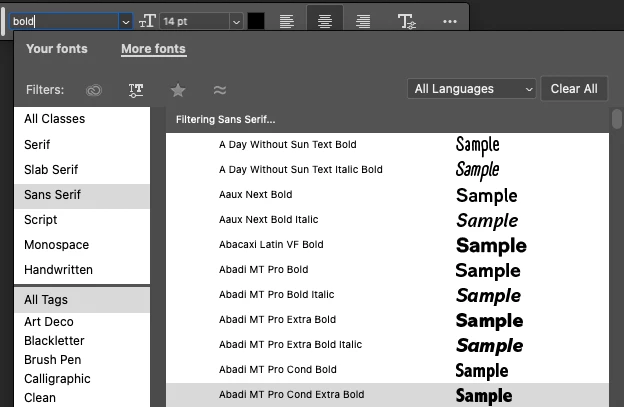
Wanted to provide an update on some of the latest Font Browser improvements that are now available in the Photoshop beta.
Please give these new changes a try and let us know if you have any feedback on how we could improve the font browser!
Thanks!
Pete
Copy link to clipboard
Copied
Thanks for the update, Pete! The extended view and variable fonts integration are fantastic additions. It's great to see Photoshop continuously improving workflow efficiency, especially with the new filter and search options. Looking forward to exploring these features in my next project.
Copy link to clipboard
Copied
That's a very nice update.
One observation I have, something that is actually also in current release, is that the browser dynamically adapts to the amount of information to display. It always prefers showing the browser on the bottom of the dropdown menu unless there isn't enough space. This is causing the entire browser to greatly jump back and forth when you switch filters making it super annoying to use.
Perhaps it would be a good idea to always put the browser at the top of the dropdown menu if that menu lives in the bottom half of the screen position wise, whether that is the menu from the Properties Panel or the small floating panel.
As second adjustment I would probably also opt for a fixed UI size when the dropdown menu is in the bottom half of the screen. So regardless of amount of content shown so that the columns stay in place removing the need to keep reorienting yourself every time you have clicked one of the filters. This whole dynamic size adjustment only works well if the UI doesn't need to move up or down.
Another awkward thing I spotted is that the menu appears on your second display if the panel is at the edge of the screen on the second display's side. It would be nice if it treated a maximized Photoshop application as 'single screen' opening up the browser on the inside.
Copy link to clipboard
Copied
Great feedback, bugreports, and observations @Shebbe .
I've logged a couple bugs around the font browser jumping upwards or downwards and the dual display issue, both if which scenarios I've been able to reproduce. We'll take a look at those!
Thanks again and glad you like the updates so far! There's more to come! Stay tuned.
Regards,
PG
Copy link to clipboard
Copied
@Shebbe FYI that this jumping above or below behavior should be fixed in the latest beta releases. I notice that if the font browser is opening upwards, there may still be some font browser changes in size depending on the results of the selected filter that might cause you to need to move the mouse to the new class/filter location.
However, If you position the task bar to a position where it opens below, these resizes of font browser window won't affect the location of the Filters.
Copy link to clipboard
Copied
That's a nice little improvement! Thanks for this and notifying us about it.