 Adobe Community
- Home
- Photoshop ecosystem
- Discussions
- Re: 100% zoom is too small on screen (designers do...
- Re: 100% zoom is too small on screen (designers do...
Copy link to clipboard
Copied
Hello, I'm using photoshop CC on amacbook pro retina. I mainly use photoshop for web design and when I open a document that is 300x200 px, the 100% view is too small on screen. Any ideas, It was this way on PS cs6 also before I upgraded. I just tried to delete the prefs file and restarted PS and it did not change. I have also tried to change my screen resolution to "best for retina" and it is still the same.
Steve
 1 Correct answer
...and just for kicks, I started to read from the beginning of this endless thread. It turns out that the whole "problem" was fully explained inside 20 posts or so. The rest of the thread, 360 or so posts by now, is just repetition, over and over and over again.
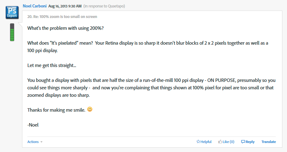
This one, post #20, from Noel Carboni, gave me an acute sense of déjà vu...

And two posts later, he went all in with a detailed and comprehensive rundown on every aspect of high resolution displays. Read it, everyone, please. And when you
...Explore related tutorials & articles
Copy link to clipboard
Copied
One of my favorite posts on this forum, from years ago, was, "I understand all about resolution! It's this 'Pixels-per-inch' business I don't get!"
The poster din't make it out of the thread alive then, either. ![]()
Copy link to clipboard
Copied
Don't forget that Photoshop started out as a Mac-only application. ![]()
Copy link to clipboard
Copied
My comment wasn't intended as a dig against Mac users or to be fodder for a Mac vs. PC debate. It was just an illustration that the point of view of people who regard the correct interpretation of 100% zoom on a display with more than twice the resolution of a "traditional" display as a problem is influenced by the environment in which they live and work. Usually we don't have too many discussions of the form "this is a problem... no it isn't... yes it is..."
You could interpret my message as "Adobe isn't keeping with the Apple philosophy with which they started". They could have, for example, replaced "100%" with "Full Size" or some such.
But mostly I'm saying education that leads to understanding is a Good Thing.
-Noel
Copy link to clipboard
Copied
Think hard about what 100% means... When you can answer "100% of what?" you will understand why it works as it does, and why it is RIGHT.
I have come here with exactly the same issue searching for this answer. "100%" should be showing the size which the image will be displayed on all screens viewing it. When I publish a picture at on my webpage it will show at 100%, therefore I should be able to create my image at 100%, and see it at 100% not at 50%, and view it how it will be viewed at output. THAT is 100%.
My 500x500px at 72ppi file shows in photoshop shows at 5.8cm wide on screen at 100% yet when I view it in preview or email it out the same image shows at 11.6cm wide which is how 100% at 500px has traditionally shown on my all screens in the decade I've been designing across print and digital.
Copy link to clipboard
Copied
Stroke_Oz wrote:
My 500x500px at 72ppi file shows in photoshop shows at 5.8cm wide on screen at 100% yet when I view it in preview or email it out the same image shows at 11.6cm wide which is how 100% at 500px has traditionally shown on my all screens in the decade I've been designing across print and digital.
Yes, and do you understand why? Do you understand that these other applications scale up to 200%?
Do you understand that the higher the screen resolution is, the smaller it gets?
Copy link to clipboard
Copied
Do you understand that these other applications scale up to 200%?
So now you're telling me EVERY SINGLE browser and application scales up to 200% in the history of computer design and all of that has always been the problem and not just this current recent issue of Photoshop displaying at 50% even when your settings are at 100% on a retina display? What is the point of scaling up to 200% when I am setting an image to be displayed at x size. This goes against everything I have ever been taught about photoshop and everything I have been paid to do to create content for the past 15 years.
This problem doesn't happen with photographs used in Indesign, or with vector illustrations. Of course now I have to work with photoshop zoomed to 200% because even with my glasses on I can't work on the graphics at '100%'. I'm getting used to working with pixelated images because they're blown up beyond what I'm setting them at. It's not what I expect of expensive software or hardware. (Don't bother going on about ppi and screen vs print resolutions, I understand all that).
Copy link to clipboard
Copied
It is caused by your fancy 5k iMac screen: every group of four pixels (2x2) is counted as one by the OS and retina compatible software. But Photoshop works with actual pixels, and an image displayed at 100% in Photoshop is around twice as small as when displayed in software which doubles the pixels in a relative sense.
The rules have changed. We have to get used to it.
Copy link to clipboard
Copied
Thanks Herbert. Thank goodness I didn't bother with the retina screen on the Macbook at home, spent the extra money on extra grunt as I already had a larger screen to plug in and work with, I can create things exactly as they're meant to be seen. As for my fancy new work computer... pfft. Sounds like I'll have to get used to it. Which is a shame. As a perfectionist down to the last pixel, I detest having to work like this. I get better visual results on my iPhone software. Will certainly be shopping around next upgrade.
Copy link to clipboard
Copied
Stroke_Oz wrote:
So now you're telling me EVERY SINGLE browser and application scales up to 200% in the history of computer design
No - I'm saying they do it when detecting a high resolution display.
This problem doesn't happen with photographs used in Indesign, or with vector illustrations.
These applications are vector-based and operate by physical dimensions. Photoshop is raster-based and operates by pixels.

Copy link to clipboard
Copied
The fix to this is simple. When you are working on web designs in Photoshop on a retina display, work in retina sized documents. Designers should start producing retina size graphics in adition to normal size ones anyway. So if your design is normally 1000px wide, make your document 2000px wide. That will ensure everything looks nice and smooth. When you are finsihed you just scale down the design before you export the graphics.
Copy link to clipboard
Copied
Actually, designers should have been doing that for a long time already now. It's been possible to zoom in on documents for quite a while. The gestures to do so on a table are extremely natural.
It's satisfying when, say, pondering whether to buy a "widget" when you can zoom in on that "widget" image and see more detail.
-Noel
Copy link to clipboard
Copied
Ideally, 960 pixels would diplay exactly the way they would in a web browser.
Shadows/gradients/text/borders are (should be) elements rendered by our browsers via CSS. The Retina display shows these perfectly.
The following are NOT solutions:
- designing at double size: causes major headaches for the front end guy and designer for pixel perfection
- designing with the "low resolution" checked or looking at it at 200% zoom is just completly inacurate from what the user will see
The only solutions I can find are
- Use another display (which sucks when you need to do things on the go)
- Photoshop gives us a Proof render engine that mimics browsers
I'll keep my fingers crossed that Adobe is working on the number 2 solution.
Copy link to clipboard
Copied
I've got used to using the 'low resolution' mode in Photoshop, it's not ideal but at least you're designing at the correct scale.
I copied this from Apples website:
Problem: I'm noticing functional or visual issues with an application. How can I make it work better?
Resolution: Try opening the application using Low Resolution mode:
1. Quit the application if it is currently open.
2. In the Finder, choose Applications from the Go menu.
3. In the Applications folder that opens, click the application's icon so it is highlighted.
4. Choose Get Info from the File menu.
5. Place a checkmark next to "Open in Low Resolution" to enable Low Resolution mode.
6. Close the window and double click the Application to reopen it.
Note: You may also contact the developer of the application to determine if they are offering an update to the application for the Retina display.
Lol to the last line!!
Copy link to clipboard
Copied
designing with the "low resolution" checked or looking at it at 200% zoom is just completly inacurate from what the user will see
So what does Macintosh have its browsers do to images exactly if an image 960px wide is not displayed as 960 screen pixels wide? Which resampling algorithms do they use?
And if Photoshop simulated that how would this affect »pixel perfection« for the display of the same images on non-retina displays or other output methods?
Copy link to clipboard
Copied
The issue is that the entire document shows up at approx HALF it's size in photoshop.
So what does Macintosh have its browsers do to images exactly if an image 960px wide is not displayed as 960 screen pixels wide?
They are displayed at 960px wide in the browser, but NOT in photoshop, that is the problem.
Which resampling algorithms do they use?
I have no idea what algorithms are used, or what you intend to achieve by asking me this.
And if Photoshop simulated that how would this affect »pixel perfection« for the display of the same images on non-retina displays or other output methods?
The simulation would have nothing to do with other displays. I suggested a "Proofing" view for Retina displays while working in PS. Output is always the same.
Copy link to clipboard
Copied
They are displayed at 960px wide in the browser, but NOT in photoshop, that is the problem.
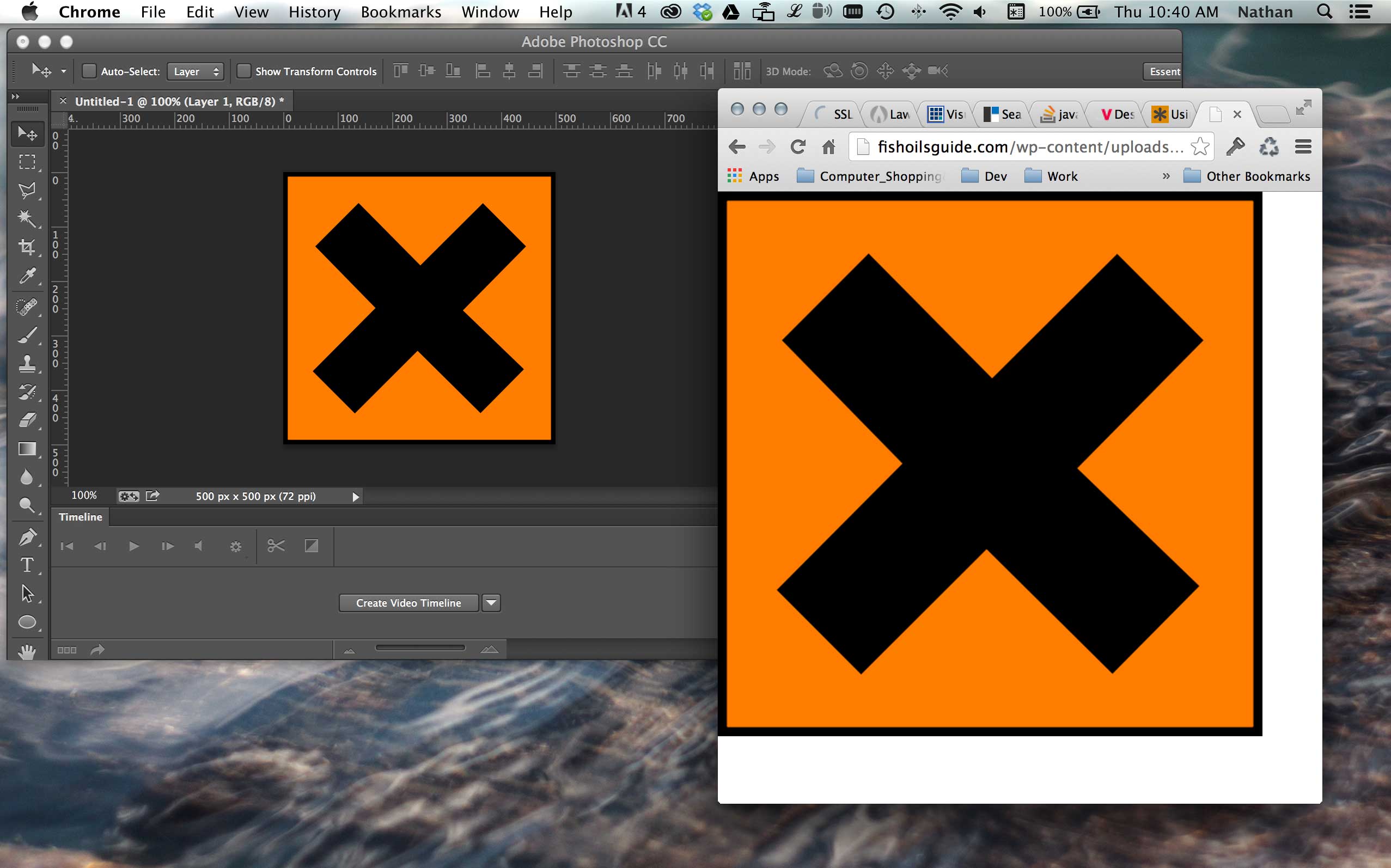
Could you please provide one non-resized screenshot with the image open in Photoshop at View > 100% and in the Browser?
Because from what others had posted it seemed to be the case that Photoshop did indeed display the correct number of screen pixels.
Copy link to clipboard
Copied
Here you go:

Copy link to clipboard
Copied
Thank you!
(edited)
Copy link to clipboard
Copied
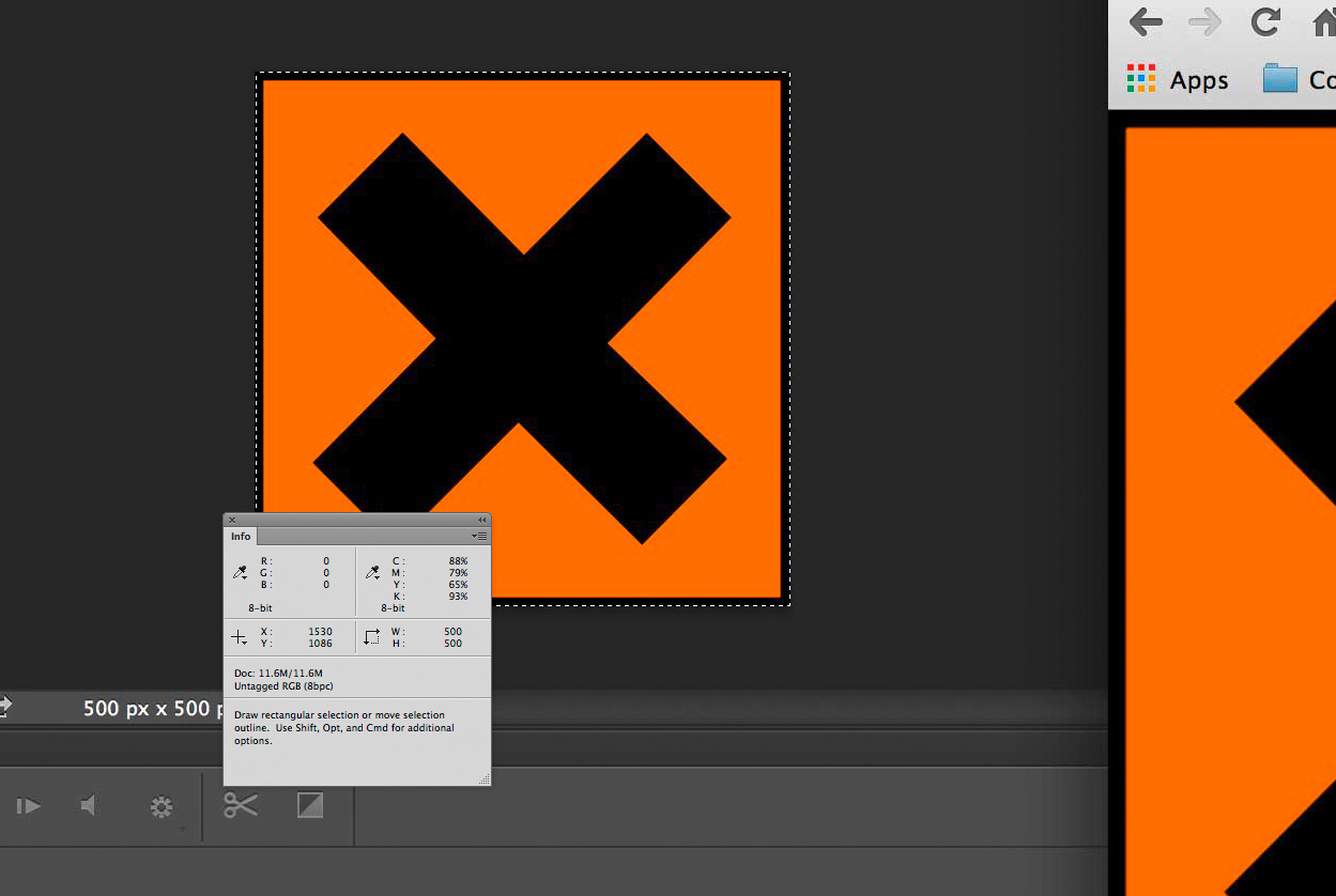
Sorry, it’s indicated in the screenshot anyway, the image is 500px by 500px and that is what the Photoshop display is: 500px by 500px.
In the browser it’s ~1000px by 1000px.
Copy link to clipboard
Copied
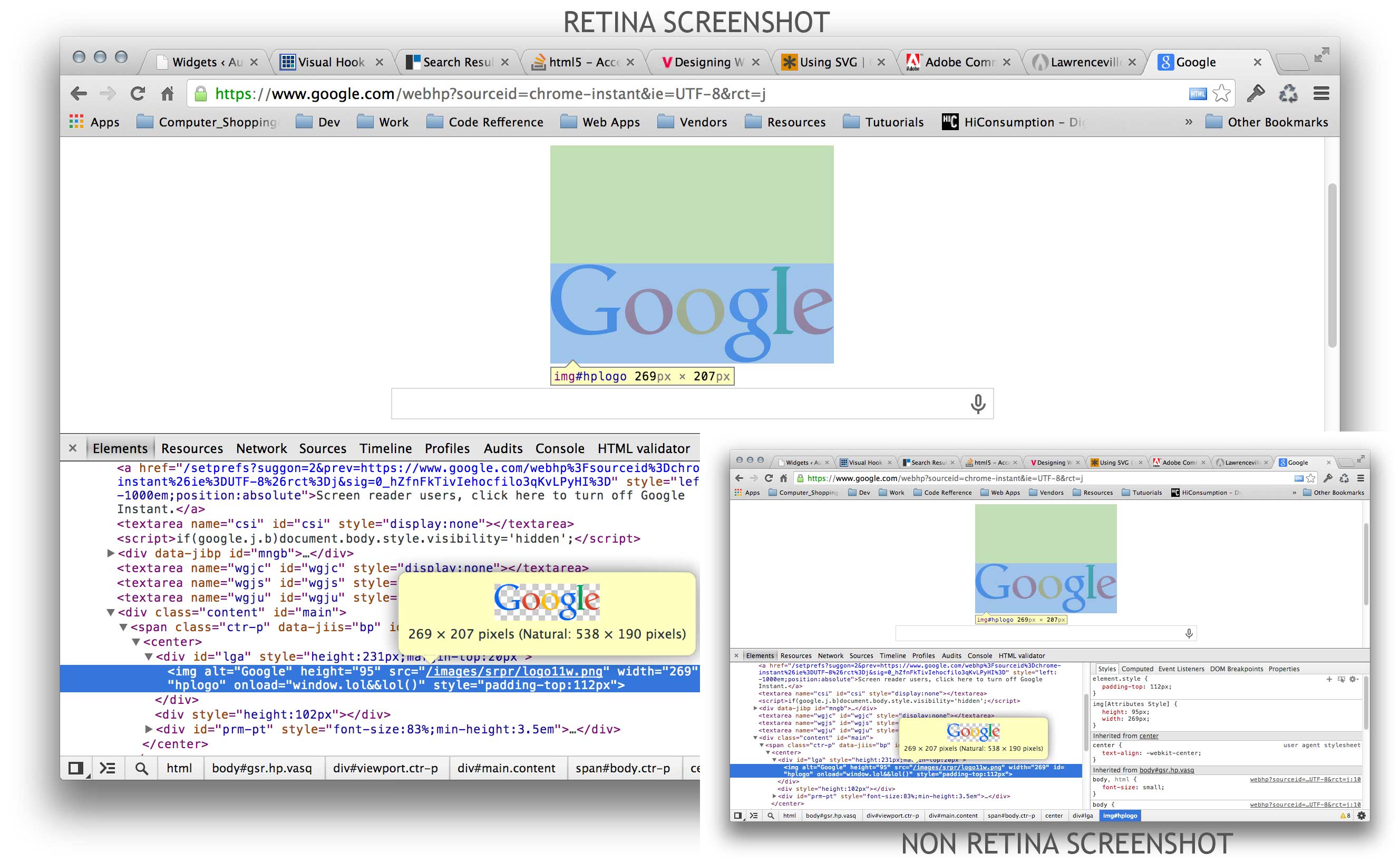
On YOUR screen it is. Here is another example for you. Google homepage Retina VS NON-Retina. The PIXEL dimentions do not change, just the density. This is the exact same window, two screenshots. One is from my Thunderbolt display, the other on the Retina. While designing for web "PIXELS" are (usually) the base unit of measurement.
Hopefully this clearly demonstrates the problem that designing for web is nearly imppossible in Photoshop on a Retina display because Photoshop does not translate the density the way that browsers do.

Copy link to clipboard
Copied
Your statement
On YOUR screen it is.
seems to betray some disconnect.
If you open the screenshot in Photoshop and measure the two different displays of the same image you get the correct number of pixels for Photoshop’s 100% View but not for the browser, do you not?

If you keep talking about pixel measurements you should accept that »Pixel« is not a measurement unit of length, as has been pointed out before.
Copy link to clipboard
Copied
Pixel IS the unit of measuement when working on web. See AaronLea's explanaiton here: http://forums.adobe.com/message/5973784#thread-message-5959717
Copy link to clipboard
Copied
Copy link to clipboard
Copied
Pixel IS the unit of measuement when working on web. See AaronLea's explanaiton here:
As different monitors can have different resolutions (even apart from retina’s higher resolution) how could defining an image’s pixel dimensions guarantee a certain physical size on other web users’ screens?
That Macintosh seems to have decided to display one image pixel as four screen pixels in a browser on a retina display seems to be basically arbitrary as 220 and 227 cannot both be the exact double of every other screens’ resolution.
Anyway, maybe we have different conceptions of what a unit of linear spatial measurement means.
I don’t contest that the Photoshop team should give the feature request you and others in effect make some consideration but I have the impression that you do not fully appreciate the underlying principles.
Copy link to clipboard
Copied
I have no idea what algorithms are used, or what you intend to achieve by asking me this.
When the browser does not display an image of x pixels width as x screen pixels wide then the image would appear to have been resampled.*
If Photoshop is expected to simulate the exact result of that resampling the algorithm needs to be known.
*) Judging from previously posted screenshots that seems to be what happens on Macs with retina displays, which would mean the statement
They are displayed at 960px wide in the browser
is wrong – that’s why I asked you to post a non-resized screenshot to verify my suspicion.

