Copy link to clipboard
Copied
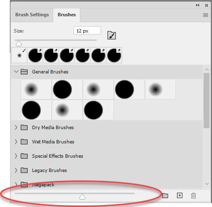
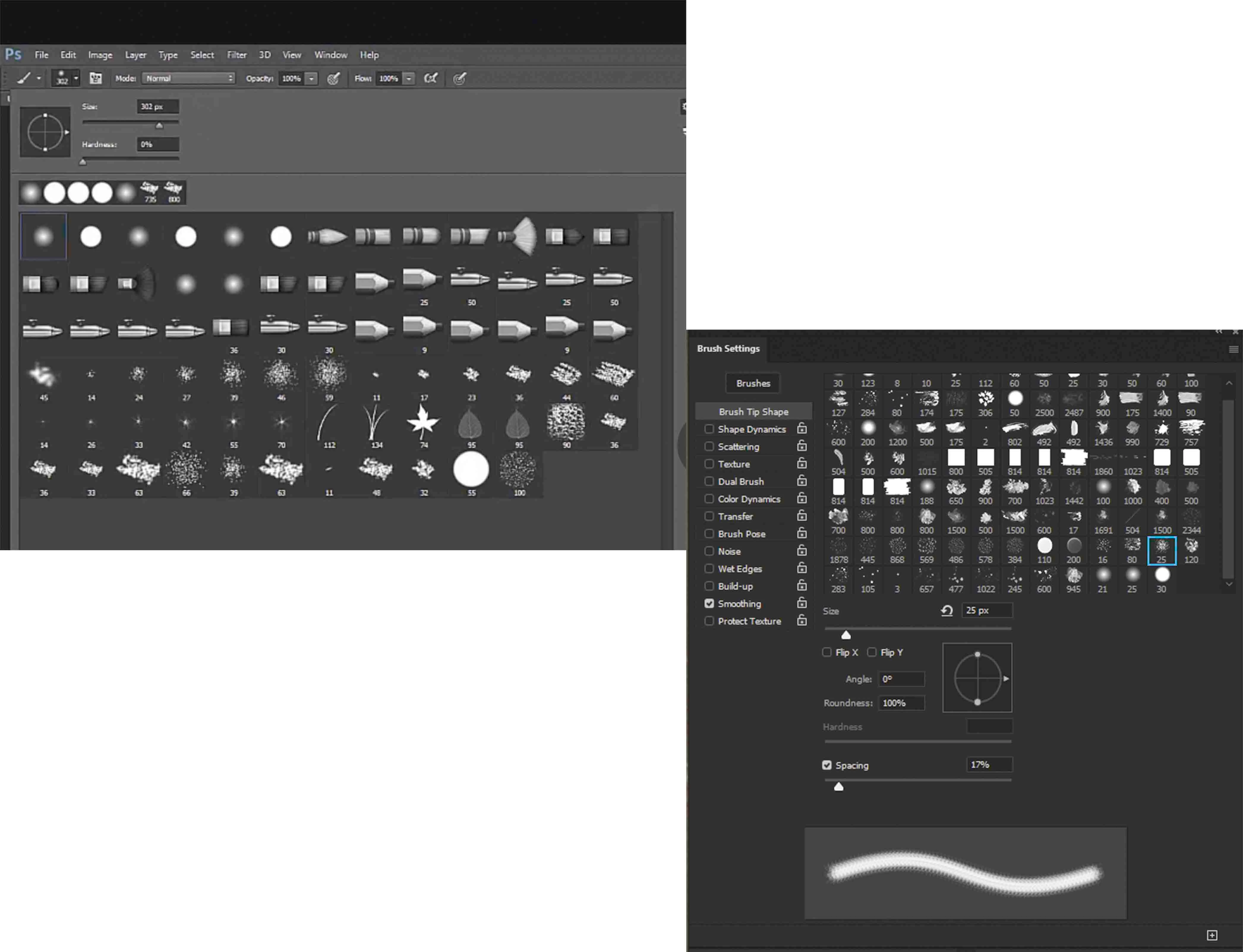
Hello and thanks very much for viewing my post, HOPEFULLY, someone can help me resolve what should be a simple issue.I am using Photoshop Version: 21.0.3 20200115.r.91 2020/01/15 and my issue is tied to brushes. I do not see where I can adjust the size of the brush icons like they are seen in the image on the LEFT. My icons are on the RIGHT and they are simply too small for me.
Please share where I need to go to make teh adjustment, I have looked EVERYWHERE!!
Thanks
On the brushes panel you can adjust the preview size , using the slider at the bottom of the panel
On the brush settings panel you cannot
Dave
Copy link to clipboard
Copied
Hi
You have two different panels open. The one on the left that you chose from the options bar is the Brushes panel.
Here is the Brush Settings panel with the panel menu open. Neither panel menu has an option to change the size of the brush.
You can make a feature request here: https://feedback.photoshop.com/photoshop_family or you can change the resolution of your monitor.
~ Jane
Copy link to clipboard
Copied
And the comparison of the screenshots the two of you posted brings another issue to mind:
Unless one works for video/movies Photoshop’s dark Color Themes are not the right choice.
Copy link to clipboard
Copied
Why is that, C_P?
Copy link to clipboard
Copied
The usual expectable viewing consitions do not justify dark surroundings for print work for example.
I suspect many people just stuck with the dark theme that was made the default when Color Themes were introduced in Photoshop.
Copy link to clipboard
Copied
Only the InDesign Classroom in a Book uses the lighter interface for the printed books, and those books are easy to read. The others take screen shots using the dark interface. If you didn't know what the Swatch icon looked like, would you be able to tell from a tiny dark splotch? These are scattered throughout the book.
Thanks, Dave — I failed to see the slider! 😊
Copy link to clipboard
Copied
Thanks VERY MUCH for your help Dave,that helped to resolve my issue. I prefer a dark background when I work because it helps "me" see colors better.
Thanks Again Dave!!!!
Copy link to clipboard
Copied
You're welcome. Nothing wrong with choosing a dark background if it works for you. Just be aware that it may inadvertently lead to darker images when printing. The histogram tells the truth 🙂
Dave
Copy link to clipboard
Copied
When I read this comment by someone else... "The usual expectable viewing consitions do not justify dark surroundings for print work for example." I giggled a bit and said, here we go again! There's a tendency in the creative community to presume that only one way works. I use a dark background on Lightroom, Photoshop, Corel Painter and "all" of my plugins and other speciality apps because they keep my eye focused on the work and the contrast helps me measure the richness in an image. The brightness of an image is controlled by the content of the image, not by the things around it. I giggled at the comment because either my print lab or my printer software controls the brightness of my images AND, I'm often accused of making images too bright.
thanks again for your help. As a side note, I'm guessing that older versions of PS allowed you to adjust the brush sizes because the image on the left came from a class Im taking and the instruction has all of her brushes in one group where she adjusts the size of all the icons.
Enjoy Your Day!
Copy link to clipboard
Copied
»The brightness of an image is controlled by the content of the image, not by the things around it.«
Human visual perception is notoriously treacherous and it does not necessarily end at the rectanuglar field you want it to.
Would you in truth say these two gradient fields appear exactly the same (when viewed at full size)?
»I'm often accused of making images too bright.«
If the output images are as you intended them to be that would not seem to matter but otherwise there might be a color management issue somewhere in the process (and it may not be on your end).
»There's a tendency in the creative community to presume that only one way works.«
Even when there is more than one way that works that does not mean that every way works equally well.
»the contrast helps me measure the richness in an image«
What do you mean by »richness« in the context of image editing or evaluation?
And out of curiosity: Did you originally actively decide to adpot the dark color theme or did you did you stick with it once it was made the default?
Copy link to clipboard
Copied
It’s not about readability but about against which background images are evaluated.
Copy link to clipboard
Copied
"It’s not about readability"
Hi CP,
My comment on readability was in the printed books about Adobe software when the authors use the dark interface for screen shots and refer to images that you can barely see. Only one author (that I am aware of) uses a light interface for screen shots in her books and it makes a difference. It's a second (separate) issue against the dark interface.
~ Jane
Copy link to clipboard
Copied
Copy link to clipboard
Copied
I agree with c.p. here. The dark background is treacherous, because it makes everything look good. It tends to isolate and "expand" all tonal relationships and hide problems that it would be better to see up front, so that you can address them properly. In particular, it will magically "clean up" muddy highlights to make them appear perfectly acceptable.
The net result is a print that looks dark, undefined and muddy. At least, if you have a dark interface, you should compensate your calibration targets accordingly. You need a much lower white point luminance to maintain a good visual screen to print match.
The dark interface in Lightroom has always been a problem, and I still can't understand why it's not customizable. Most people I know compensate by setting the image backdrop to a light color - but that makes the whole interface a dizzying chaos that confuses the eye even more.
I always compensate in Lightroom by a considerable amount. You really need to pay attention to the histogram, as Dave says.
In a file browser, like Bridge, it's the oppsosite. Here I want to see the potential in a file, so I deliberately keep Bridge dark.
I know this is off topic, but it's an interesting discussion. So this is probably as good a place as any.
Copy link to clipboard
Copied
On the brushes panel you can adjust the preview size , using the slider at the bottom of the panel
On the brush settings panel you cannot
Dave
Copy link to clipboard
Copied
I agree on the light theme for print. With the dark theme the eye adapts and tends to adjust images too dark for print.
Dave
Copy link to clipboard
Copied
The order of replies in this thread is all over the place and a prime example of why nested replies in this forum should go !
On the eye-brain adaptation subject, the centre squares in the cube are identically coloured, measure them and you'll see . They don't look it though.
Dave
Copy link to clipboard
Copied
A quick on line search turned up this example which I like even better. Put your finger over the join between them and you will see that blocks A and B are the same shade of grey.
Funny things eyes and brains 🙂
Dave