• Global community
    • Language:
      • Deutsch
      • English
      • Español
      • Français
      • Português
  • 日本語コミュニティ
    Dedicated community for Japanese speakers
  • 한국 커뮤니티
    Dedicated community for Korean speakers
Exit
0

Advice On Skin Color

Participant ,
Sep 07, 2018 Sep 07, 2018

Copy link to clipboard

Copied

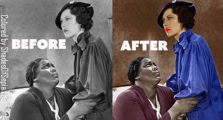
Hi guys, I need some advice on skin color. One on the things I love to do with Photoshop is to color b&w photos. The problem I have is, I always find it more difficult to find a natural looking skin color for Caucasian skin. Is it just a matter of playing with colors, or is there an actual technique used to find the appropriate color? I suspect that my problem is because the image is gray scale, I have I have two colors to work with. Strangely, finding Black skin is way easier for me. Go figure.
ImitationOfLifeBeforeAfter.jpg

Views

5.7K

Translate

Translate

Report

Report
Community guidelines
Be kind and respectful, give credit to the original source of content, and search for duplicates before posting. Learn more
community guidelines

correct answers 1 Correct answer

Community Expert , Sep 08, 2018 Sep 08, 2018

Way to go, Chuck! I tried it by first adjusting the Lab straight line Curves to match the starter CMYK 10,30,50 value and it produced the middle image. Then I tried, without target numbers, to adjust that adjusted middle image to match the color in the top image. In other words, holding to the  a  and b Curve center point and rotating each of those two Curves plus adjusting the L channel (the easy part) finally produced the bottom image. Took forever. Maybe longer. Not as easy as it looks when h

...

Votes

Translate

Translate
Adobe
Guest
Sep 07, 2018 Sep 07, 2018

Copy link to clipboard

Copied

Votes

Translate

Translate

Report

Report
Community guidelines
Be kind and respectful, give credit to the original source of content, and search for duplicates before posting. Learn more
community guidelines
Community Expert ,
Sep 07, 2018 Sep 07, 2018

Copy link to clipboard

Copied

I wrote a Tech Sheet for my students as an introduction to adjusting skin tones and it may be helpful. Be warned: it reflects my personal bias regarding the subject -- for example: working in CMYK.

Skin

Color of skin varies considerably depending upon ethnicity, type and level of illumination, nearby reflective surfaces, and even time of day. The Eastman Kodak Q-60 Color Input Target includes a dozen skin tone reference samples and those are far from the variety we see in one day. As a result, there is no single combination of RGB or CMYK values in Photoshop that produces the only “correct” flesh tone.

We can, however, come up with some guidelines that may be applied when using Curves to correct what we recognize to be unnatural skin color in a digital image. Moreover, since whatever shifted the skin tone away from normal also affected the colors in the rest of the photograph, correcting skin tones with a curve adjustment automatically contributes to correcting other colors throughout the entire image.

Flesh tones are more easily and precisely adjusted in CMYK mode. In that context, satisfactory Caucasian skin tone is rendered when the yellow value of the skin is similar to the magenta – certainly within ten points -- and the cyan is one-third to one-fifth the value of the magenta. More often than not, the yellow is a bit stronger than the magenta, but it is not a hard and fast rule.

For example, c10 m40 y50 k0 is a common combination for light Caucasian skin. Fashion and cosmetic advertising typically reduces those numbers by about 25% -- but the proportion is similar. It is the relationship of the three colors to each other, rather than these exact values, that is the guide here. It provides a general direction for change when the color of a face tends toward lobster, cadaver or ghoul.

Making a skin color change using Curves

baby composite.jpg

1. As mentioned above, flesh tones are more easily and precisely adjusted in CMYK mode. Choose Image > Mode > CMYK Color. While using the Color Sampler tool with the Sample Size in the Options bar set to 3 x 3, position the cursor on a non-highlight part of the face and click. Note that the CMYK values that comprise that skin sample will appear in a separate panel labeled #1 within the Info panel.

2. Choose Image > Adjustments > Curves. Hold down the Cmd+Shift keys and click on the sampler mark in the image. It will seem that nothing has happened but if you look at the Info panel you will see it has added a segment to #1 showing the CMYK values again. Consider them Before and After. As you change the curve, the Info panel will show the change... the After. In addition, you will discover this command also placed a dot on the separate Cyan, Magenta, Yellow and Black curves for you. (Input and Output numbers will appear, as well. They may be slightly different from the numbers in the Info panel for that value. That is not important. It is the Info panel that will be our guide.)

3. Choose a channel from the drop-down menu in the Curves’ Channel field and tap the + key on the keyboard until the marker on the curve turns black.  Use the up or down arrow to move the curve until, in the Info panel, the adjusted value – the After -- for that channel approaches the ratio mentioned above. As you alter the curve, the color of the image will change to reflect it.

4. Proceed from channel to channel and back again as you fine-tune the color, keeping in mind the c10, m40, y50 ratio. Once that relationship has been addressed, additional skin color correction becomes an aesthetic decision. To clear the Color Sampler tool mark, choose that tool and click on Clear in the Options bar.

One final hint: If you are going to err, err to the warm side. Then click OK and return to RGB mode if desired. 

3_faces.jpg

Note: With the Caucasian color ratio as the starting reference, Black skin tone composition is typically a stronger in both cyan and magenta. Often the cyan increases to about half of the magenta value. In addition, any touch of black can be considered part of the cyan calculation. The result is an enormous array of tans and rich browns. Asian skin tones, and there are many, are a bit stronger in yellow and cyan than the Caucasian example cited.

skins.png

Votes

Translate

Translate

Report

Report
Community guidelines
Be kind and respectful, give credit to the original source of content, and search for duplicates before posting. Learn more
community guidelines
Community Expert ,
Sep 07, 2018 Sep 07, 2018

Copy link to clipboard

Copied

Norman - excellent tutorial.

I wish we had, in Photoshop, the vectorscopes used in After effects and Premiere. They have a skin tone line which makes it easy to move the Hue onto that line and get a good tone. Dark and light skin both sit on the line

I used Lumetri colour correction in AE to tweak the two skin tones onto that line with the result below

ImitationOfLifeBeforeAfterCorrected.jpg

Dave

Votes

Translate

Translate

Report

Report
Community guidelines
Be kind and respectful, give credit to the original source of content, and search for duplicates before posting. Learn more
community guidelines
Participant ,
Sep 07, 2018 Sep 07, 2018

Copy link to clipboard

Copied

norman.sanders

I think I understand. You know, it almost sounds like you're saying we don't have a choice but to switch to CMYK in these circumstances. When I took a class in PS, my teacher clearly stated that CMYK should only be used with print; and RGB should only be used for images meant to be digitally displayed. So, in a real life situation, you've just pointed out there maybe some reasons to switch to CMYK. Now, out of curiosity, can this possibly cause more problems in terms of our monitors being calibrated differently?

Votes

Translate

Translate

Report

Report
Community guidelines
Be kind and respectful, give credit to the original source of content, and search for duplicates before posting. Learn more
community guidelines
Community Expert ,
Sep 08, 2018 Sep 08, 2018

Copy link to clipboard

Copied

Hi

You don't change monitor calibration or profile when working with CMYK. Your monitor has not changed so it's profile does not change.

The issue with switching to CMYK mode and back again is that any colours in your image that are out of gamut I.e. out of the range of colours that can be contained in the chosen CMYK space, are lost and they do not return when you convert back to RGB. Whether that is an issue depends on the colours in your image.

You can work in RGB but set the info panel to display CMYK values and use targeted Hue and Saturation layers to adjust the colours to bring to the ratios shown by Norman but that is not as easy as adjusting CMYK curves as described by Norman where each adjustment affects a specific value.

Hence my comment that the vectorscope would be useful along with the color controls that we see in the video applocations. They make adjusting a skin tone very easy as you are moving a point to a target line on a scope, effectively adjusting by the numbers albeit in a graphical way and without converting to CMYK.

Dave

Votes

Translate

Translate

Report

Report
Community guidelines
Be kind and respectful, give credit to the original source of content, and search for duplicates before posting. Learn more
community guidelines
Community Expert ,
Sep 08, 2018 Sep 08, 2018

Copy link to clipboard

Copied

Dave is absolutely right. Changing the Mode to CMYK, with its more limited color gamut, is a trade-off and something to consider. On the other hand, in this case, you're in luck. The more limited CMYK gamut should not be a problem since you are beginning with a b&w image. Good.luck! 

Votes

Translate

Translate

Report

Report
Community guidelines
Be kind and respectful, give credit to the original source of content, and search for duplicates before posting. Learn more
community guidelines
Participant ,
Sep 08, 2018 Sep 08, 2018

Copy link to clipboard

Copied

As far as the calibration, I was concerned about other people's computer. But I realized in the end it really doesn't matter. 'Cause unless you're already an artist, I'll bet that most people's monitor isn't calibrated properly anyway. This is really helpful information. It's unfortunate for my my beloved hobby will continue to be a pain in my butt. However, one things for sure, it gives me the opportunity to have a LOT of practice!!!

Votes

Translate

Translate

Report

Report
Community guidelines
Be kind and respectful, give credit to the original source of content, and search for duplicates before posting. Learn more
community guidelines
Community Expert ,
Sep 08, 2018 Sep 08, 2018

Copy link to clipboard

Copied

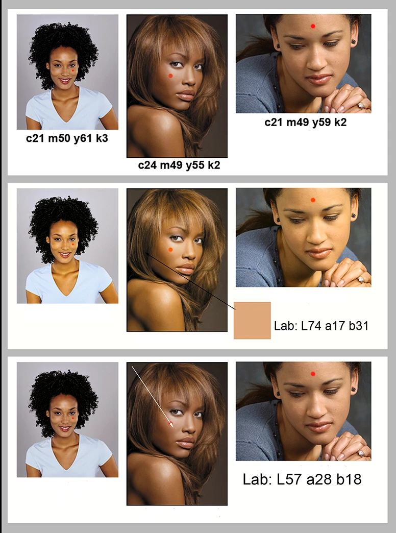
Norman, what about L*A*B*? it doesn't have the gamut issues and the A & B channels can be compared, as the ratio is pretty close:

Votes

Translate

Translate

Report

Report
Community guidelines
Be kind and respectful, give credit to the original source of content, and search for duplicates before posting. Learn more
community guidelines
Community Expert ,
Sep 08, 2018 Sep 08, 2018

Copy link to clipboard

Copied

Way to go, Chuck! I tried it by first adjusting the Lab straight line Curves to match the starter CMYK 10,30,50 value and it produced the middle image. Then I tried, without target numbers, to adjust that adjusted middle image to match the color in the top image. In other words, holding to the  a  and b Curve center point and rotating each of those two Curves plus adjusting the L channel (the easy part) finally produced the bottom image. Took forever. Maybe longer. Not as easy as it looks when holding to the center pivot point and the straight-line a  and  b curves. Yes, it it can be done and something I never tried before (and will never try again). Whew! Thanks.  (Setting the L first was a tremendous help.)  Come to think of it RGB (227, 170, 127) is a CMYK-equivalent starting point. But for me, CMYK is the way to go.

comp.png

Votes

Translate

Translate

Report

Report
Community guidelines
Be kind and respectful, give credit to the original source of content, and search for duplicates before posting. Learn more
community guidelines
Community Expert ,
Sep 08, 2018 Sep 08, 2018

Copy link to clipboard

Copied

Norman, while it might be difficult to correct face tones in L*A*B*, it's not to hard to draw with L*A*B*, which is what I think the OP is doing by colorizing the image. L*A*B* is good to use for color relationships. I did this illustration in L*A*B*, as it was easier to select varying wood colors, that had a some what similar color relationship, much like face tones. Not to mention the actual faces in the image.

Uebele-097.jpg

Uebele-096.jpg

Votes

Translate

Translate

Report

Report
Community guidelines
Be kind and respectful, give credit to the original source of content, and search for duplicates before posting. Learn more
community guidelines
Community Expert ,
Sep 09, 2018 Sep 09, 2018

Copy link to clipboard

Copied

In most cases I personally would suggest setting the colour samplers to CMYK* and/or Lab without the real need to change colour modes From RGB**.

* SWOP; GRACoL; ISO Coated/Fogra39 etc. (common litho sheetfed not newsprint or other device conditions that differ from the CMYK skin tone recipe values)

** For basic curve moves: R=C G=M B=Y

Votes

Translate

Translate

Report

Report
Community guidelines
Be kind and respectful, give credit to the original source of content, and search for duplicates before posting. Learn more
community guidelines
Community Expert ,
Sep 11, 2018 Sep 11, 2018

Copy link to clipboard

Copied

LATEST

Similar to Dave’s #3 post, I think it is interesting to look at the ratio/relationship between the channels in various colour modes using colour sliders. I have placed lines on the colour sliders to illustrate the “shape or spread/distance of the colour components”:

sliders.jpg

Votes

Translate

Translate

Report

Report
Community guidelines
Be kind and respectful, give credit to the original source of content, and search for duplicates before posting. Learn more
community guidelines