- Home
- Photoshop ecosystem
- Discussions
- Re: Background distraction help
- Re: Background distraction help
Background distraction help
Copy link to clipboard
Copied
Hello All!
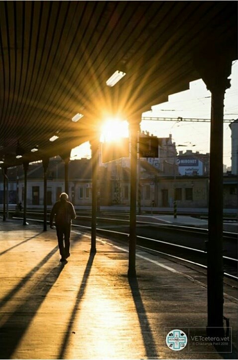
Completely new this forum, but I was told this is the place to go for interact with experienced folk! I really love this image I took this summer. However the background is terribly distracting, what methods can I use to improve it?
1) White advertisement on building: even after clone-stamping it, the colour white is far too loud to not draw attention. How can I tackle this?2) When clone stamping distant objects, the noise or texture in the original image does not copy, while gives a 'painted over' look. Can provide an example if unlcear, but how do I avoid this?

Explore related tutorials & articles
Copy link to clipboard
Copied
Hi there,
As the background of this image looks distracting, you make local adjustments to the background and dull the whites and highlights to make it look less distracting. Local adjustments can be done by using the Adjustment Brush available in the Camera Raw filter.
Please read here to know more: Make local adjustments in Adobe Camera Raw
Regards,
Sahil
Copy link to clipboard
Copied
I would first get the tones close to what I wanted with curves and a mask, and then use content-aware fill or clone.
Copy link to clipboard
Copied

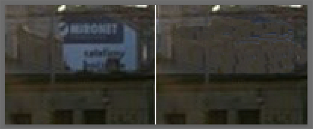
An enlargement of the area of concern is both lighter and blue (with, according to Lab Color, a hint of green).
Using the Clone tool set to Color will not do the job. It should be set to Normal in the Options bar.
This is a quick Clone, adequate in the size posted.
This is a soft image with significant areas of flat tone that provide an assisting texture. (Possibly from an iPhone).
The mood is apparent as is. Authenticity is unimportant. Beyond the correction shown, why not leave it alone.
Copy link to clipboard
Copied
Norman, we talked about the Dodge & Burn tools a few days ago, and how they can be targeted to a specific tonal range. I'm thinking this is an example of where that might be useful. By using the Burn tool set to Shadows, you can darken the background buildings without effecting those nice highlights. In fact you could then use the Dodge tool set to Highlights to brighten up those highlights. I don't know how much it improves the image, but it does what sada asked.

I'm not a big fan of B&W, but this might be an occasion when it works. It has those leading lines into the bright flare of the sun, and your eye then goes back to the bright highlights on the man on the platform. The rails also lead the eye to the figure on the platform. It's a decent image.

Copy link to clipboard
Copied
Trevor.Dennis While I may not agree with the loss for detail in the shadows -- loss of a sense of place -- it sparked something that had been bothering me from the start and you woke me up to it, for which I thank you. The color, in this case, is a distraction. This image would be far more powerful in black & white and in black & white it needs the background detail with the tone adjustment I suggested. I hope the OP agrees.
Copy link to clipboard
Copied
Great shot! Looks like you have some good suggestions on getting rid of those elements.
What about maybe just toning them down a bit?
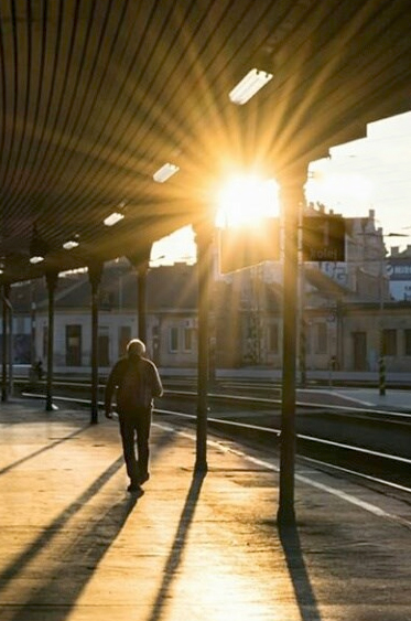
Here I blurred the signs a little and then just added an element on top, dropped the opacity and then played with the blend modes.

I just played with it for 2min, I'm sure you can make it look much better than mine.
Hope you found this helpful! ![]()
Copy link to clipboard
Copied


