Copy link to clipboard
Copied
Hi community.
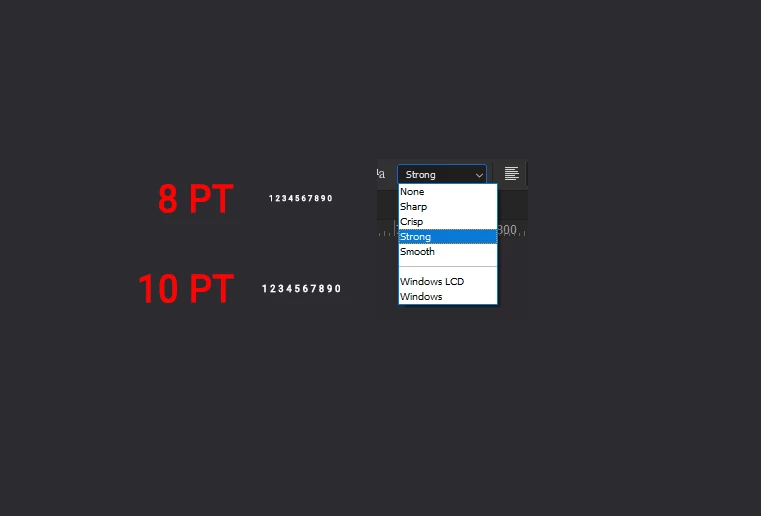
I need to keep my font size for a particular project Im working on around 8 points, but it seems a bit blurry, although I have picked strong as the anti aliasing. I also tried to import from AI a vector font creating outlines, but in PS it still looks not as crisp when its scaled down to 8 points.
Is there a particular font which is good for small scale? and looks sharp and crisp? I noticed that from 10 points and up the font starts to look more clear.
Is this for a print job (if so, what type of printing) or for on-screen viewing (if so, on what devices)?
8pt is pretty hard to read on screen, you MIGHT get away with it with great eyesight and a high-rez screen like an Apple Retina display or iPhone/iPad but IMO it's risky for distribution online..
I'd suggest that the way to find it is to test, try it yourself, that’s how we users here have learned, your own view may differ, so testing is vital as there are no rules in many cases.
As Didier
...Copy link to clipboard
Copied
Hi
"Strong" means the antialisaing is important so it is normal it seems a little blurry.
Try to use Crisp or Sharp instead and it will be less antialiased.
Also it depends ton the targeted output media. For screen 8 pt is rather small and if inverted (white on on black) it is worse.
I would suggest a web font like Roboto and maybe increase the lettre spacing a little…
Copy link to clipboard
Copied
Is this for a print job (if so, what type of printing) or for on-screen viewing (if so, on what devices)?
8pt is pretty hard to read on screen, you MIGHT get away with it with great eyesight and a high-rez screen like an Apple Retina display or iPhone/iPad but IMO it's risky for distribution online..
I'd suggest that the way to find it is to test, try it yourself, that’s how we users here have learned, your own view may differ, so testing is vital as there are no rules in many cases.
As Didier mentioned, black on white looks different to white out of black in terms of legibility too.
I hope this helps
neil barstow, colourmanagement net :: adobe forum volunteer:: co-author: 'getting colour right'
google me "neil barstow colourmanagement" for lots of free articles on colour management
Copy link to clipboard
Copied
@Stefan Cargoski wrote:
I need to keep my font size for a particular project Im working on around 8 points, ...
I noticed that from 10 points and up the font starts to look more clear.
Is it important to your project that the viewers can actually read the text? Or is it required for your project that the typesize is smaller than some people can read?
Creative Pro has several tips:
https://creativepro.com/legibility-and-readability-whats-the-difference/
Penn State has also has a good article:
https://accessibility.psu.edu/fontsizehtml/
Jane
Copy link to clipboard
Copied
One possibility would be to use a bitmap font, which are designed to not need anti-aliasing and still be readable.
Copy link to clipboard
Copied
Going way way back to Courier New takes some beating when it comes to small UI fonts