- Home
- Photoshop ecosystem
- Discussions
- Re: Best way to change colour scheme of a polygona...
- Re: Best way to change colour scheme of a polygona...
Copy link to clipboard
Copied
Hi everyone, I have downloaded a a polygonal design in blue (without layers) but I would like to change and experiment with the colour scheme preferably to a red and grey.
I have tried using a colour overlay but I cannot change the colours specifically. I have also tried recreating shapes but it's really tedious and the colour fade and gradient does not look great at the end. My question, is there an easier way to do this with an image that has no layers? I have attached the image below:
All answers are much appreciated!! ![]()
 1 Correct answer
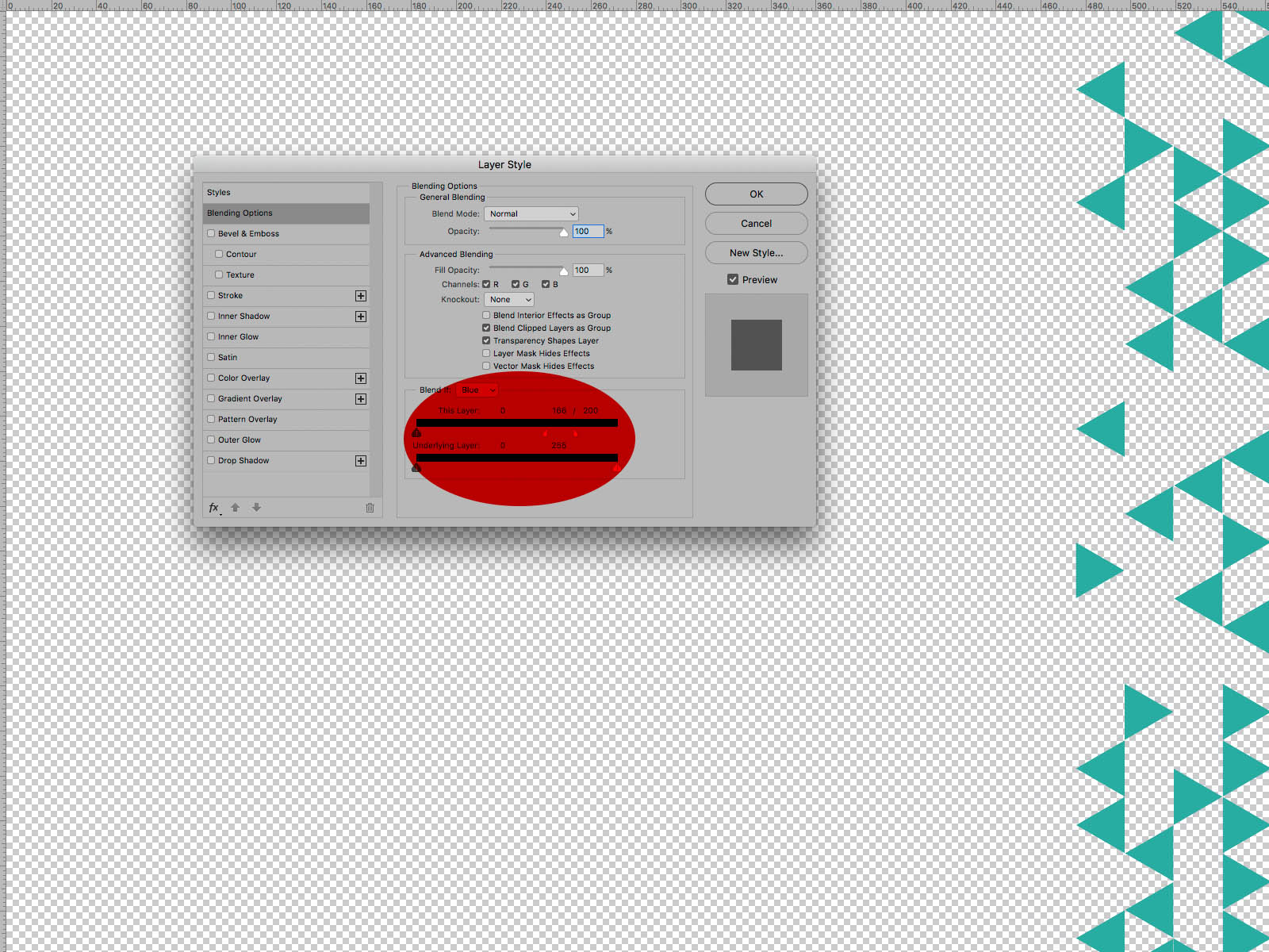
In this case Blend If Setting may also yield fairly decent results in isolating certain areas.

Explore related tutorials & articles
Copy link to clipboard
Copied
Good day!
Try using a Hue/Saturation Layer.
There you can determine the Colour Range an Adjustment should work on.
Regards,
Pfaffenbichler
Copy link to clipboard
Copied
In this case Blend If Setting may also yield fairly decent results in isolating certain areas.

Copy link to clipboard
Copied
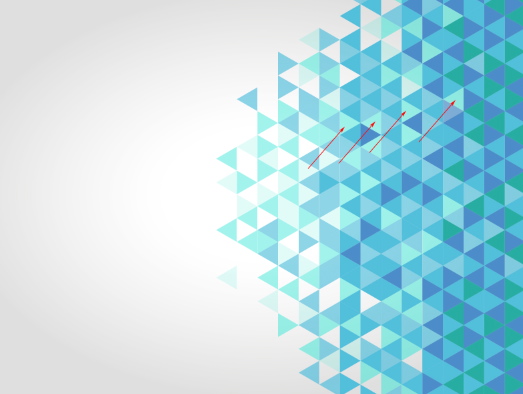
CP's solution would be perfect if the image did not have what seems to be light Radial Gradation superimposed on the mage. It makes the color and/or luminosity levels in the lighter end of the scale almost impossible to isolate even with judicious use of split sliders. ( Amend that: impossible for me. Believe me, I tried.)
In the sample below, changed to Lab Color for precise discrete readings of color and luminosity), the areas marked with arrows differ in both Lightness and color. Small as this difference is, isolating that value and the isolating even lighter ones will make you sweat. In short, blame the Radial Gradation for intruding on CP's excellent solution. If the gradation was not part of the image, it is possible even the Magic Wand, set to appropriate tolerances, might even work.

Copy link to clipboard
Copied
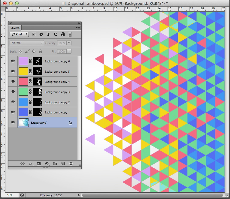
I couldn't leave this alone. Using the Magic Wand and Options bar set to a 3x3 average, tolerance of 12 and noncontiguous I found six plateaus. The Layers panel shows the masks produced. Not prefect but perhaps adequate. Of course, changing any colors (perhaps to reds and grays) in the set is a simple Edit > Fill routine. There was no brushwork on the masks.


