Thanks, Trevor.
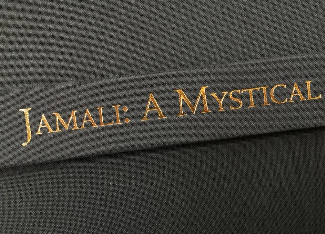
The cover is stamped with foil so it's quite flat with .25" pt or less indentation around each letter. Example from the printer:
This time I found a gold foil texture, and clipped it to the Type layer.
I selected the foild and Type layers and made them a Smart Object so we can apply Layer styles.
To simulate an indented bevel, set Direction to Down.
Note: It might be an idea to hit Reset to Default before applying the bevel & Emboss to rule out previous settings make life hard for you.
So, the centre title uses Bevel down, and upper title Bevel Up.
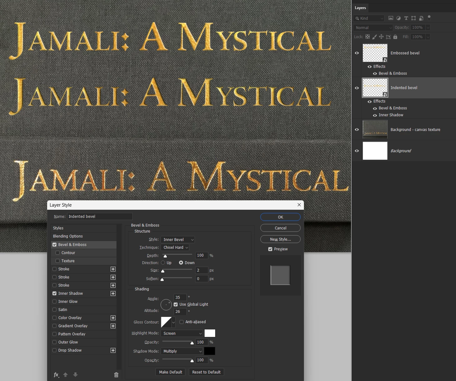
How far do you need to go with this? i.e. the example text shows the canvas texture affecting the font outline.
It's all doable. We can make the foil effect from scratch rather than use stock images. Let us know exactly how you want this to look, and we/I will do our best to show how to do it.
