Inspiring
March 22, 2024
Answered

Cannot get the shading right of a key cap I am designing
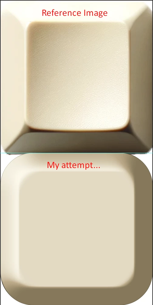
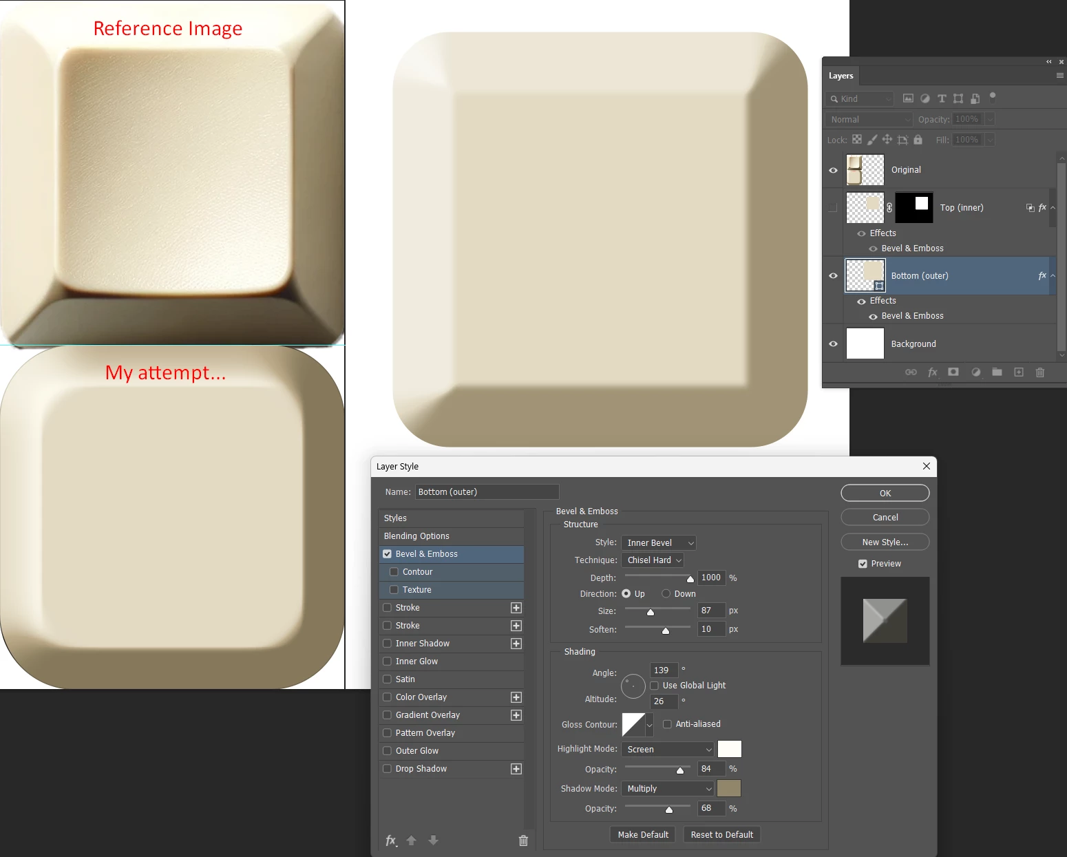
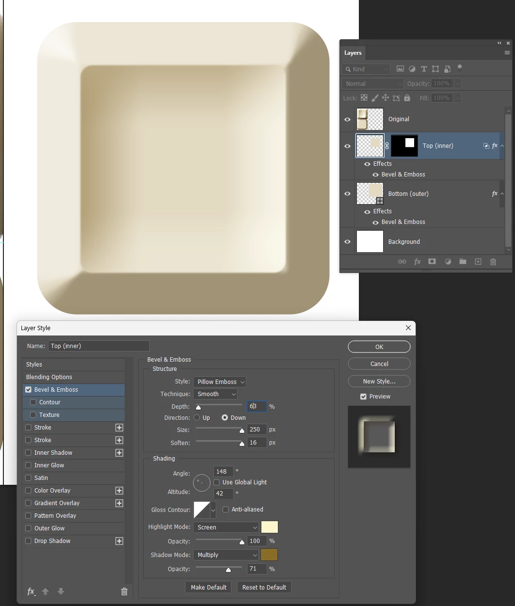
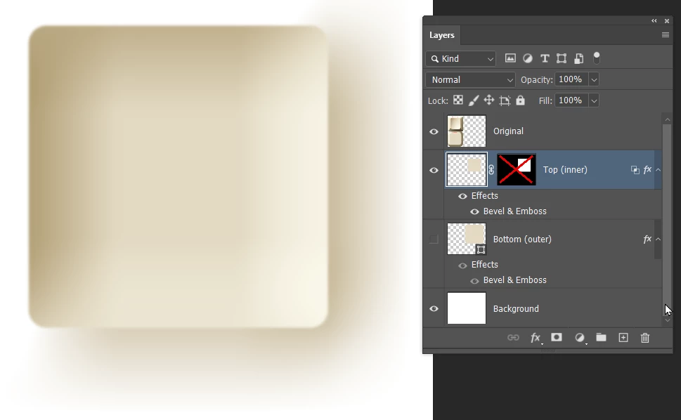
  • March 22, 2024
  • 3 replies
  • 622 views

Hi all,


I have been at this for a while and cannot figure out how can I replicate this keycap design that I have. I have been playing around with Bevel&Emboss, gradeint overlay and other things that I cannot remember, but it still looks completely terrible to the reference image. Does someone have any pointers in what I can do to make it look nice, I cannot accomplish the depth, nor the lighting spot on... 


This topic has been closed for replies.
Correct answer Trevor.Dennis

You need to use two layers because Bevel & Emboss is not one of the Layer Styles we can stack


So lower layer, which is the outer bevel

Upper layer, which is the shallow inner depression.

Things to note with this:

The low value Depth which I have at 63%, and the Altitude.  Both make a big difference.

Note I have a layer mask which is the exact size of the layer.

This prevents spill from the Pillow Emboss.

I have 'Layer mask hides effect' checked in Layer Style panel.

This layer started as a shape, but the outline was too sharp, so I rasterized and blurred it a touch.


3 replies

Trevor.Dennis
Community Expert
Trevor.DennisCommunity ExpertCorrect answer
Community Expert
March 25, 2024

You need to use two layers because Bevel & Emboss is not one of the Layer Styles we can stack


So lower layer, which is the outer bevel

Upper layer, which is the shallow inner depression.

Things to note with this:

The low value Depth which I have at 63%, and the Altitude.  Both make a big difference.

Note I have a layer mask which is the exact size of the layer.

This prevents spill from the Pillow Emboss.

I have 'Layer mask hides effect' checked in Layer Style panel.

This layer started as a shape, but the outline was too sharp, so I rasterized and blurred it a touch.


Trevor.Dennis
Community Expert
Community Expert
March 25, 2024

Note: you can't save multiple layers as a layer style, but when I create something like this, I like to combine the layers as Smart Object, and save it to a Creative Cloud Library.  I mentioned rasterizing the upper layer so I could blur its outline.  I would like to have made that layer a Smart Object before adding the layer style, so I could save the combined layers to a CC Library maintaining the contents as vector objects.


[EDIT]  If you are interested in these sort of effects, you might like to follow the TextureLabs YouTube channel.


Trevor.Dennis
Community Expert
Community Expert
March 25, 2024

Chuck Uebele
Community Expert
Community Expert
March 24, 2024

I would agree that it's too complicated a shape for layer styles. Frankly, Illustrator's mesh gradient would be ideal for this.

c.pfaffenbichler
Community Expert
Community Expert
March 24, 2024

I think that appearance is way too complicated to be approximated with Layer Styles on one Layer.