

- Home
- Photoshop ecosystem
- Discussions
- Centre spread page curl effect?
- Centre spread page curl effect?
Centre spread page curl effect?

Copy link to clipboard
Copied
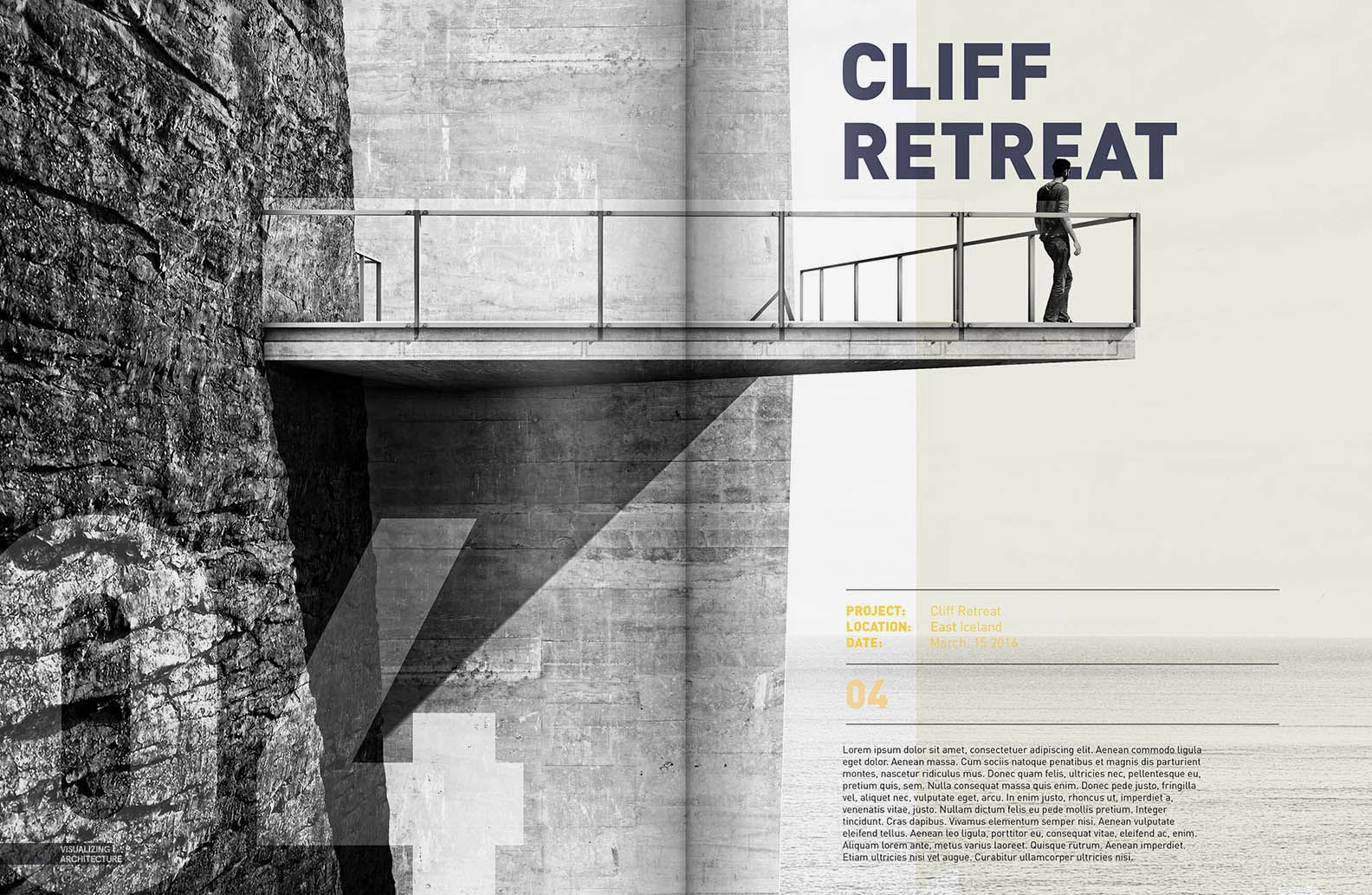
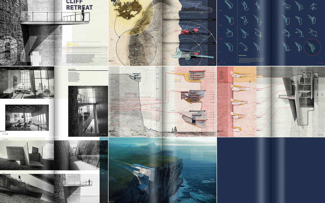
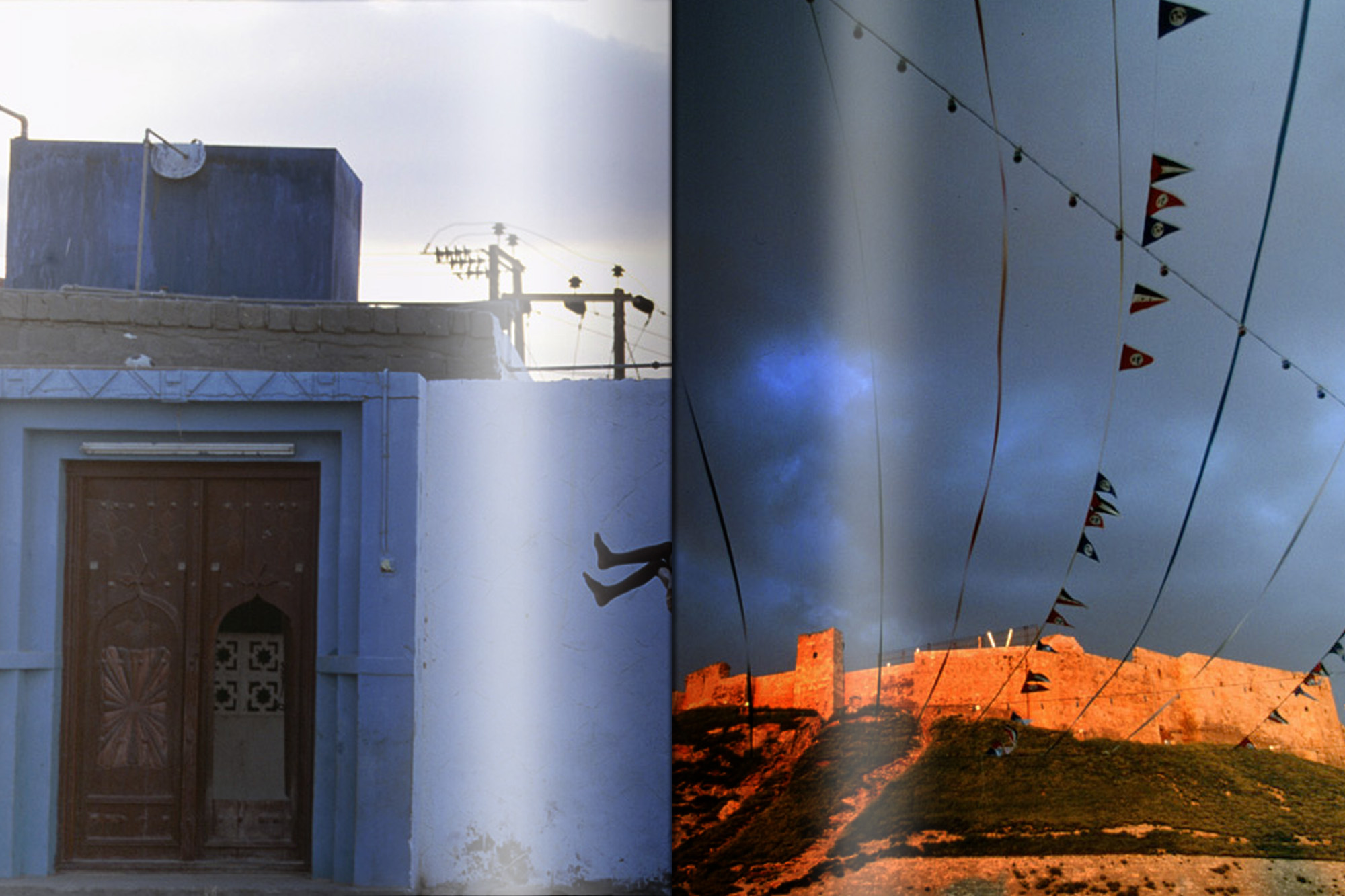
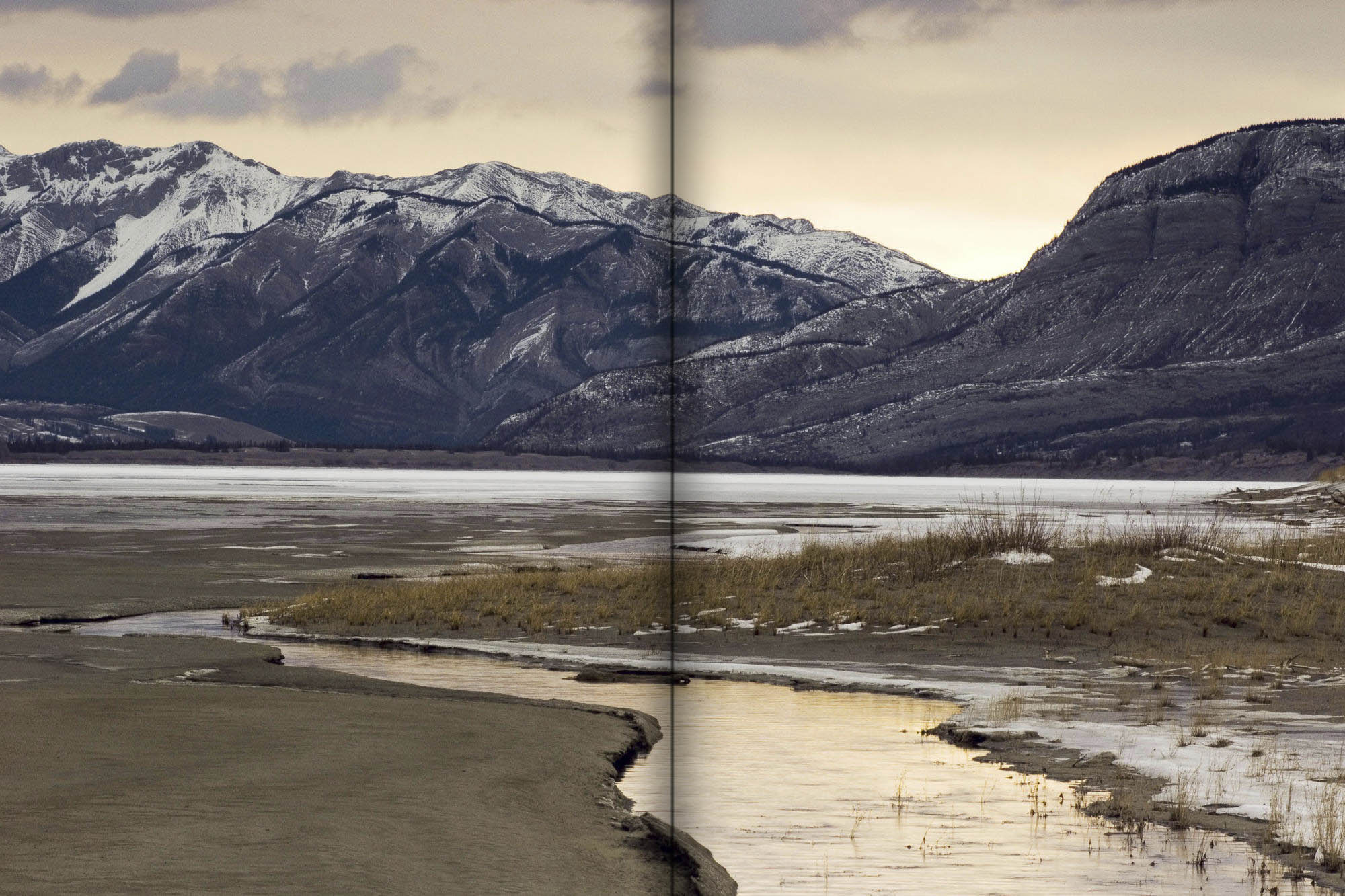
I designed a book. I am making a showcase window for this book in my blog for it. I want to give page curling effect to its spread in Photoshop as shown in these reference images.
How can I do it?


Explore related tutorials & articles
 17
Replies
17
17
Replies
17

Copy link to clipboard
Copied
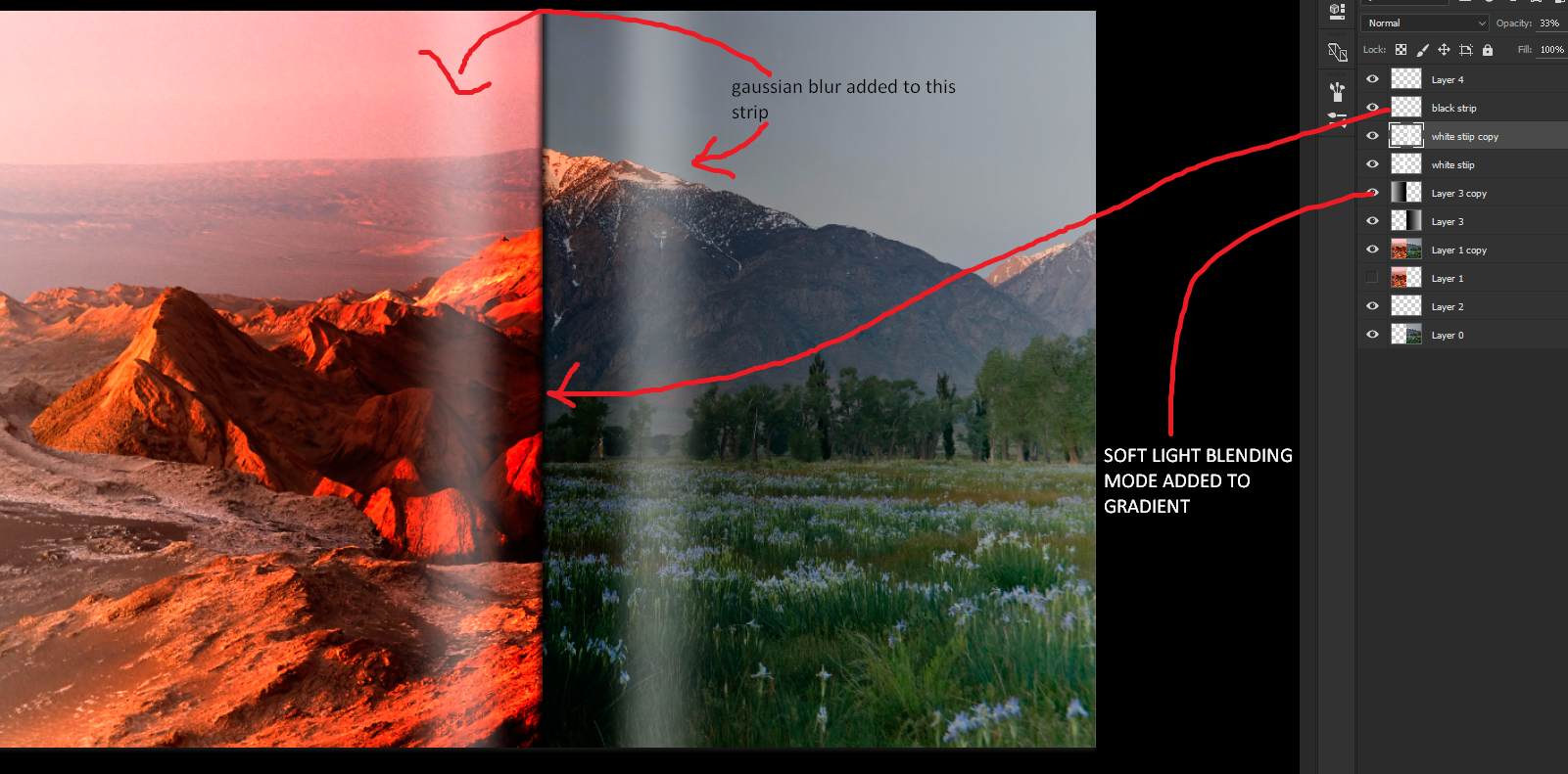
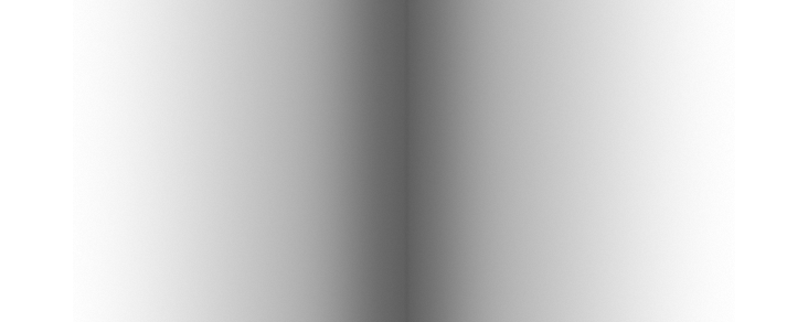
This has been done using gradients and using guides and selections.The curvy effect is achieved by using a linear gradient `s angle set on a perfect 90 degree angle.Check this out to get a similar effect.
Copy link to clipboard
Copied
Thanks for giving a similar example. I am unable to figure out the technique for white curls effect. I gave one but it looks untidy. The soft light gives a slow gradient on either of my photographs on the left and right but the curl effect is not coming as realistic. I have added a small black thin rectangle in the centre but the effect is not looking as close to the posted sample. Please give suggestions.

Copy link to clipboard
Copied
For that centre fold, try setting up a custom gradient as below

Add it to a new layer and set blending mode to multiply

Dave
Copy link to clipboard
Copied
I have made the gradient. How can I apply it in such a way that it gets centrally aligned in a perfect manner? I have to do hit and trial. Have you added a thin black strip separately in your psd file? Can you please share it?
Copy link to clipboard
Copied
Hi
Sorry for delay in replying.
Click on your image to the left of the centre line, then hold the shift key and click to the right. The gradient will be vertical. If it needs moving slightly to the left or right - use the move tool to move the layer with the gradient on it to the left or right.
I deleted my example after I posted it, but there was no extra line involved. Just a background image and a layer with the gradient in the centre and set to multiply blending mode. That thin black strip was purely the gradient - the trick is to move those gradient stops close together.
Dave
Copy link to clipboard
Copied
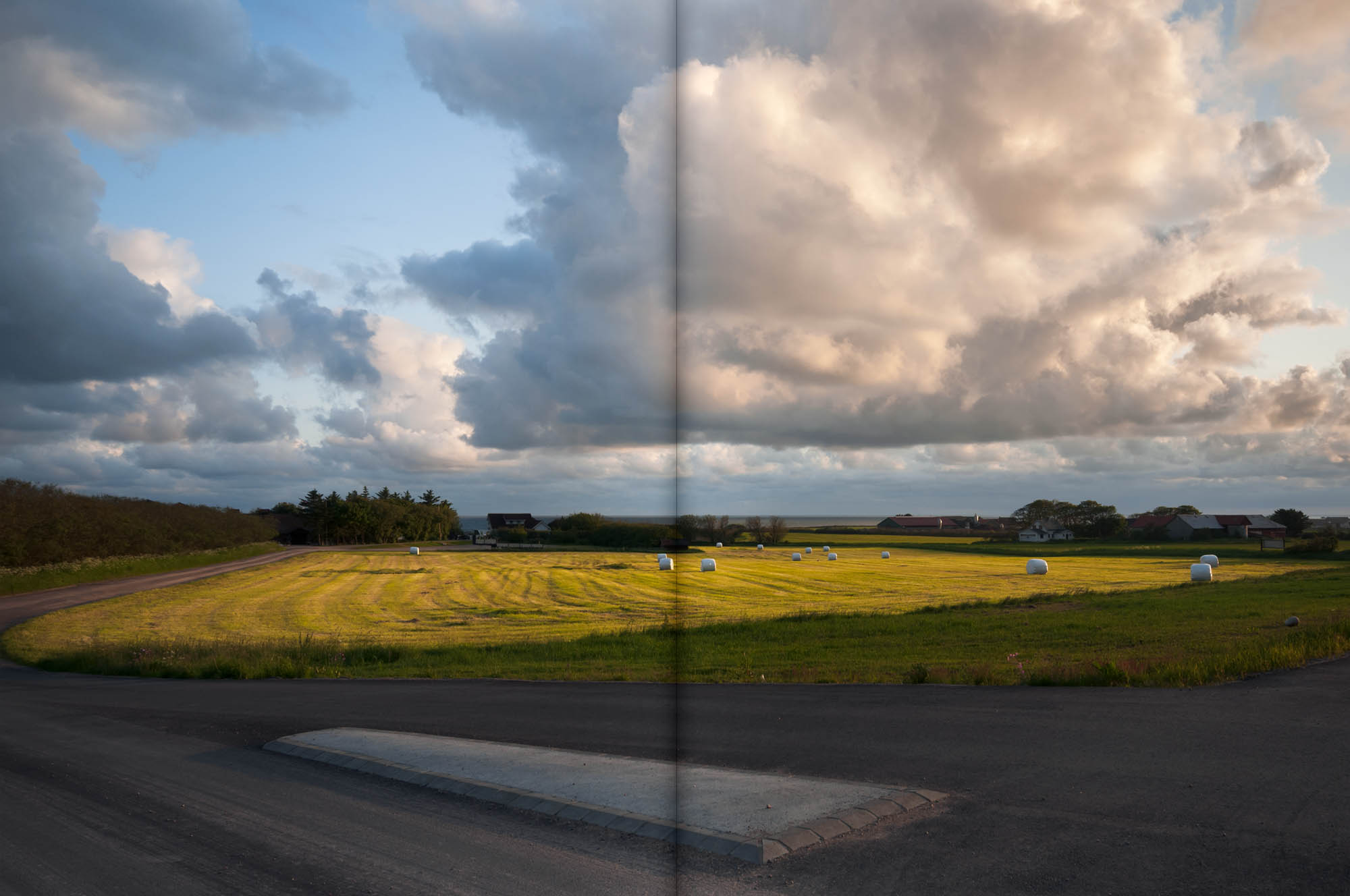
I tried using your method. I am not getting that realism as you got. Here's the photograph.

Copy link to clipboard
Copied
You have the crease and faded shadow, but you also need to add soft highlights outside the shadows

I started another thread earlier today (NZ time) saying I'd looked at this problem and tried adding a Smart Object with an Action, but was not able to record the step of placing the SO.
Place a Library Asset With an Action?
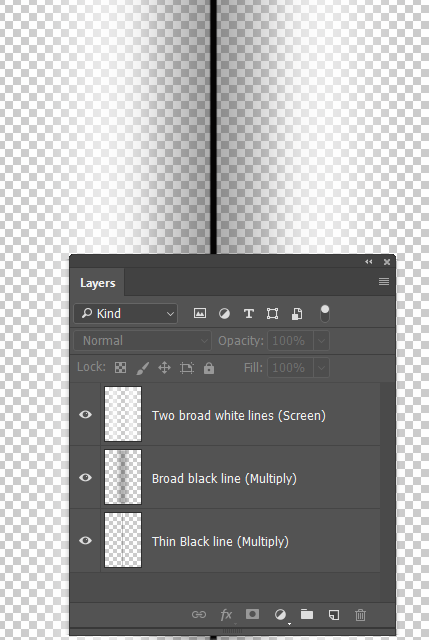
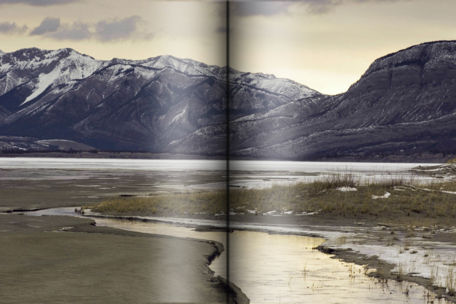
I created the three layers below by painting the black and white strokes on the relevant layers, and blurring with Gaussian blur. The dark strokes were set to Multiply, and the white to Screen. The three layers were selected and made into a Smart object, and the Smart Object was dragged to a CC Library. Note the transparency is important when making the SO.
At any time after this, you can right click the SO in the library and choose Place Linked and it will be placed in the centre of your image. Free Transform to stretch to the full height, and you are good to go. It would have been icing on the cake to do this with an Action, but like I said, I was not able to record the Placing from Library step in the Action.
Copy link to clipboard
Copied
Trevor.Dennis wrote
You have the crease and faded shadow, but you also need to add soft highlights outside the shadows
I started another thread earlier today (NZ time) saying I'd looked at this problem and tried adding a Smart Object with an Action, but was not able to record the step of placing the SO.
Place a Library Asset With an Action?
I created the three layers below by painting the black and white strokes on the relevant layers, and blurring with Gaussian blur. The dark strokes were set to Multiply, and the white to Screen. The three layers were selected and made into a Smart object, and the Smart Object was dragged to a CC Library. Note the transparency is important when making the SO.
At any time after this, you can right click the SO in the library and choose Place Linked and it will be placed in the centre of your image. Free Transform to stretch to the full height, and you are good to go. It would have been icing on the cake to do this with an Action, but like I said, I was not able to record the Placing from Library step in the Action.

I was also adding the white blurs using just a gaussian blur applied to a rectangular fills initially when I started this thread.

Copy link to clipboard
Copied
I think the main problem is just that it's slightly overdone. Pull back a bit and it should be fine.
Copy link to clipboard
Copied
https://forums.adobe.com/people/D+Fosse wrote
I think the main problem is just that it's slightly overdone. Pull back a bit and it should be fine.

What process are you using? Please give step by step method.
Copy link to clipboard
Copied
Well, basically the same as outlined by the others above...it's just a question of hitting the right gradient stops. I experimented, just like you have to, until it "snaps" and looks right. But it doesn't take as much as you think, and it shouldn't hit solid black.
Oh, and there's a slight hint of lightening on either side, not so much that you notice it, it's just a hint.
Copy link to clipboard
Copied
https://forums.adobe.com/people/D+Fosse wrote
Well, basically the same as outlined by the others above...it's just a question of hitting the right gradient stops. I experimented, just like you have to, until it "snaps" and looks right. But it doesn't take as much as you think, and it shouldn't hit solid black.
Oh, and there's a slight hint of lightening on either side, not so much that you notice it, it's just a hint.
I cannot see any lightening on either side. Can you please point it in a screenshot?
Copy link to clipboard
Copied
I did say you wouldn't notice it 
OK, I threw away the original, so now I'm just redownloading my own screenshot. It's this:

The shadow gradient in itself should be highly logarithmic in shape, tapering slowly off outwards. You set this up in the gradient editor. 4 or 5 stops may be needed.
Copy link to clipboard
Copied
I think you guys are placing the highlights too close to the centre. You need to visualise where the highest part of the page will be according to the natural curve of the book or magazine. Developing that from the example at the top of this illustration, places the highlights well outside the crease.

Copy link to clipboard
Copied
OK, I see what I did differently, FWIW...
Instead of an overlay, I used a Levels layer to darken the highlights most, then decreasing effect down to black which is almost unaffected. Then I used the gradient in the mask, and reduced opacity a bit. And a one pixel central line, dark gray, in Multiply mode and again reduced opacity.
The main thing is still, I think, to not overdo it. It can be quite subtle and still get the point across. Remember that the eye will "believe" that the light comes from the upwards direction, so there are no really deep shadows here.
Copy link to clipboard
Copied
I tried using your method. I am not getting that realism as you got. ......
Hi Arunj
Sorry I've not been around for the last day.
The others have really answered the question. Just play with the gradient - the centre of mine was not full black (the opacity was 75%). A quick way though is set the gradients the way I showed and, with the blending mode set to multiply, adjust the opacity so that it looks right on your image.
I did not include the lighter "reflections" - but I would put them on a separate layer and set it to screen and again adjust the opacity to make it look right.
Dave
Copy link to clipboard
Copied
davescm wrote
I tried using your method. I am not getting that realism as you got. ......
Hi Arunj
Sorry I've not been around for the last day.
The others have really answered the question. Just play with the gradient - the centre of mine was not full black (the opacity was 75%). A quick way though is set the gradients the way I showed and, with the blending mode set to multiply, adjust the opacity so that it looks right on your image.
I did not include the lighter "reflections" - but I would put them on a separate layer and set it to screen and again adjust the opacity to make it look right.
Dave
I tried using the screen option for the blending mode for reflection. I don't see any changes in the output.

Find more inspiration, events, and resources on the new Adobe Community
Explore Now
 AdChoices