- Home
- Photoshop ecosystem
- Discussions
- Changing color for part of image: which method?
- Changing color for part of image: which method?
Copy link to clipboard
Copied
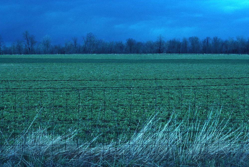
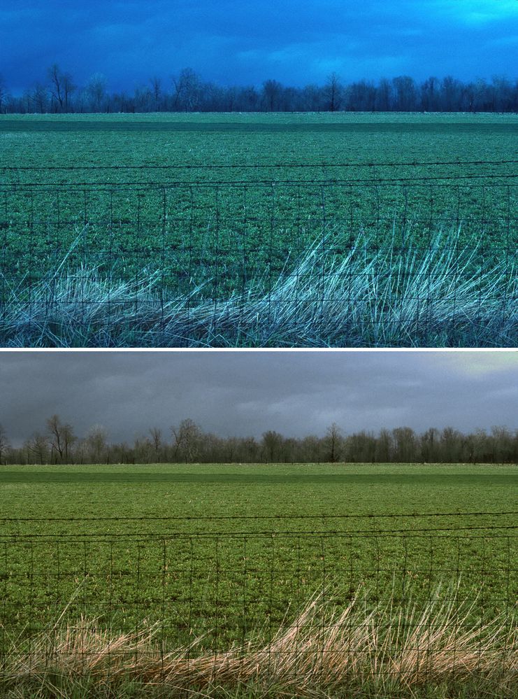
This image is a scan of Kodachrome. I want the dead vegetation in the foreground to be its natural color (tan, beige) and it's currently way too cool. Using Color Balance > Tone: Highlights on the image as a whole affects the whole image too much.
I am able to satisfactorily select the desired area and create a layer from the selection, but
using Hue/Saturation or Color Balance directly looks unnatural.
Please suggest a practical method to color the vegetation. Details not necessary unless you wish - all I need is a quick summary or some keywords and I can research how to do it.
Thank you
 1 Correct answer
> I want the dead vegetation in the foreground to be its natural color
> All I need is a quick summary or some keywords and I can research how to do it.
****
Based on the those items above, I would suggest that you locate the specific PMS “natural color” you have in mind and make a note of its Lab Color value.
Next you may have found that, working in RGB, the contrast and range of the existing vegetation is incompatible with the new color you want. In RGB you cannot alter contrast without cha
...Explore related tutorials & articles
Copy link to clipboard
Copied
The whole image to too cool and blue. I would use L*A*B* color to create a mask to isolate the brush in the FG. the BG is pretty much green, so the A channel might be the best choice to create a mask to use for a curves layer.
Copy link to clipboard
Copied
I think I understand what you suggest (it allows me to select the foreground) but what I am asking is what method to use to adjust the color.
Copy link to clipboard
Copied
I would just use curves.
Copy link to clipboard
Copied
> I want the dead vegetation in the foreground to be its natural color
> All I need is a quick summary or some keywords and I can research how to do it.
****
Based on the those items above, I would suggest that you locate the specific PMS “natural color” you have in mind and make a note of its Lab Color value.
Next you may have found that, working in RGB, the contrast and range of the existing vegetation is incompatible with the new color you want. In RGB you cannot alter contrast without changing the color values, calling for compromise and, on occasion, a fake looking result.
I suggest that you change the Mode to Lab Color where contrast and range control is discrete from color and controlled in the L channel with a Curve adjustment.
The two Color Channels (labeled a and b) are altered in Curves in a way far different from those in RGB, so if Lab is unfamiliar to you, you might check the manuals and videos devoted to it.
That is the quick summary you requested. For details, keep in touch with us. Good luck.
Copy link to clipboard
Copied
norman.sanders, I appreciate the great explanation, plus you adressed another question I've long had about contrast and color ("In RGB you cannot alter contrast without changing the color values").
You've given me a good excuse to learn more about Lab color and the powerful things it can do.
Thanks also for the offer of further help if needed.
Copy link to clipboard
Copied
Am I missing something here?
I see an image with an extreme cyan/blue color cast all over. Fix that, Curves and/or Levels (either will do it), and the foreground gets the dead grass color it should.
Copy link to clipboard
Copied
D Fosse, thank you for pointing out that color correcting for the cyan makes the entire scene correct. Being one to get caught up in details, I'm really good at overlooking the obvious much of the time.
In this case, I want to retain the cyan cast for the field, trees, and sky (uploading the image to this forum exaggerated the cyan beyond my preference). My intent is for an artistic interpretation of the scene. In the original image (Kodachrome), the cyan-ness along with accurate representation of the dead grass works very well and I'm trying to recreate that scene.
Copy link to clipboard
Copied
OK. I actually suspected you might want a bit of blue - since Norman seemed to read your question differently from what I did. Norman usually knows what he's saying, so that's why I asked if I missed something 🙂
Still, I'd tone down the blue considerably. You'd still get that gloomy "night" effect, even more so I think. At night, we don't really see much color at all and it all turns monochrome.


