
Color Management: Need help exporting print files!!!
Hello Dear Community
I'm a bit at my wits end here, as for years I've been having an issue where my B&W CMYK images – regardless of what computer I'm using, what version of Id, Ps or what printers i'm working with – they mostly tend to come out with a yellowish or greenish tinge.
My working process:
I run a music label and design all the covers as well. Usually I scan in found photography and edit it via Ps, then save it as a grayscale or rgb PDF. After that I use an Id design template, (in this case for cassette inlays) and import my image. Here, I then export everything using whatever print profile is requested, such as FOGRA39 or in the newest case, iso coated v2 300%.
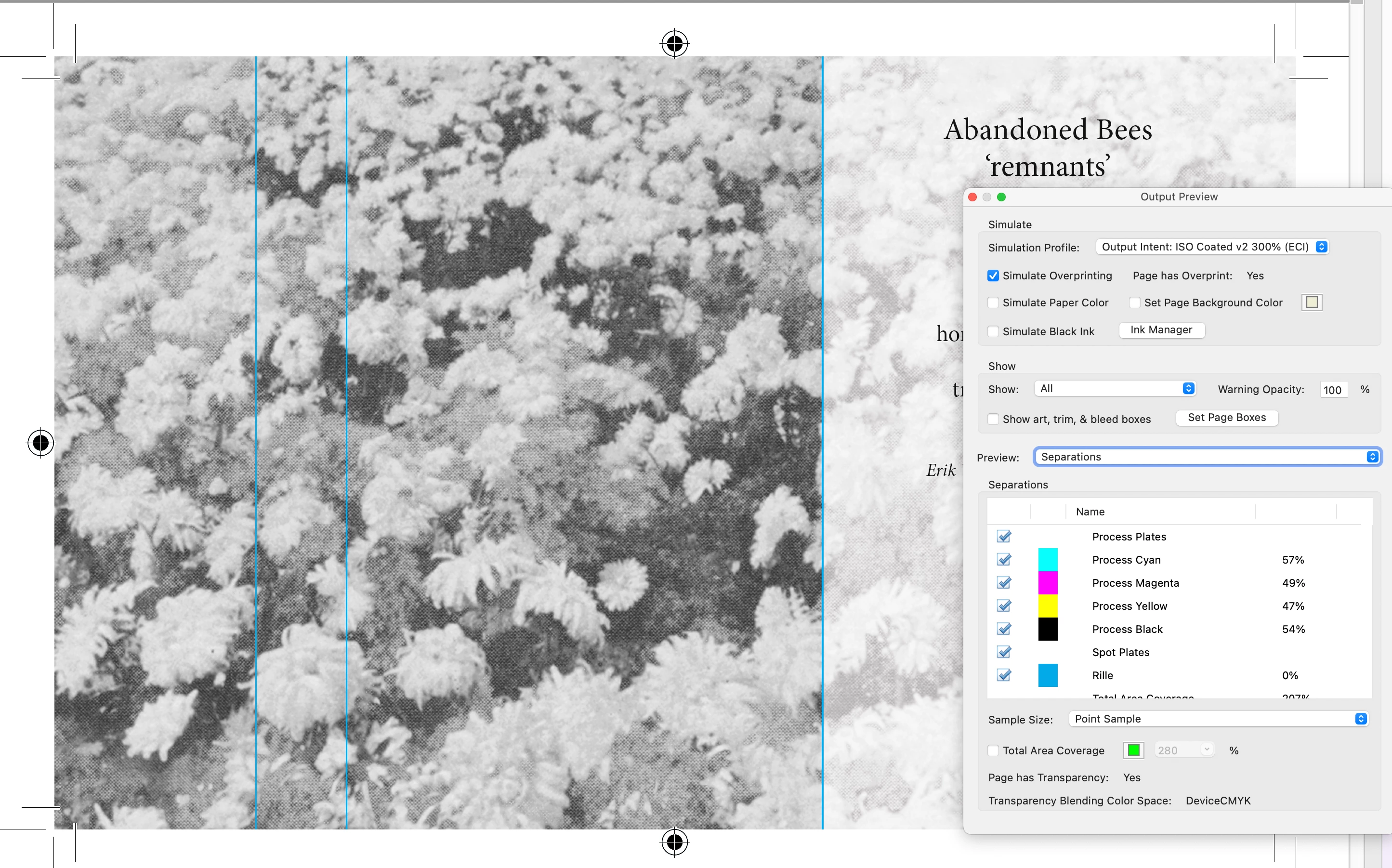
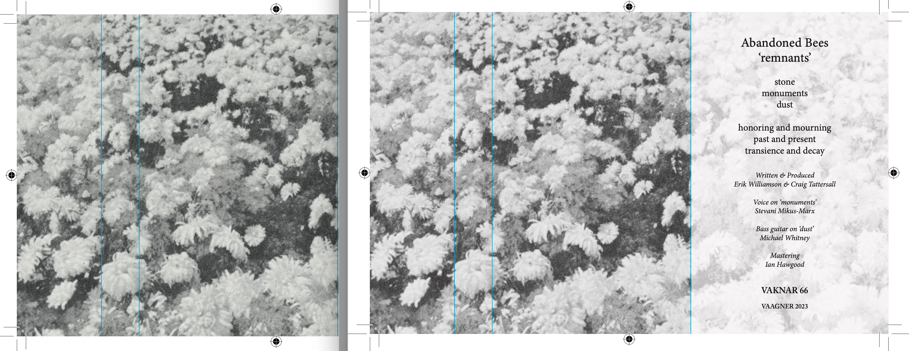
Now somewhere along the way, something must be going horribly wrong, as this is my intended image, which according to Adobe Acrobat using print production should print as follows (and as intended):
yet instead, this is the type of outcome I usually get from various professional printing places;
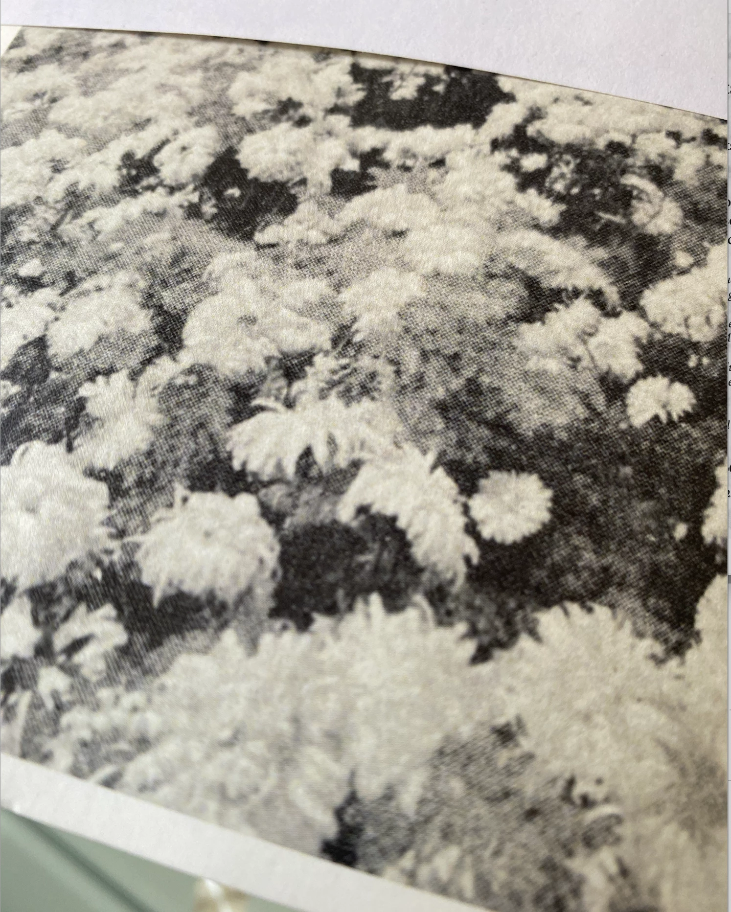
Other examples are the next image from a latter project, which came out purplish instead of B&W when printed, while the bottom is the lackluster grayscale print version.
More interestingly. The image looks correct in both image preview and acrobat, as well as in Id itself, yet if I don't choose 'Preserve Numbers' during the export's color conversion option, the image shows up yellowish in the preview– perhaps already indicating that something seems to have gone wrong here:
EXAMPLE: Exported as PDF without preserved numbers (left), which is how the images also usually print, vs the right (preserved numbers), which is how I would like them to print, but they tend to come out looking like the yellowish/greenish image on the left.
Now what would the correct path be here, if I wanted to have the image prepared in Ps and then exported in Id as a CMYK printing a black and white image? Do I save it as an RGB in Ps and then first export it as a CMYK via the correct profile in Id? (in this case iso coated v2 300%) And if so, what boxes are the correct ones to tick for the color management settings?
Am I doing something completely wrong, or is it just very hard to get B&W images to print (relatively) accurately via a professional setting using CMYK? Why are most of my friends somehow able to do this, are they supplying RGB images and letting the printers handle the colors or what?
Infinite gratitude who can help me out of this year-long dilemma, it's really been weighing in on me... All the hard work I put into these projects, just for them to not print as intended in the end...
Looking forward to some potential help here, and glad to supply anyone with whatever they need information wise.