You are exactly right about the way it works.
Thanks for the further explanation.
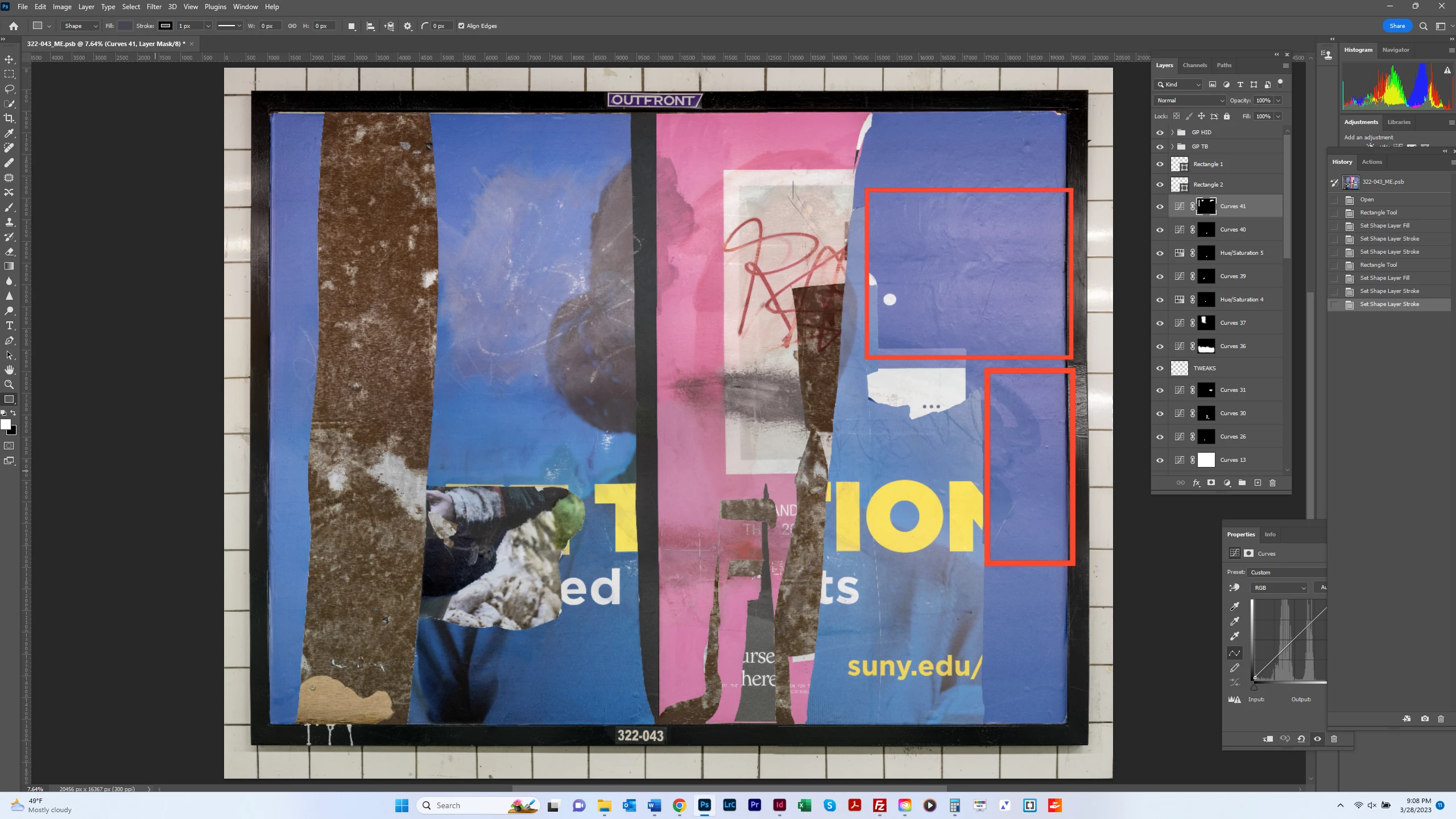
Here's another technique you could try. Select an area you want to change.
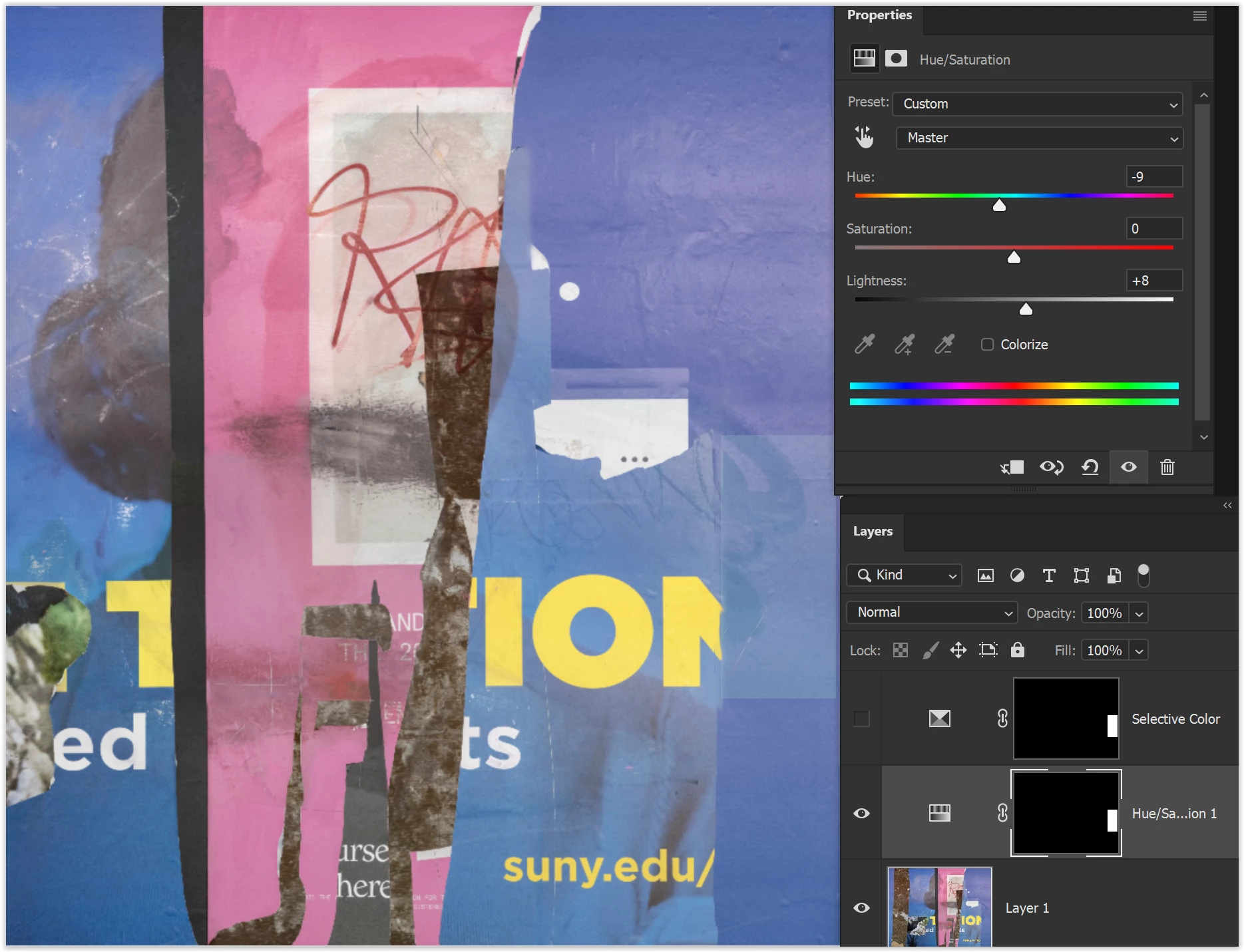
Create a Selective Color adjustent layer. These are the settings that I used:
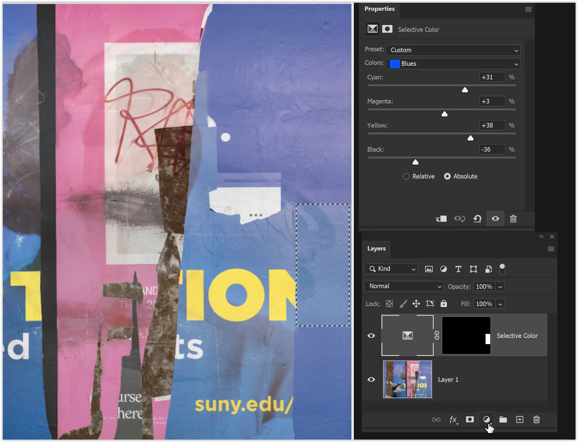
You'll probably need to make 3 or 4 separate selections using this technique because of the color changes in the area that needs adjustment.
A Hue/Saturation adjustment layer could also work.
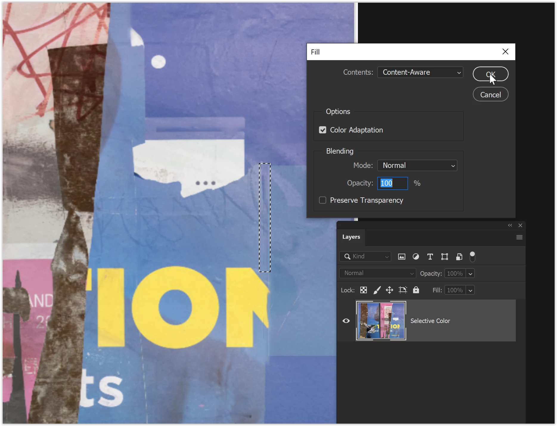
If the selection isn't perfect, you'll need to touch up the transition areas. You could do that by applying the adjustment layer, selecting the transition area, and Edit > Fill, Content Aware.
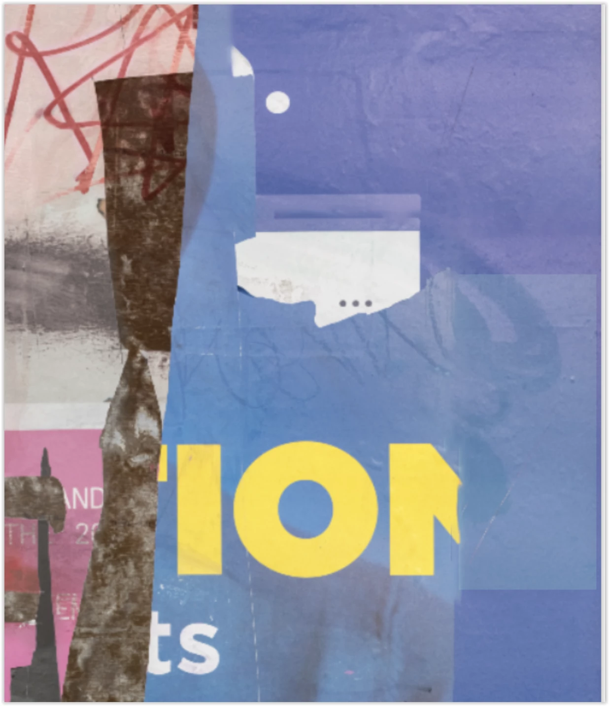
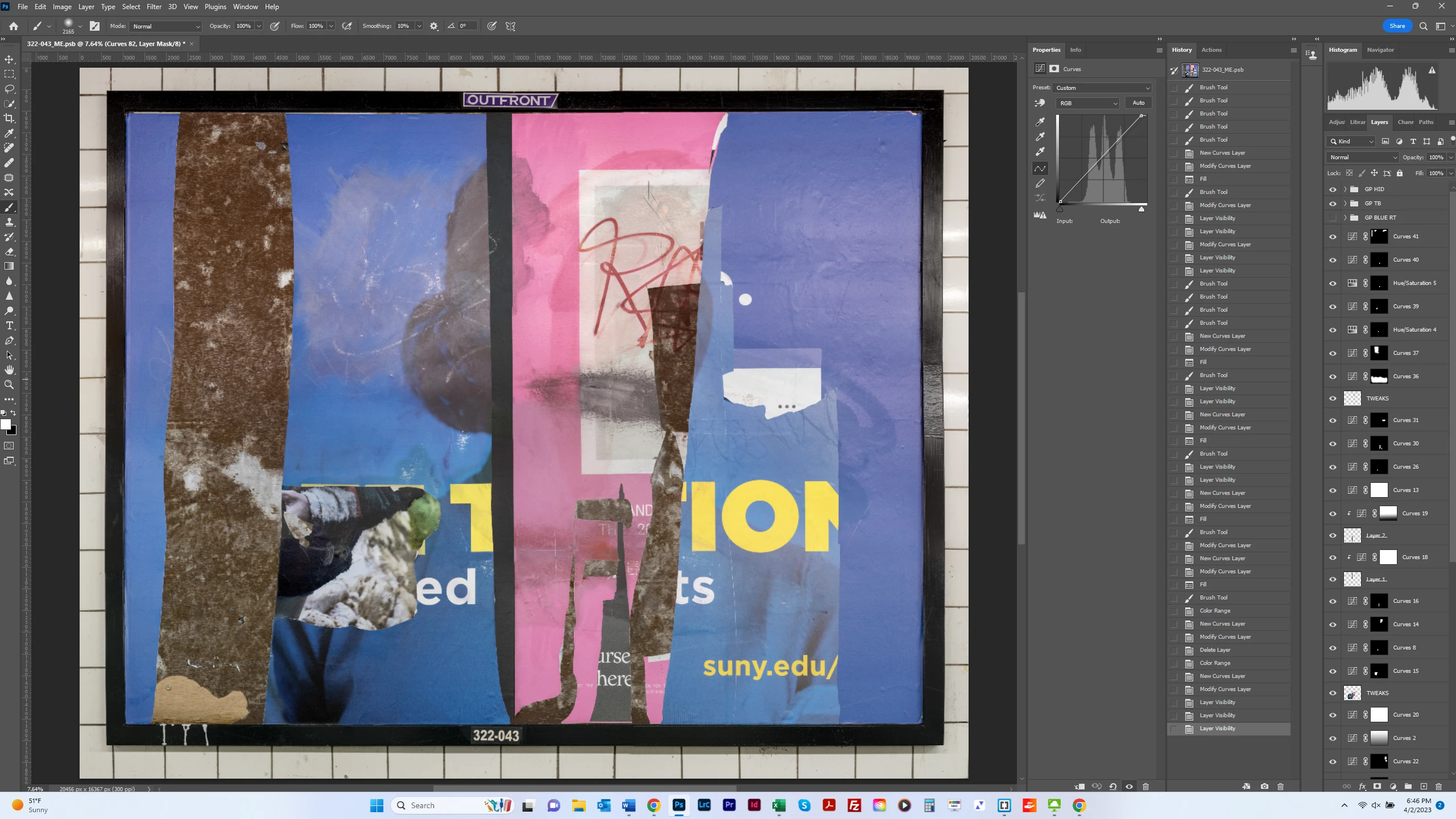
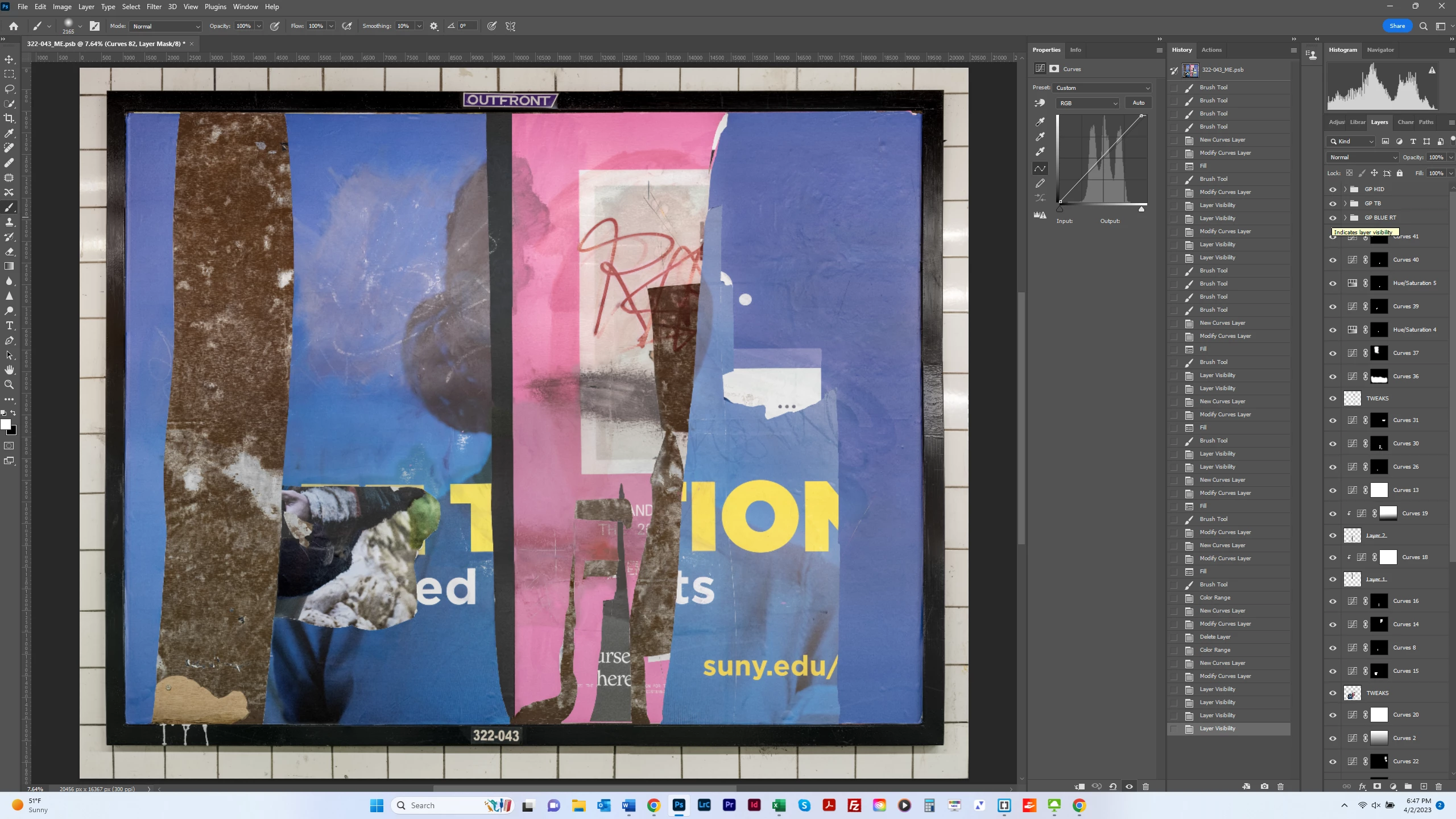
Thanks for that. I ended up going back to my original solution - which was to add adjustment layers to incrementally match up color, brightness and saturation. I'm not sure it was the best method - or at least the quickest - but I'm fairly happy with the result - before and after shots below. It's good to know about the different options for matching color. Dave's solution also looks quite good - he's probably better at frequency separation than I. My problem is that I rarely separate texture and color to my satisfaction - I always seem to bring in (replace) more pixels than I want. I never did find out what was meant by "color mode" - but I suspect it's shorthand for blending colors, which I don't think is the same as matching colors but I need to do some tutorials. Thanks to all who helped out with this.