- Home
- Photoshop ecosystem
- Discussions
- Colour Profile Settings for Printing in USA
- Colour Profile Settings for Printing in USA
Colour Profile Settings for Printing in USA
Copy link to clipboard
Copied
Hi all,
I am based in the UK but I am sending an artwork file to someone in the USA to have printed over there. I realise there are many variables with colour settings and there is plenty to get my head around, but which profile/ setting would be the best bet in this situation to send? I know printers in the US use different colour settings to European ones.
Many thanks for any help.
L.
Explore related tutorials & articles
Copy link to clipboard
Copied
Hi Lynn,
US Web coated is likley the simple answer from the information you provided
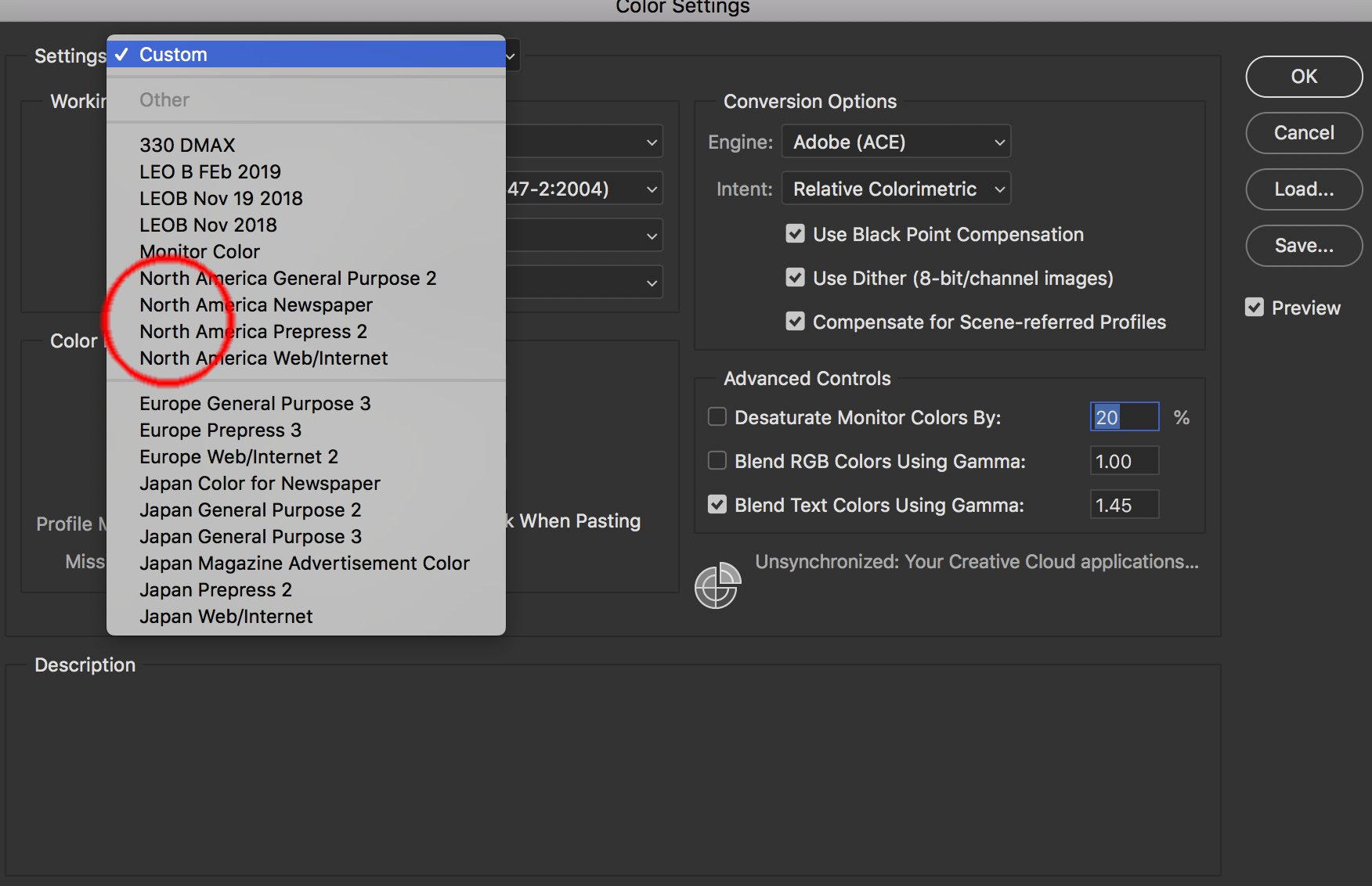
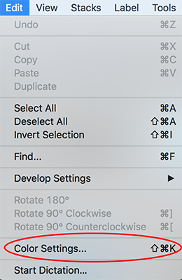
Edit >> Color Settings then choose one of the North American that is most appropriate.

Those are most popular and would agree with Adobe, except maybe Gracol for newsprint instead of SNAP 2007.
Are you FOGRA in UK, I believe much of Europe is.
Copy link to clipboard
Copied
Contact the lithographer and request permission to send an 8 bit RGB (Adobe RGB 1998) file for him to convert to his particular CMYK profile that will be used (considering press, paper, etc.). Try to avoid a generic CMYK setting. Request a Contract Proof.
Copy link to clipboard
Copied
You always need to ask the printer what particular CMYK profile to use (if CMYK is what they request).
Forget Color Settings, that's just defaults. The question is what profile you are using in the document.
Copy link to clipboard
Copied
I prefer to set my Color Settings in the Bridge. That way if I use Illustrator or Indesign in the process (Illustrator with Photoshop) they are start with the same color space. It also keeps the Colors Synchronized in the Create Cloud. It also gives you a nice overview on what each setting provides.
1. Open the Bridge
2. Edit> Color Settings

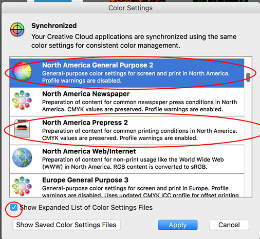
3. Choose Expanded list of Color Setting Files if you do not see North America
4. I would choose North America General Purpose if you don't know which, printing to a Digital Press or your Photos uses sRGB (Most digital devices use this color space to capture images)
5. I would choose North America Prepress 2 if you are going to a Offset Press. (CMYK plates) or your images use Adobe1998 RGB)
6. You can ask the American counterpart or the American Printer too.

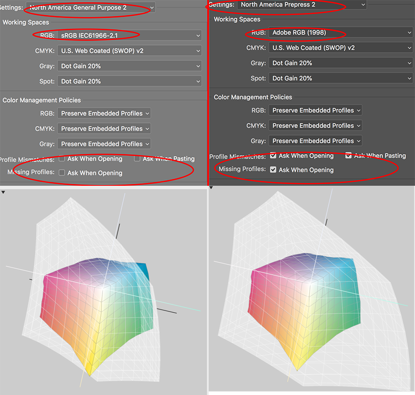
This image shows the differences between the two settings.
North America General Purpose uses the sRGB space for RGB and it does not tell you when there is a mismatch.
North America Prepress uses Adobe RGB (1998) for the RGB space and it gives you a dialog box if you open or paste into a different space. Rule is you are born in the space you die in the space (convert to another space) otherwise color does weird things. The color spaces on the left are sRGB compared to CMYK. The color spaces on the right are Adobe 1998 compared to CMYK. All devices have a color space close to sRGB. If you take your photos in RAW you can easily go to Adobe 1998 which is a larger color space and great for press. (Not a great space if you want your item to look similar between Screen viewing and Print. sRGB is the space for both screen and print)
The bottom line most of my work is in North America General Purpose today. And that is the default space when using Adobe.

Get ready! An upgraded Adobe Community experience is coming in January.
Learn more
