

- Home
- Photoshop ecosystem
- Discussions
- Conversion from RGB to CMYK press ready of a probl...
- Conversion from RGB to CMYK press ready of a probl...

Copy link to clipboard
Copied
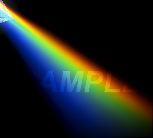
I'm trying to convert an image from RGB to CMYK for press.
The conversion has some troubles as image use a lot of colours out of gamut, and also i need to convert to a 300% total ink CMYK profile (such as ISO coated v2 300).
I'm not satisfied with Photoshop conversion from Adobe RGB to Iso coated v2 300 (this is the common profile used by some media partners)... do you have any hints or suggestion?
I know that is quite impossibile to obtain the same vivid and brilliant colours.
I attach the "problematic" piece of image.


 1 Correct answer

First make sure the RGB file is max neutral black 0-0-0. That converts into ISO Coated 78-68-58-94 - that's the blackest black you will ever get in ISO Coated (ECI) 300%. That is 300% coverage, that's a brick wall you can bang your head on.
The spectral colors, from Adobe RGB, will be partly out of gamut in ISO Coated - mostly the yellow-greens and the deep blues. You really need to soft proof this and make the appropriate adjustments. The greens will show blocking-up and banding, and the deep bl
...Explore related tutorials & articles
 36
Replies
36
36
Replies
36
Copy link to clipboard
Copied
Ok, it's clear now what you mean... but have you experienced difference on final printed work between this method vs adding CMYK images directly?
Consider that i'm sure at least that these services use-and-require ONLY ISO Coated v2 300 (maybe another similar one... but i have to check...)

Copy link to clipboard
Copied
I can attest to no difference between Indesign’s separation and Photoshop’s provided the settings on both applications are according.
When placing CMYK images in indd just make sure not to repeparate at export – but this should not be an issue if indd and the placed images share the same Colour Space.
Copy link to clipboard
Copied
Ok... and... many thanks for you help!
Copy link to clipboard
Copied
In this case I suspect I would end up creating the spectrum in ISO Coated, taking care to maintain smooth, even gradients in each color channel. Remapping this from Adobe RGB is difficult. Possible, but difficult.
You have to keep in mind that this particular image is a demonstration piece for gamut clipping. Even if I tried, I couldn't think of an image where the effects would be more conspicuous. Here - this is what gamut clipping looks like, worst case scenario. Normally, letting the profile do it is good enough, with minor adjustments. This takes a little more.
Print profiles let you choose rendering intent (working RGB spaces don't support that). That should take you some of the way - in this case I think Perceptual looks a lot better than Relative Colorimetric. But it still takes some work.
Keep soft proof on while you work, to monitor the result of the adjustments. Gamut clipping, by definition, is the point where any color channel hits 0 or 255/100. So look at individual channels. Convert a copy of the file just to note the areas where this happens. Look at the histogram and the individual channels. Generally, use whatever preferred tool in combination with "Blend If" to target the high or low ends of each channel specifically.
Copy link to clipboard
Copied
Thanks for your help.
Yes... unfortunately there are no magical photoshop functions unknown to me (or to us) to do that  ... (maybe in future with the AI help integrated in color separation ?!?) there is some work here to do... you give me some useful hints, thanks again.

Copy link to clipboard
Copied
Hi
I am coming to this late, but I'll mention that, if you decide to (it was advised above) - edit images in CMYK that needs care -
WHY? - well, the fact the image is already "in" CMYK does not constrain the gamut, so have a care if you decide to push the colour or levels after conversion to CMYK. Because doing that you can violate the ink limit.
This would lead to a VERY unhappy pressman.
That's why many press experts like Don Hutcheson prefer to work in RGB with soft-proofing active - then convert. That RGB to CMYK conversion restricts the colour to what CAN be printed by keeping the total ink values within the limits of the ink and paper (as expressed by the ICC profile).
This next tip applies to future projects, not your current conversion, but you may find it of some use.
Occasionally smoothness in very high gamut (i.e. a long way out of destination gamut) images can be improved by using a device link profile. Thosem profiles can be set up to more properly take gamut mapping into account than the standard ICC process.
BUT, at last look, Photoshop unfortunately did not support RGB to CMYK device links.
Photoshop can use device links in conversions, but only CMYK to CMYK, it seems.
Many feel that device link profiles are all about keeping clean blacks in CMYK to CMYK conversions but there's much more to device links than that.
So, the area where device link profiles really excel is in CMYK to CMYK, and as Photoshop can use them now it can be worth a try.
If you were printing on a low gamut medium, say uncoated [a pretty unsaturated medium], you may see improved results by first using the standard Photoshop convert to profile process - converting from RGB to a large CMYK colourspace (like ISO coated v2) then using a device link between ISO coated V2 and the uncoated icc profile.
I've seen this improve vital detail in saturated areas. Of course, though, it cannot put more ink on the paper than the paper can take.
Then theres channel blending as championed by a man who sued to be known by some as "the arch anti calibrationist" Dan Margulis. That truly can work wonders in bringing out detail in poor separations
It's nice to be able to do device link conversions in Photoshop now, of course you also need someone to make the device link profiles for you.
I hope this helps
if so, please do mark my reply as "helpful"
thanks
neil barstow, colourmanagement

Copy link to clipboard
Copied
Best to place the image in Indesign. InDesign converts RGB to CMYK better than Photoshop.
Chana
Copy link to clipboard
Copied
InDesign converts RGB to CMYK better than Photoshop.
How do you figure that?
Copy link to clipboard
Copied
Yes, I would normally advise RGB master > convert to CMYK, partly to avoid exceeding max ink (and partly to repurpose for different processes).
However, the spectral colors here is a special case, because of the smooth transition required between them. Remapping this from Adobe RGB into ISO Coated without banding is very tricky. I didn't fully realize just how tricky until I tried. It can be done, but it takes a good deal of time and effort. It might save some labor to do it in ISO Coated to begin with, picking colors that are already within gamut.
Yes, Channel Mixer can be very effective to control gamut clipping - but in that case it should be used in combination with "Blend If", to target the range where the clipping actually occurs. If the clipping is at the low end of any given channel, there's no reason to desaturate the high end unnecessarily.
Copy link to clipboard
Copied
https://forums.adobe.com/people/D+Fosse ha scritto
Yes, I would normally advise RGB master > convert to CMYK, partly to avoid exceeding max ink (and partly to repurpose for different processes).
However, the spectral colors here is a special case, because of the smooth transition required between them. Remapping this from Adobe RGB into ISO Coated without banding is very tricky. I didn't fully realize just how tricky until I tried.
Yes i can confirm that this is not an easy job, and require time... but... in this SPECIAL case i think that there are no other way to do that and get a smooth transition... i have tried a lot of combination in conversion, but nothing give me an easy solution...
Copy link to clipboard
Copied
DFosse,
Oh for that spectrum image I agree. It's really likely it will be a lot easier to create that specific effect in CMYK.
But its really important to watch those ink limits.
My note of caution about violating ink limits was more directed to those who read this thread later and perhaps might push the saturation images post conversion.
I'd convert first, observe the locations of the highest ink values, then make it in CMYK and place eyedroppers in those same areas.
Watch the values, its very easy to go over 300 in dark areas.
I hope this helps
if so, please do mark my reply as "helpful"
thanks
neil barstow, colourmanagement

Copy link to clipboard
Copied
Technical details aside, you need to set expectations with your client. As long as the client is satisfied with the finished results, you are golden. Do your best, bill accordingly, and let them know that simpler artwork will give better results next time.
-
- 1
- 2

Find more inspiration, events, and resources on the new Adobe Community
Explore Now
 AdChoices