Converting Pantone to CMYK
Copy link to clipboard
Copied
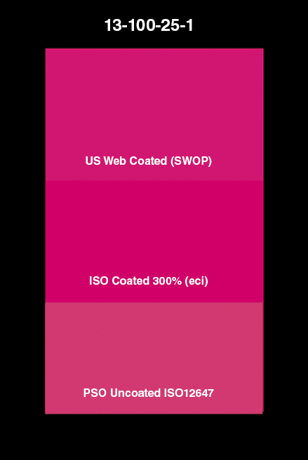
Hi. I changed a Pantone 226 to 13-100-25-1
Doesn't really seem as close. Any suggestions?
What is the best way to convert any Pantone to CMYK, eyedropper tool?
Thanks in advance.
Explore related tutorials & articles
Copy link to clipboard
Copied
Boiler plate text: a) None of this matters without color management and b) some colors cannot be converted to CMYK and retain the same vibrancy and gamut (which is the reason spot colors exist in the first place) and c) some of these colors cannot be perfectly approximated on screen for display purposes. So there you have it, there could be several reasons. Anything more specific will require actual info about your system, color management settings, what colors you are trying to convert and so on. Screenshots would also be useful so we can advise on how to improve your results.
Mylenium
Copy link to clipboard
Copied
What is vital in this situation (as Digital Dog has mentioned) is to know for sure what ICC CMYK profile represents the printing condition (the press behaviour).
Once you know that and have the CMYK ICC profile, you can take a Pantone L*a*b* value and convert that to CMYK just fine.
It MAY be, though, that the Pantone you've chosen is unprintable "out of CMYK" -
Pantone is all about special inks - SPOT colours. Where an extra unit is run on the press, so CMYK+1
I hope this helps
neil barstow, colourmanagement net :: adobe forum volunteer:: co-author: 'getting colour right'
google me "neil barstow colourmanagement" for lots of free articles on colour management
Copy link to clipboard
Copied
Okay, thanks. Am I understanding you correctly? I need to know the ICC CMYK of the printer I am using in order to convert the Pantone color correctly, not mine? What I did was, select Pantone 226, then picker and it gave me a cmyk of 13-100-25-1... Would that not be the same with any printer, or monitor? Yes, I understand some Pantones do not work as cmyk, but I believe 226 should come accross pretty close.
Copy link to clipboard
Copied
Start here:
http://digitaldog.net/files/CMYKPart1.pdf
http://digitaldog.net/files/CMYKPart2.pdf
You need a specific profile that defines the CMYK you wish to convert to; that's the bottom line.
Copy link to clipboard
Copied
Note that the Pantone website includes this disclaimer:
"*Before using, understand that the colors shown on this site are computer simulations of the PANTONE Colors and may not match PANTONE-identified color standards. Always consult PANTONE Publications to visually evaluate any result before utilization."
https://www.pantone.com/connect/226-C
Pantone colors are intended for print. There are 18 base colors that get mixed according to specifications. The absolute best way to find out how a Pantone color will print is to look at a Pantone book and not at your monitor.
"Printers order specific spot colors by their identification number, or mix them using the Pantone Ink Mixing Formula. Creating a Pantone Spot Color is similar in concept to mixing yellow and blue paints to make green—only with a much greater degree of precision. Spot colors are mixed in the ink room or by an ink supplier, using a palette of 18 base ink colors and a unique Pantone Ink Mixing Formula. A Pantone Chip should be included with the ink as a reference, to help ensure the printer achieves the intended color intent on press. Spot colors are added to a single deck on the press and printed as a custom color, and when the job is done, the spot color ink must be removed.
"To manufacture the 18 base inks used for mixing PMS Colors, ink manufacturers must be licensed by Pantone, and in order to retain their license, they must annually submit samples of the base ink colors for approval. These quality control measures help ensure Pantone Spot Colors are reproduced consistently around the world."
https://www.pantone.com/articles/color-fundamentals/understanding-different-color-spaces
If there is a reason you need the Pantone colors (such as corporate branding), then you will need to get the app from Pantone now that they have pulled out of Adobe.
If you are going to use CMYK, just use a best match. Proper color management is essential.
Jane
Copy link to clipboard
Copied
Agree Jane, if the OP is not paying for an extra (spot) press colour, then the best strategy would perhaps be to convert the Pantone colour's L*a*b* values to the ACTUAL press CMYK ICC profile.
I hope this helps
neil barstow, colourmanagement net :: adobe forum volunteer:: co-author: 'getting colour right'
google me "neil barstow colourmanagement" for lots of free articles on colour management
Copy link to clipboard
Copied
Thank you. The reason is this. It is a booklet inside a CD. The face of the CD was created as Pantone 226. So I am trying to match that in cmyk for printed booklet as close as possible, without the extra expense of Pantone. I understand Pantone is an exact color/ink, and some Pantone don't work at all as cmyk like the neon colors for example, but i think Pantone 226 should work in cmyk as close as possible. When i select the picker inside the Pantone area of Photoshop, it gave me a cmyk of 13-100-25-1 Was wondering if that was the best, or as close as I would get to the 226.
Copy link to clipboard
Copied
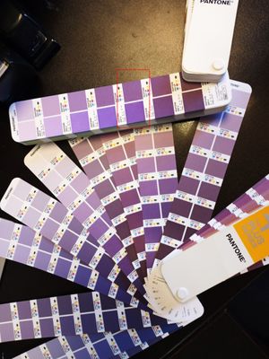
Do you have the paper Pantone fan color guides? The 266 conversion in the Color Bridge book is not all that close, and looking at the CMYK book, I did not see a close equivalent there either.
The difference is not as dramatic in a photo, but if you have the fan guides you can look for yourself.
Copy link to clipboard
Copied
Sorry, I meant 226, not 266. I do have the Formula Guide.
Copy link to clipboard
Copied
When i select the picker inside the Pantone area of Photoshop, it gave me a cmyk of 13-100-25-1
By @Rafael26281653wpvv
That depends on which specific CMYK profile is required for this particular print process. You need to ask the printer about that.
The Photoshop default just happens to be US Web Coated SWOP, because there has to be some default - but there's no guarantee it's the right one here. There is no universal generic "CMYK".
Copy link to clipboard
Copied
thank you. I see what you mean. I didn't know it wasn't universal. So I should ask the printer that will print these for cmyk profile they use?
Copy link to clipboard
Copied
Yes, exactly 🙂
Copy link to clipboard
Copied
Yes that’s exactly what you should do.
Then take the L*a*b* values of the Pantone colour enter to Photoshop and convert to that specific CMYK - note the achieved values
I hope this helps
neil barstow, colourmanagement net :: adobe forum volunteer:: co-author: 'getting colour right'
google me "neil barstow colourmanagement" for lots of free articles on colour management
Copy link to clipboard
Copied
@Rafael26281653wpvv wrote:
What is the best way to convert any Pantone to CMYK,
One other thought: have you talked to the print shop about this?
Jane
Copy link to clipboard
Copied
No, I have not.
Copy link to clipboard
Copied
Hi @Rafael26281653wpvv , You didn’t mention your destination document’s color mode and profile assignment—is it RGB or CMYK?
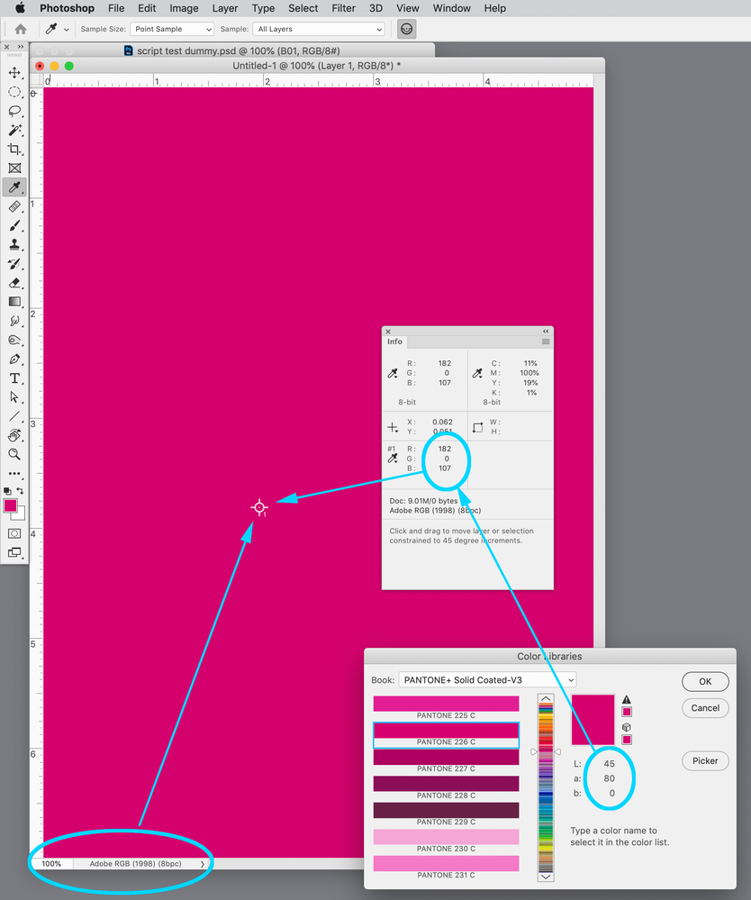
If you are picking Pantone 226 from the Color Picker’s Pantone+ Solid Coated Library, the color is defined as Lab, and if you apply the color to an RGB document, the Pantone Lab values will be converted into the document’s assigned RGB space.
Here my document is RGB with AdobeRGB assigned, and the starting 40|80|0 Lab values get converted to RGB 182|0|107 when I apply it to the document. The Info Panel’s CMYK values are showing the CMYK values I would get on a future conversion to the current Color Settings Working CMYK space (Coated GRACoL 2006 in this case), not the Actual Color:
If I change the Color Settings’ CMYK Space to US Sheetfed Coated you can see the assumed CMYK output values change from 11|100|19|1 to 8|100|16|0, but the RGB values are the same:
If you are editing in an RGB space the final CMYK output values will depend on where the file is going. Are you placing it in an InDesign page layout with its embedded profile? And then where is the final conversion to CMYK happening, and to what CMYK profile—on a PDF export or at print output?
https://community.adobe.com/t5/indesign-discussions/branding-color-guide/td-p/10818696
Copy link to clipboard
Copied
I just emailed asking what cmyk profile they use
Copy link to clipboard
Copied
Hi Rafael,
Also tell them what you are trying to achieve.
Jane
Copy link to clipboard
Copied
i got this GRACoL2006_Coated1v2-PerfX
hope that's what you were asking about
they know exactly what i'm trying to achive. thanks again.
Copy link to clipboard
Copied
In order to get the GRACoL2006_Coated1v2-PerfX CMYK output values your document’s Mode would have to be CMYK with the GRACoL2006_Coated1v2-PerfX profile assigned. The Color Settings’ Conversion Options would also have some affect on the CMYK color when you apply the Lab 45|80|0 color to the document—PANTONE 226C is slightly outside of the GRACoL CMYK gamut.
Also if the CMYK document is being placed in an InDesign page layout, make sure the same CMYK profile is assigned to the ID document (Edit>Assign Profiles)
Copy link to clipboard
Copied
(from a former commercial offset press operator)
Pantone, or "spot", colors (inks) have far greater gamut (range of possible colors) than Process color (the combination of ink colors Cyan, Magenta, Yellow, and Black). Process is 4 printing units each laying down one of the colors CMYK, one after the other. Pantone spot colors are a single ink that is formulated to precisely the desired color, used in a single printing unit laying down only that one colored ink. Conversion from Pantone to CMYK is never an exact match because you're converting a color from a large gamut to a smaller gamut. Some colors convert better than others. Particularly tough are orange and violet hues. When you say "Doesn't really seem as close", that will always be the case going to Process color. It's a fact of life. In most cases the general feeling is a lack of saturation. As a designer with knowledge of this limitation, I sometimes fudge the color build to help. For any process components not 100% but near it, I'll pump them up, maybe all the way, maybe not, and pretty much always ditch small amounts of black that show up in a color build, to brighten the color. It's as much an art as a science.
Copy link to clipboard
Copied
Whenever I have trouble communicating the colour to the Printer / Painter / Powdercoater, I send them a physical sample of the colour, to be matched under daylight. We can spec. as close as possible with PMS / CMYK, but sometimes it won't translate well due to the recipient's digital hardware & software / PMS book (may be old). So the fallback is always physical sample.
Copy link to clipboard
Copied
That means one of two things.
One, the CMYK profile is the wrong one.
Or two, the color is out of gamut and cannot be reproduced with CMYK inks.
Copy link to clipboard
Copied
@GWJL A physical sample is a good idea, but it might be hard for them to match without a lot of work.
It's best to convert the Pantone Lab values to THE CORRECT CMYK profile for the press process. A physical sample will still help ensure it's right, but if you use the correct CMYK profile at least you are giving the printer the right plate values to make the job easier.
I hope this helps
neil barstow, colourmanagement net - adobe forum volunteer - co-author: 'getting colour right'
google me "neil barstow colourmanagement" for lots of free articles on colour management
Help others by clicking "Correct Answer" if the question is answered.
Found the answer elsewhere? Share it here. "Upvote" is for useful posts.


