Participant
July 19, 2017
Question

Correcting for uneven lighting?

  • July 19, 2017
  • 1 reply
  • 2898 views

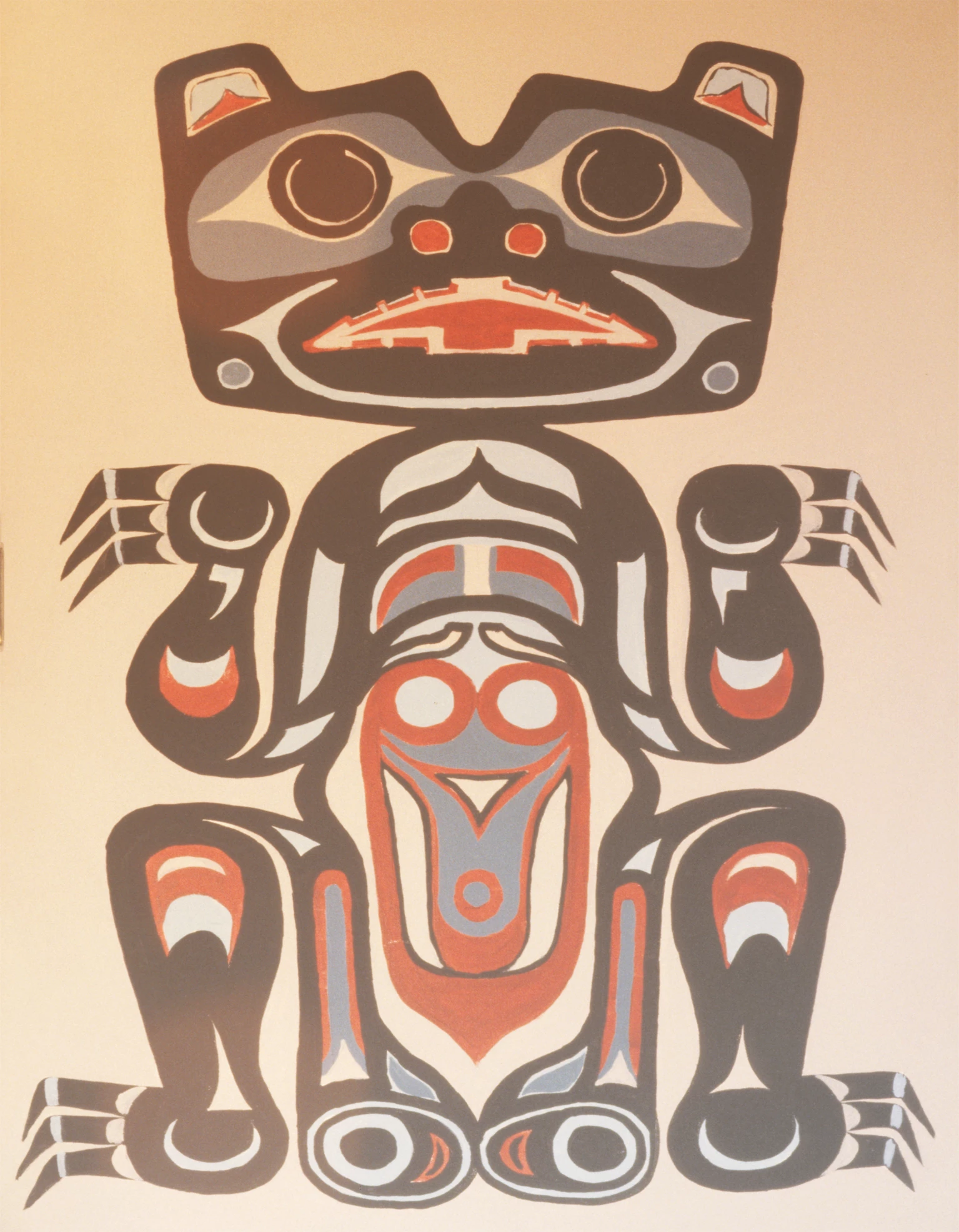
I want to use a Haida style paining of a cinnamon bear as a greeting card but the picture of the painting was poorly illuminated so black at top has become gray at the bottom.  How can I make the colors consistent?  I am learning to use Photoshop 13 so do not let a seemingly over simplified answer inhibit you.  Gil S

    This topic has been closed for replies.

    1 reply

    davescm
    Community Expert
    Community Expert
    July 19, 2017

    There are some nasty colour changes as well as the shading. There is also some lens flare.

    One way is to make a mask from the 4 paint colours and use those masks on solid Color Fill layers

    To do this use the quick selection tool initially make a selection of the brown areas. (You can Alt click to remove from the quick selection and click to add.

    Add a solid color layer (set to brown) and then add a layer mask to that layer based on your selection (Layer - Add layer mask - Reveal selection). Now you can tidy up that mask by clicking on it and painting with white where you want the layer to show and black where you do not.

    Turn that layer off by clicking on the eye symbol in the layers panel

    Repeat for the other colors

    Turn the new color layers back on (eye symbols)

    Add another solid color layer with the paper color underneath the previous 4 colours.

    Dave

    Trevor.Dennis
    Community Expert
    Community Expert
    July 19, 2017

    Nice job Dave.  I took a different approach.  As the OP mentioned the 'blacks at thew top', I am thinking that the darkest tones need to be black, or close to it.  So I pulled up the blacks with a curves layer.

    You can see from the colour sampler points that #2 is not quite there, so to even it up I ran a gradient down the curves layer mask.  Rather than stabbing in the dark trying to find the right start point for the gradiant, I set the foreground colour to 160,160,160 which is getting the three locations reasonably close.

    The background still has a problem, so I made an alpha mask from the red channel to make a layer mask for the graphic, placed a solid colour behind it.  The curves layer was affecting the background, so I clipped it to the graphic layer.

    My blacks are not perfect though, and Dave's approach gave you consistent tones across the graphic, so his way is probably better.

    A little side story about how you can get into a grove rut with your Photoshop workflows.  Late last night I finished a commissioned montage for the 'Centre for Applied Cross-cultural Research (CACR)' which involved a ton of inter layer masking.  I'd obviously had the workflow from that programmed into me, because my first approach to preventing the curves layer affecting the background was to do the same thing with a compound layer mask like this

    That was crazy because clipping is a single click operation. But it's a good excuse to let me show off my montage :-)

    Participant
    July 20, 2017

    Wow!!!  Your montage would eat up about 10 years of my life.