Cracked Texture Aligned with Font Direction? - how to?
Copy link to clipboard
Copied
Hi,
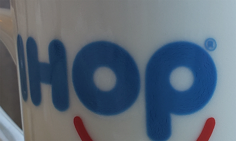
I have a close up picture of a coffee mug from IHOP (International House of Pancakes). As you can see in the photo here, the ink of the IHOP letters have a cracked texture. But the 'cracking' aligns or flows in the direction of the font or letters. (Look at the photo at 100%)
ANY THOUGHTS on how to reproduce this effect?
I am making or mimicking this font with other text - but I want the same cracked ink look.
THANKS!!
AJ
Explore related tutorials & articles
Copy link to clipboard
Copied
In Photoshop that seems difficult and may ultimately need pretty much manual painting.
But you could certainly create a Brush (or several) with scraggly lines.
Copy link to clipboard
Copied
I am not entirely sure what you are after but you've mentioned a directional texture, so see if this helps.
Make your Type layer and go Type > Create Work Path
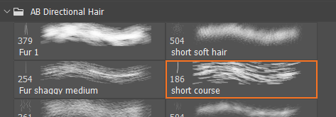
Now you need your texture to be in the form of a brush preset. I am going to use this Aaron Blaise hair preset
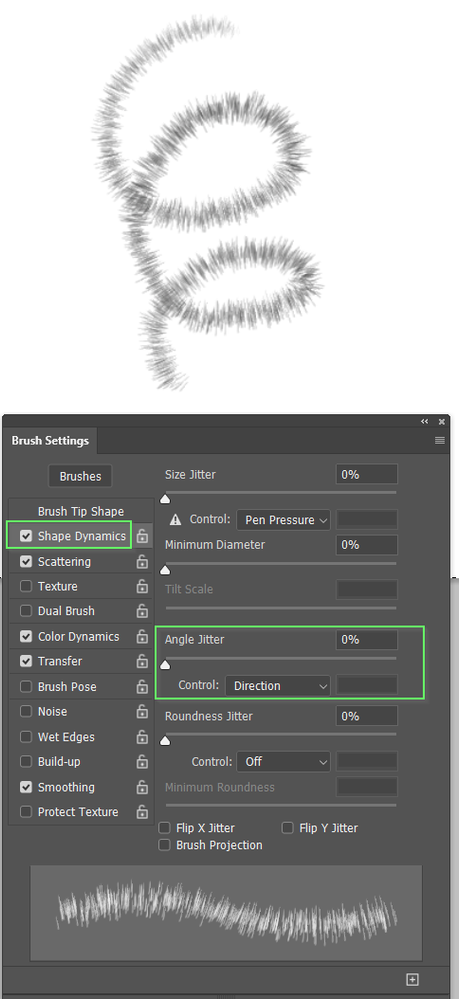
It's Angle Jitter is already set to Direction but that doesn't work for our purpose so I have roated the brush 90°
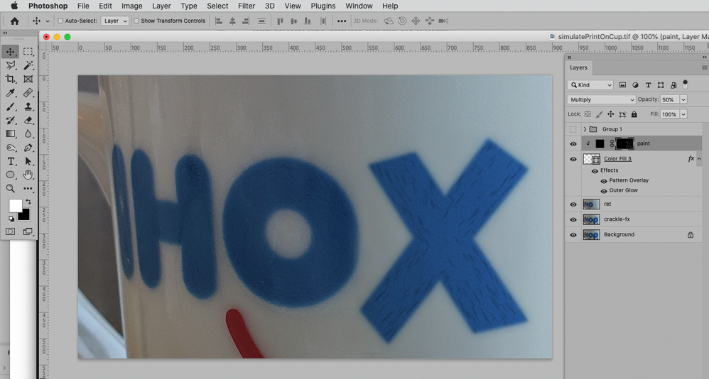
Now add a layer above the type layer, and clip it to the Type layer.
Note I have made the text a lighter colour to better contrast the texture.
Select the clipped layer.
Select a contrasting colour.
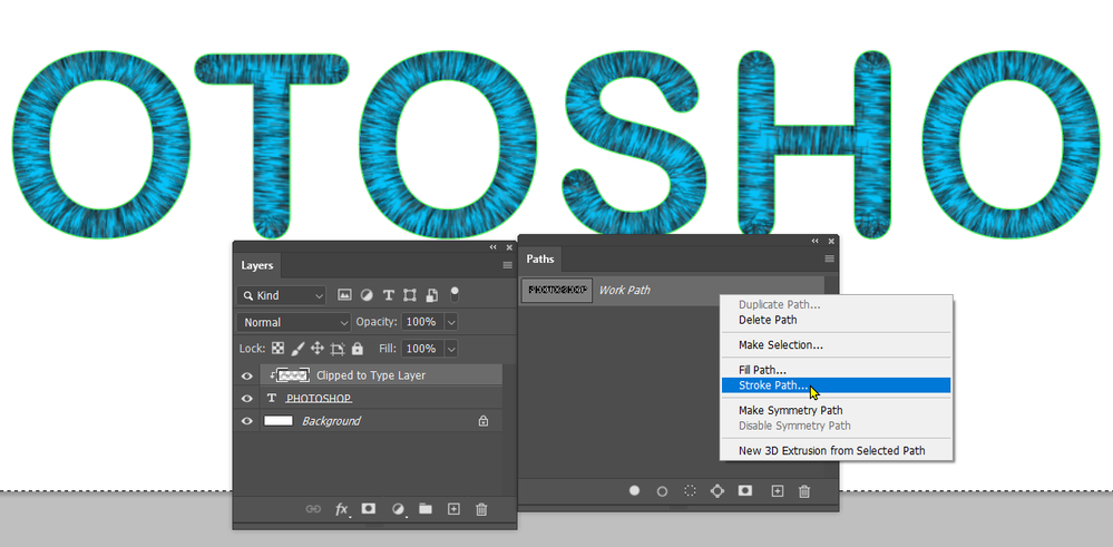
Right click the work path and chose Stroke Path
When the dialog box appears choose Brush, and makes sure Simulate Pressure is not checked.
I played with brush size and spacing for best effect, but I think you'll get the idea
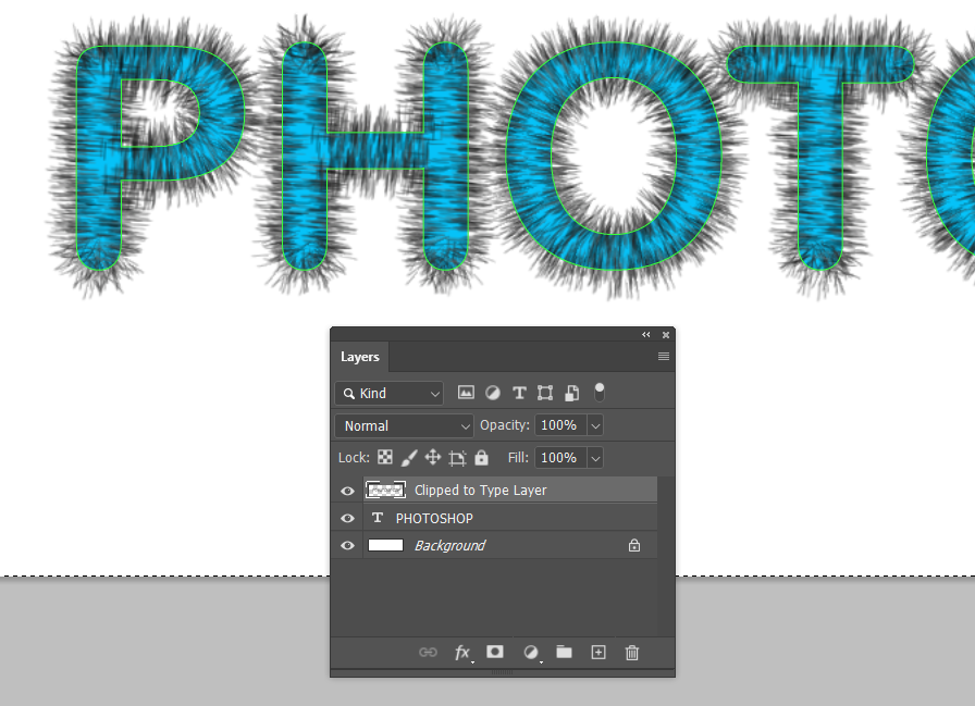
Just to clarify, the brush follows the path which outlines the text, so if we unclip the layer we can the full effect of the stroked path.
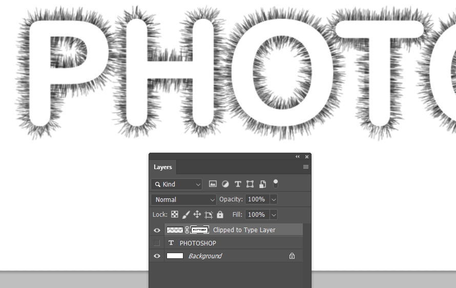
There are all sorts of options you can use from here. Turn off the Type layer, but use it to create a layer mask for the layer with the stroked path, and invert the layer mask for instance.
