
Answered
Creative Cloud Library Menu Panel Doesn't Match Others
Hi everyone,
I'm newb to PS and just started to appreciate the convenience CC Library brings. But my menu panel doesn't look quite right:
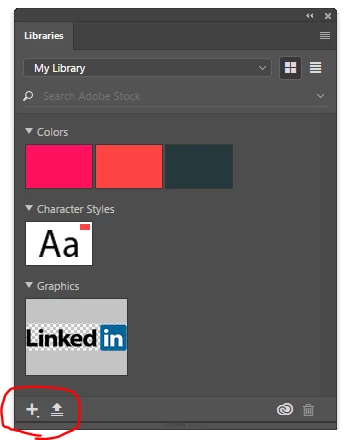
The only way I can add a new color/character style/graphic is to click that plus button and select what and what not to include:

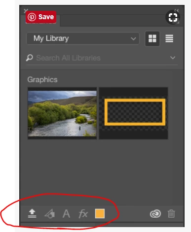
It certainly isn't efficient to click multiple times in order to add to the library if the general option I see people use is to just click once:
I couldn't find any setting regarding this change of menu panel so I'm seeking for advice here  Thank you!