

- Home
- Photoshop ecosystem
- Discussions
- Re: Decreasing layer opacity for specific area of ...
- Re: Decreasing layer opacity for specific area of ...
Decreasing layer opacity for specific area of layer

Copy link to clipboard
Copied
Hi,
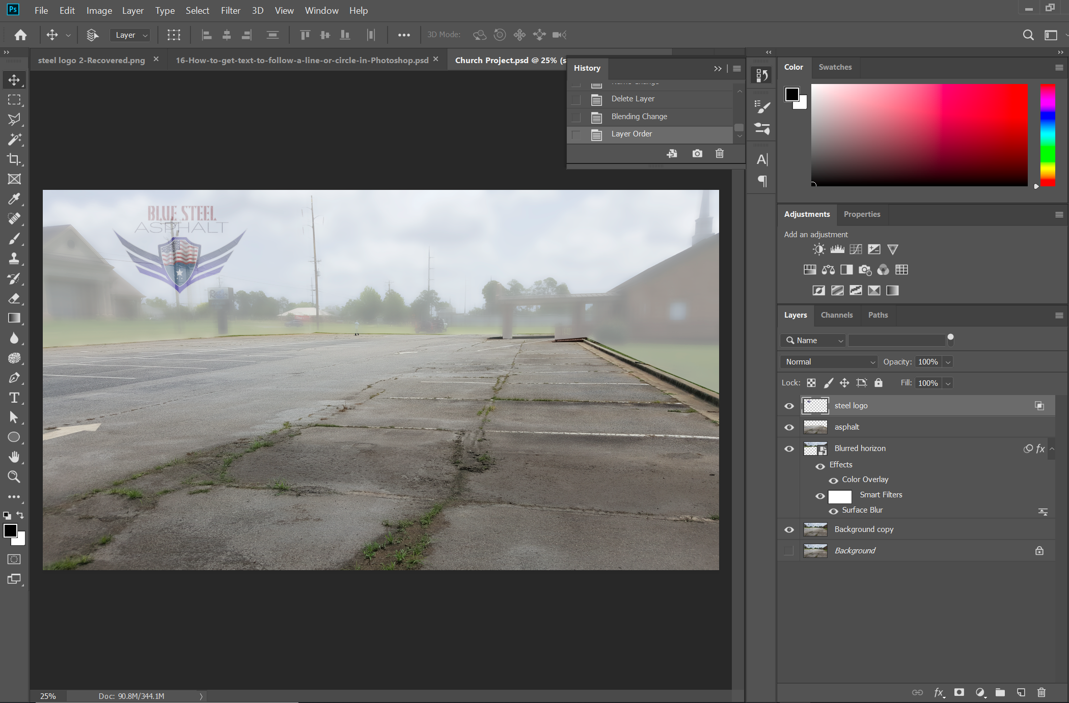
I am working on an image to the social media platforms we use for my family's asphalt business. The goal is to highlight how poor the initial state of the asphalt is on our latest job. I am working with 2 main parts of the original image: the asphalt layer (and some of the concrete is okay, too) and the background (everything that is not asphalt), which I labeled as "Blurred horizon". I chose to leave the asphalt layer in color to focus attention on the grass and cracks embedded all throughout the parking lot. Additionally, I chose to blur the horizon layer slightly and give it a white overlay. Lastly, I am placing our company's logo over the horizon layer. I used the layer styles to blend the logo to the underlying layer. However, the underlying layer is showing up through the logo rather noticeably in some areas. The best outcome would be to remove/ hide any of the underlying layer where the logo is currently occupying. How can I best achieve this from where I am now? Is there a more efficient path I could have used to reach my end result?
Thanks in advance for reading this and formulating a solution to help me...Thanks!!


Explore related tutorials & articles
 15
Replies
15
15
Replies
15
Copy link to clipboard
Copied
Place the Logo on the top layer. and make sure the blend mode is normal and opacity is set to 100%
Copy link to clipboard
Copied
This is what happened when I made those changes. The light pole is still showing thru the logo. I'm not very familiar with clipping masks, but I feel this is when one could be instrumental lol. Any suggestions?
Copy link to clipboard
Copied
Sure looks like the logo is somewhat transparent. Sometimes a solution for that is to duplicate the layer a few times and merge those duplicates to remove that. Then add a layer mask (if needed) and you should be good to go.
Copy link to clipboard
Copied
You have indicator on the right side of steel logo layer that advanced blending options are in use. Open Layer Style dialog and remove advanced blending or right click on layer and choose: Clear Layer Style.

Copy link to clipboard
Copied
https://forums.adobe.com/people/Bojan+%C5%BDivkovi%C4%87 wrote
You have indicator on the right side of steel logo layer that advanced blending options are in use. Open Layer Style dialog and remove advanced blending or right click on layer and choose: Clear Layer Style.
A good call, but I think the logo has a white background, which I guess is why the OP used Blend If. I HATE blend if. Especially with hard edged objects where the inevitable left behind pixels will look a dreadful mess.

Copy link to clipboard
Copied
Bit harsh on Blend If there Trevor  . It has its place (not in this image) , but what many don't realise is you can soften the transition by holding down Alt when moving the triangles to split them.
Dave
Copy link to clipboard
Copied
That is exactly what I did during the initial use of the 'blend if' slider
.png)
Copy link to clipboard
Copied
The logo has a transparent background. I used the layer styles to blend the logo with the underlying layer and I liked that look more than decreasing the opacity of just the logo. At this point, I was hoping to make the underlying layer 0% opacity or clipped just in the shape of the logo to keep that light pole from bleeding thru. You mentioned that you don't like the 'blend if' function...here are the 2 business logos we have. I used 'blend if' to create the 2nd one from a steel texture stock photo. Did the 'blend if' slider work in this instance or would you have rather used a different route to achieve the steel look in the logo. Just curious...I only have a few tools in my repertoire and if I can add something better, I most definitely will!


Copy link to clipboard
Copied
We can see from the icons on the Logo layer that you are using Blend If. I realise that some people like Blend if, but in reality, it is the work of the devil, and best avoided at all costs. In fact with what is one of the most vital graphics you'll ever use in regards to your company, having the logo as a raster drawing on a white background is crazy.

Do you have the logo as a vector object with a transparent background? If not, either create it, or paste it to this thread at a decent size, and I have a strong feeling someone will do it for you. If you feel up to doing it yourself, use as many shape and text layers as you need, and join them as a Smart Object. Then drag that SO to a Creative Cloud Library where you can grab it at any time.
That vector log layer should go at the top of the stack.
The way you have delineated the asphalt and concrete from the background is not looking nice, and I am not sure what you have done to get there. I don't see any layer masks, and this situation is crying out for them. I've used a layer mask to hide the lower part of this concrete car park. It's a hard, stark cut off
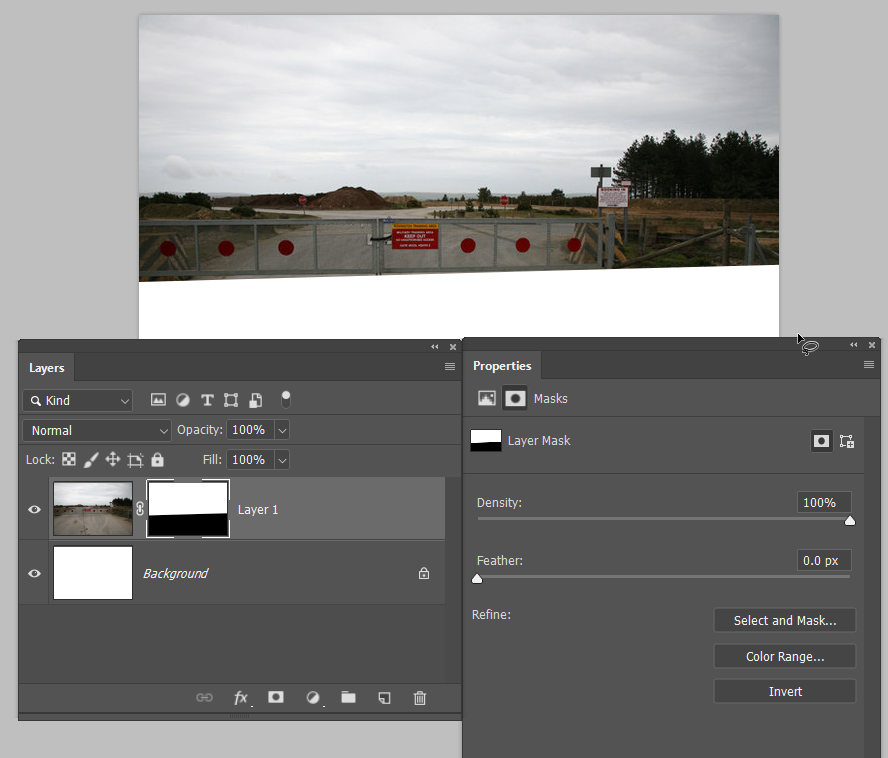
But I can feather the mask in Mask Properties to soften the transition
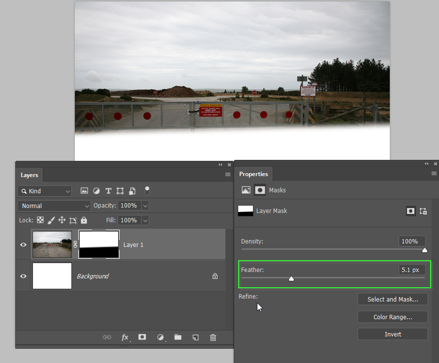
I can even move where the transition is by unlinking the mask (the red highlight), and moving the mask. This is flexible and non destructive, and can look much tidier than the way you have done it.

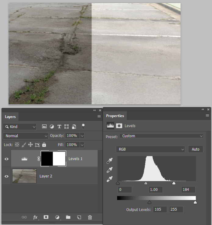
Overlaying with a layer filled with white, is probably not the best approach to 'whiting out' what lies below. It can work, but I it would be rare for me to go that way. There are infinite ways to achieve the same end with Photoshop, but what I have done below is
Add a Levels Adjustment layer
Move the highlight Input slider to the left making all pixels that fall to the right of it full white
And move the shadow Output slider to the right which lifts the shadow content.
I've split the mask so you can see before and after. It's an approach that is flexible and non destructive, and you can mask where it has and doesn't have an effect.
Paste that logo here if you'd like some help with it.
Copy link to clipboard
Copied
I was looking at later screenshot and it indicates (at least that is what I see) that layer with logo is surrounded with transparency.

Copy link to clipboard
Copied
Yes, you are correct. I used the 'blend if' slider to make the logo have an opaque look. I changed it and here is the result:
.png)
That light pole is bleeding thru...how do you suggest I proceed from here? Is there any way to make the underlying layer not show up just in the area corresponding to the logo?
Copy link to clipboard
Copied
I don't know how to make the changes to the logo, yet  I love the feedback and I will try to implement your suggestions for future purposes. Here is the logo file if anyone would like to beat me to the punch. I'm working on it, but it will most likely take me longer than most people here!

Copy link to clipboard
Copied
Yeah, I agree my selections are rough. I simply used the pen tool to make a selection of the background and 'inverse select' for the asphalt. Then, I made each of these selections into their own layer. That's it lol...no feathering...it is a very harsh border. I am working on your suggestions right It may take me some time, but I am grateful for your informative and descriptive feedback!

Copy link to clipboard
Copied
Duplicate the layer. Use a black layer mask to hide just the part needing a different opacity, then invert that mask on the second layer. Adjust the opacity of both layers to suit.
Copy link to clipboard
Copied
Okay...give me just a bit to work on that. Thank you and I will see how that works!

 AdChoices