Copy link to clipboard
Copied
I'm trying to design a website in photoshop. I've never quite understood how to measure the particular elements though. I believe it's probably because the resolution in my browser is different from the resolution in my ps file. Here's what I mean...
I'm designing this in photoshop:
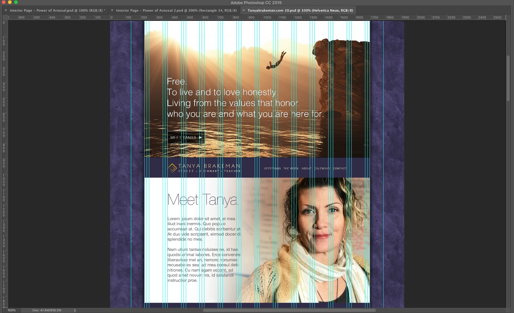
This is how it displays at 100% in photoshop. The resolution is set to 144 dpi. The dimensions in PS are 1920px wide by 8626px tall, but at 100% it's displaying quite small on my screen.
How can I tell how it will actually display once it's in the browser? I will be passing this off to a developer who will need to know how large the text needs to be etc. The last time I sent a web comp to a developer, the text was all too large...
Does my question make sense? It's hard to describe! Let me know if I can provide any other information to be more clear about this! Thanks!!
Copy link to clipboard
Copied
Your question does make sense but what you need to know is how the browser will scale the image.
In Photoshop, 100% zoom maps 1 image pixel to 1 screen pixel. It has nothing to do with a physical size (and so Photoshop on a low pixel density screen will be shown at a larger physical size than on a high pixel density screen). Both are mapped 1 image -1 screen pixel.
The ppi setting is irrelevant and is only used when printing and when showing the ruler size in cm or inches.
Some browsers when used on screens with high pixel density, such as the Apple retina screens, scale the image rather than showing it at the 1 to 1 mapping. So for example it may be shown at 1 image pixel mapped to a block of 4 screen pixels and therefore looks physically bigger than the 100% view in Photoshop.
Dave
Copy link to clipboard
Copied
I just want to figure out the best way to set up a file so that I know how I want it to look and the developer also knows how I want it to look. I do have a basic understanding of how websites work and I of course know that elements must enlarge/shrink/move etc. to flow differently on different sized screens. But I want the developer to know the basic ratios of text to image to screen size.
For instance, I created this comp in the past:
I sent this to a web developer to turn into a website and it ended up looking like this:
Do you see how much larger the text is on the left hand side of the developer's version? I want to be able to show what I want in a clear way, but I'm not sure if I'm viewing the image properly in photoshop.
So, based on what people have said here:
If I'm on a retina screen, could I potentially view at 200% at 96ppi and I would be viewing the image about the size that it might appear on the web browser?
Copy link to clipboard
Copied
sarahpeller wrote
Do you see how much larger the text is on the left hand side of the developer's version? I want to be able to show what I want in a clear way, but I'm not sure if I'm viewing the image properly in photoshop.
So, based on what people have said here:
If I'm on a retina screen, could I potentially view at 200% at 96ppi and I would be viewing the image about the size that it might appear on the web browser?
Your OS display properties, browser font size preferences & zoom level are all effecting how web pages appear to you on your screen. I'm not exaggerating when I say everyone uses different settings to suit their vision & device requirements. What looks like "grossly oversized text" to you might well be "normal" or even "undersized" to somebody on another device. Prototyping in Photoshop is, at best, a rough estimate of what final web pages will look like online.
Copy link to clipboard
Copied
Hmm... Ok. Is there a better program for a graphic designer who is not a coder to use to make a prototype?
Copy link to clipboard
Copied
One option is Adobe XD CC
Free prototyping tool, mobile app UI/UX design | Adobe XD CC
Copy link to clipboard
Copied
Whoa, cooool! That looks like it will help a lot, especially if I can create my designs in Illustrator or Photoshop. I have not heard about this program yet and most developers that I have worked with always expect a photoshop file. I've even seen some web comps done in InDesign by other designers. This looks really interesting. I'll check it out. Thanks, John Waller & Nancy OShea for your helpful comments!
Copy link to clipboard
Copied
XD is a vector based UI/UX design, prototyping and sharing tool. But you still use Photoshop & Illustrator to create the graphics.
Adobe XD tutorials | Learn how to use Adobe XD CC
Copy link to clipboard
Copied
there was a great program for doing this called Muse but Adobe has dropped that without a real replacement option
XD is like Photoshop... not really designed to do web sites and will just give you different errors
if you don't want to learn code then I would send you to Spark as a good compromise to build limited sites
Copy link to clipboard
Copied
Spark is not a prototyping tool. Spark is an online 1 page website builder.
Ussnorway wrote
XD is like Photoshop... not really designed to do web sites and will just give you different errors
What the heck does that mean?
Copy link to clipboard
Copied
To add to Dave‘s excellent advice, you should create a website that reflows for several devices. For example, a computer, a tablet and for a smart phone. And use web fonts and Alt text on images.
Copy link to clipboard
Copied
This is how it displays at 100% in photoshop. The resolution is set to 144 dpi. The dimensions in PS are 1920px wide by 8626px tall, but at 100% it's displaying quite small on my screen.
Resolution (ppi) has no effect on screen viewing - any image will display according to its pixel dimensions regardless of the ppi value. Ppi (pixels per inch) is used by printer drivers to calculate the physical dimensions of the print. In this case, the image would print at 13.33 (1920/144) by 59.9 (8626/144) inches. This is of course irrelevant, but it shows you the purpose of ppi.
If the image appears small to you, it's probably because you have a Retina (high resolution) screen, which has a much higher number of pixels than regular screens. For all these pixels to fit, they have to be very small. At 100%, Photoshop will display one screen pixel for one image pixel, and since the pixels are small, the image will appear small.
Web browsers compensate for this, and enlarge everything to 200%.
The last time I sent a web comp to a developer, the text was all too large...
Text on web pages should be real text, text which is part of an image will not be picked up by search engines.
The developer should know this, and should also use responsive design, which will ensure that the page displays properly in any web browser on any platform.
Copy link to clipboard
Copied
Q: How long is a piece of string?
A: It depends.
Responsive web design is not about fixed widths & heights because your end product must fit all devices from ultra small to ultra large & everything in between. Also the W3C web standard for images is 96 pixels per inch up from the old standard of 72 ppi. It was never 144. See link below for more info.
https://hacks.mozilla.org/2013/09/css-length-explained/
In web design, we use CSS widths expressed in percentages, viewport units or rems. We rarely if ever use explicit height values because height is variable. It changes depending on the user's viewport and the amount of content on the page.
I use Photoshop to create images for the web. But I build my page layouts in Dreamweaver and test the actual layout in browsers and devices.
As a quick example, this is my prototype in a desktop browser. The native background image is 900 x 900 px. But it is scaled up or down by CSS code.
The same prototype in a smaller viewport (320 x 480).
This is the responsive HTML and CSS code I used.
<!doctype html>
<html lang="en">
<head>
<meta charset="utf-8">
<title>Background-Size Cover Demo</title>
<meta name="viewport" content="width=device-width, initial-scale=1">
<meta http-equiv="X-UA-Compatible" content="IE=edge">
<style>
body, html {
margin: 0;
padding: 0;
height: 100%;
display: flex;
align-items: center;
justify-content: center;
}
body {
background: url(https://placeimg.com/900/900/nature) center center fixed;
background-size: cover;
font-size:4.215vw;
}
.container {
width: 50%;
margin: 0 auto;
padding: 5%;
background: rgba(255,255,255,0.7);
}
.center { text-align: center }
</style>
</head>
<body>
<div class="container">
<h2>Heading 2</h2>
<p>Lorem ipsum dolor sit amet, consectetur adipisicing elit.</p>
<p class="center"><a href="https://example.com" class="button">CLICK HERE</a></p>
</div>
</body>
</html>