• Global community
    • Language:
      • Deutsch
      • English
      • Español
      • Français
      • Português
  • 日本語コミュニティ
    Dedicated community for Japanese speakers
  • 한국 커뮤니티
    Dedicated community for Korean speakers
Exit
3

Effect on test (layer style)

Community Beginner ,
Nov 19, 2023 Nov 19, 2023

Copy link to clipboard

Copied

Effect on text: Good morning. Some time ago Adobe "sent" me some PSDs. I would like to imitate the effect that was applied to the font you see in the image. The fact is that there is no effect (layer style) in the text layer and I don't understand how it can be imitated.
Thank you
Roberto

Photoshop: 25.1.0

Windows 11

TOPICS
Windows

Views

440

Translate

Translate

Report

Report
Community guidelines
Be kind and respectful, give credit to the original source of content, and search for duplicates before posting. Learn more
community guidelines

correct answers 1 Correct answer

Community Expert , Nov 20, 2023 Nov 20, 2023

I don't think you can completely match it with Layer Styles because we don't have enough control of the profile.  In Eye Candy 7 you can draw the profile.  You can still get fairly close though
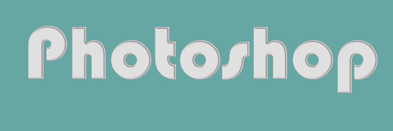
image.png

In Bevel & Emboss Smooth works best.  You're trying not have an outer bevel, and Smooth gets you closer to that.

Altitude is important.  You need to go as high as you can get away with before you lose the inner wall.

Note the Highlight wasn't doing anything, so I set it to zero.

image.png

OK, the important thing

...

Votes

Translate

Translate
Adobe
Community Expert ,
Nov 19, 2023 Nov 19, 2023

Copy link to clipboard

Copied

The original text has been rasterized. If you look at the thumbnail in the Layers panel for the original text, it's a rasterized thumbnail as opposed to the T that appears in yours. The character details that appear in Photoshop in the original is just showing what font is currently selected to use.


You might get close to simulating the effect with Layer Styles, but it looks like it may have been 3D text--look at the difference in the perspective between the "i" on top and the "s" on the right.


Although you can try making the text 3D in Photoshop, the 3D features have been deprecated. 


Instead, you might try making the 3D text in Illustrator (Effect > 3D and Materials).

Votes

Translate

Translate

Report

Report
Community guidelines
Be kind and respectful, give credit to the original source of content, and search for duplicates before posting. Learn more
community guidelines
Community Beginner ,
Nov 19, 2023 Nov 19, 2023

Copy link to clipboard

Copied

(for Myra) But of course I had to think about it, it was rasterized, that's why I didn't "see" the text in the layer... As you can see from the MyText image you can see the attempts I made to get closer to the result of the text I was trying to "imitate " ". I also thought that maybe if I found a particular "action" I could get there, but it's not easy.
(for Ares) ok, see answer to Myra

Thanks anyway for your timely responses and help. I'll get over it.
Roberto

Votes

Translate

Translate

Report

Report
Community guidelines
Be kind and respectful, give credit to the original source of content, and search for duplicates before posting. Learn more
community guidelines
Community Beginner ,
Nov 20, 2023 Nov 20, 2023

Copy link to clipboard

Copied

Sorry Myra, I forgot. Why did whoever created that PSD need to rasterize that text layer?
I'm a beginner and I'm not clear on the purpose.
Thank you
Roberto

Votes

Translate

Translate

Report

Report
Community guidelines
Be kind and respectful, give credit to the original source of content, and search for duplicates before posting. Learn more
community guidelines
Community Expert ,
Nov 20, 2023 Nov 20, 2023

Copy link to clipboard

Copied

If you don't need to have the perspective and want to get close, here's one approach with 2 layers that each have their own set of Layer Styles.

white-Christmas.jpg


I did the following:

  1. Set the text
  2. Duplicated the layer
  3. Applied Layer Styles to the first layer
  4. Changed the Fill on the 2nd layer to 0% (so that only the Stroke and effects on it appeared and not the text itself)

Here are the Layer panel settings for the layers:

2023-11-20_13-28-33.jpg2023-11-20_13-28-18.jpg

Here are my Layer Style settings for the bottom layer:

2023-11-20_13-27-17.jpg2023-11-20_13-27-31.jpg

And here are my Layer Style settings for the top layer (I added the stroke first and then applied Bevel & Emboss):

2023-11-20_13-28-01.jpg2023-11-20_13-27-49.jpg


Votes

Translate

Translate

Report

Report
Community guidelines
Be kind and respectful, give credit to the original source of content, and search for duplicates before posting. Learn more
community guidelines
Community Beginner ,
Nov 21, 2023 Nov 21, 2023

Copy link to clipboard

Copied

Myra, thanks for your patience and suggestions. As mentioned, I had achieved a result that satisfied me. There he is

MyNEWText.jpg


With your suggestions I achieved this. I tried several times but I think I did something wrong despite all the tests I did. However, this result is also beautiful, isn't it? Now I'll try again. Look here:


MyraText.jpg


Roberto

Votes

Translate

Translate

Report

Report
Community guidelines
Be kind and respectful, give credit to the original source of content, and search for duplicates before posting. Learn more
community guidelines
Community Expert ,
Nov 21, 2023 Nov 21, 2023

Copy link to clipboard

Copied

LATEST

It turned out great! 🙂

Votes

Translate

Translate

Report

Report
Community guidelines
Be kind and respectful, give credit to the original source of content, and search for duplicates before posting. Learn more
community guidelines
Community Expert ,
Nov 19, 2023 Nov 19, 2023

Copy link to clipboard

Copied

You need to use Styles from Styles Panel or add "fx" from bottom of your Layers panel. Just open Style Panel and drop Shadow icon on your text or text layer.

Layer effects and styles in Adobe Photoshop

Votes

Translate

Translate

Report

Report
Community guidelines
Be kind and respectful, give credit to the original source of content, and search for duplicates before posting. Learn more
community guidelines
Community Expert ,
Nov 20, 2023 Nov 20, 2023

Copy link to clipboard

Copied

I don't think you can completely match it with Layer Styles because we don't have enough control of the profile.  In Eye Candy 7 you can draw the profile.  You can still get fairly close though

image.png

In Bevel & Emboss Smooth works best.  You're trying not have an outer bevel, and Smooth gets you closer to that.

Altitude is important.  You need to go as high as you can get away with before you lose the inner wall.

Note the Highlight wasn't doing anything, so I set it to zero.

image.png

OK, the important thing here it the shape of the contor, and to a lesser extent, the range.  The settings are quite finicky.  A little difference makes a big change.
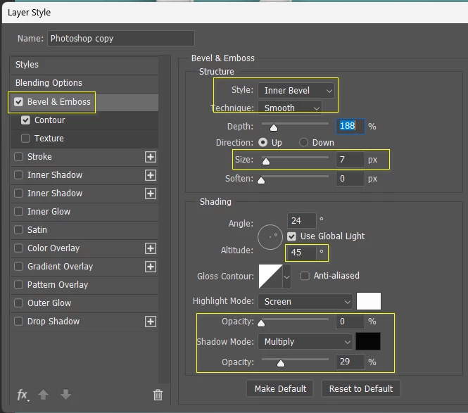
image.png


You can get it a bit finer with Eye Candy 7 but there's a problem with both versions, and that's the shading on the outer left edges. That is going to create a dark line when you try to extrude to give it some depth.  You could maybe fake it using a masked stroke, which wouldn't be too hard.

image.png


Votes

Translate

Translate

Report

Report
Community guidelines
Be kind and respectful, give credit to the original source of content, and search for duplicates before posting. Learn more
community guidelines
Community Beginner ,
Nov 20, 2023 Nov 20, 2023

Copy link to clipboard

Copied

Thanks Trevor for the great advice. I worked a bit on the styles, adding a little contour and the result is better. It's not quite like the PSD, but it's close. Thanks again.
Roberto

Votes

Translate

Translate

Report

Report
Community guidelines
Be kind and respectful, give credit to the original source of content, and search for duplicates before posting. Learn more
community guidelines