Participant
November 24, 2019
Question

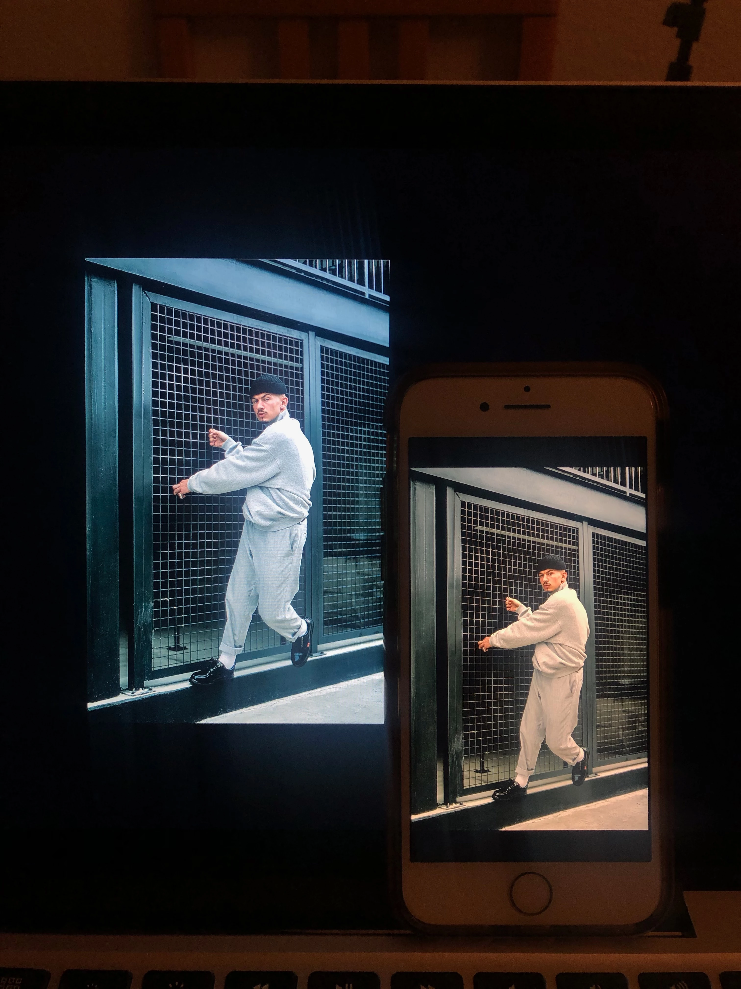
Final photos look WARMER on iPhone than in photoshop and Mac display, Please help?

  • November 24, 2019
  • 2 replies
  • 4279 views

Hey guys thank you for reading! 


So ive been having some difficulty with this lately, the images would look perfect on Photoshop and my mac but once airdropped over to my phone it looks warmer and strange. any ideas?

i thought it could be color calibration with the monitor but i dont understand how to correct it without any expensive tools or services? 


any feedback will be greatly appreciated.


This topic has been closed for replies.

2 replies

Conrad_C
Community Expert
Community Expert
November 25, 2019

Apple devices have several settings you must make sure are consistent, before comparing colors across them:

  • TrueTone. This alters the warmth of a Mac, iPhone, or iPad display to try and match the ambient light, the way paper does when it reflects ambient light.
  • Night Shift. This makes a Mac, iPhone, or iPad display warmer in the evening hours, for more comfortable viewing that theoretically preserves your ability to sleep properly.
  • Reduce White Point. This is not a common setting to change. It's in the Accessibility section because it's intended to help users with vision problems. But if it's on, it will change the warmth of the display.
  • Automatically Adjust Brightness. While this does not affect the warmth of the display, if the display keeps getting brighter and dimmer as the ambient light changes, that's going to affect your corrections. What looked OK a minute ago might not look OK after the light changes in the room.


Because all of those settings alter the display, and all are available on the latest versions of iOS and macOS, you need to make sure that all Apple devices you compare images on are set the same way. The most reliable way is to shut off all those features, then set all device displays to the same brightness level.


But that won't even guarantee that all Apple displays will have the same warmth, because Apple has changed the white point of iOS device displays over the years. And it also assumes your Mac display has the same color gamut (sRGB or P3) as your iPhone, and is using the correct display profile. Any difference could make the iPhone display look different than the Mac.


If you want the most reliable preview of your images, it's not going to be on a phone. It's going to be a Mac or PC display after profiling the display at your target viewing specs, and preferably also calibrating if your display supports that. How it looks on phones is never going to be reliable, because of the different ways each user can set up their own phone. And that's on iOS, which has color management built into the system. On Android, it's worse.


You can never get it right for all phones. If you manage to get it right on the phone in front of you, it might still look different on all other phones. All you can really do is get the image right on a profiled/calibrated display, and not worry about phones, just let it go.

Maiane Gabriele
Inspiring
November 24, 2019

First of all, in order to check if this is a calibration issue you can try different images in both screens. If this was the case all of them are going to have the same problem. 


Besides it you can check your document color profile, are you working with rgb? If you aren't, try to change this settings in the document. Select Image > Mode > RGB. I'm considering you're going to use this image in digital environment. Also check if you're still retaining the rgb mode when exporting your image.