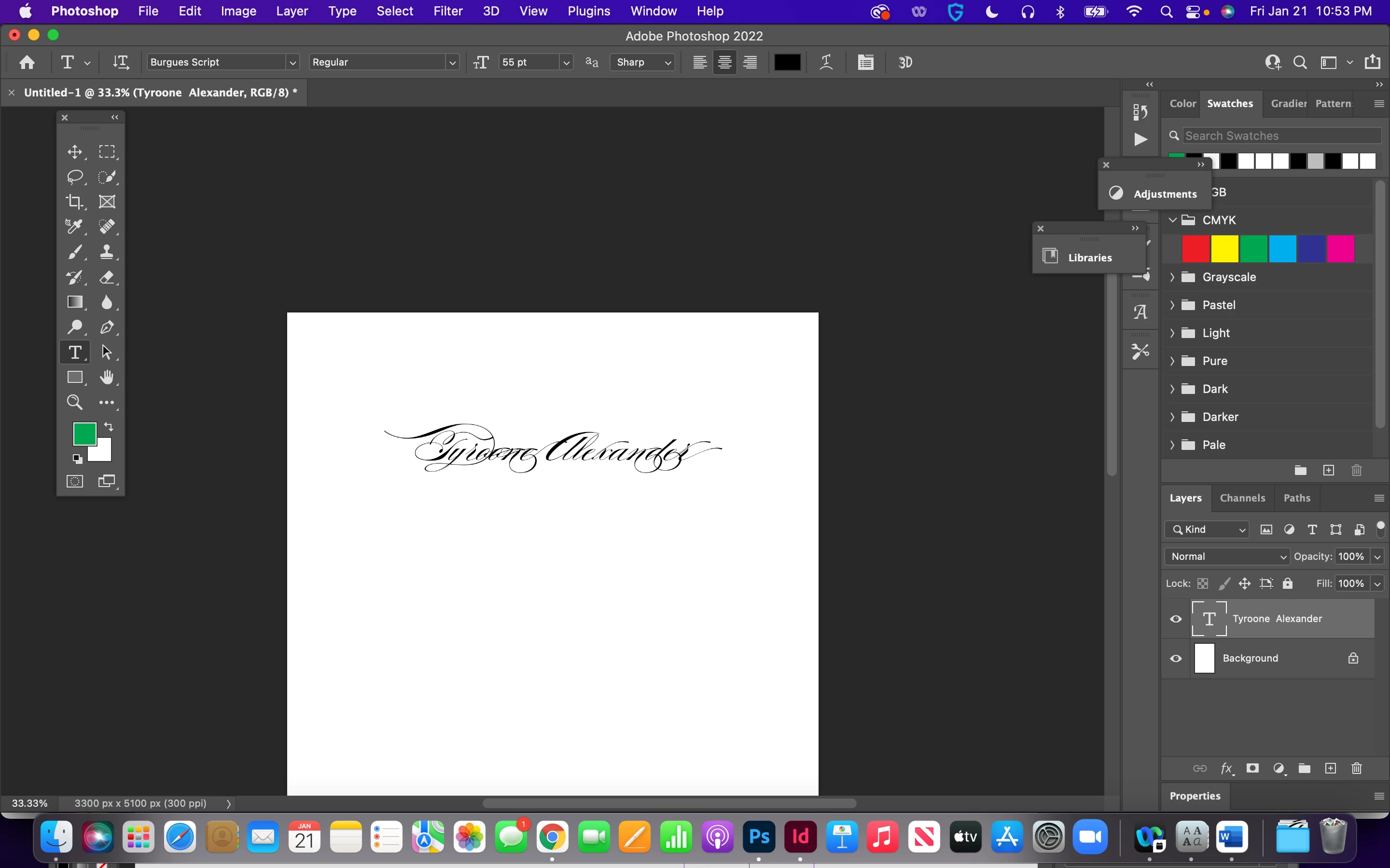
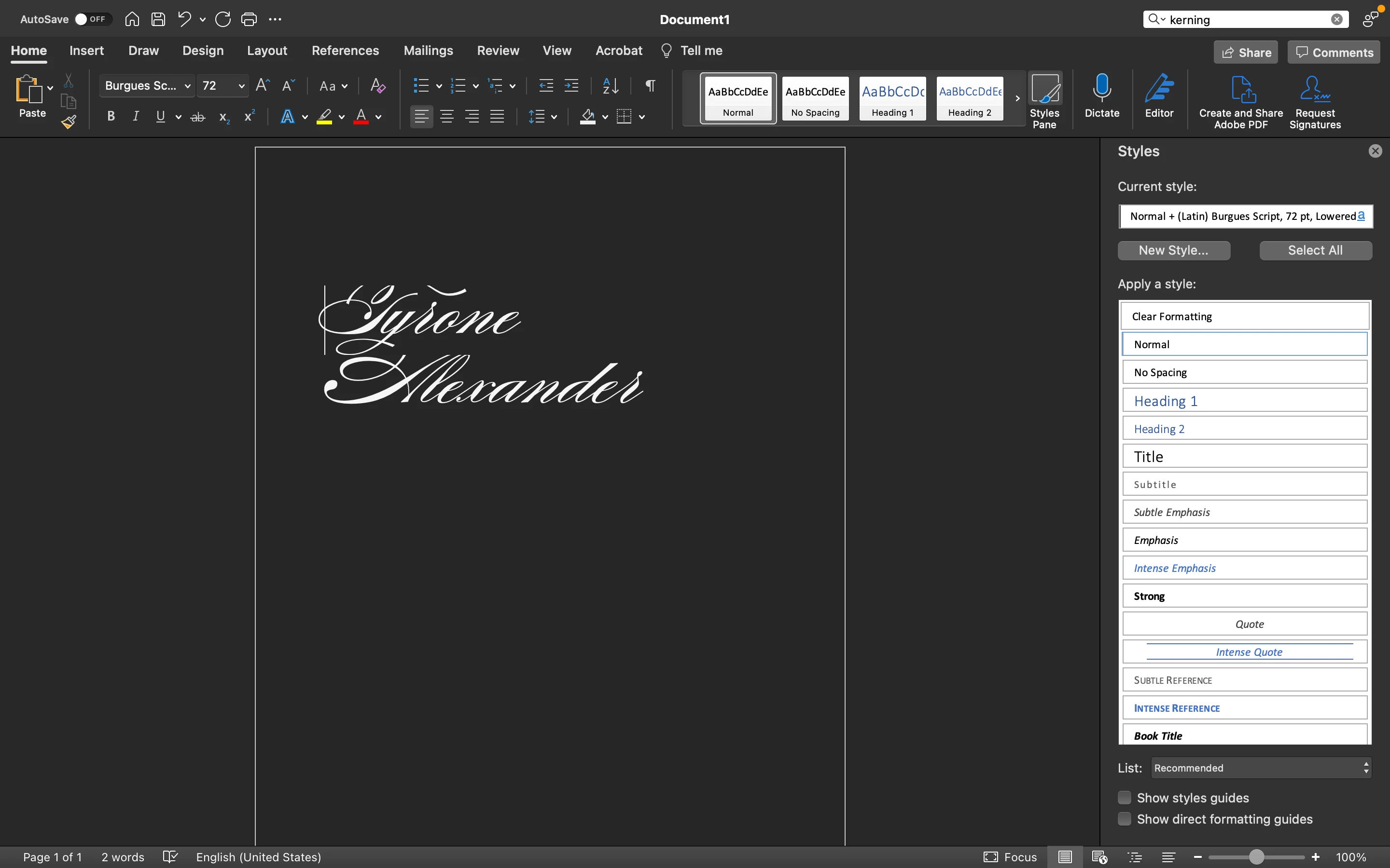
Copy link to clipboard
Copied
This font shows up differently in Word than it does in Adobe. I wanted it to look like the font that's in Word but I don't know what is happening, There are stark difference in some of the letters and it is harder to read in the version that is in adobe.
Copy link to clipboard
Copied
I would look at the advanced type options, a decorative script font probably has lots of alternative characters, flourishes, etc.
Copy link to clipboard
Copied
Thanks that worked! I didn't even know about stylistic sets and other features!
Copy link to clipboard
Copied
With your text tool select all the charachters in Photoshop.
As mentioned the Sudtipos Font Burgeus Script has stylistic alternates. Word is not that advanced in typography to handle that. In both Ilustrator and photohsop you can change stylistic alternates by selecting one letter.
Sudtipos is my favorite type foundry, Ale Paul has created some of the most beautiful fonts, but the avearge person working in Adobe is not as typographically adept as 30 years ago.
Copy link to clipboard
Copied
Agree with Lumigraphics. Unless you enable it, Word will not use alternate glyphs and ligatures while those options are on by default in PS. That alone could explain the difference in appearance.
Mylenium
Find more inspiration, events, and resources on the new Adobe Community
Explore Now