Participant
November 25, 2023
Question

help needed with colour management and print settings - dull prints

  • November 25, 2023
  • 1 reply
  • 456 views

Hi, 

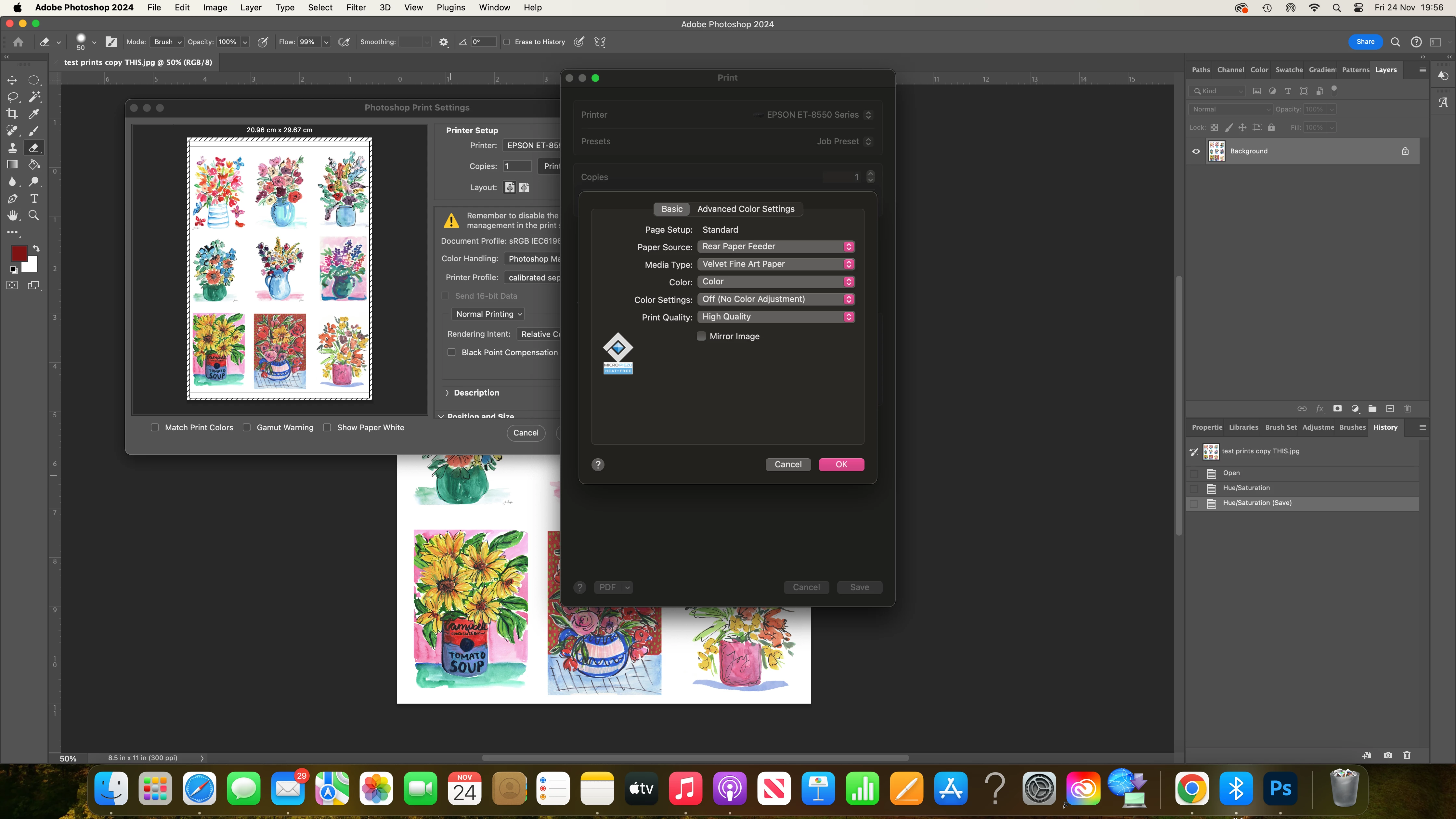
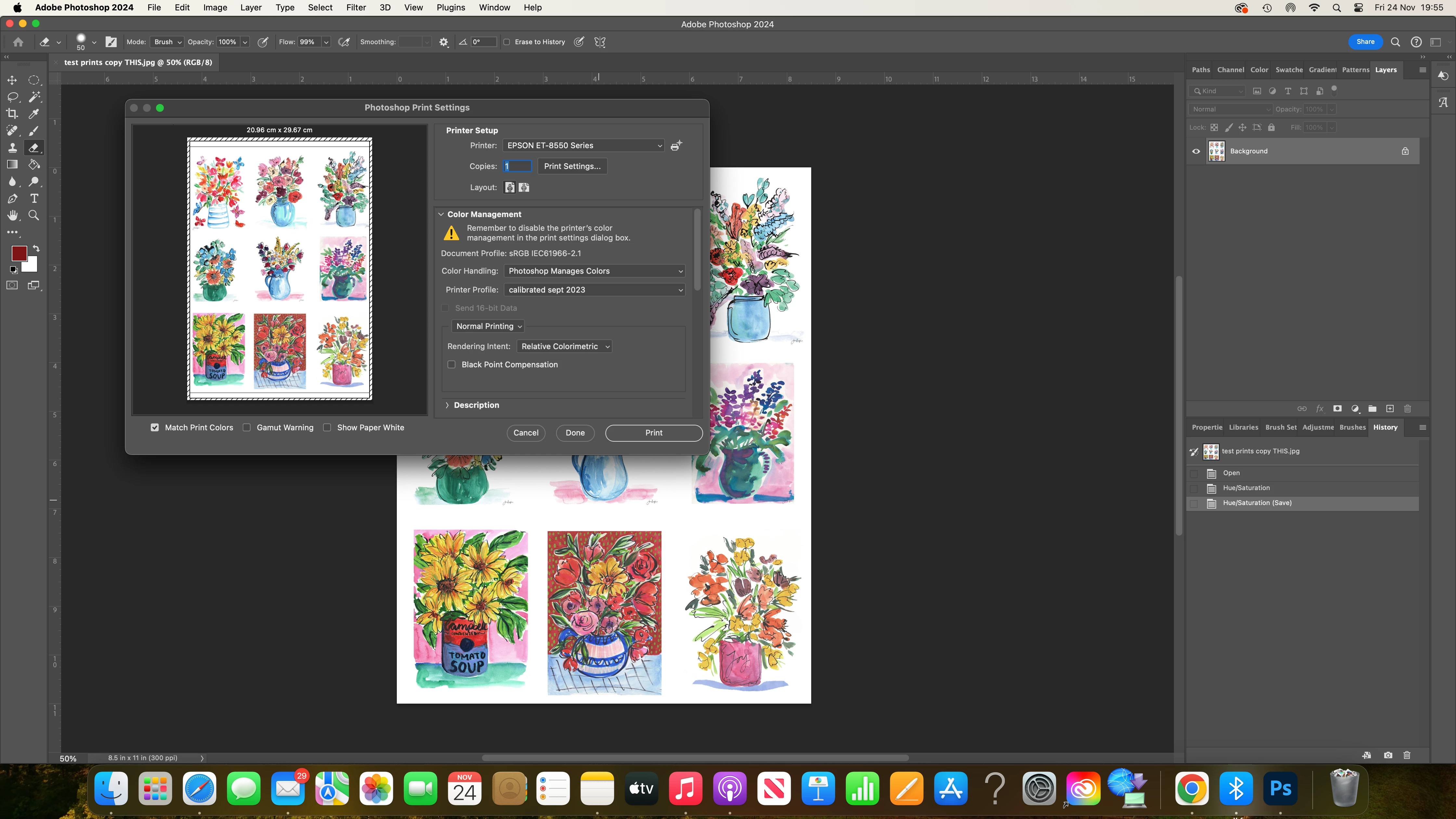
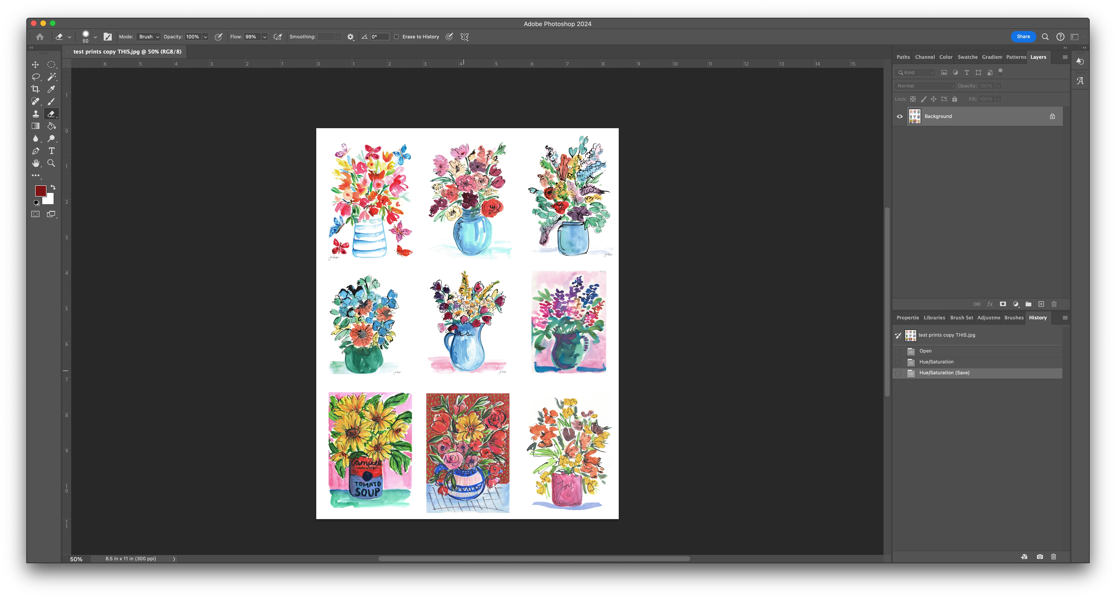
I hope you can help. Yesterday I printed a set of prints at home that I was really happy with, using epson velvet print setting with a hahnemuhle paper to sell in my etsy shop. Stupidly, I did not make a note of the print settings  I used. Today, I have tried to repeat what the printing that I did, and they are coming out really dull. The only thing I THINK I did differently, was try a downloaded ICC profile for a different paper, as I believed this was going to be better in the long run. However, I didn't like the results. I have since deleted the ICC profile and tried to go back to the settings I used yesterday but cannot replicate the results. I am attaching screen shots to see if you can spot anything that is obviously wrong, or if you can in anyway point me in the right direction. Coincidentally, creative cloud has updated and I appear to have more settings available to me today in the drop down print settings box - and I fear more to mess around with...

I am lost! I have customers waiting for prints that I cannot currently get right. Please help! 

Thank you!


This topic has been closed for replies.

1 reply

Per Berntsen
Community Expert
Community Expert
November 25, 2023

You seem to be using the monitor profile as printer profile, this will result in wrong colors.

Download the correct profile from Hahnemühle – the one for the paper/printer combo that you're using.

In my experience, Hahnemühle profiles are quite accurate.

If colors still are wrong, try to recalibrate your monitor. (the profile named "calibrated sept 2023" leads me to believe that you have a hardware calibrator)

Your should also check Black Point Compensation in the PS print dialog.


Participant
November 25, 2023

Thank you for taking the time to reply. 

I am using an epson 8550 and sadly, Hahnemuhle don't provide profiles for this model, so i'm aware this is one of the problems, however, I did manage to get a good colour match yesterday, though I don't know how, or what the printer profile was for that print...

I think you are right that I am using a monitor profile. 'calibrated sepy 2023' is my own calibration I did following steps online. 

So, I have gone back to Canson and downloaded their profile for a paper I have, used the correct profile printer and ticked black point compensation and it is working - thank you! 


However, it's not my preferred paper - and I DID manage to get a good colour match on the Hahnemuhle with velvet epson paper selected, so I must have used a different printer profile from this list. Do you have any suggestions as to which I should try (before I go about wasting more paper!) OR is doing this (using paper without the correct profile) likely to get inconsistent results. If that is the case, and yesterday was a fluke, I'll go back to testing out different papers with the correct profiling again! 

Participant
November 25, 2023

In addition, should I be choosing no colour adjusment in this box?