• Global community
    • Language:
      • Deutsch
      • English
      • Español
      • Français
      • Português
  • 日本語コミュニティ
    Dedicated community for Japanese speakers
  • 한국 커뮤니티
    Dedicated community for Korean speakers
Exit
0

How can I fit in a character in space?

Community Beginner ,
May 27, 2023 May 27, 2023

Copy link to clipboard

Copied

I want to put a man floating in space (don't ask why that man is Rick Astley) and I have no experience in creating lighting in space... any tips on how to make it realistic? 
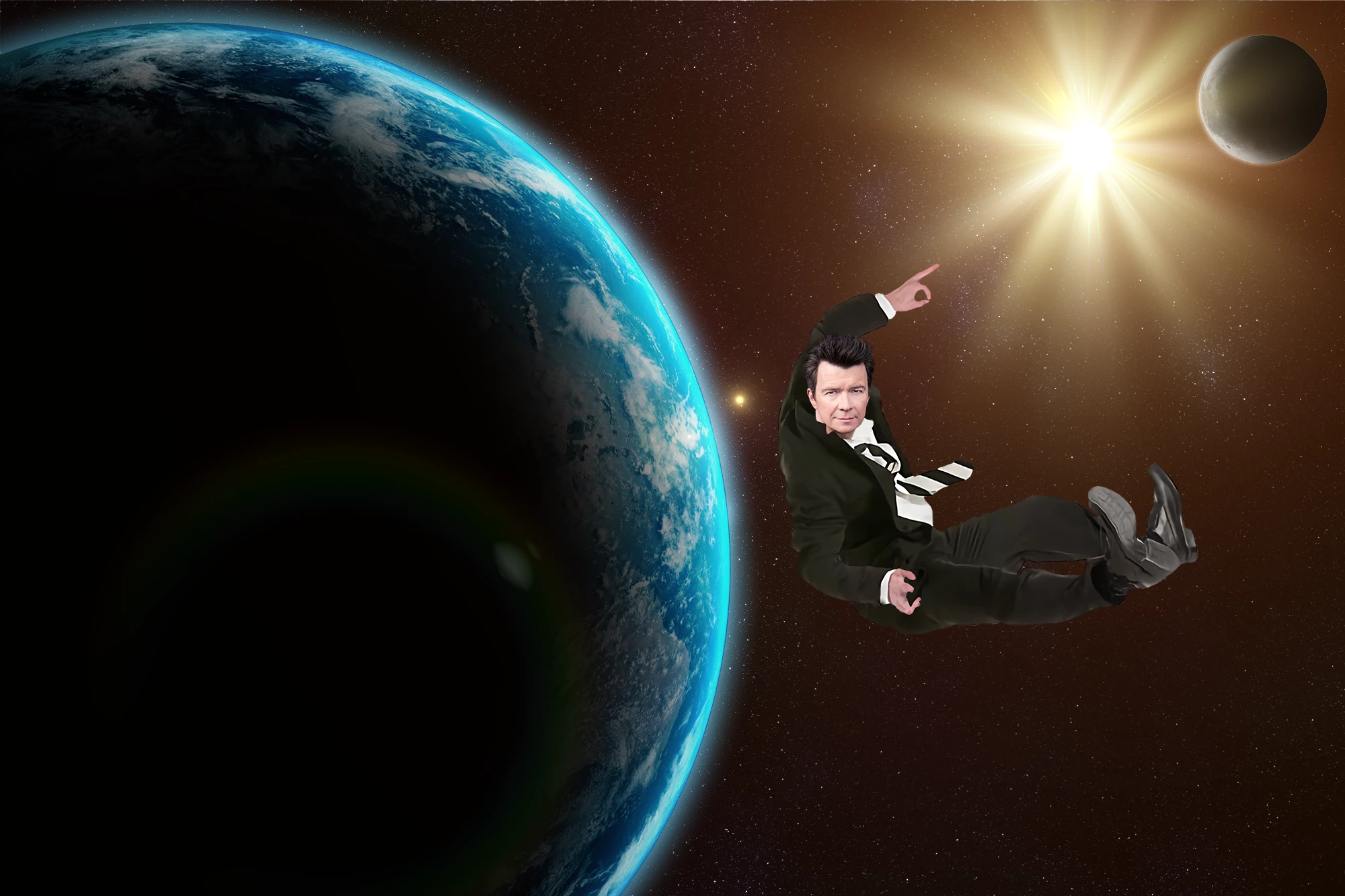
 

Spacee.png

TOPICS
Windows

Views

747

Translate

Translate

Report

Report
Community guidelines
Be kind and respectful, give credit to the original source of content, and search for duplicates before posting. Learn more
community guidelines

correct answers 3 Correct answers

Community Expert , May 28, 2023 May 28, 2023
quote

But isn't that literally the whole point of photoshop though?

By @GradientOGames


Sure, much of the point of Photoshop is to be able to get different images to work together. But the reason you’re getting these reactions is that when done professionally, or to a high fine art standard, mixing images is only easy and fast when every component starts out consistent with the others, usually due to planning and coordination of the photographic and digital/3D elements.


What you are asking for he

...

Votes

Translate

Translate
Community Expert , May 28, 2023 May 28, 2023
quote

Sorry about the rude reply earlier, I was quite stressed at the time :).

I am actually enrolled in art class, but the 8th grade doesn't really ask much so I'm looking online to better my skills.

By @GradientOGames

=========

No worries. 😇


I think the path of least resistance is to let Generative AI create a comp for you.  You can join the Midjourney Beta on Discord or use Stable Diffusion Online.

https://discord.com/invite/midjourney

https://stablediffusionweb.com/


AI is far from perfect bu

...

Votes

Translate

Translate
Community Expert , May 28, 2023 May 28, 2023
quote

This is just common sense. You can see what the light source is here, right? Do you think it's logical that backlight should illuminate the subject from the front?


By @D Fosse


That's about how I look at it.  You can see where the light should be hitting, so it comes down to the best ways to darken and lighten the relative areas of the composited image element.


Curves set to Luminosity is how I would darken, and my first step to brighten is to duplicate the layer and set to screen.  Add a

...

Votes

Translate

Translate
Adobe
Community Expert ,
May 27, 2023 May 27, 2023

Copy link to clipboard

Copied

Well for one thing, your subject is not a good fit for this picture because of where light and shadow are located on the man's face.  Your image's light is coming from the sun, not the planet. 


To look natural in composites, your subjects must mesh with their surroundings. 

https://photoshoptrainingchannel.com/compositing-photoshop-tutorials/


Nancy O'Shea— Product User, Community Expert & Moderator

Votes

Translate

Translate

Report

Report
Community guidelines
Be kind and respectful, give credit to the original source of content, and search for duplicates before posting. Learn more
community guidelines
Community Beginner ,
May 27, 2023 May 27, 2023

Copy link to clipboard

Copied

But isn't that literally the whole point of photoshop though? Also it appears all the tutorials are centred around compositing realistically in an ordinary atmospheric setting, rather than some miscellaneous locations, such as the vacuum of space. Are there any directive tips you can kindly hand over to me? Or else why did you comment if you have nothing of value to help me with? Your comment assumes I have already made an attempt, a very bad one, at lighting in my composite hoowever you are sorely mistaken. Any help would be much appreciated, but here's a little advice: don't comment if you don't have anything helpful to say.

Votes

Translate

Translate

Report

Report
Community guidelines
Be kind and respectful, give credit to the original source of content, and search for duplicates before posting. Learn more
community guidelines
Community Expert ,
May 28, 2023 May 28, 2023

Copy link to clipboard

Copied

quote

But isn't that literally the whole point of photoshop though? 


Any help would be much appreciated, but here's a little advice: don't comment if you don't have anything helpful to say.


By @GradientOGames

=========

Photoshop is a great tool in the right hands. But it's only a tool and not a replacement for understanding fundamental art concepts such as complimentary shadow/light, vanishing points and perspectives. At this point, enrolling in art class is all I can suggest.


You're welcome.  🙂


Nancy O'Shea— Product User, Community Expert & Moderator

Votes

Translate

Translate

Report

Report
Community guidelines
Be kind and respectful, give credit to the original source of content, and search for duplicates before posting. Learn more
community guidelines
Community Beginner ,
May 28, 2023 May 28, 2023

Copy link to clipboard

Copied

Sorry about the rude reply earlier, I was quite stressed at the time :). I completely understand what you mean, although I can't find an image of a suit floating somewhere (if you know where I can find more that would be awesome!), I'm sure I can find a better angle of Rick.


I am actually enrolled in art class, but the 8th grade doesn't really ask much so I'm looking online to better my skills.


Thanks for remaining calm 😄


Votes

Translate

Translate

Report

Report
Community guidelines
Be kind and respectful, give credit to the original source of content, and search for duplicates before posting. Learn more
community guidelines
Community Expert ,
May 28, 2023 May 28, 2023

Copy link to clipboard

Copied

quote

Sorry about the rude reply earlier, I was quite stressed at the time :).

I am actually enrolled in art class, but the 8th grade doesn't really ask much so I'm looking online to better my skills.

By @GradientOGames

=========

No worries. 😇


I think the path of least resistance is to let Generative AI create a comp for you.  You can join the Midjourney Beta on Discord or use Stable Diffusion Online.

https://discord.com/invite/midjourney

https://stablediffusionweb.com/


AI is far from perfect but it will give you something to start with that you can edit in Photoshop.


Nancy O'Shea— Product User, Community Expert & Moderator

Votes

Translate

Translate

Report

Report
Community guidelines
Be kind and respectful, give credit to the original source of content, and search for duplicates before posting. Learn more
community guidelines
Community Expert ,
May 28, 2023 May 28, 2023

Copy link to clipboard

Copied

This is just common sense. You can see what the light source is here, right? Do you think it's logical that backlight should illuminate the subject from the front?


Votes

Translate

Translate

Report

Report
Community guidelines
Be kind and respectful, give credit to the original source of content, and search for duplicates before posting. Learn more
community guidelines
Community Expert ,
May 28, 2023 May 28, 2023

Copy link to clipboard

Copied

LATEST
quote

This is just common sense. You can see what the light source is here, right? Do you think it's logical that backlight should illuminate the subject from the front?


By @D Fosse


That's about how I look at it.  You can see where the light should be hitting, so it comes down to the best ways to darken and lighten the relative areas of the composited image element.


Curves set to Luminosity is how I would darken, and my first step to brighten is to duplicate the layer and set to screen.  Add a fully concealed layer mask and paint in the effect.  The composited image is going to be a cutout, so something I use a lot is to Ctrl click to load the selection, and stroke the selection either in the layer mask to reveal a highlight, or directly onto a new layer above the image layer with a white stroke.


The bridge below was built with Photoshop for one of our SFTW threads, and has a white stroke to highlight the hard edges.  You can feather the layer mask with mask properties, or make the layer a Smart Object so you can keep fine tuning any feather.
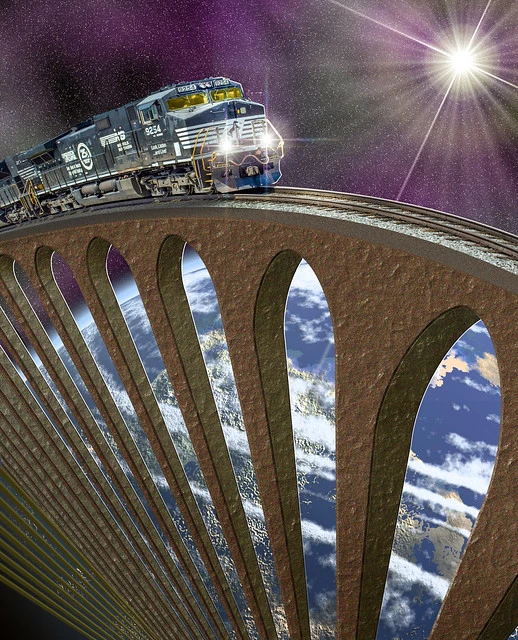
image.png


Same sort of thing with this photo.  The aircraft's outline was selected with the Pen tool, and selectively stroked with white to lift it from the background.  As before, make the stroke layer a Smart object so you can fine tune any blur, and make sure you save the workpath so you can use it again (that means drag the path to the New Path icon.
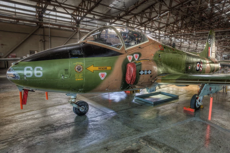
image.png


I use Dodge and Burn a lot on copied layers.  The trick with those tools is using the right tonal range setting (Shadows, midtone, highlights).  Use trial and error to start with — you'll get nasty muddy results using the wrong setting.


Shadows are going to be super hard edged in space because there are no reflections to soften them, but you'll need to use artistic license and take some liberties with reality becauuse you'll want to see some detail on the darkside.


BTW, I was not going to reply to this thread after your first reply to Nancy. Check out her profile to see how many thousands of people she has helped over the years she has posted here.  We do it because we love the apps, and we learn new things ourselves, and we have no obligation to help folk.  


Votes

Translate

Translate

Report

Report
Community guidelines
Be kind and respectful, give credit to the original source of content, and search for duplicates before posting. Learn more
community guidelines
Community Expert ,
May 28, 2023 May 28, 2023

Copy link to clipboard

Copied

quote

But isn't that literally the whole point of photoshop though?

By @GradientOGames


Sure, much of the point of Photoshop is to be able to get different images to work together. But the reason you’re getting these reactions is that when done professionally, or to a high fine art standard, mixing images is only easy and fast when every component starts out consistent with the others, usually due to planning and coordination of the photographic and digital/3D elements.


What you are asking for here is not necessarily impossible or wrong, it’s just…because the components are so dissimilar, although what you want is possible, it’s just going to take you a lot longer and a lot more advanced techniques to get to a believeable final result. (If you don’t need it to be 100% believeable, like if it’s just for a meme gag or something, then you don’t have to work so hard.)


Space lighting isn’t much different than any other lighting. It’s the same as being in a photo studio  with one point light source, undiffused. Just make your layers match that, relative to the star. His lighting should actually be similar to the planet on the left. The example below shows a quick hack using two instances of the Inner Shadow layer effect to make Rick’s right side darker and his upper left edge lighter where the star light is hitting him. You have to get the distance, angle, color, and blending mode right. But my example still looks terrible; really his whole body should be re-shaded manually with brushes to make a convincing light side glow and dark side shadow. To do that convincingly requires knowledge of how to model and shade human anatomy, which you get from art school.


Photoshop-Layer-Style-Inner-Shadows.gif


If this was being done professionally, they would have made sure that not only light direction should be consistent among the images being combined, but a lot of other things too, including color balance, and optical perspective based on position/distance in frame for a given lens focal length. This part isn’t even about Photoshop, it’s just about compositing in general: The more that elements are technically not consistent, the harder you are going to have to work in Photoshop. If you are a beginner, and you aren’t yet familiar with traditional compositing requirements or Photoshop, and you also start out with inconsistent layers…that’s a lot of hurdles to get over.


In the future, AI will probably help you with this. If you look in the Photoshop Neural Filters, there is one filter on the Wait List called Shadow Regenerator that might solve these kinds of problems. But because that filter is not yet available, you can’t use it yet. Today, if you want to get this done fast at high quality, you must still combine consistent original images with traditional art and photography training and the right Photoshop techniques.


Photoshp-Neural-Filters-Shadow-Regenerator.jpg

Votes

Translate

Translate

Report

Report
Community guidelines
Be kind and respectful, give credit to the original source of content, and search for duplicates before posting. Learn more
community guidelines
Community Expert ,
May 28, 2023 May 28, 2023

Copy link to clipboard

Copied

Look at the way the planets are lit. Light from the sun/star falls on the edges. The man should be lit the same way. You can achieve that by painting, but would be much better off starting with an image of Astley that would suit such rim backlighting, for example with his face turned sideways. You can achieve a lot in Photoshop compositing but it is always easier and more effective to start out with suitable images.


Dave

Votes

Translate

Translate

Report

Report
Community guidelines
Be kind and respectful, give credit to the original source of content, and search for duplicates before posting. Learn more
community guidelines
Community Beginner ,
May 28, 2023 May 28, 2023

Copy link to clipboard

Copied

I can't find another image of a suit floating like that but I'm sure I can get a better angle of Astley's face, I'll get back to you when I can.

Votes

Translate

Translate

Report

Report
Community guidelines
Be kind and respectful, give credit to the original source of content, and search for duplicates before posting. Learn more
community guidelines